Kerning in FontCreator's not too bad, but it does have quite a few little quirks and tricks that get it that way.
Fwiw: can only speak from the perspective of older versions. I use FontCreator 11 for all Chequered Ink fonts; I've bought 14 and it changed so much that it massively impeded my workflow, so I went back down. 15 is the version on sale now; the kerning info I'm about to give may not apply.
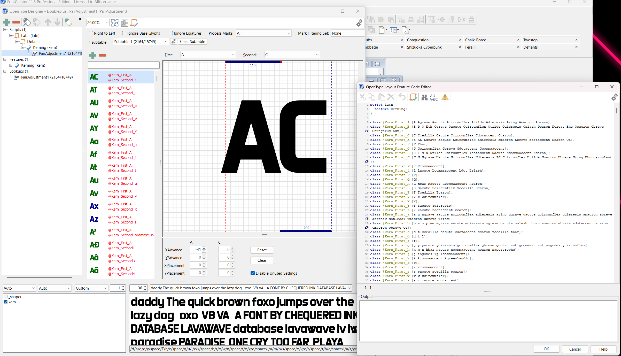
There's an automatic kerning tool in FontCreator but it does require a lot of manual work to make it great. It's a bit of a dice roll; some fonts only need minimal adjustments, others you may as well clear everything and do it from scratch. It works off of the base height, x-height etc of each character, and some don't look great.
Thankfully, fixing is mostly a matter of creating a new/selecting the existing pairing of characters you want to alter, and then dragging them together or apart as required. There is also an in built code editor for them, which can be handy for fast changes, adding eg. accented versions of the same letter to the same kerning pair, and also prefabbing kerning for a specific font style if you know it'll fit similar-style fonts in the future. (Very handy when you've made 970 of them.)