

Haven't gotten around to trying everything yet, all this new stuff looks cool. I especially love that you made it easier for roll20 folks to use. I was fine with a 64 grid but now it's even easier.
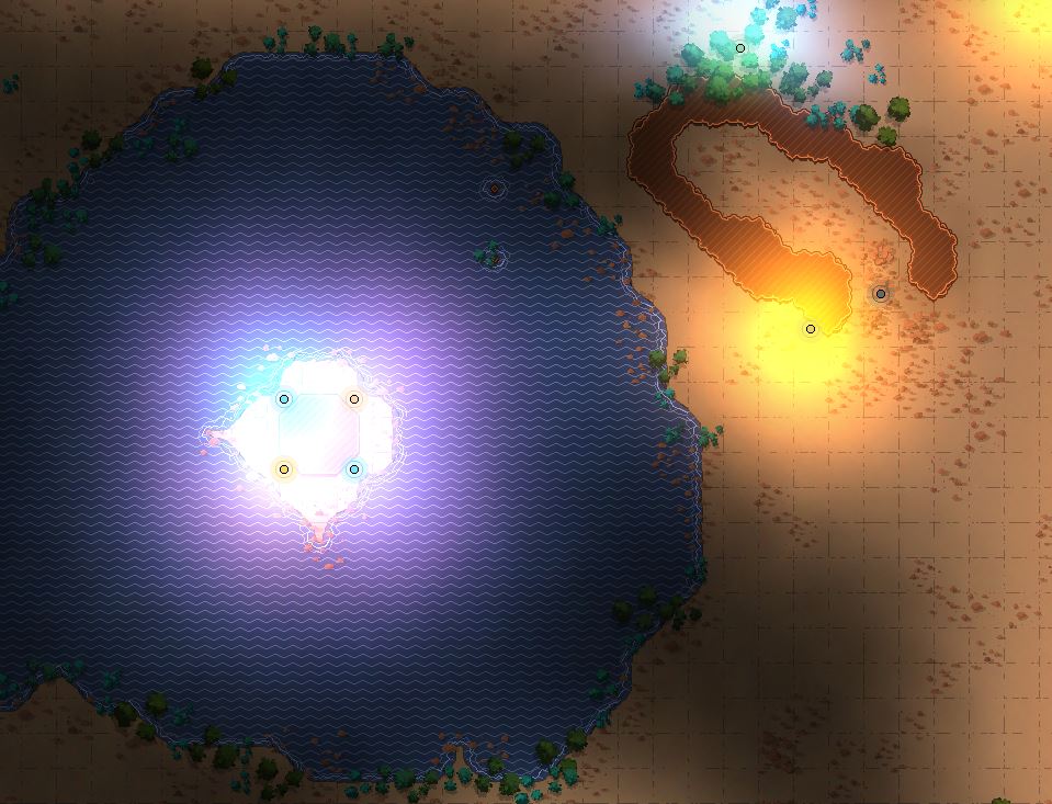
I digress, the new lighting reminds me more of light explosions. It seems like the only options are barely visible, super glow, and you're looking at the sun. I think this can best be seen by looking at the screen captures below for version 15 vs. 16... you can see how the light in version 15 is much more subtle and has an opportunity to interplay with other elements. In 16, it literally just looks like slightly tinted solid color blocking everything around it. And oddly, in some cases (not shown below) adding a wall next to a light source somehow makes it dimmer rather than just creating a shadow.
Version 15:

Version 16:
Again, I love your work... and I know you don't have total control over everything... but let's chat about this because this could keep me in update 15 for a while.