This was a cute little game, it's a shame you didn't have enough time to add in a goal or gameplay loop.
All of the sprites look great - especially the plants and potions- and it is very clear how much time you had dedicated to the Green and Red books which look ABSOLUTELY BEAUTIFUL.
A few small improvements to things that stood out to me which would just require small alterations that only require minimal time and effort:
Screen Size - the UI doesn't properly fit on the screen which is not a big issue (I only found out how out how to set it the day of the submission xD), but even when full-screened the game remains a set size and requires zooming in multiple times for the text to be readable. I don't even know what you had to do to limit it like this as I've never experienced it when working on 2D projects, so I sadly can't give a tip on how to fix it, but you should look into how to set it to scale up for future projects.
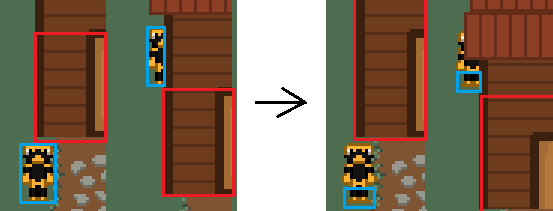
Collision - the collision dimensions are not very suitable for the viewing angle of this type of 2D game, when I tried walking into and around the houses, I noticed that it appears that your collider is sized for what you would expect for a more top-down game like Poke'mon where your character is much more square, your character is able to walk behind the back of most of the building, while only being able to move within a few feet of the front. This would be so much nicer if the player's colliders were only around their feet, which would allow them to walk right up to the house. The house colliders also could be improved where allowing the player to move behind the sprite is completely fine, but at the moment it feels like the house has no depth to it, if you increased how high the collider went it would feel more natural with how close you are able to pass behind the building.
Here's a quick example of how this would look for the two colliders:

Backdrop - the background art looks great, but this would absolutely have benefited to the actual backdrop for the game behind that being the same or perhaps a darker shade to the trees at the edge rather than remaining the what I'd guess is the default blue
Overall most of my score is coming from the truly amazing job you did on the visuals xD
I would love to see how this game would look in the completed state you had been aiming for, this is the second game I've really really liked the concept of but sadly the creator wasn't able to find much time during the jam to dedicate to it. I really hope next jam you get enough time to have the game in a state that is satisfying so it can truly shine with your amazing pixel art skills. :D

