
Very cool! 😁
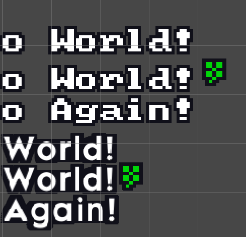
Btw. can you explain to me why my icon further up on one font than another? Does this have something to do with what's the size of the font or what sort of metric makes this be like it? Got any suggestion how I could make it more consistent to align with "bottom of the text" or is this just issue with fonts I am using?
Maybe there exists some tag magic again that I could use to fix this, lol.
EDIT: I guess <y=-0.2> kinda did it, would just need to save somewhere how much icon offset every font approx. needs.