
My first venture into Galduen didn't last long, I got stuck in the tutorial...
I somehow managed to brick the tutorial, while trying to go to Osur-ei I just couldn't get it to work (tried clicking everything) and instinctively tried to reorient the camera with WASD which sent me back to the start and I can't seem to click anywhere anymore.
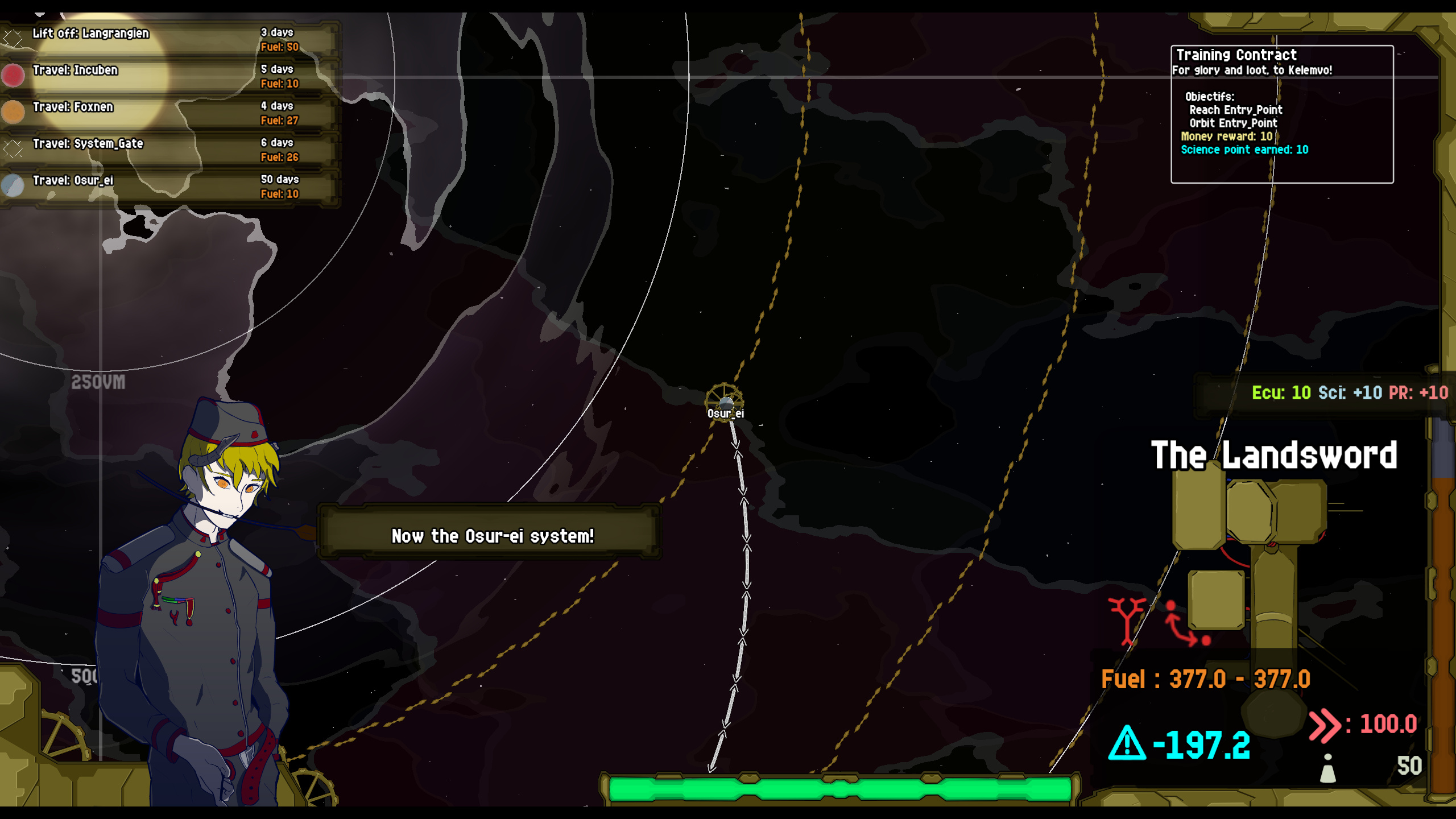
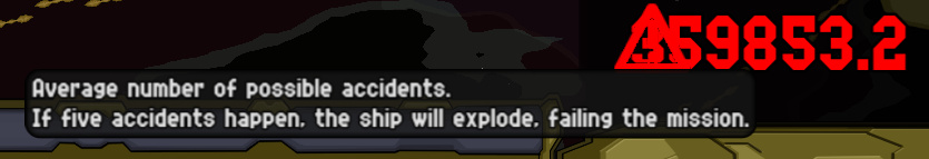
This is where I got stuck, clicking the system, the travel line or anything does nothing. Also is average number of possible accidents really supposed to be -192.2?
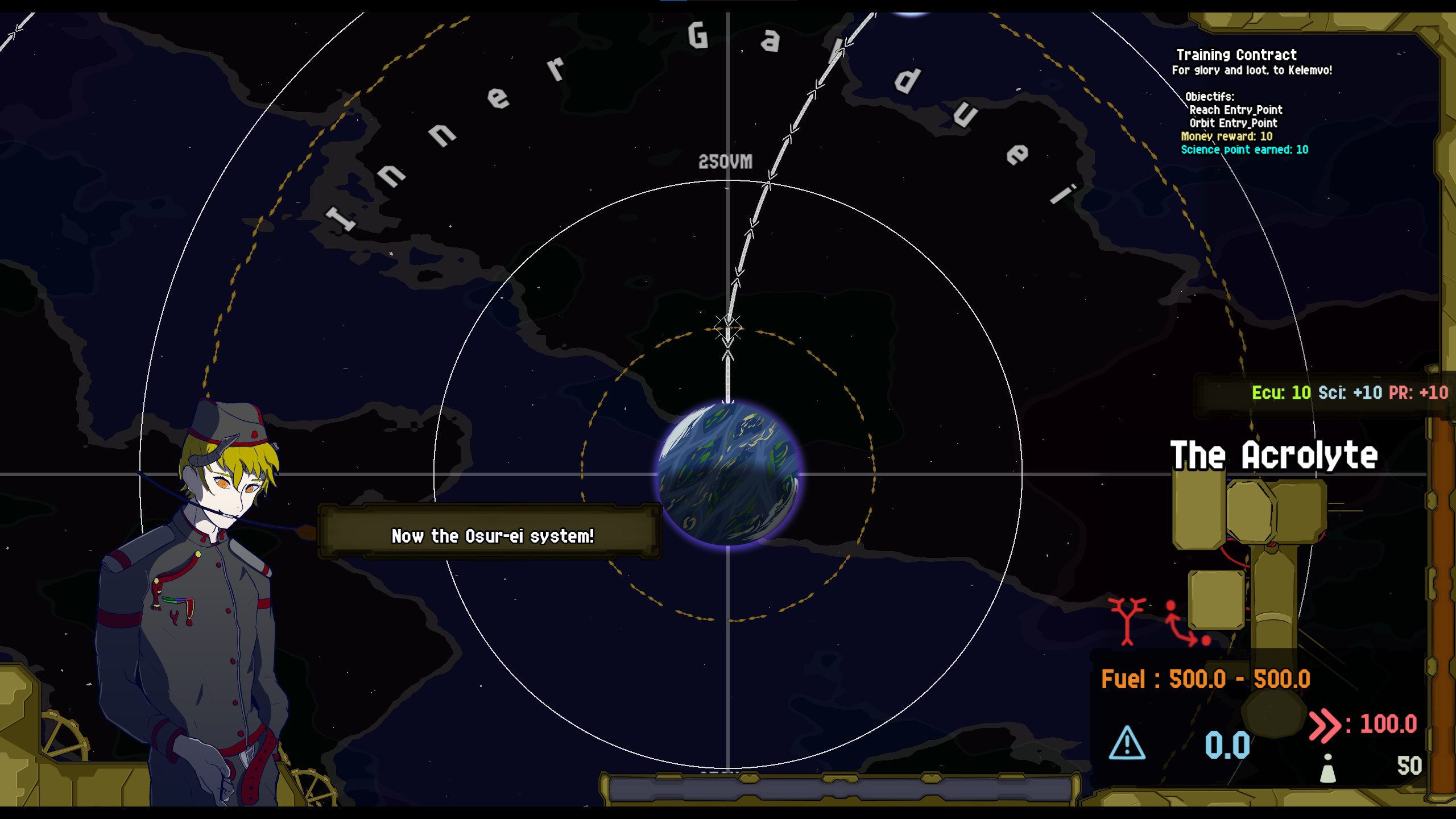
Then after pressing S(?) too many times I got stuck here.
In the tutorial while going to the lagrangian point the character says "as you can see the momentum is increasing" but the meter is empty, also you can barely tell fuel has gone down because the top is obscured by another UI element.
No "preview" of the momentum change when hovering a travel line like there is for fuel.
WASD does seem to reorient the camera, in some situations but in other the buttons might do something else? That wouldn't be good.
Not a big fan on the chunky arrows in the orbital view but I guess they fit the overall aesthetic.
As there will be a lot of button pushing in the game it should be satisfying, the digital sound (placeholder?) doesn't really fit. I'd expect something more chunky and metallic, with buttons indenting, popping down and up when pressed.
Increasing the Darken slider actually makes it brighter, change the wording or invert the slider.
A lot of spelling, grammatical errors, inconsistent wording, etc. But I think you're aware of it and will do a pass on all that later so I won't comment more on it.
Some text and other UI elements go outside their borders. E.g:
The planets would look really good rotating, something similar to this: https://deep-fold.itch.io/pixel-planet-generator
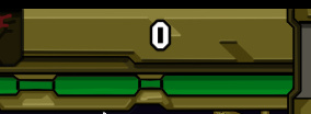
Overall I think the UI looks alright I think my problem with it is that it looks like it tries to go for a diegetic look but the actual information elements and buttons don't fit into that and just seem slapped on there. For example this 0 here I have no idea what it represents, and is put on a seemingly non-related background element.
Another example of something I don't think fits:

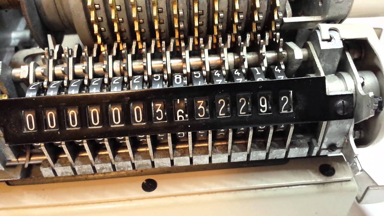
The feeling I get from the rest of the setting I'd expect they'd use mechanical calculators or something so numbers would be displayed closer to something like that:
Whoops, from 2nd tutorial:

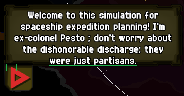
His mouth is way too low:

3rd tutorial, moved the camera while this was up and it got misaligned:
In the game I often dont have time to read the popups in the bottom left. Could do it like some other games and have smaller icons popup down there that you can click to enlarge and see info and rightclick to dismiss.
Going to the moon lower PR...? It's the weird culture I guess. Also it said reach THE moon right? Galduen has 3 moons.
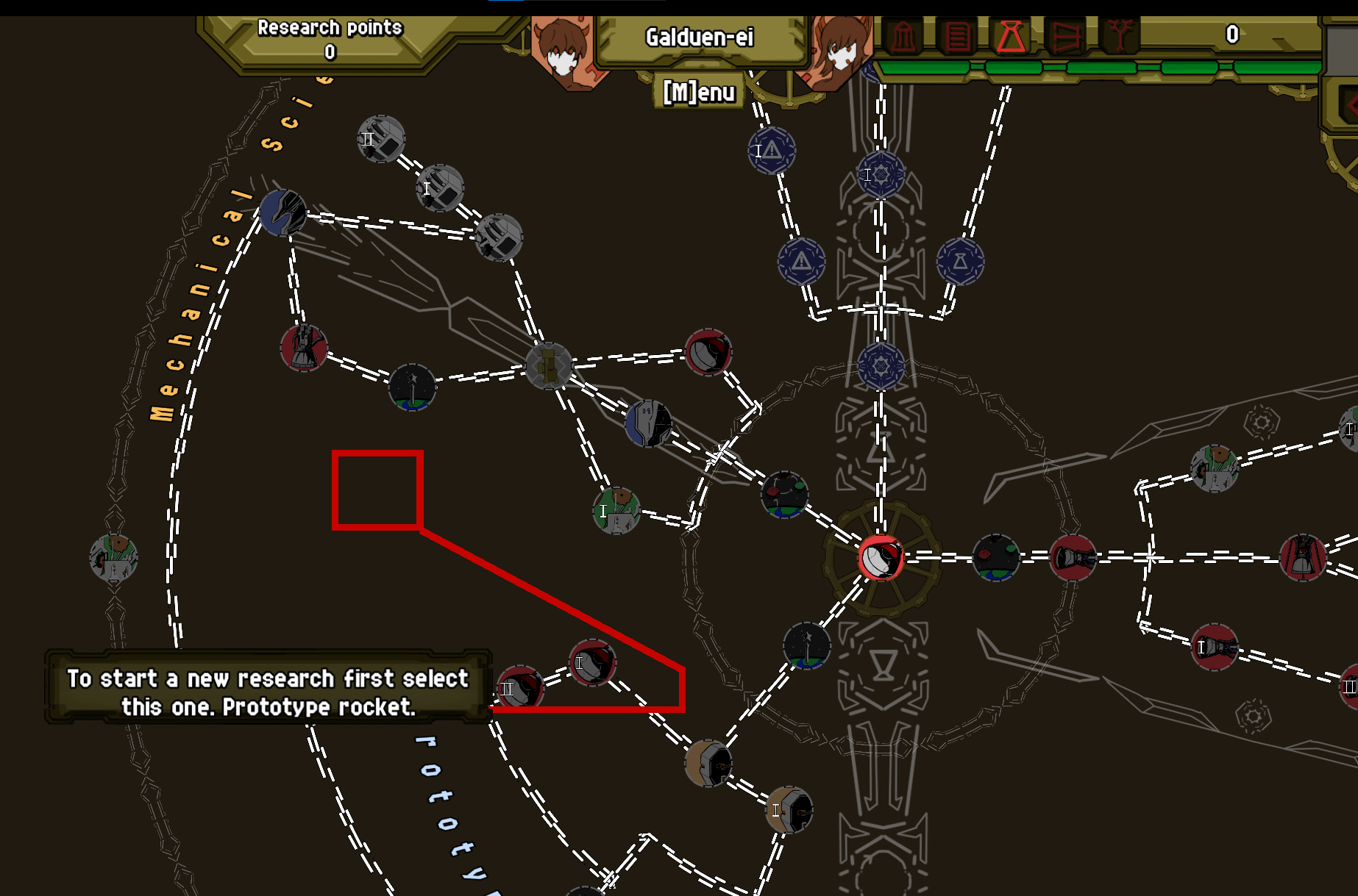
This section of the research tree doesn't have a label like the others:
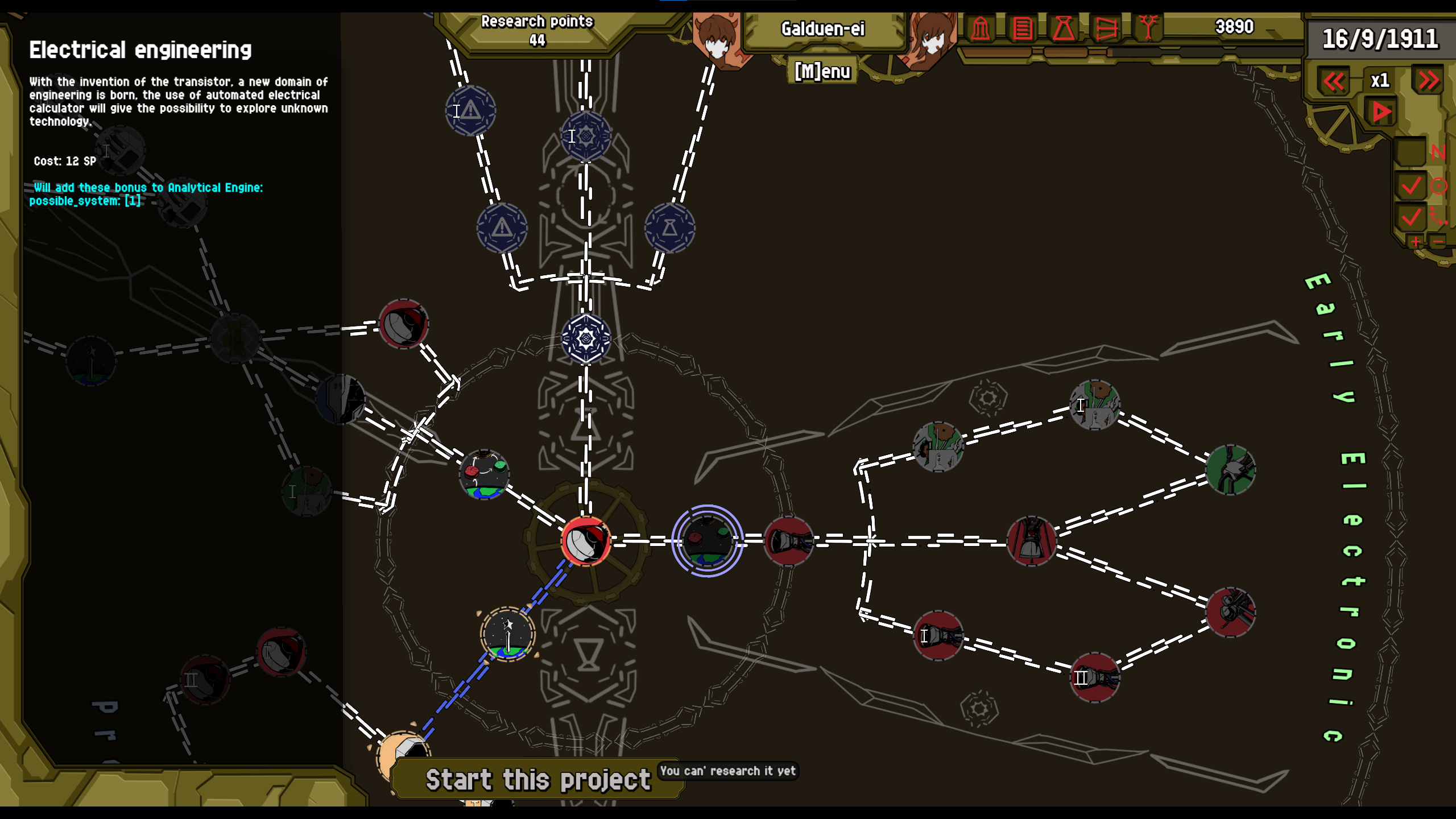
I can't research this node but I have no idea why I can't, it should say what I'm lacking. Research points should be enough though.
Maybe it should be possible to build ships ahead of time? So you can have an prebuilt fleet to send out.
It should auto-pause whenever something completes, it should probably be a toggleable option.
There's no return button for the research and story screens like there is for the others.
I'd expect you to be able to inspect ongoing/accepted contracts in the mission control screen but as far as I can tell all you get is the time left to build the vessel in the top left? Also one time I got a mission to <null> accepted message. Actually it seems you can see failed expeditions (maybe I had the speed too high otherwise?), but they also seem stuck here forever:

Ship building is very LOUD.
Eh what's the worst that can happen!...
Space is littered with my failures. It's pretty funny that a failure still gets you cash.

All in all I did have fun despite some jankiness, mostly in the tutorial. And I can see the bones of a real game starting to take shape. I feel like there aren't many ways, at least in the very beginning, to mitigate accidents other than send out probes and pray. Landscape pictures look great. I am interested to see where you'll take the game.