For a single dev., this is craaaaazy quality. Gameplay is peak, think I logged more minutes in this game than any other jam game from this batch of submissions.
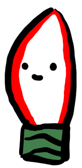
Think only feedback I have would be on art. Something about the lighting, the enemies, the string, and the environment felt like different art styles. Like they are all cartoony, but almost like "distant cousins." The shadowy guys for some reason just didn't feel like they matched the vibe of your bulbs. Could've been their color maybe or something or the fact that they faded into the ground when no other asset did, it just felt "not the same", I can't describe it.
Speaking of bulbs, it felt a lil' weird having a hard color line on the bulb itself to indicate it was on. This is just only because no other asset had that same behavior. I don't know a lot about Unity, but I'm assuming you did that to work around lighting limitations with web builds to indicate a colored light. Maybe having it softly vignette from white to your desired color might look better. If Unity has like a the ability to make that in engine (like in Godot), you could even animate it and adjust the blur points.
The environment also doesn't have like the hard outlines like you have on your bulbs. Assuming you did that for distinction so players could see the environment, but for me personally it felt "off" (no pun intended).
Treat these art comments as nitpicks honestly. I had a lot of fun playing your game and would def come back to it. I do love me my bullet heavens!
- S.