

Realy great work, thats a game ready effect right there!
Play asset pack
[VFX] Lilith's Ion's itch.io pageResults
| Criteria | Rank | Score* | Raw Score |
| Overall | #2 | 4.356 | 4.356 |
| Presentation | #2 | 4.444 | 4.444 |
| Documentation | #2 | 4.444 | 4.444 |
| Creative | #2 | 4.444 | 4.444 |
| Technical | #2 | 4.222 | 4.222 |
| Research + Development | #3 | 4.222 | 4.222 |
Ranked from 9 ratings. Score is adjusted from raw score by the median number of ratings per game in the jam.
Judge feedback
Judge feedback is anonymous and shown in a random order.
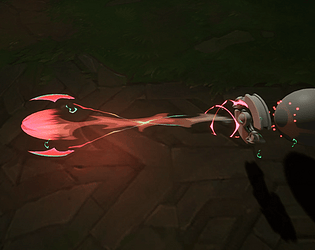
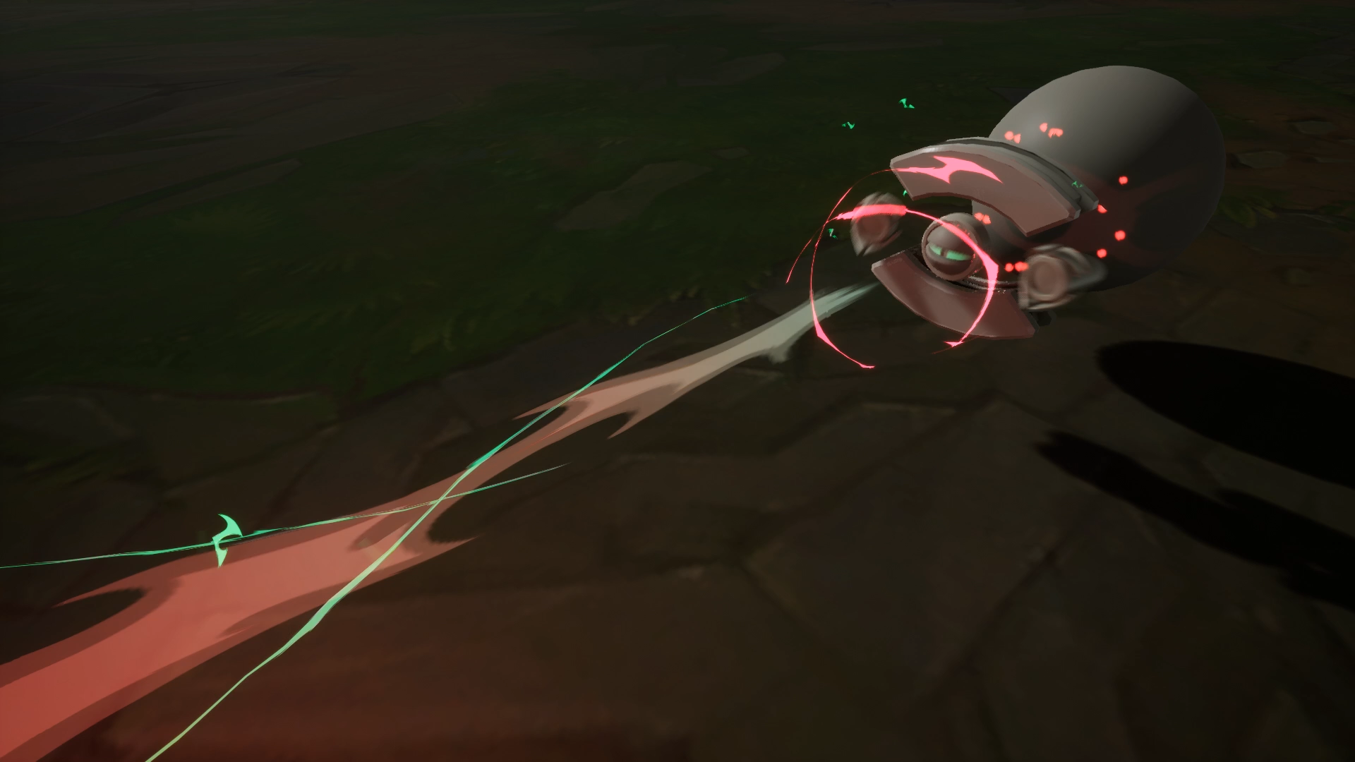
- I really like your research and presentation on this piece. It clearly shows that you spent your time to make it as best you can make it, and the work shows it. I really like the elements you used to get the overall effect you were going for. The idle, powering up and release states are clean, readable and has really good motion. However the only criticism I can give you is for the impact state. I think it is really quick and it feels like it doesn't give the big impact I was expecting. The charge and the release shows that something big is coming but when it hits it is a little underwhelming. It is a snipe shot after all, which is expected to have a big damaging hit when you get it. If you spend a little bit more time on your impact I think this will be a great portfolio piece. Really fantastic work, keep it up! I wish you good luck on the competition and your career ahead.
- great work feedback -The projectile doesn't feel impactful when it hits the target -The impact effect feels a bit too fast it would be great to see ab bit of leftover energy after the hit i really love what you have done over all
- Very good work. The timing is amazing. Definitely like the use of color. The only thing I might wonder as a player is the end, even though the color changes to the cool blues it still feels somewhat angry for quite a long distance - does that mean it's seeking a new target? Could that be secondary lesser damage?
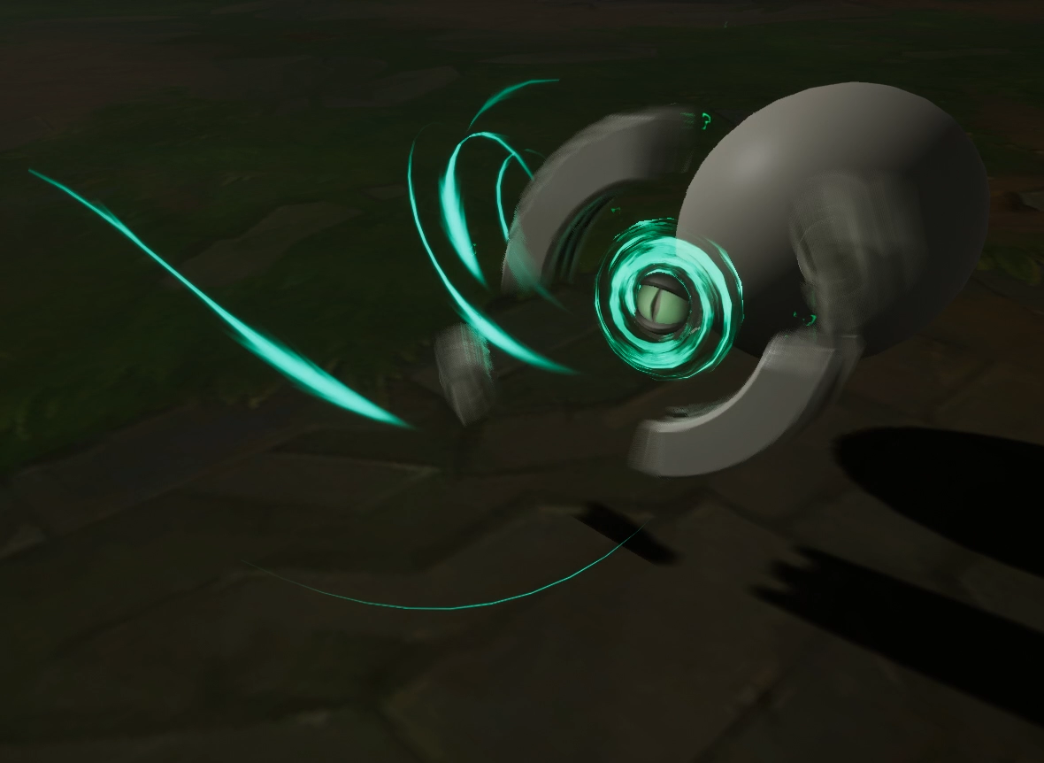
- This was a really well thought out project, you have taken on enough work to enable you to finish an effect to a high quality and create a well written and researched documentation. You have taken elements from the LoL Guide and VFX principles and aligned them to your project showing clear understanding of the fundamental ideas. The documentation has a consistent theme throughout the pages also and clear personalised branding. The effect is well displayed with options for slowing it down which makes it easier for the reviewer to enjoy all the little details you have added and slight offsets on timing of individual elements of the effect. Overall the effect is of a high quality and has really nice elements. Personally I am not sure about the reversing spin of the weapon, it might work better to continue spinning in the same direction and having a slight pause where the gizmo spins for half a second before firing off. Similarly to the spin up of a mini-gun. The impact has a lot of really good elements, however the impact ring / shockwave shrinks at the end which actually removes some of the impact force. Continue to scale this outwards for the best results and perhaps a little larger to offer more force. A distortion ring may also help to emphasise the impact force. I really like the subtle offsets on timings of different elements. This adds a really good layer of polish and is something missed by many.
- hi ReeceKuby, Just an amazing work. You have good reference, good philosophy. You give .exe, with control (time, camera), maybe you can add overdraw view or fps count for a futur effect, and add quit button for your .exe. This is AAA visual effects. Timing on impact can be better, but this is really good job. Lowys Clément, VFX artist ubisoft MONTREAL
- The research into the intended colour schemes for the effect was very thorough on your moodboards. You showed great aptitude in your colour choice and deciding which colours fit well for a neon demon like weapon. However it would be good to see more research into the types of shape language you intended to use, exploring not only concepts, but other games and media which have similar vfx representations. From the concepts that were provided, the development through the initial sketches has shown that you have done extensive research into the looks and functionality of an effect that may be included on a League of legends character. With regards to the technical side of things you’ve shown a good understanding of how to use the material editor, particle system and blueprint system. You have demonstrated that you have experimented countless times to get the desired results as all the parts are precise in their intention. I can also see that extensive tests have been conducted to get the best camera angles for the presentation. In terms of your creative approach, you have done a good job looking at what shape language works best for the vfx, going for large spiky shapes which can be associated with demonic themes. In terms of colour schemes for a demon neon look, the choice you made compared to the other colour sets was the correct one. Making use of the wide contrast of pinks, purples and cyans, you have demonstrated the effect with a degree of ‘punchiness’ to it , where as others would make it seem very subtle. I Think the overall presentation of the vfx meets most of the expectations that an industry vfx artist would be expected to follow. As mentioned in your documentation with regard to the impact - ( “effect didn’t carry a lot of power however I didn’t want to just add massive explosions to the effect due to gameplay readability and importance”). The impact and projectile could have done with a touch more power, the effect would have benefited from increased speed timings, this would enable you to pull off an effect which more clearly shows “this is doing damage”. Another option for demonstrating more power would be making the impact more explosive at the front and back of the target, yet still keeping it clear and concise, focusing on the same small area of effect, having more visible shapes involved in the front and an increased spread of simmering/ dissipating out particles as the impact burst out the back of the enemy character. I do want to congratulate you on how well you have thought out this effect, you have clearly demonstrated extensive research and tests which are shown very clearly in the presentation of the final product. Below are some good references for punchy vfx https://www.youtube.com/watch?v=jb3PqtUTSZY - 0:25-0:36,1:08-1:18,(single arrows and barrage of single arrows) - 14:04-18:15,(First and second attacks for each character) https://www.youtube.com/watch?v=I6S-NEF-UlM
- Hello well done! , i would say add more glow to the impact and make it slower, to really sell the idea that the projectile is hurting the enemy. Dont give up! a very good VFX
Challenge Tier
Search For A Star
Leave a comment
Log in with itch.io to leave a comment.