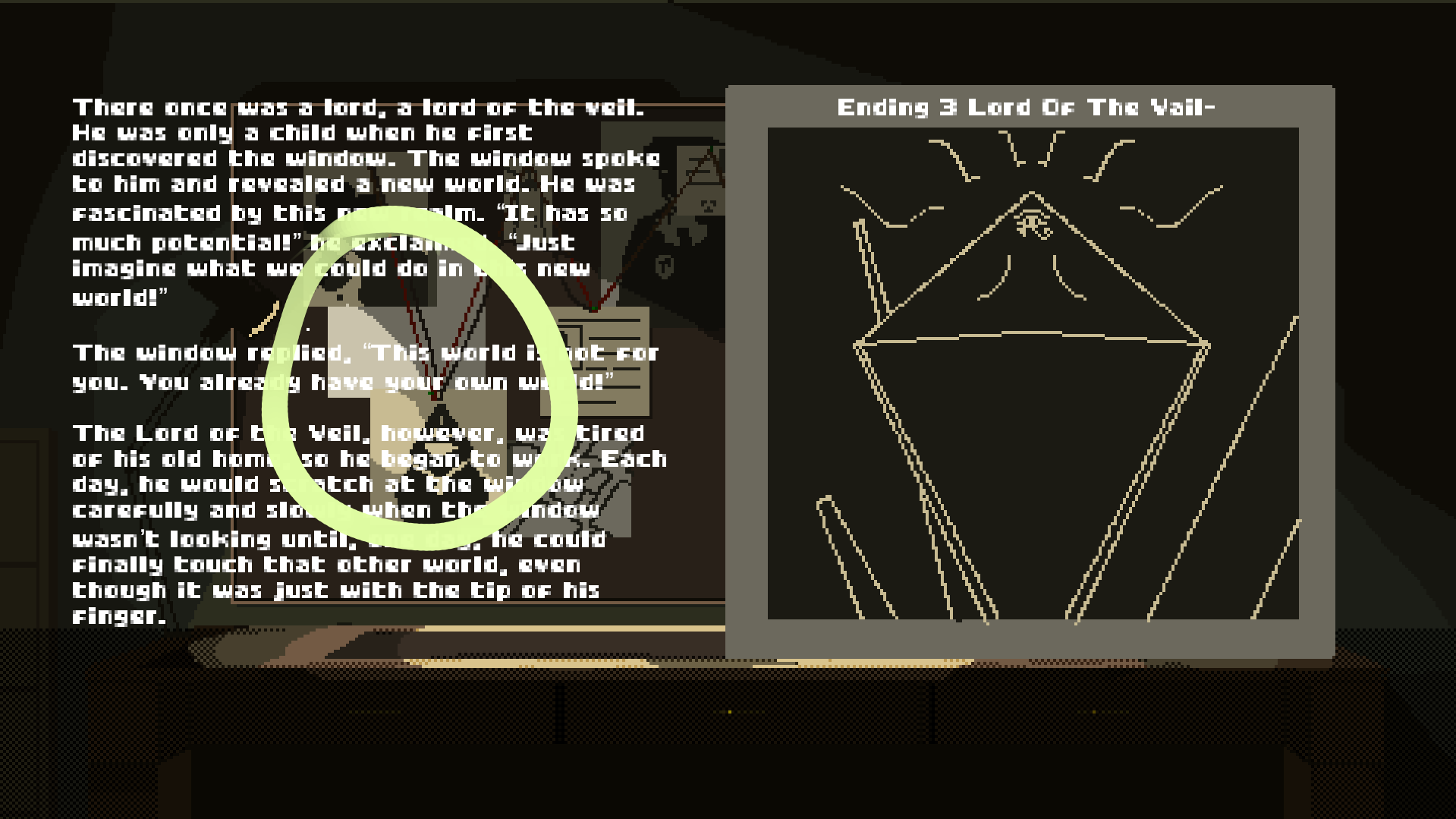
Imagine you want to read a book with one hundred pages. If the font is pixelated too much (has a low resolution), or creates a bad contrast with the background, the book will be hard to read. For example, on the first screenshot of your game, if there was a dark transparent rectangle behind the text, it would have been much easier to read. There are guidelines, which UI designers, web developers and typesetters use. You can achieve a lot simply by choosing a good font (family, size, color), and making a good layout of the text. One of the best illustrated books I've read on this topic is Refactoring UI, by Steve Schoger and Adam Wathan (2018-2019).


