Play game
Turn On The Light!'s itch.io pageResults
| Criteria | Rank | Score* | Raw Score |
| Fun | #2 | 3.125 | 3.125 |
| Gameplay | #3 | 3.000 | 3.000 |
| Overall | #3 | 3.125 | 3.125 |
| Theme | #3 | 3.625 | 3.625 |
| Innovation | #5 | 2.750 | 2.750 |
Ranked from 8 ratings. Score is adjusted from raw score by the median number of ratings per game in the jam.
Discord Username(s)
OMEN#7852
Leave a comment
Log in with itch.io to leave a comment.


Comments
nice little game, simple but intuitive
some feedback:
the collisions could be improved, there's too much jitter
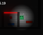
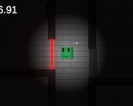
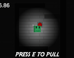
the radius of light doesn't make much sense since i can still see everything, maybe hiding key objects like buttons and lasers outside of it could make for more interesting gameplay
cheers
good theme representation and fun implementation
The theme is represented very well! We would like to see more complex levels! Great job!
Thanks for playing the game. I am gonna make more complex and difficult levels in the game so the game doesn't become too easy.
Hey,
I like the idea. It's simple and effective. It feels a bit though that the polish is put on the UI, not on the game. To my taste some of the levels could be longer / harder, so the difficulty curve isn't quite there. Player death animation could have been nice addition.
Good job!
Thanks for the feedback. I totally forgot to add player death animation so sorry for that. I wanted to make the game easy enough to play so that's why you may think the game is too easy. I will add harder levels so it becomes more fun to play.
I love this game! Simple and easy to understand how to play. Really excellent use of the darkness theme.
- I understand that you want the player to be able to see the puzzle, but I think it would be better if the shade of darkness was a bit darker, it would be better.
- because otherwise the character's aura of light would not make sense, if I can totally see everything around me.
-14/14 plays without errors beyond the clipping on the walls (which is most likely that, you have left it on purpose)
-Good game :-)
Thanks for your feedback.
I didn't realise that there should be more darkness in the environment. Anyways I updated the game and now the environment is bit darker.
Also breaking the walls is not a bug it's a feature that's why you can see the walls which can break are of a slightly different color.