


Play asset pack
Neon Ninja - Kiara De Angelis's itch.io pageResults
| Criteria | Rank | Score* | Raw Score |
| Creative | #8 | 4.000 | 4.000 |
| Research + Development | #11 | 4.000 | 4.000 |
| Documentation | #14 | 3.833 | 3.833 |
| Overall | #14 | 3.800 | 3.800 |
| Presentation | #16 | 3.667 | 3.667 |
| Technical | #18 | 3.500 | 3.500 |
Ranked from 6 ratings. Score is adjusted from raw score by the median number of ratings per game in the jam.
Judge feedback
Judge feedback is anonymous and shown in a random order.
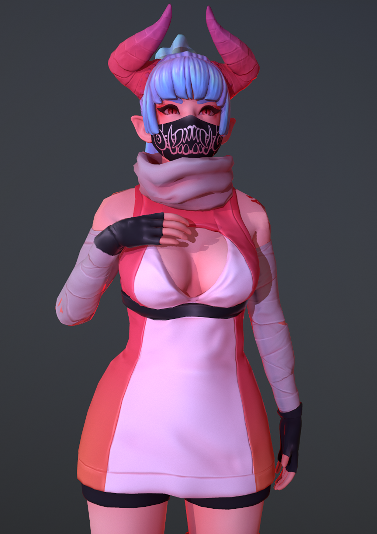
- It’s a well rounded character you have created, Which was nearly two characters so well done for that! Just be aware that substance is a industry standard so you may struggle gaining work in he field without the knowledge to use it. But, there are always options to get round painting on 3d, such as perhaps using poly paint in zbrush, or photoshop as you did, which worked well, but not as well as it could have if you were able to visually see those pen marks hit the 3d surface. A nice stylised piece of work, topology is about the right density, uvs are well done, but where you have struggled is mainly due to use of software I feel. For the future, have a try at polypaint in zbrush, that might help, substance painter is a hog on lower spec computers so I would suggest an upgrade at some point if you wanted to head into character art. You need that experience of using the industry standard tools. But for your folio for now I think you have produced a lovely piece that works well, which I feel (given your 2d expertise) would benefit more from texturing in a software that enables projection onto the 3d surface, rather than photoshop. Anyway keep it up! Oh also, you don’t actually need to split the character up when creating it, you can keep each object in the same space, and label them to fit the high name_low name_high then bake it, in marmoset or substance. That way you get the nice ambient occlusion also as well as clean bakes that you would get by separating. Hope that helps!
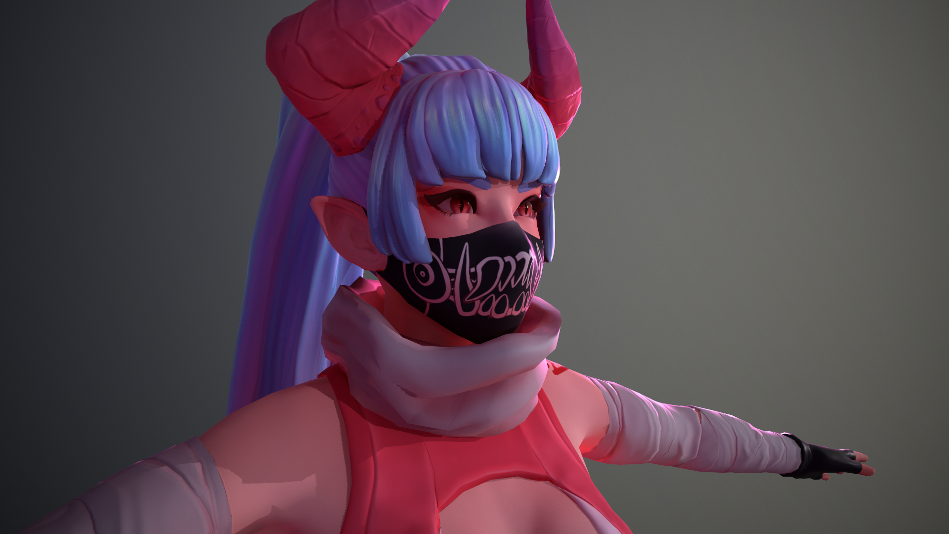
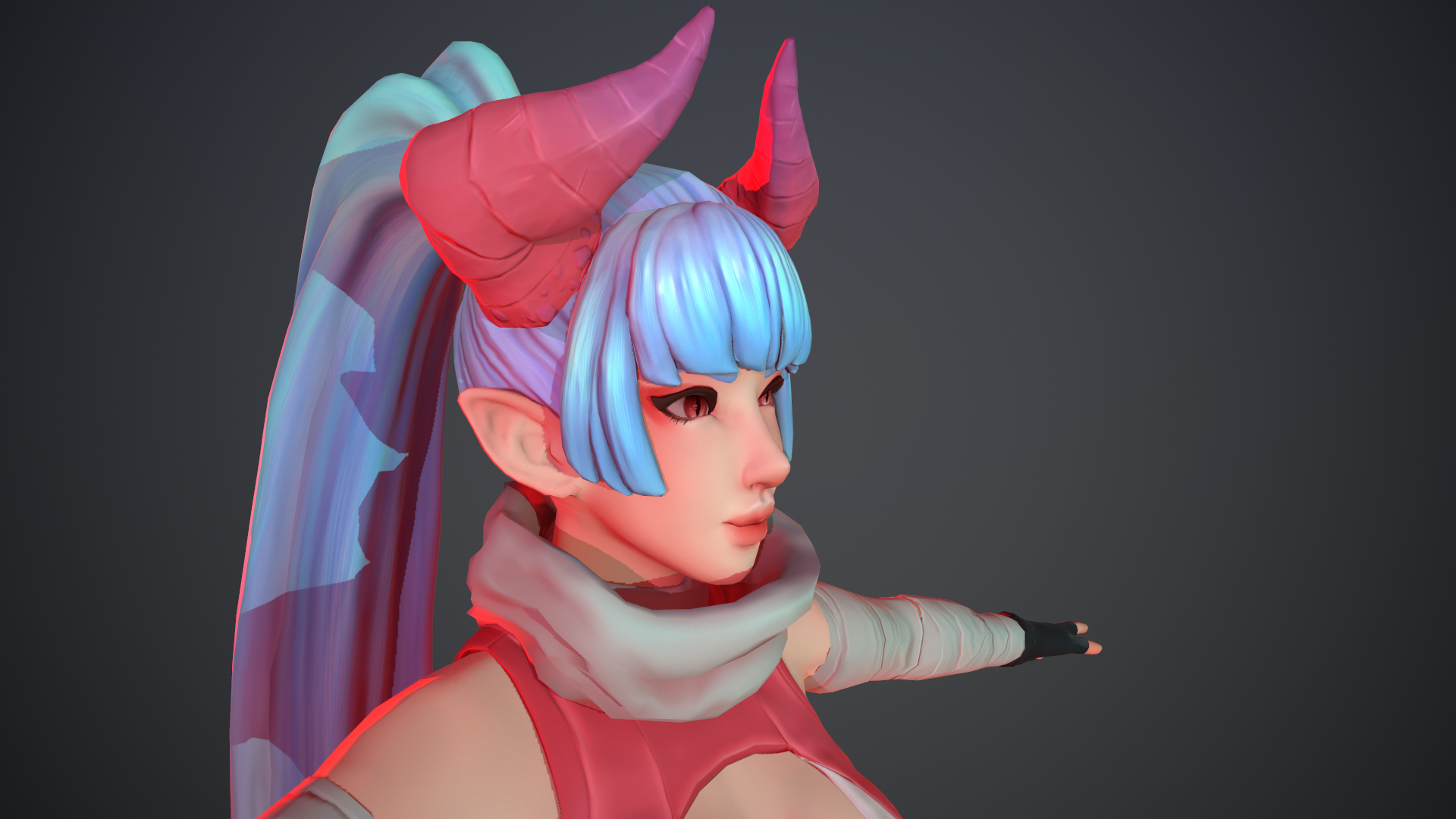
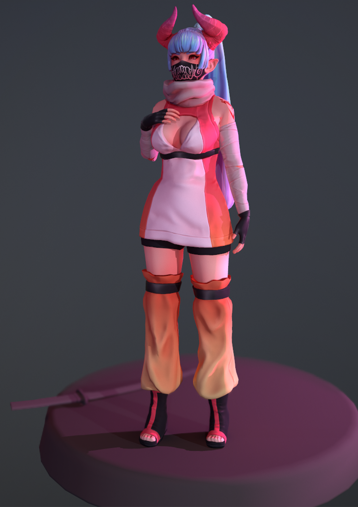
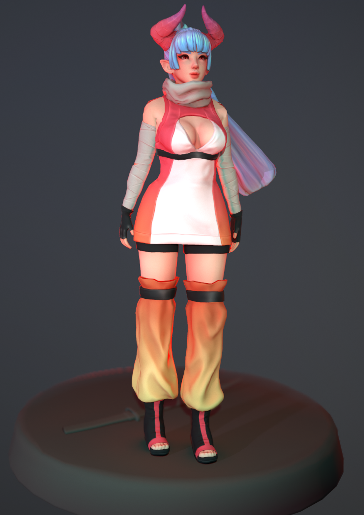
- Really like this character! The face shot is very appealing and I like your red and blue colour choice a lot. The face has a nice amount of rest area to detail, as well as nice proportions which is key with females. If this is something you're interested in, I would make a ton more and keep studying to see how you can refine it. The simple character design and costuming compliments the piece, too. I particularly like how you did the hair, especially the highlight on the front bangs looks awesome. For critiques: Your proportions look a bit off. The hands look very small, and her overall proportions feel too realistic compared to the face aesthetic, I think you could've elongated her legs and narrowed the waist to avoid the dumpy feeling it has right now. This kind of simple character design also benefits a lot from a well-balanced and appealing pose, and right now your pose is very stiff with no contraposto and the weight looks equally distributed on both legs. If you like these types of characters I would study pvc anime figures, as they are the best example of how to pose female characters in an appealing way, sometimes in subtle poses that have amazing balance and weight distribution. If you're looking for a reference point that's more realistic, check out the work of James Marsano who is a master of posing female characters imo. Your cloth sculpting is nice, the realistic treatment works nicely, just keep studying real reference and look into marvellous designer/cloth sim at least for reference of how large areas of cloth fold. Keep in mind your points of tension versus rest areas where the cloth is tight over a form underneath. The surfacing on the cloth looks a little basic, the scarf in particular looks almost untextured. The wraps on the arms also might have benefited from some cut in topology to pull out the silhouette of the edges, as they look very 'baked on' especially when they deform. Sometimes you need to cut in more geometry so your baked on textures don't slide around and deform. Your overall lighting is quite nice, in your fulllbody shots I think it would benefit you to draw more attention to the face by giving the spotlight more falloff, so the body has a gradient from dark to light. Overall great job!
- Really great level of documentation, however most of it is based on your original idea. It's good to see you decide to start again with things like the proportions to make sure they are right, as much of a time sink as it is. Your finished sculpt is really nice. The body, head and hair are the most successful parts for sure. The folds in the clothing are a bit unnatural, with your limited time maybe using a program like Marvelous Designer would have been useful here to get a base? For the scarf, I've found that it's useful to actually model the scarf in that style as it helps avoid some lumpiness. Your retop is pretty nice with good topology density. I think it would have been better if you retopped the tunic and the torso as one mesh, as having them separate could result in some clipping issues when being skinned by an animator. As there's not a massive change in form this wouldn't be a problem. Your UVs are laid out very nicely and it's good to see just one texture sheet for the character! I really like the texture, the hair and face have been done really nicely. I really like the pink toned shadows throughout the model. The white on the dress is a bit too white in my opinion, it gets washed out a lot when hit by light. It would also be good to see some of the shadows for the creases in the clothing painted in. This would be much easier using Substance Painter. Even with a stylised model Substance Painter is very useful so I recommend learning it. I like your final renders also, they are clear which is good. The poses could be more dynamic yes, but that will come with practice. Really nice project! In future try commit to a concept so you have the time to fully realise it, as I think you suffered a bit from having to restart.
- Great concept and preparation work. The model is good but needs attention in a few areas like the hands and ears - ears and hands are complicated volumes with soft curves that meet with harder/tighter angles. If you can spend time on this area, conveying these volumes and shapes it will help you massively.
Challenge Tier
Sumo Digital Rising Star
Leave a comment
Log in with itch.io to leave a comment.