


Play Character
Anubis(siness)'s itch.io pageResults
| Criteria | Rank | Score* | Raw Score |
| Research + Development | #16 | 3.800 | 3.800 |
| Creative | #16 | 3.800 | 3.800 |
| Overall | #20 | 3.480 | 3.480 |
| Technical | #23 | 3.200 | 3.200 |
| Documentation | #23 | 3.400 | 3.400 |
| Presentation | #26 | 3.200 | 3.200 |
Ranked from 5 ratings. Score is adjusted from raw score by the median number of ratings per game in the jam.
Judge feedback
Judge feedback is anonymous and shown in a random order.
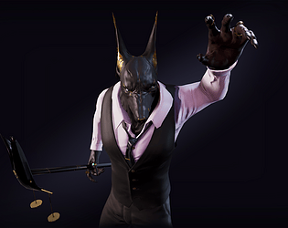
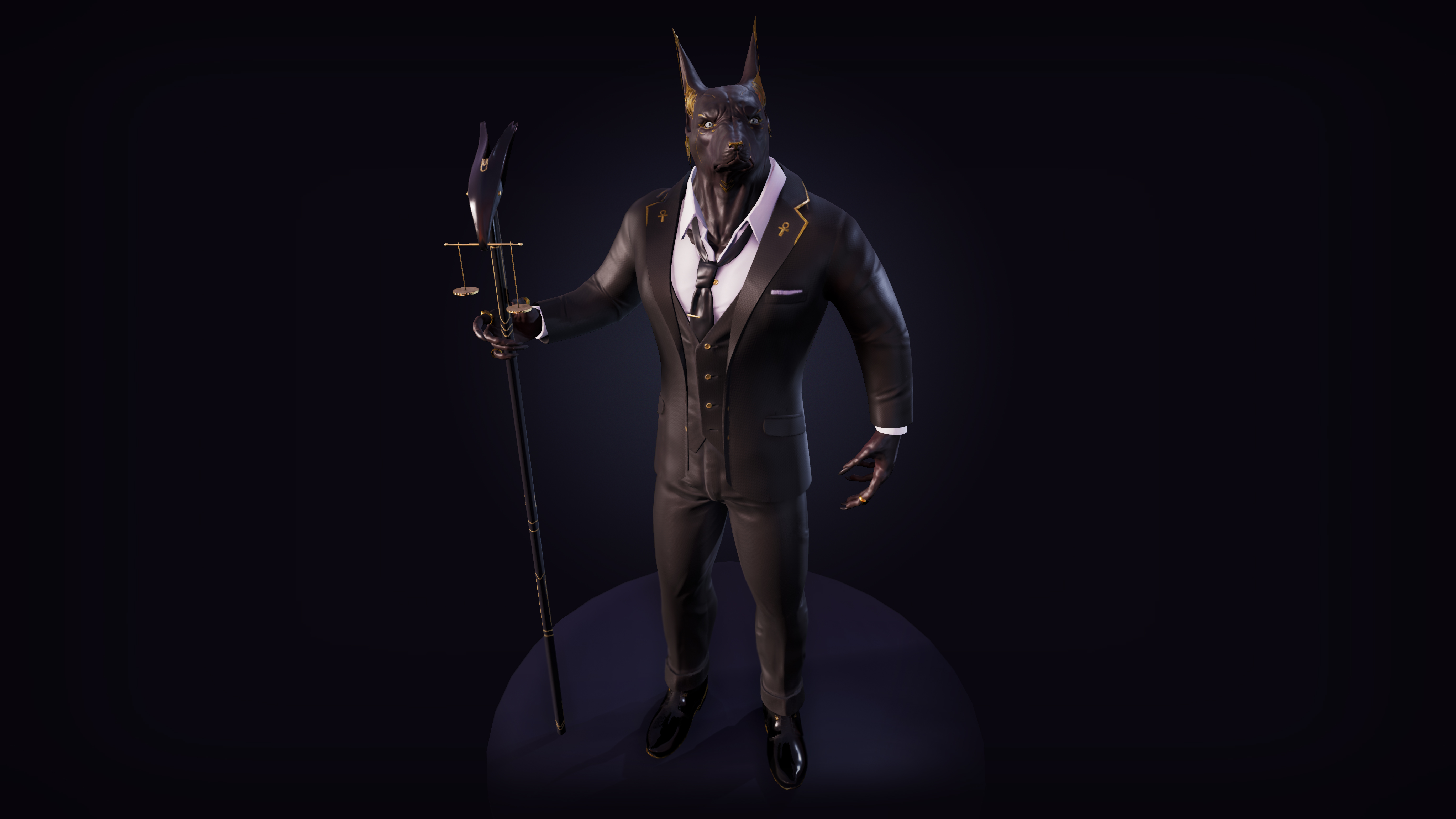
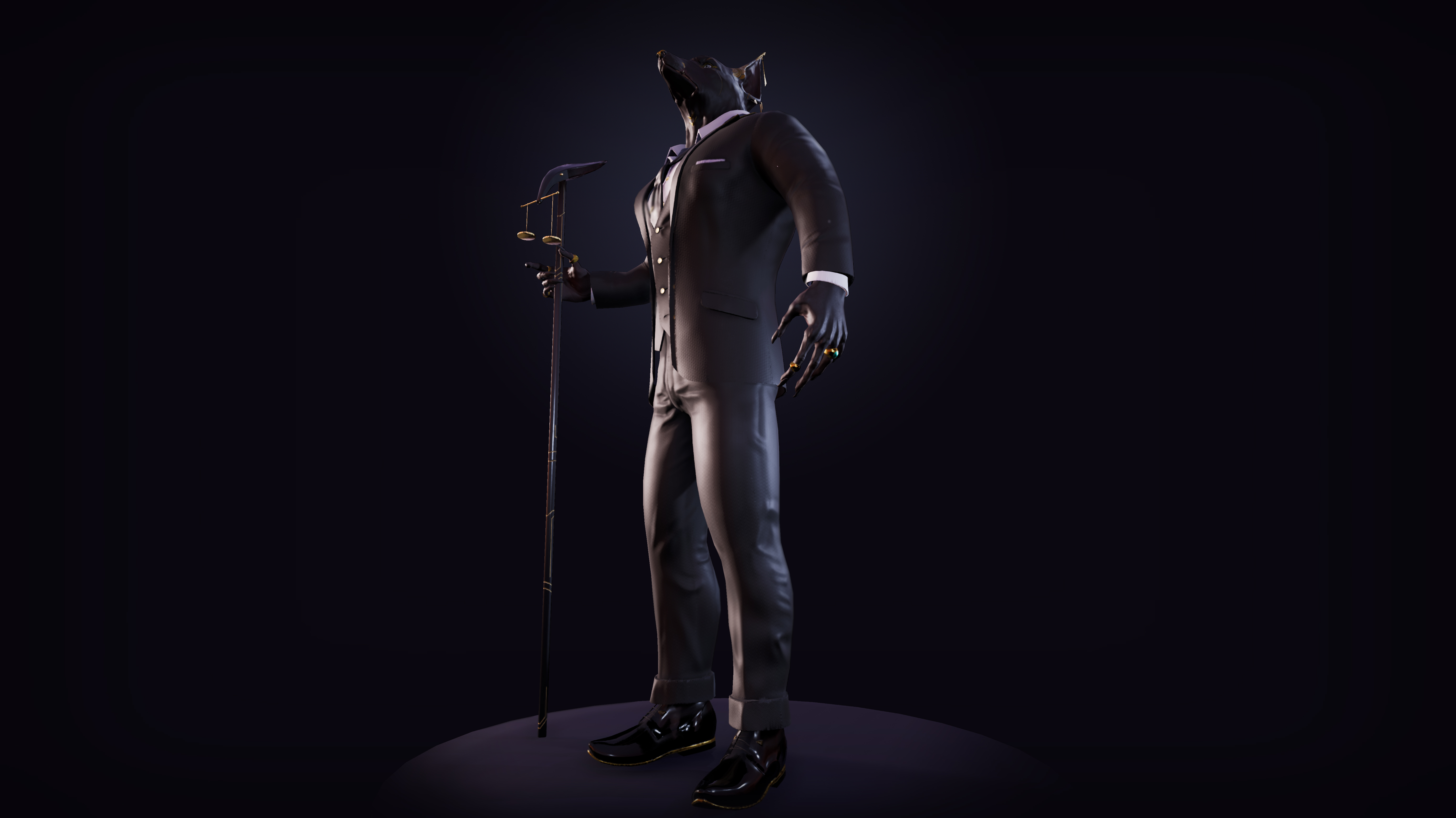
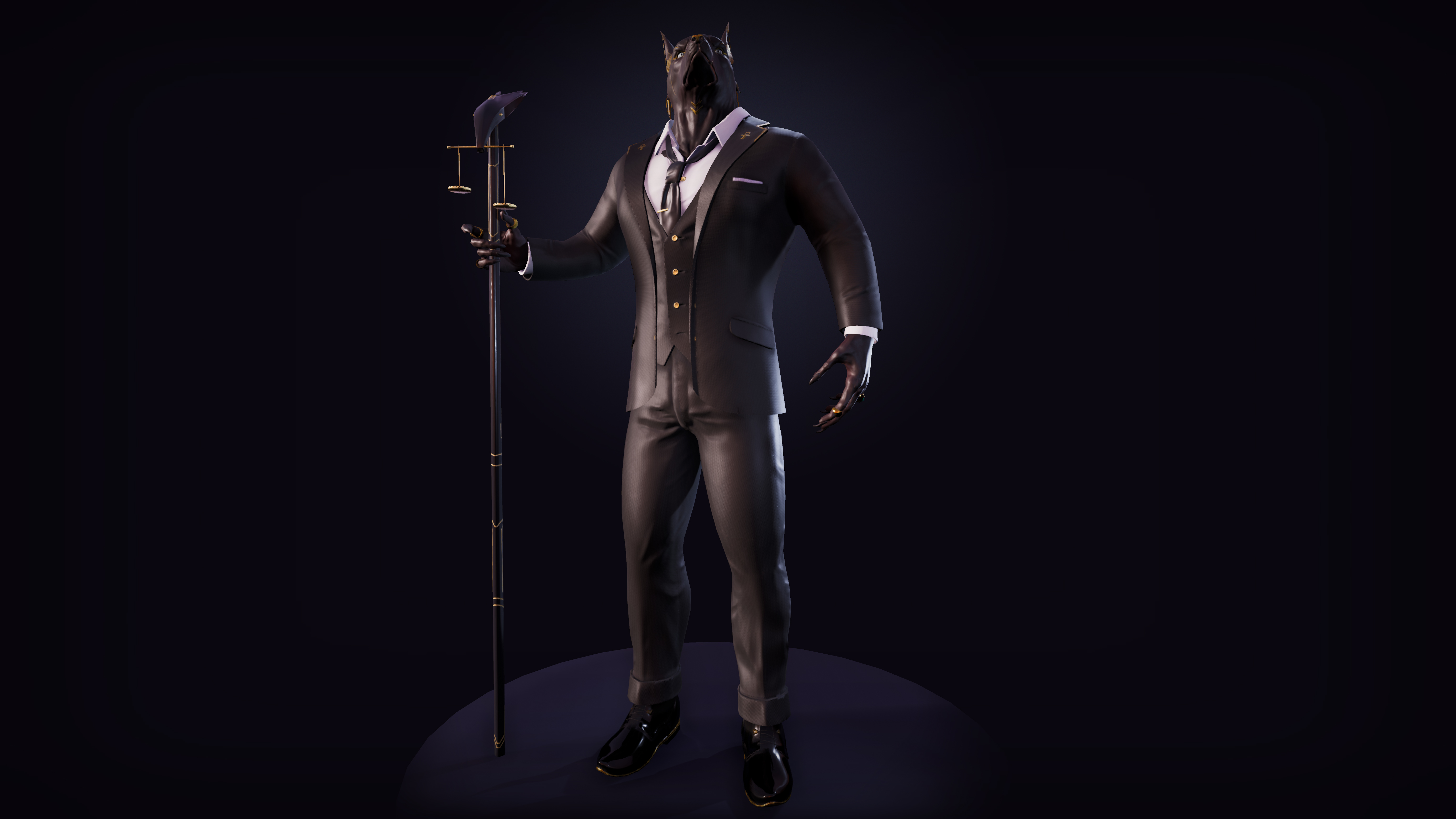
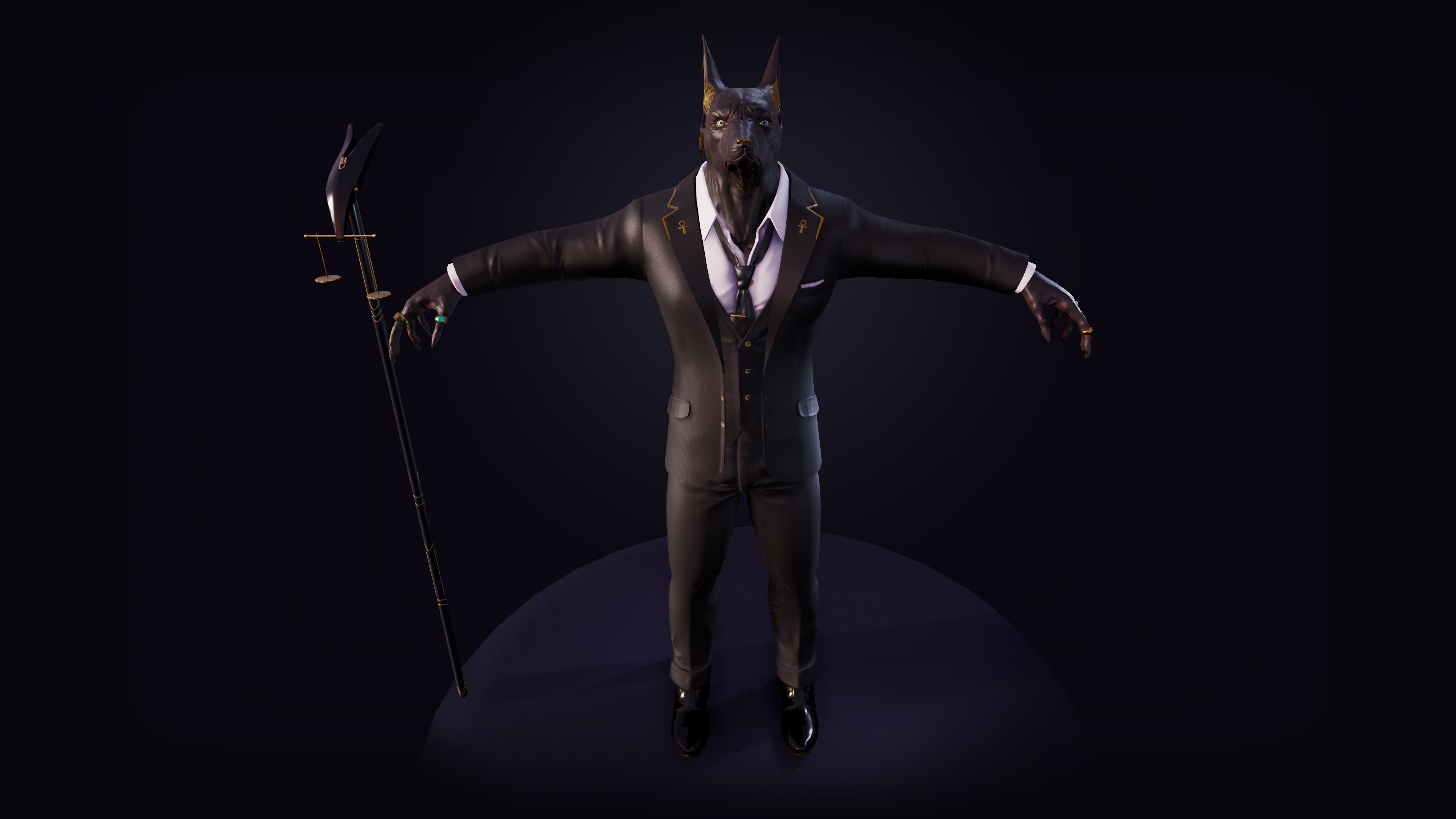
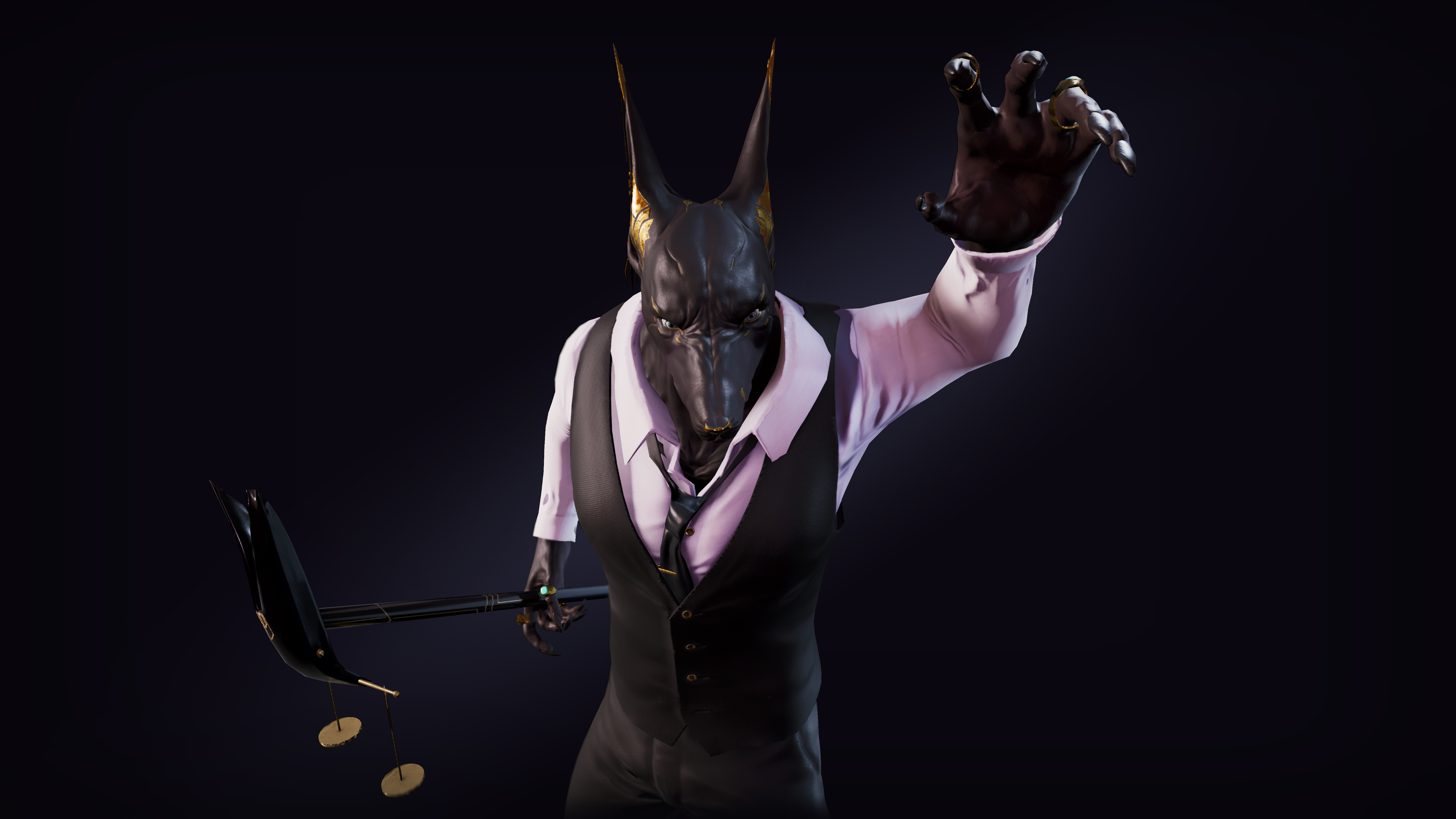
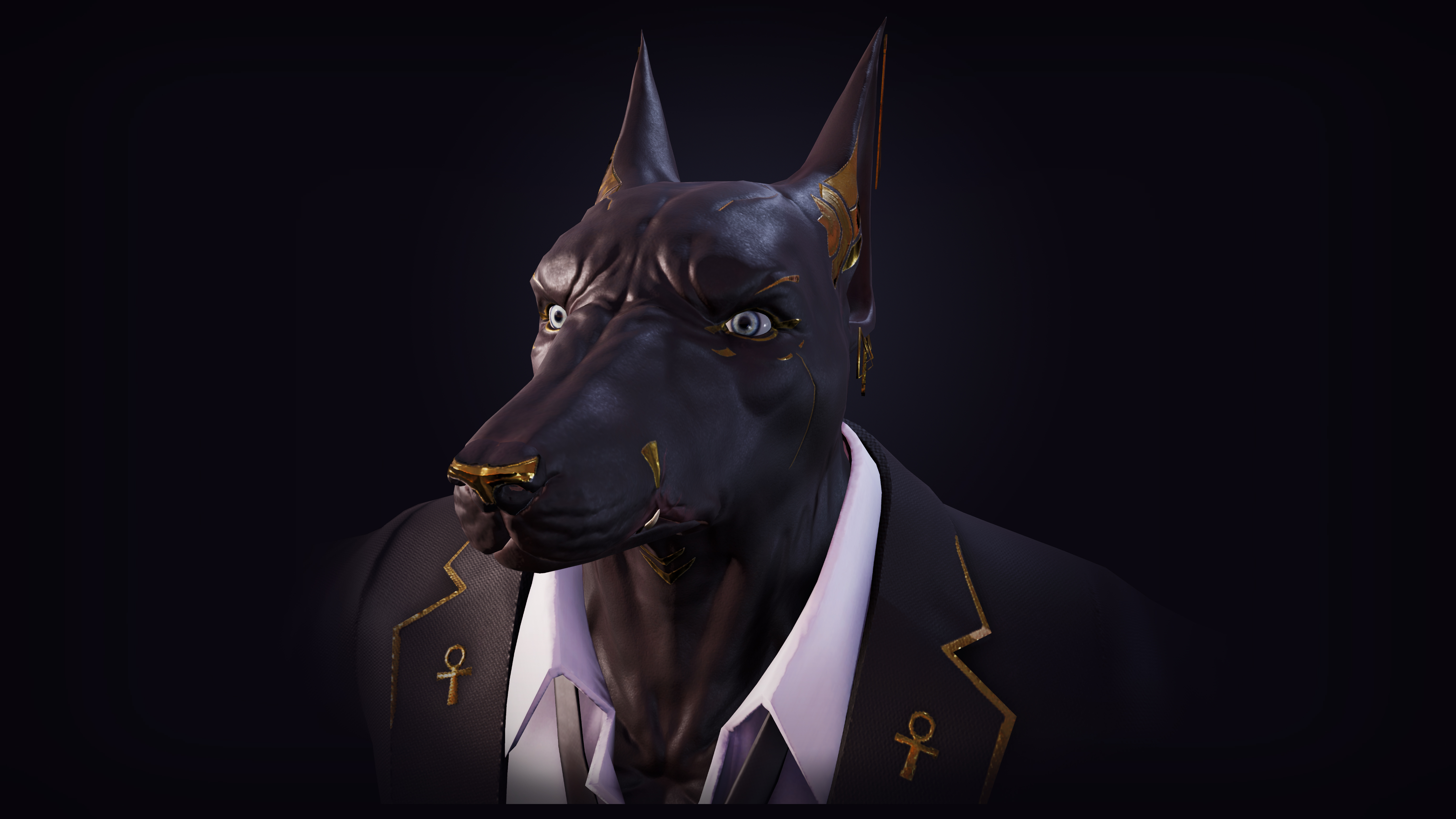
- Hi Wullaert, nice job finishing this character for SFAS. Here is my feedback for the character. - Materials - More work could have been done to improve the material rendering across the character. The suit feels too plasticy, it could have used a micro tiling detail texture to break up the surface. The skin is pretty smooth, and could have used some pore details to break up the surface. TexturingXYZ could have supplemented the surface detail nicely, I recommend looking into techniques to improve your skin sculpt and detailing. - Eye Rendering - I recommend downloading the DigitalHuman project off of the Unreal Marketplace, and study it to see how they developed the eyes of the character. The Anubis's eyes are too bright and do not integrate very well to the face. - Presentation - Dont present a dark character on a dark background, it's hard on the eyes. It would have been nice to see this character maybe in a glitzy casino lobby, or something that is brighter. The goal should be to improve the contrast between the character and the background. - Clothing - The edges of the suit jacket, and the dress shirt, are way too sharp. These should be rounded out and softer, it looks like a hard polygon edge, which clothing doesn't really do. Asides from those points, the work done is solid. It shouldn't take you too long to improve the character further. Best of luck!
- A nice character that shows you understand the character process but could use more practise in anatomy and sculpting. It works well as a character, a nice concept also, but I would look at sculpting torsos, or heads a little, arms etc, isolating them and sculpting them on their own, or just simply make a few more characters! 😊 Just keep practising!
- A narrative behind the design, which has been used to influence the design. There’s evidence of some good design experimentation with regards to the facial details, and the suit tailoring. It might have been interesting to see some examples of different head shapes tried before the final design was decided upon. The character blockout doesn’t follow the silhouette used in the concept phase, which is a shame as I think the one in the concept is more uniquely stylised and interesting. The final presentation is good with a series of different poses and the variation of having the jacket removed is a nice addition and helps bring out the characters personality. The texturing is good in general, but I’d suggest investigating the material balance on some areas, particularly the material value of the suit could use some refinement to look more like fabric.
- Good level of documentation. Missing some key information such as polycount and more info on the texturing process, but otherwise very comprehensive. Your base sculpt is really nice, I think the anatomy works well and you've got a really nice mix between humanoid and dog. It's nice to see that you worked on the muscle definition and asymmetry, however as you knew you were covering most of this with clothing I think you could have saved time here on the project. The clothing turned out really nice too. Some of the creases on the jacket arms feel a bit unnatural but overall it's really strong. In future I would recommend sculpting the character in more of an A pose, as currently his arms are quite raised which would result in the deltoids not posing super well. It's also good to have the fingers more straight for rigging purposes. Topology appears good on the head, and you've also got some really well packed UVs. Not much documentation on the texturing process here. The eyes stand out to me as being a bit too bright and not very dog-like. This is due to the Iris being quite small, whereas dogs tend to have large Irises. The whole model is also a bit shiny which gives him a bit of a plastic look. However the texturing is very consistent which is great to see. I like your final renders, I think the poses you have chosen are really nice. I would try finding a different background colour, as the dark character on the dark background makes it a bit difficult to see.
- Great work on getting this far with Anubis, overall it looks like it will make a nice portfolio piece with some further polish! The cloth is sculpted very nicely and it's clear a lot of research went into this. As you mentioned you weren't able to finish everything to the level you might have liked, depending on what your goal is for the project, it might be worth restructuring your pipeline a little bit. Anatomy is definitely incredibly important, but it might be good to separate that kind of practice into a study rather than letting it eat into your competition time so you can focus more on other aspects you mentioned you find challenging, such as rendering and presentation. In terms of textures, it would be nice to see more detailing in the albedo and roughness maps especially- right now the textures are very clean which leads to a very uniform look overall. It may be worth to think more about what kind of storytelling you can do using your albedo and roughness- perhaps there is some wear at the seams or at the hems. Could there be some dust on his shoulders because he spends many hours hunched over his desk? Maybe his vest could be a little bit lighter than his blazer, or the lapel could be made out of velour while the rest of the suit is made out of silk, or there's some sort of pattern embedded on the suit- things like that. Additionally in terms of value and colour, it could be worth exploring more colour variation in the different pieces of clothing, as well as in the face. Right now the skin and the suit are very similar in terms of value, it looks like you've broken things up a bit through lighting but I believe there would be no harm in pushing this more. Lastly, it looks like the mesh elements are all broken up in the UE4 scene which shouldn't entirely have to be necessary- try combining meshes in ways that seem logical to you, for example combine most of the mesh but keep the jacket separate if you want to be able to toggle its visibility. All in all great work, keep it up and keep pushing yourself like you have with this project! It was cool seeing your development process in the journal and it looks like you're full of great ideas and have a lot of stories to tell with your characters. Would love to see more of your work in the future :)
Challenge Tier
Sumo Digital Rising Star
Leave a comment
Log in with itch.io to leave a comment.