

Play asset pack
Nana: Tiny Warrior's itch.io pageResults
| Criteria | Rank | Score* | Raw Score |
| Research + Development | #6 | 4.200 | 4.200 |
| Presentation | #10 | 3.800 | 3.800 |
| Documentation | #15 | 3.800 | 3.800 |
| Creative | #16 | 3.800 | 3.800 |
| Overall | #17 | 3.760 | 3.760 |
| Technical | #23 | 3.200 | 3.200 |
Ranked from 5 ratings. Score is adjusted from raw score by the median number of ratings per game in the jam.
Judge feedback
Judge feedback is anonymous and shown in a random order.
- A great character which was a pleasure to review. In your self-review you know where you need to improve, so you’re doing great so get practising!
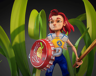
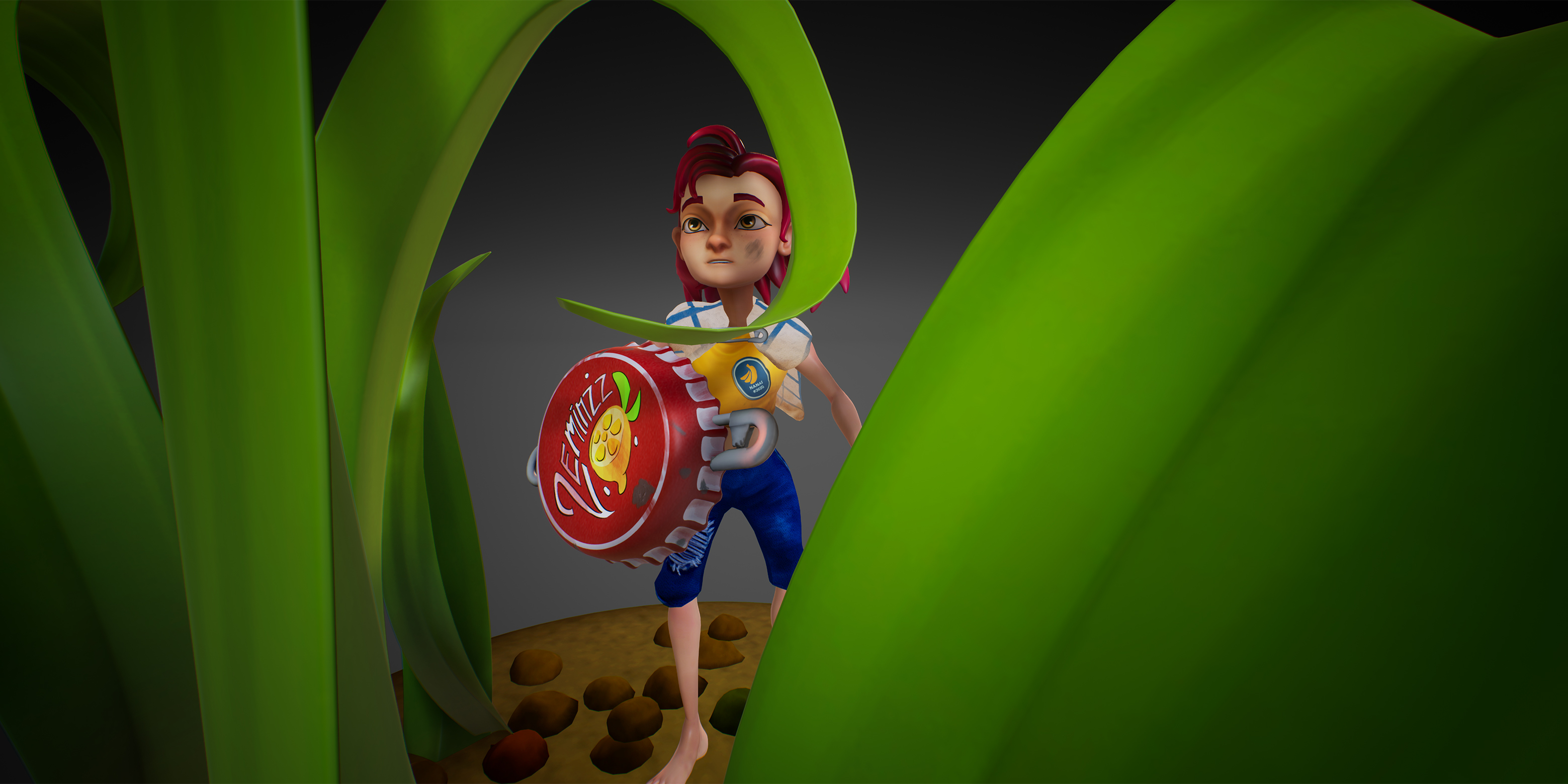
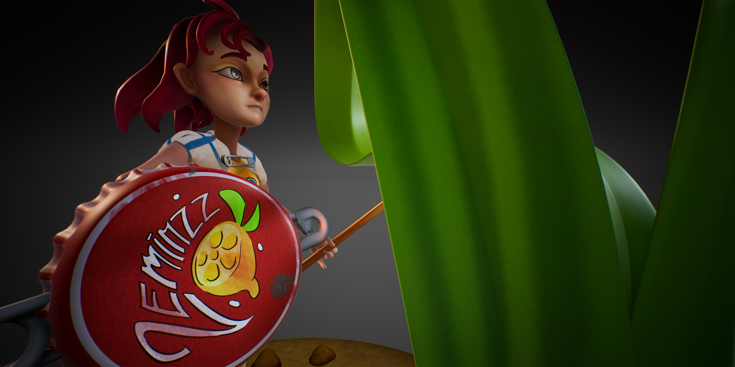
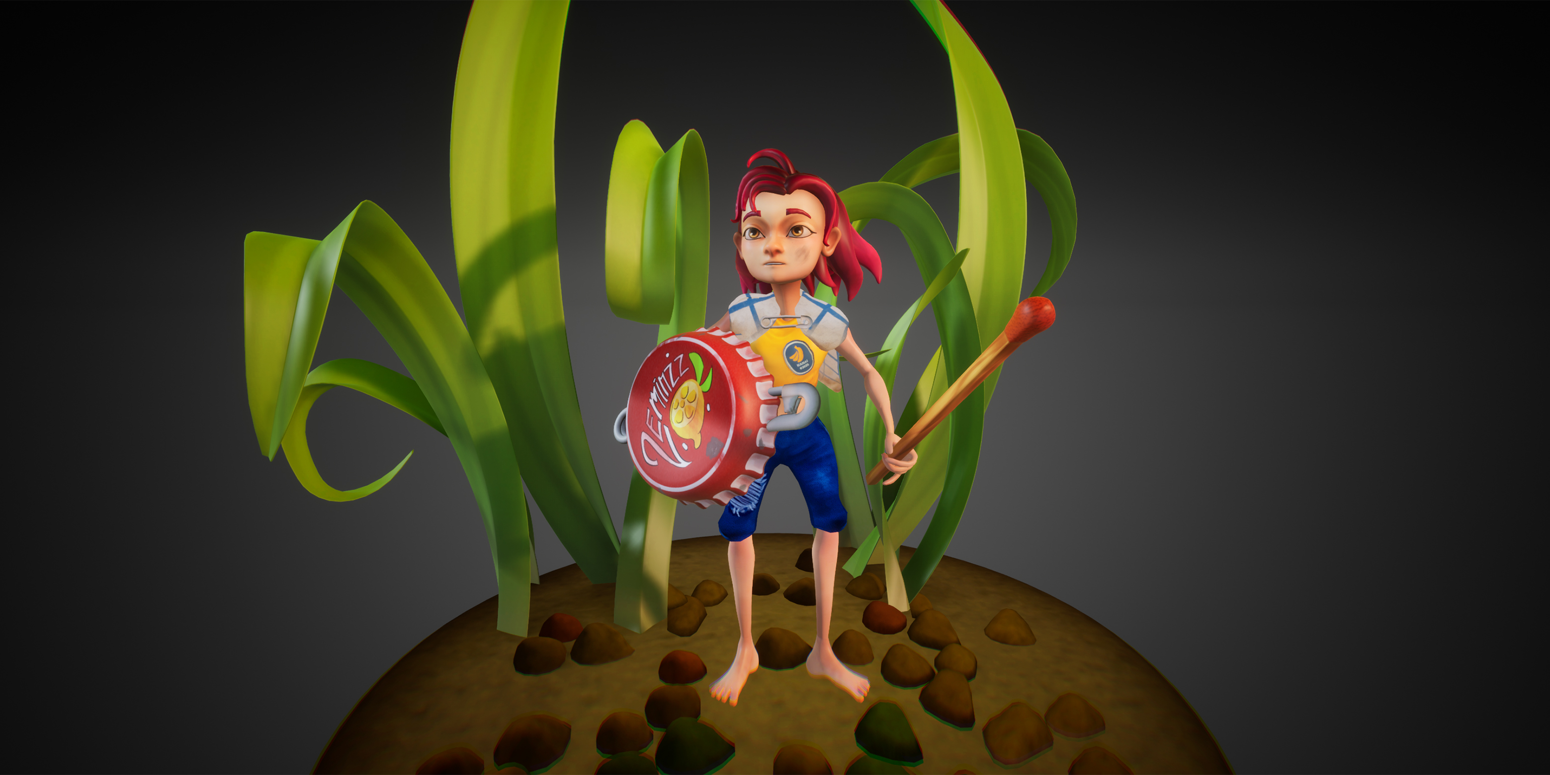
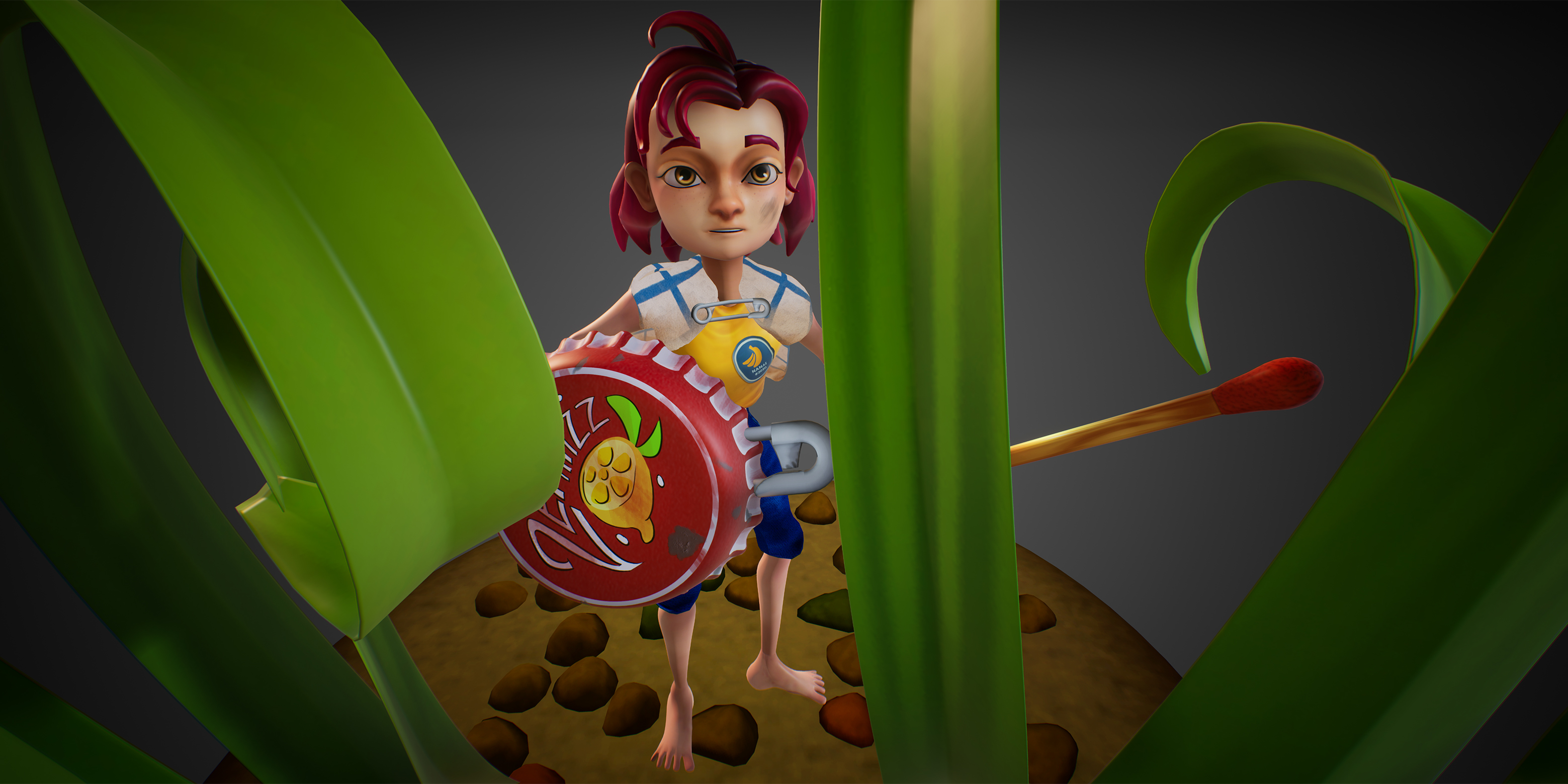
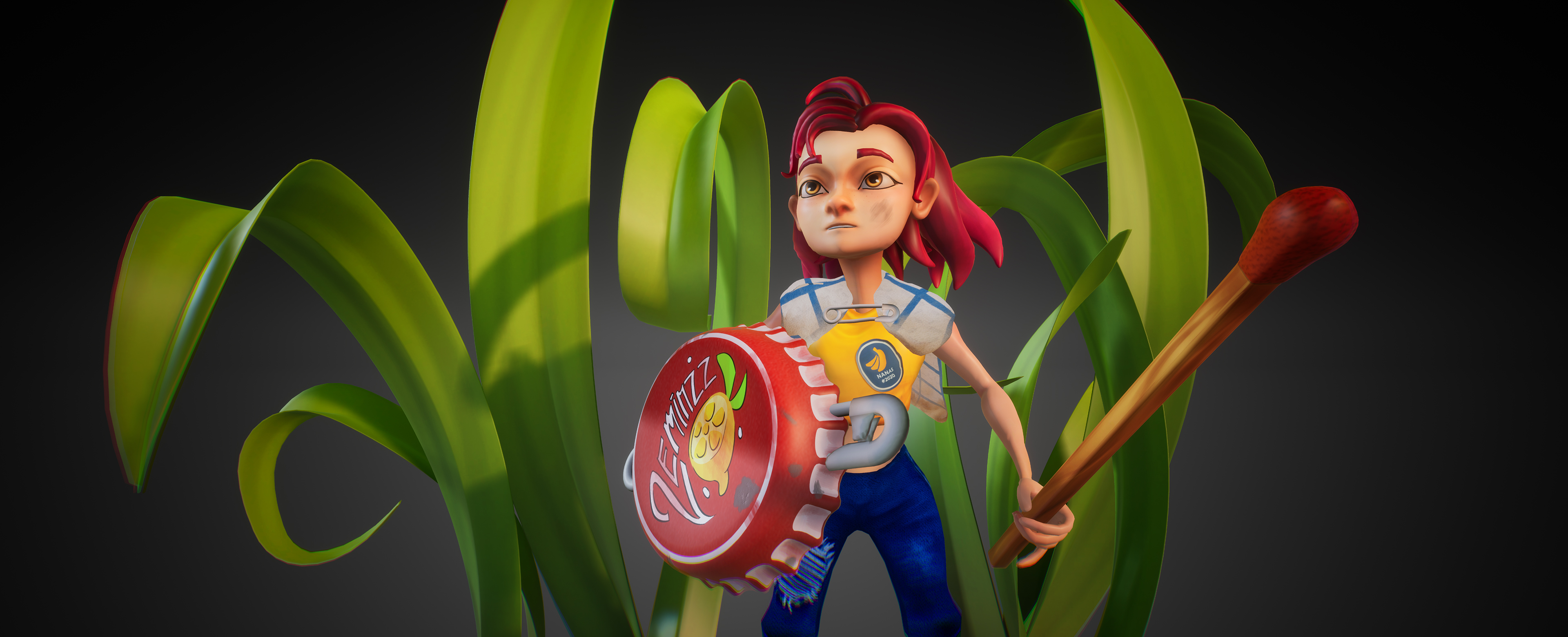
- Good effort. Lack of shadows didn't help the overall presentation. Would have liked to have seen more use of a range of materials i.e. for the metal areas and eyes. Would have been more dramatic with a lit match. Really liked the paintovers and the drinks lid logo.
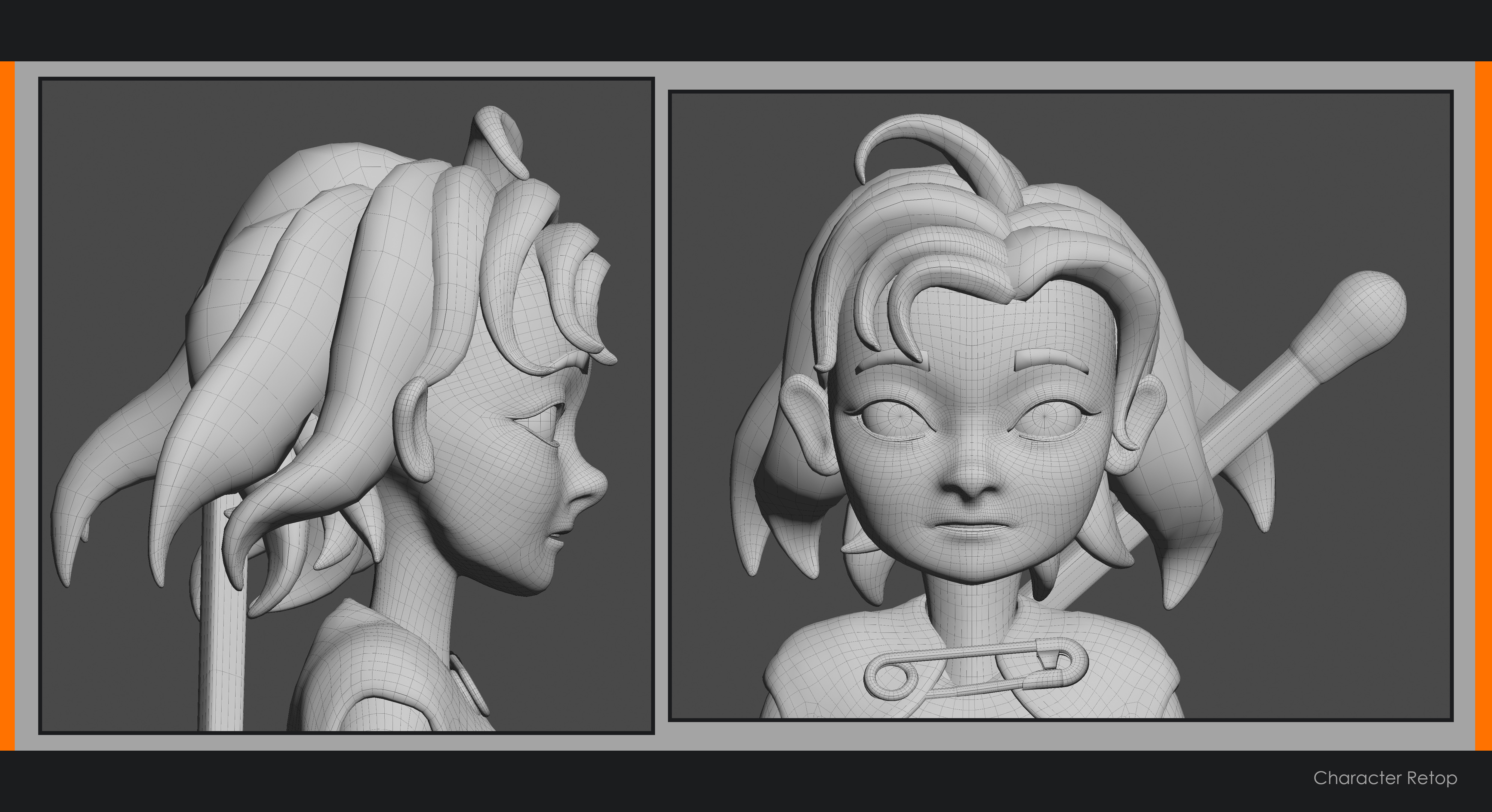
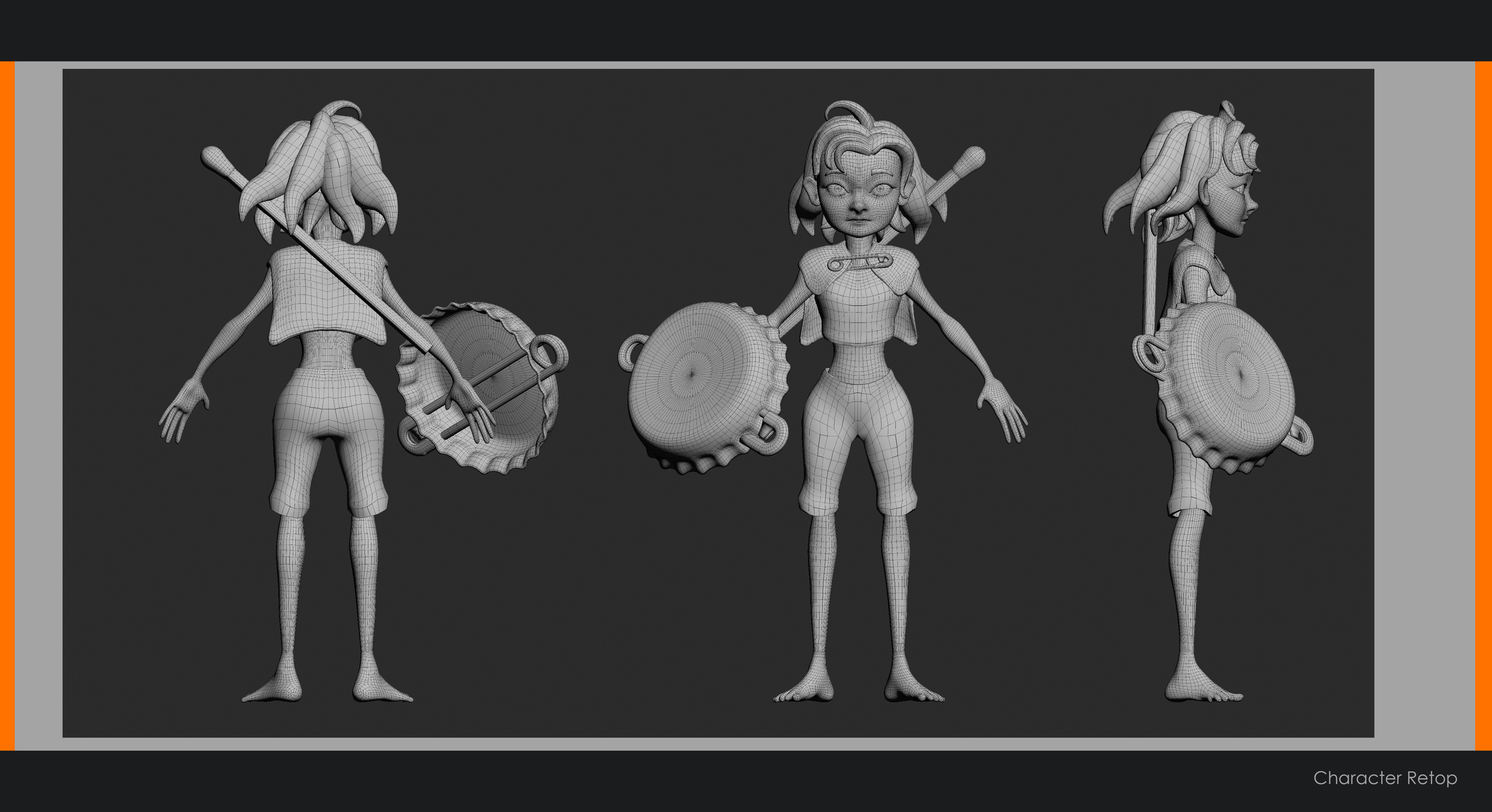
- Hi Luke, nice job finishing the character for SFAS. Your documentation and process was very well written, and you seem to know your strengths, and weaknesses, that you need to focus on, which is excellent to see. Anatomy - You call this out at the end of your document, but I want to also say that anatomy should be a big focus as well. A good exercise is to sculpt your own hand, to sculpt a shoulder and bicep, a knee with the thigh and calve, etc. Just do smaller studies and learn how the muscles connect and overlap throughout the body, these types of exercises help you to learn quickly different regions of the body. For stylized characters this is still important, even though the anatomy is softer and less pronounced usually. UV - There is lots of unused UV space, you can definitely improve the packing of assets to maximize texel space. I would recommend for characters, to split off the head into its own UV set, keeping the hair or other elements in separate maps. This will allow for easier control over the shader and lookdev when it comes to assigning materials, subsurface profiles, and the like. Presentation - The lighting is a bit flat, the character could use a stronger directional light to show the forms of the body. Shadows help show off anatomy and volume, but there aren't any self casting shadows on the character. Don't use chromatic abberation unless if pushing a deliberate aesthetic (cyberpunk, gritty, realistic, etc). I don't feel that it adds to the presentation, and actively hurts it. Presentation Pedestal - I would have spent a bit more time on the ground, getting more granular details in there. Disney has stylized characters, but their environments are very detailed. While not a focus of the character, if there is a distracting element, it hurts the overall presentation,. Texturing and Materials - You called this out at the end of your breakdown, but I thought it would be worth mentioning. A much stronger focus on how to render materials, realistically or stylized, is definitely a high priority. In modern renderers, learning how to use Subsurface elements for skin is important for character rendering. Learning Substance Painter, or another equivalent package, is highly recommended. Take a closer look at how light reflects off of surfaces, how broad or sharp the specular highlight is. I recommend, as a learning exercise, make a simple prop that you can find in your house (TV remote, video game controller, mouse, kitchen knife, etc), and model it accurately. Then texture it exactly as you see it. This kind of exercise is fantastic for training your eye to see the material for how it is, not what you think it is. It also helps you get comfortable with a new piece of software, like Substance Painter. Last note, make sure you have pixel edge padding on your textures, and that they don't stop at the edge of your UVs. This is important for game productions where MIP maps come into play. Technical - The character is fairly highpoly, with an uneven distribution of polygons throughout. The pants are lower poly than the shirt and scarf, but since they deform a lot in animation, they should probably match the same density as the other assets. The bottle cap has a lot of unused triangles in the middle. If a vert is not improving the silhouette or supporting shading or animation, remove it. I also recommend looking up edge flows from other artists to see what works when it comes to bodies and faces, there are many good guides and resources (free or purchase) out there that you can learn from. Rigging - If you want to be a character artist, knowing a bit of rigging is a good thing, since it helps to know the entire pipeline. However, I would recommend focusing more of your time on anatomy, materials, presentation and lighting over rigging, since those will be your bread and butter skills in the industry. Final Thoughts - If you keep working this way, where each project you have a set goal to learn some new skill, you will advance very quickly. This is an excellent way to learn and grow, so definitely keep doing this.
- This is a really effective character and I love it! Your design inspiration is super clear and comes through in your final result. There's very few large things that would need improvement. I really like the overall shape and proportions of the character. Anatomy-wise, it's usually helpful for a rigger if the hands are facing flat and the feet are pointing directly forward. The sculpt is really clean however it falls a bit short on the clothing pieces. You've set the precedent for a nice level of detail in the face and hair, however there's no wrinkles or anything in the shirt/trousers. You wouldn't need to go super extreme here but just refining this a little bit would be great. A small issue is that there are some scaling inconsistencies with the real world objects. I don't think this is a massive deal, however you especially notice it with the two safety-pins. If one was perhaps a paperclip instead this could alleviate that? It's a pretty small gripe though as what you're trying to get across is clear. Your end character is a bit expensive. It's quite high poly and has a lot of texture maps. I don't believe that stylised characters can't be high poly, however here I don't think it needs it. I love the texture-work here, I think it's just the right balance between stylised and realistic. The face has been done really nicely. On stylised characters I often like to add a gradient that darkens the bottom of the character - I think this would have been really effective to implement. The hair seems a bit shiny, perhaps the roughness could be bumped up a bit here. A nice project. I would have liked to see more documentation throughout discussing your process. Your final renders came out really nice too - the pose is really nice and you've ended up with a great portfolio piece.
Challenge Tier
Sumo Digital Rising Star
Leave a comment
Log in with itch.io to leave a comment.
Comments
No one has posted a comment yet