

Play asset pack
The Jester's itch.io pageResults
| Criteria | Rank | Score* | Raw Score |
| Documentation | #8 | 4.333 | 4.333 |
| Research + Development | #11 | 4.000 | 4.000 |
| Creative | #15 | 3.833 | 3.833 |
| Overall | #16 | 3.767 | 3.767 |
| Technical | #21 | 3.333 | 3.333 |
| Presentation | #22 | 3.333 | 3.333 |
Ranked from 6 ratings. Score is adjusted from raw score by the median number of ratings per game in the jam.
Judge feedback
Judge feedback is anonymous and shown in a random order.
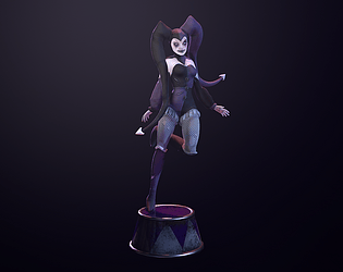
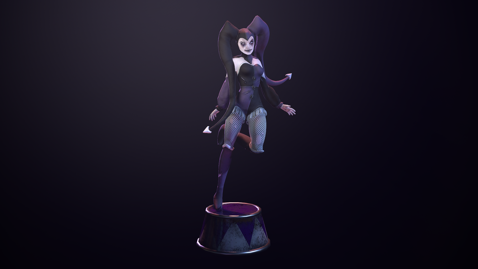
- This is a really nice piece of work, very well organically sculpted however yes some issues with retopoloy and the density of the mesh. There is no need to smooth the meshes using quadraw you could relax it with the shift key quaddraw brush, and add enough loops to make it work well. So you don’t require that extra level of smoothness really. But apart from that it’s a very lovely style. I particularly like the tears, but take note there is a head/hat collision on the top of the head, but happily it appears like a tear also. Good work all round, your organic sculpting is quite nice, and with practise could grow to a very fruitful career.
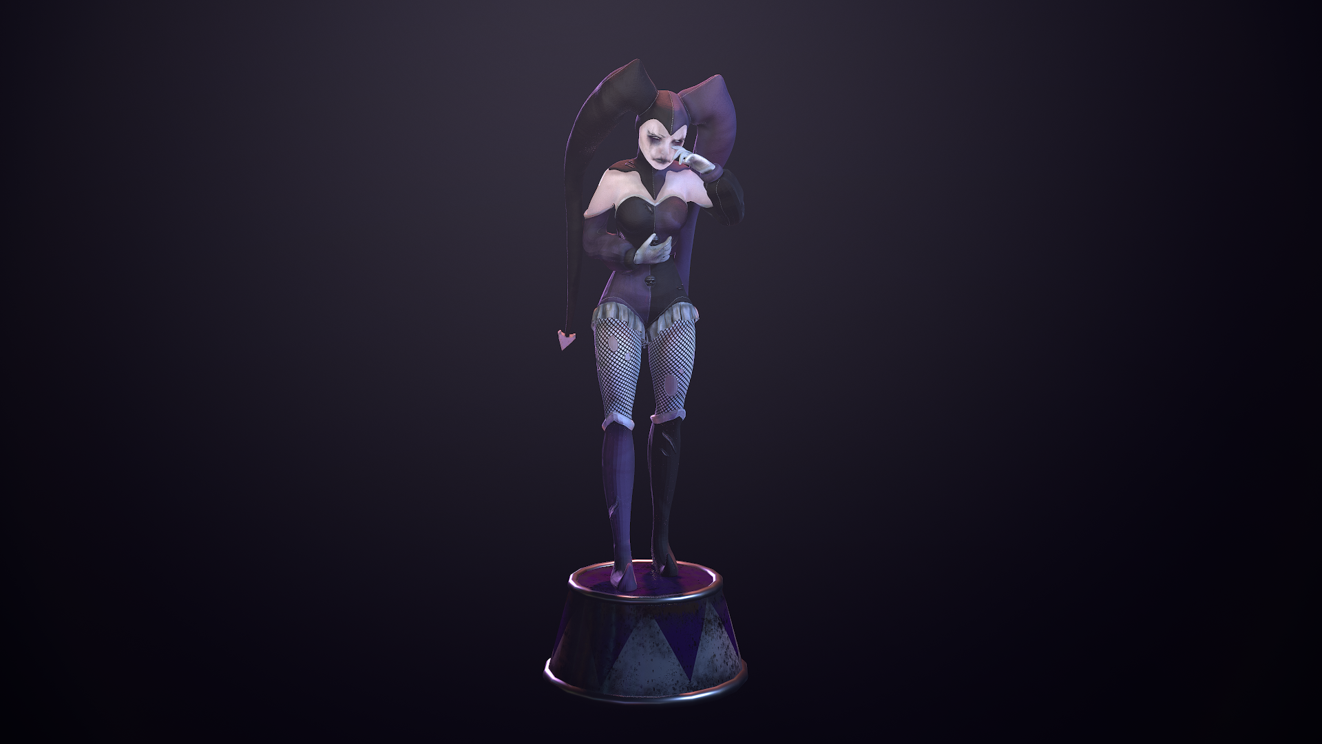
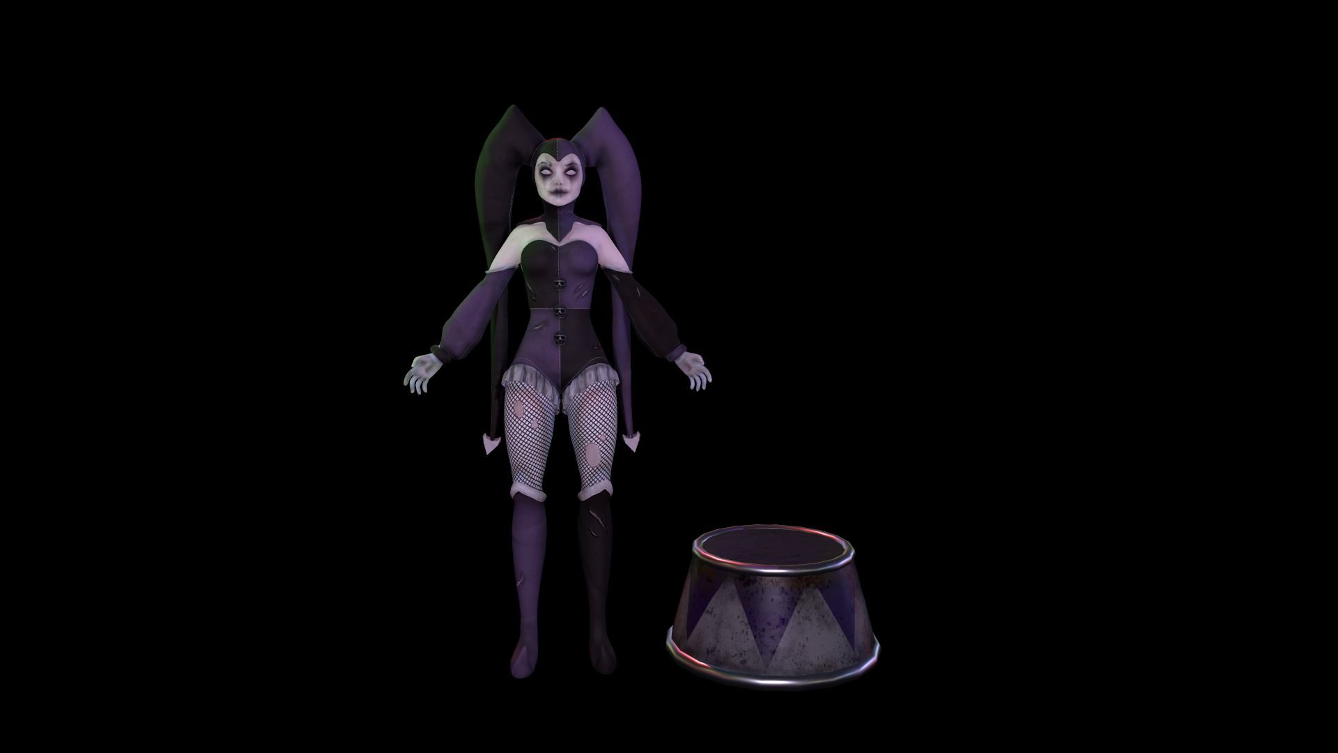
- Hi Madelaine, nice job on the character. I have some feedback which I hope you can take to improve upon your next character. Topology and optimization - She is very dense, and there is an uneven amount of topology throughout the character. Usually you want to try to keep the polygon density consistent across the character, with more polygons where it's necessary for animation, or key areas such as the face. Her silhouette is rather smooth, and doesn't have a lot of protrusions, so I might expect a character like this to fall into the realm of 40-60k triangles about 1/3 of the current triangle count. UV's - Pack the following assets into their own texture sheet" - Head - Eyes (either use a mirrored texture, or 1 texture sheet per eye) - Accessories (*for your next character) - Hair can be split into several sheets, one for eyelashes/facial hair, one or more for hair on the head, and one or more for any fur on the body. Anatomy - Several elements of the character need more work, notably the hands are fairly smooth looking and the spacing between each finger is way too wide. Make sure to sculpt accurate anatomy underneath any clothing, then put the clothing on top of your character. This will ensure that the anatomy reads correctly even if it is covered up. The face is also rather uncanny, I am not sure if it was meant to be a mask, but more time should have been spent getting a more anatomically correct face. As well, make sure to have a proper mouth bag for any characters you make, in order to get the appropriate seam between the lips. Texturing - In a PBR workflow, you want to avoid using solid black colors on your textures. You also do not want to have ambient occlusion contributing to the albedo texture (the purple part of the hat has black spots, looks like AO)
- Great work, the amount of research done for this piece is very impressive and it shows that thought was put into every little detail before it was executed. The reference board was fun to look at as well and it was interesting to see some of your texturing process. Both the face and body on the sculpt look nice, her jaw seems to be a little bit on the long side however (usually you would want the jaw to end in the middle of the profile, more or less). When it comes to the cloth, looking at the intended style for the character I believe it might have ended up looking nicer if it had been sculpted instead of simulated using marvelous. Look at the cloth for overwatch for example, replicating the way folds pinch on sleeves might help with the style you set out to achieve in the documentation. Another thing that drew my attention is the resolution on certain parts of the body. The jester hat is so high poly that the shapes end up feeling a little bit blobby, if things had been spaces out a bit better it might have helped with the silhouette. The knees have a lot of loops for deformation around the knee, but probably would have looked fine with a bit less as well. The skulls on her tunic are very dense and could have been simplified a lot. Keeping things uniform doesn't only help for efficiency, but also in order to keep the style consistent throughout the entire character. In terms of textures it would've also been nice to see more variety in the materials. The glossiness on the cloth is mostly a flat colour, it would have been cool to see some variation in there as well. For example, what if the purple parts of the outfit were made of a different material than the black parts? Things like this would improve the visual interest around the piece. That being said, you did a great job with the presentation. It ties into the theme very nicely and really brings the piece together. Both poses also look strong, the emotion in the crying pose is nice to see and the dynamism in the pose where one of her legs is up is great too. It looks like you're well on your way, I'd recommend to keep up the hard work and practising to make sure you have a strong, consistent sculpting style and continue improving your technical knowledge.
- Good effort. Change of direction is a brave thing to do. Lighting is a bit flat and poses weren't very convincing. Good documentation.
- Really nice level of documentation. I really liked your process and the amount of research you did. I wish you'd stuck to the pastel Jester initial plan as I found it more unique, but I can see why you made the switch! Your basemesh is really nice anatomy-wise, I really love the face and I like the smoothed out look of everything. The fingers on your sculpt were a little twisted, it's usually best to have them straight. I think you lost some of the cleanliness of the sculpt when you added the clothes though. I think the 'ears' would have come out much smoother if you'd either modelled them in Maya first or utilised Zbrush's Zspheres. The wrinkles in the sleeves and 'ears' feel unnatural and a bit lumpy, I think you could have studied reference more here. The retop and UVs are done nicely. The density of the retop is a bit inconsistent, for example the boots are lower poly than the leg that the attach to. There's also some clumping around the back of the neck which is a bit messy. Don't be afraid to add some triangles in inconspicuous places to reduce polys in these areas. Overall an The texture work is pretty successful. I really like the look of the bodice. I think the texturing on the face looks a bit out of place compared to the body. You've got nice sharp textures throughout the clothing, however the smudged makeup has ended up a little too blurry. Some extra definition around the nose and darker areas in the makeup would help combat this. While her face is obviously painted, you could still get some colour variation going on to help bring her to life. I really like the poses you chose, I agree that they show off her character nicely. Really nice renders, my only gripe is that the dark background makes her difficult to see from a distance. For a portfolio piece try using a slightly more contrasting background so she's easier to see. Nice project though!!
Challenge Tier
Search For A Star
Leave a comment
Log in with itch.io to leave a comment.