

Play asset pack
Templar Knight's itch.io pageResults
| Criteria | Rank | Score* | Raw Score |
| Technical | #2 | 4.571 | 4.571 |
| Presentation | #2 | 4.714 | 4.714 |
| Overall | #4 | 4.286 | 4.286 |
| Creative | #8 | 4.000 | 4.000 |
| Research + Development | #10 | 4.143 | 4.143 |
| Documentation | #11 | 4.000 | 4.000 |
Ranked from 7 ratings. Score is adjusted from raw score by the median number of ratings per game in the jam.
Judge feedback
Judge feedback is anonymous and shown in a random order.
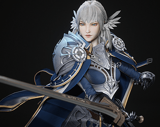
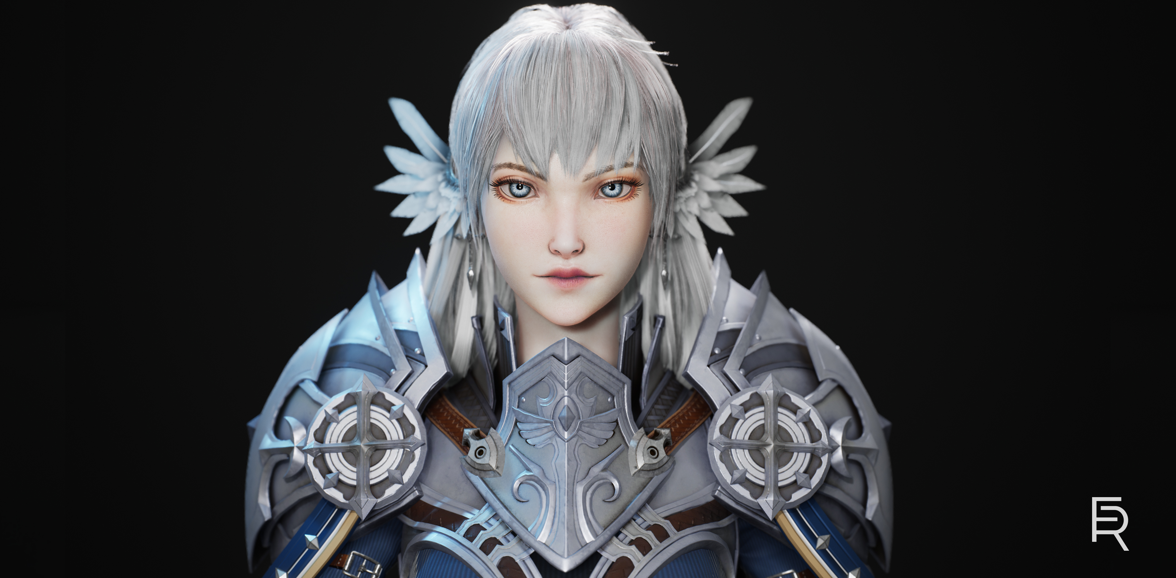
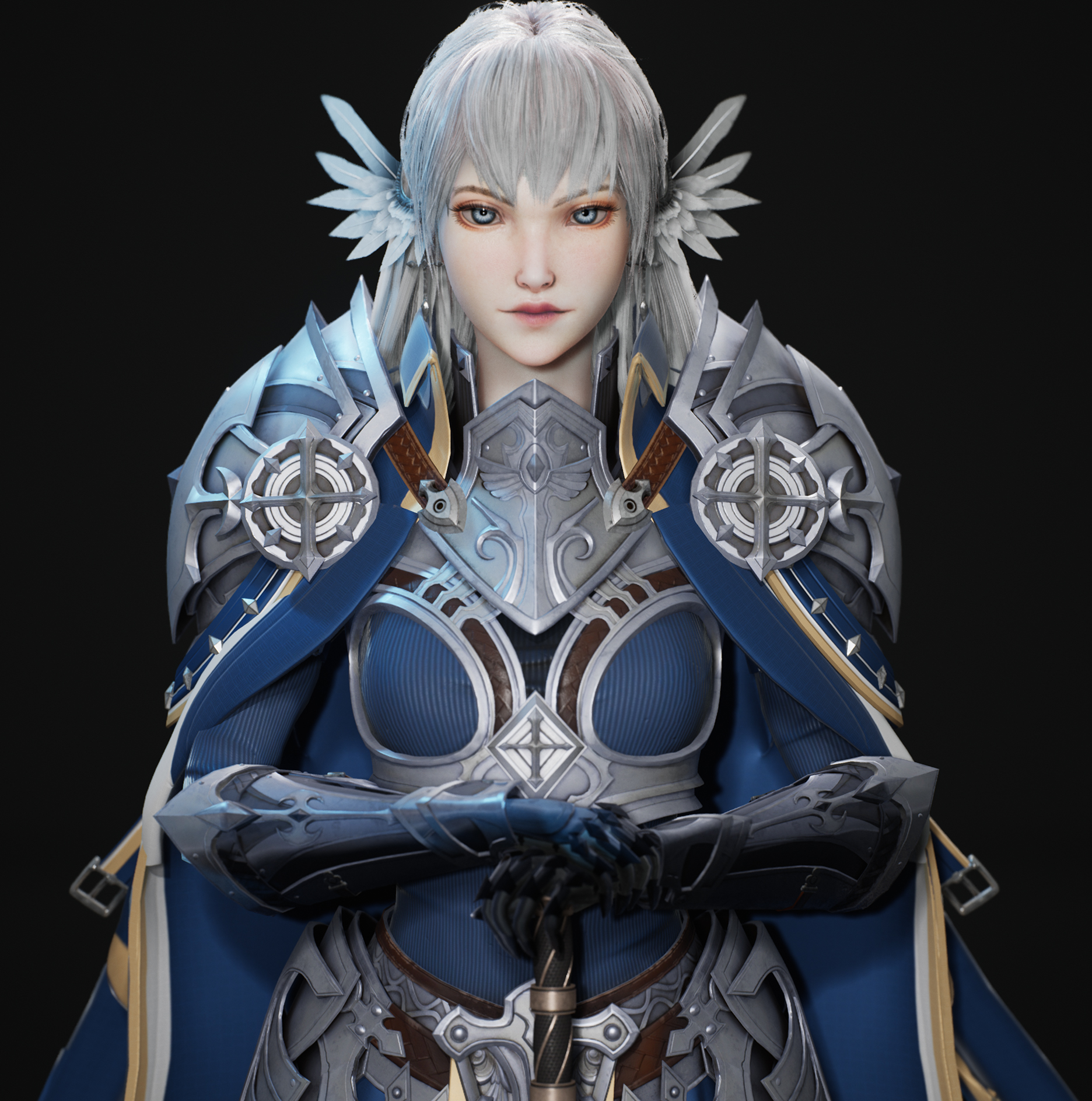
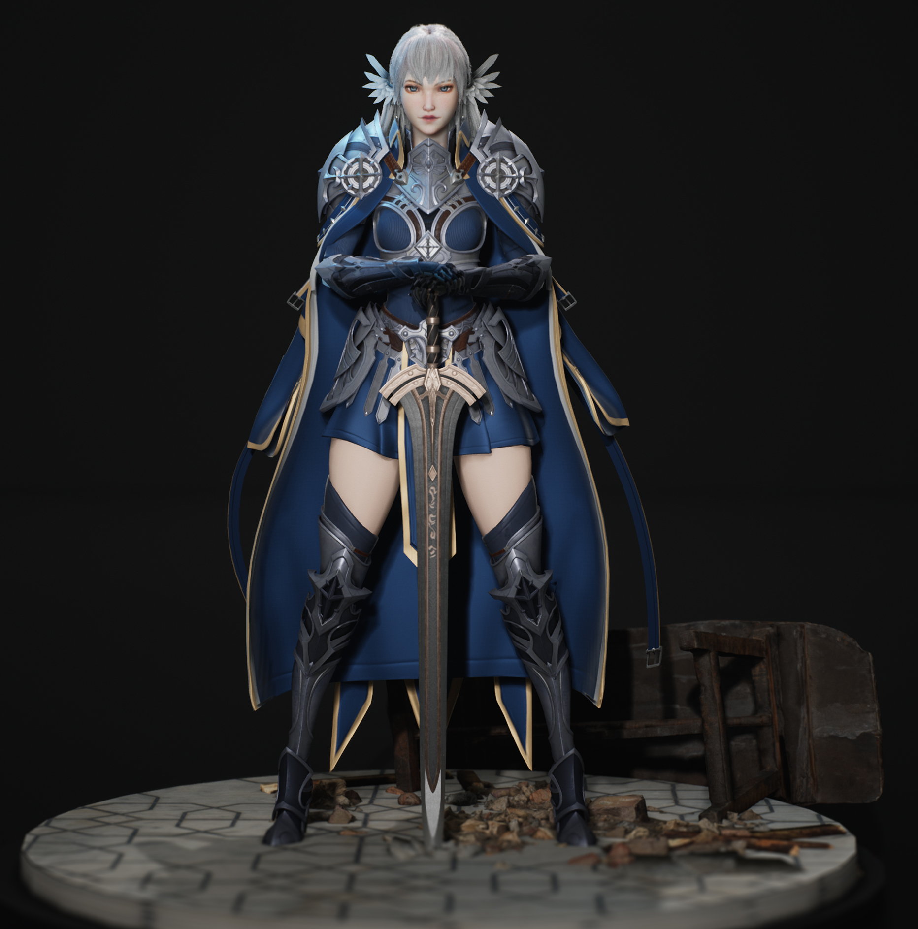
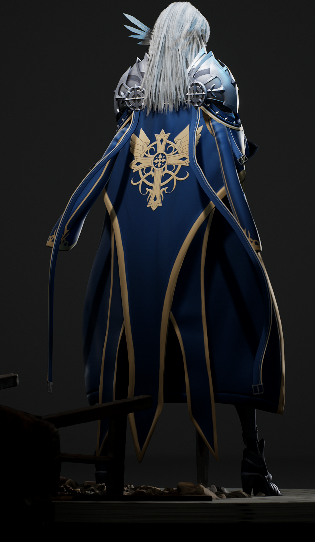
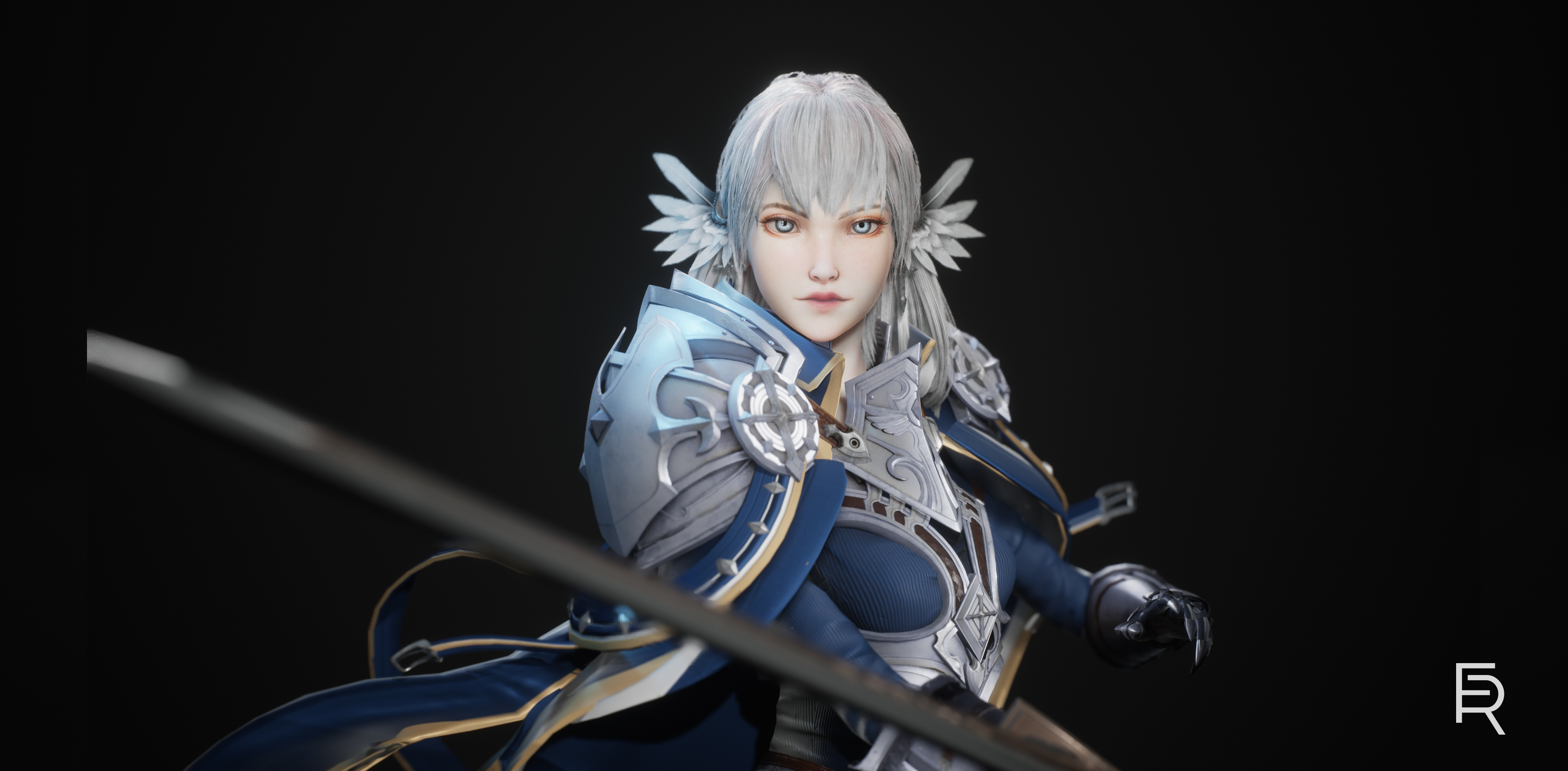
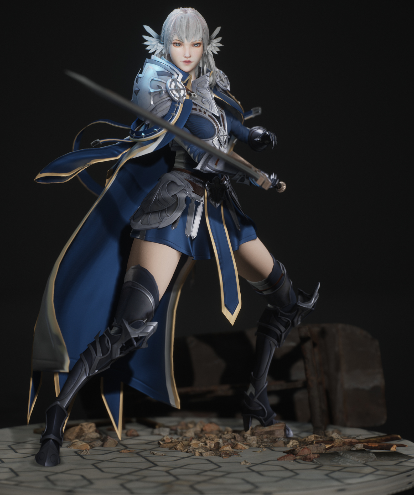
- Your final outcome for this project is absolutely beautiful! I feel like there is very little feedback to give for the finished model, as it is stunning. Final renders are great, they show off the character well. Polycount is extremely high in this model. I understand that some AAA games have the budget to have character models with a polycount that high, however generally for a portfolio piece I would try to keep it much lower. Companies like to see you being able to create an optimised piece. However it's understandable that going off of polycounts found in Horizon that you would achieve this. UVs are laid out nicely and texture work is excellent. If i was nitpicking, I do wish the lips had more of the peach tones that you've included around the eyes/cheeks. The hair around the front of the face looks really nice, however in the back I think it falls flat. It's a little choppy at the ends, and could have done with some more strands to fluff it out a little. This could have also been hidden if you'd chosen to make the hair a bit wavier in the back. This is pretty nit-picky, it still looks excellent. Documentation is the weakest area here. You've not provided much commentary on what you think of your work, as well as a completely missing chunk detailing how you sculpted the body. I would have liked to see more of a description of what you were doing. Overall a very beautiful model, although very expensive.
- Amazing piece over all, perhaps one of my favorite yet! Some key feedback on the final asset: -over all clean model and textures so well done -Very nice color and material separation and definition – personally I would have went with the slightly blond hair as it draws more attention to the face. -Model is quite high poly overall , hair could be baked onto planes to save polys and the face and the feathers could be less dense. -Perhaps the piece is a little to symmetrical over all and could use for some unsymmetrical elements such as wear and tear -A warm rim light to highlight the face would be a great touch.
- Hi, I really enjoyed viewing this project! I have created similar works before in the same line as wanting to produce work similar to YCFCG but real time, and im as happy with your results as mine, a really lovely piece of work. I especially like the turntable that highlights the depth you have in the hair. The topology is clean and well thought out, the texturing, although minimal in places, works well for the character and art style, so I cant see any real areas that I can highlight for improvements initially based on the final product. However, looking at the document, I would spend some time studying some facial anatomy, maybe even consider building out from a skull, muscle then skin, to get a feel of how the face is developed. But this didn’t lose your marks since it works in the final animi style piece. I would have liked to have seen a self-critical conclusion to the document, but the piece is well focused, well thought out, and well designed. I may take one of the concept artist you chose pieces to bring to 3d in the future also, due to the ease of having all those plans already available. Good luck in the future and great work!
- The project has been well presented, stands out for the quality and fidelity on original concept. A clear workflow and a good tech knowledge has been shown along all the phases of development. Maybe a better work could have been done on colours and lights but anyway, spot on!
- Solid work Radomir! There isn't much to say for this entry, it's solid all around. The only notable difference at a glance is the missing tassels hanging off of the shoulder pad cloth. But good job sticking true to the concept. I do have a few things to suggest that could have made it a bit better, in both rendering and technical sides. Rendering/Materials - The metal feels pretty flat and non-reflective, like it wasn't polished and was left raw. Of course, since this is battle armor, it shouldn't be perfectly reflective and new, but having varying levels of wear and tear across the surface, and getting more metallic reflections, would help make the armor pop a bit more. Also, the leg armor is maybe a bit too dark, and doesn't feel like it's totally a part of the upper body set. The cloth feels a bit too wet and reflective, it should have been more rough, with a soft fresnel on the albedo to give it a bit of fuzzy feeling. I recomment to render with super sampling on, or render your images at 2-4 times the final presentation resolution. By downscaling the image for presentation, it will help to soften out jaggy edges, notably in the hair. Anatomy - It's a bit hard to tell, but her hands might be too small and her wrists a bit too thin. Did you build the armor around a base body? I always recommend building a proxy base body first to make sure the underlying character is believable, then add the armor on top, to make sure it physically fits correctly. Skin Texturing - I would remove the dark edges around the nose, it's too strong and breaks the stylized aesthetic. The concept has a very soft look, so keeping the skin softer would have helped. The lips also get super dark where they meet, they should remain a more fleshy pink tone instead of going into black. The caruncles of the eyes could also be pushed to be more pink, they are too desaturated and grey. Topology - Further optimization could have been done on several elements on the body. Generally, it's a good habit to keep geometry density as consistent as possible across the body, so all of your physics cloth elements should be about the same density. The metal armor could have been reduced, especially on the outer shoulder pads, the center of the belt, and a lot of the smaller detail work. Bolts and small rivets should be baked down to a normal map, you have many small elements that would hold up just fine if they were baked down, and it would save you a ton of tris. Lighting - In the concept, the interior of the cape is really dark, which helps pop the body and armor. Would have been nice to keep some of that contrast in the final presentation. Platform - Small note, but for podiums or other things that character stand on, it is ok if you go a bit crazy with the geometry, since that's definitely not the focus of the character. I see some polygonal faces on the silhouette of the platform, it should be nice and round. Also, breaking up the tiles to make them stick out a bit would have been nice to see. Lastly, you have a chrome and mat ball in your scene with a color checker, which is a bit odd considering that you aren't rendering a realistic character. These things are useful when matching real world values to make sure colors and material parameters fall into believable bounds. If you had some reference of metal/skin/cloth with calibrated lighting, then it makes sense to use them, otherwise I recommend training your eye to match material reference you have gathered from multiple sources. I hope you can take these suggestions and use them to improve your next piece, you've got some solid foundations already, it's just a matter of hitting that next level.
Challenge Tier
Sumo Digital Rising Star
Leave a comment
Log in with itch.io to leave a comment.