


Play Environment
No Face's Happy Place's itch.io pageResults
| Criteria | Rank | Score* | Raw Score |
| Presentation | #6 | 4.000 | 4.000 |
| Technical | #7 | 3.667 | 3.667 |
| Overall | #9 | 3.600 | 3.600 |
| Documentation | #12 | 3.667 | 3.667 |
| Creative | #18 | 3.333 | 3.333 |
| Research + Development | #25 | 3.333 | 3.333 |
Ranked from 3 ratings. Score is adjusted from raw score by the median number of ratings per game in the jam.
Judge feedback
Judge feedback is anonymous.
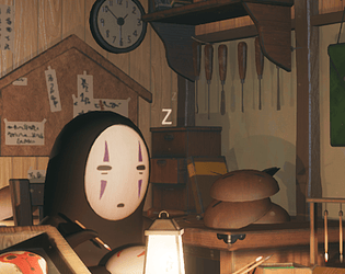
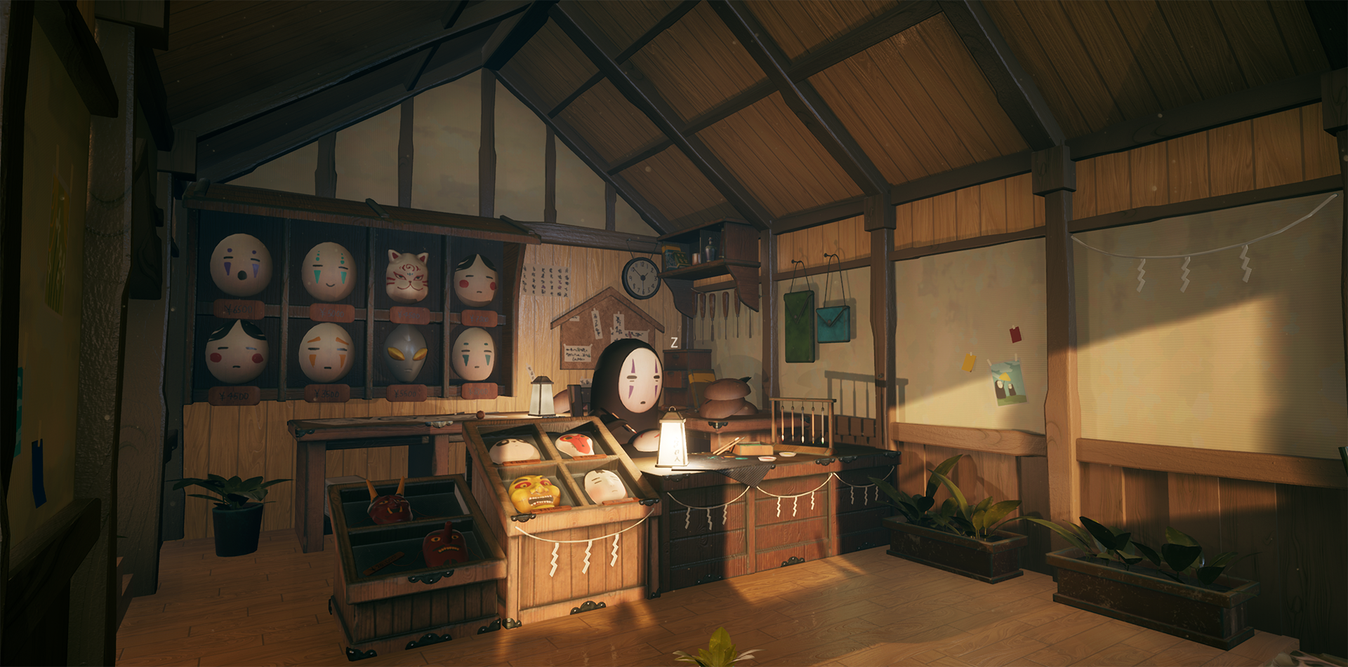
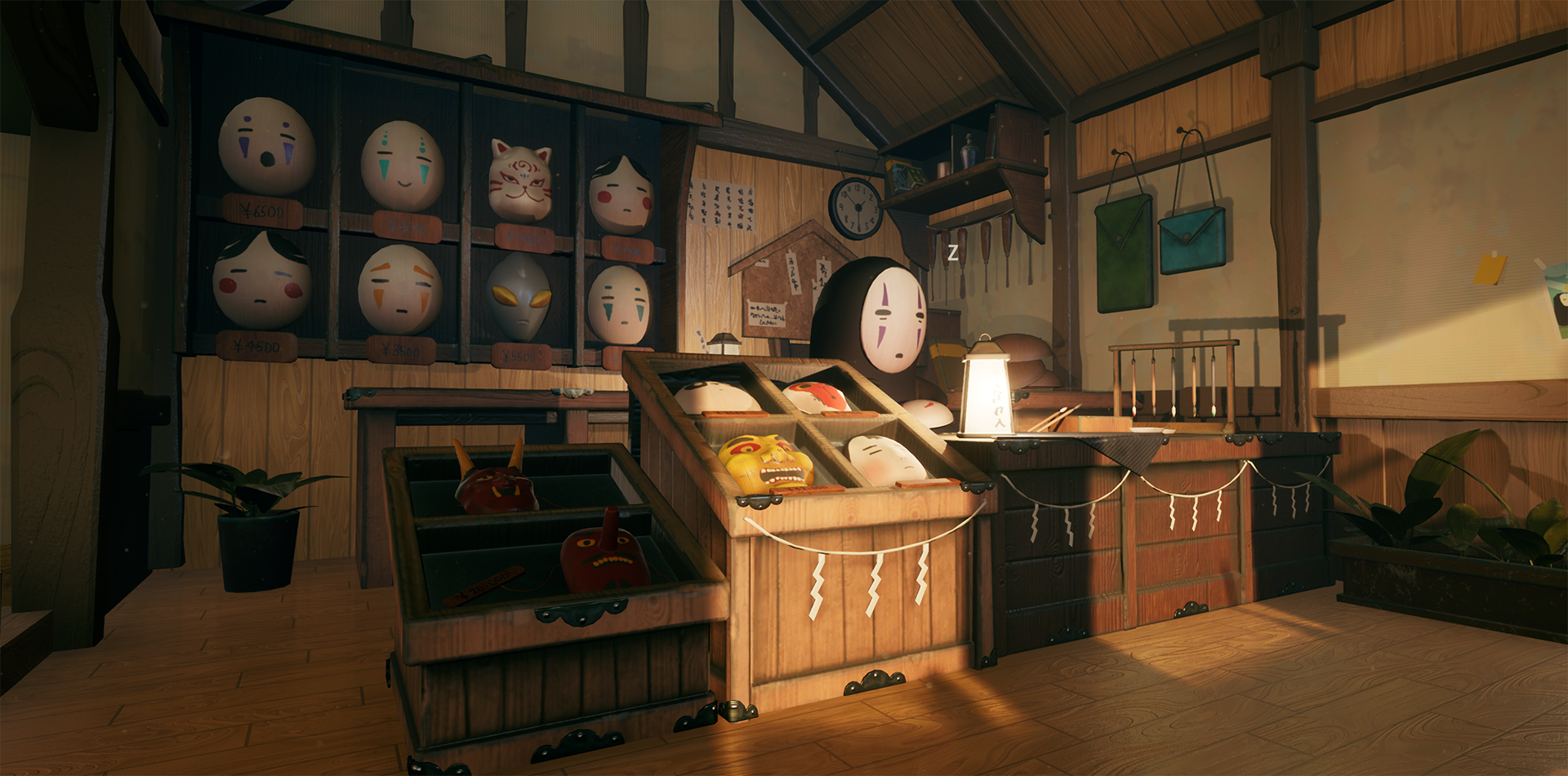
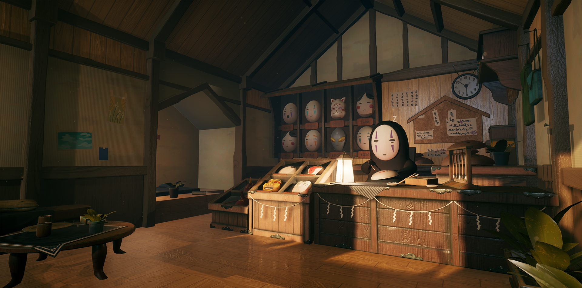
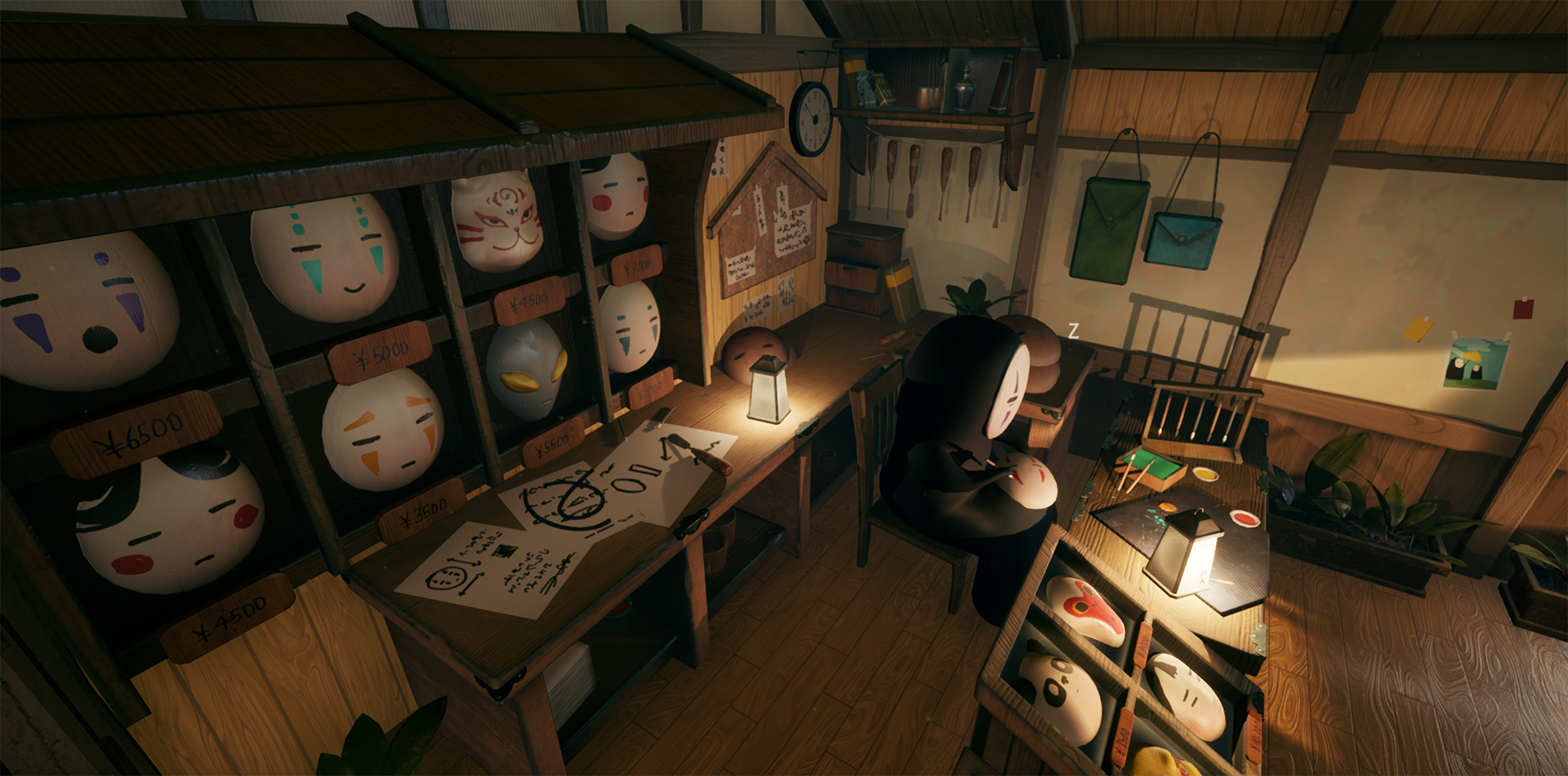
- Hi Gia! I love your piece so much; you’ve really captured the theme of “a happy place” so well and your piece really stands out as a solid and confident piece of environment art! I also can’t believe you’ve only been doing environments 3 months because your pipeline and final product are fantastic. Well done! I like the concept you chose, and although it’s not mentioned in your documentation, you seem to have a good awareness of selecting it not only for its scope as an achievable 3D project, but also the suitability for conversion (not all drawings convert well, as I’m sure you’re aware, judging by your choice). I wouldn’t sell yourself too short on you design skills though, you’ve added a bit to the piece and your tweaks show an amazing design flare! You may also sometimes want to do auxiliary concepting work, even if working from someone else’s concept; for example a floor plan or research and design of specific materials. However in your case you approach that start of work strongly, and your blockout and lighting is very confident, so there doesn’t seem to be much need for much more concepting work as you’ve reflected it in the blockout instead. Working from other people’s work is also good practice for industry! I love that you’ve used this project as an opportunity to learn and grow. Being aware of your weaknesses and setting your sights on achieving a specific goal from a project is really great mindset. For example, your work with Substance Designer is really impressive, especially for a first time. Using Youtube tutorials is also great, there’s a wealth of resources out there and you took the initiative to find one that worked for the stylised look you were going for. Some variation in the wood floor texture’s spec or roughness maps would have been cool I think; the material takes up a not insignificant amount of the scene and in places could do with breaking up visually a little (I appreciate you’re aware of this and have done it using mesh on the walls, which is great). A grunge texture, maybe even one that uses your normal or AO information to increase roughness/ reduce specularity within the grooves of the wood, would break up the light on the floor nicely and add some visual interest to this surface. If you work with Substance again (which I hope you do, you’ve done great work so far!) you may want to try the Substance plugin; it can interface directly with your Substance materials and give you a lot of room to mess with values and tweak things without having to hop between programmes. As you get used to using nodes in Substance the Unreal material editor will also start to come naturally to you; you’ve clearly used it a little before but there are a lot of cool things you can do with it. You texture maps are excellent; the use of atlas textures across the scene is great optimisation and your technical team in industry will love you for this! The modularity of the assets is also great and you’ve set dressed so well. If anything, the set dressing is too well optimised; if you wanted your atlas textures could be split up, which would allow for variation in materials. For example, using a subsurface shader for your plants, particularly in combination with your gorgeous lighting, would have a lovely effect I think! Furthermore, while most of your meshes are pretty low polycount, potentially adding some LODs on larger meshes would not only allow for a higher texel density on some assets, but could also allow for adding some bevels here and there to round out some of your smaller assets. Your approach to lighting is very strong: I appreciate that you think about the environment as a composition and think about leading the eye with lights, the outcome is lovely. Raising the temperature of the lights in combination with the saturation tweaks in postpro has really sold the mood of this piece. Be careful of light overlap though; a lot of lights overlaying each other can be expensive to render and drop your framerate substantially in bigger scenes, as well as cause potential render artifacts. In a small and otherwise well-optimised scene like this doesn’t pose a problem of course, but it’s good practice to check your optimisation viewmodes (in the dropdown in the Viewport in Unreal; the default is “Lit”) to check light overlap. Most potential problems in this area can be fixed pretty efficiently by reducing the attenuation radius and (if needed) increasing intensity. Again, though, this hasn’t been detrimental to the scene from the looks of it, so just something to watch out for! The addition of the animation and particle effects is awesome, you’ve really gone above and beyond with this project! It really adds a story to this piece and pushes the visual interest of No-Face as the focus of the piece. The video with the music and some nice panning shots on your project page show off the best of your work and are beautifully presented. Overall great work, can’t wait to see more of your environment work in the future!
Challenge Tier
d3t Rising Star
Leave a comment
Log in with itch.io to leave a comment.
Comments
So cute! This is such a great stylised piece!
I'm happy you like it, thanks!
This is so cute! Spirited Away is a classic <3
Thank you so much!