


Play asset pack
Record Shop's itch.io pageResults
| Criteria | Rank | Score* | Raw Score |
| Overall | #10 | 3.533 | 3.533 |
| Presentation | #11 | 3.667 | 3.667 |
| Technical | #13 | 3.500 | 3.500 |
| Creative | #14 | 3.500 | 3.500 |
| Documentation | #14 | 3.500 | 3.500 |
| Research + Development | #17 | 3.500 | 3.500 |
Ranked from 6 ratings. Score is adjusted from raw score by the median number of ratings per game in the jam.
Judge feedback
Judge feedback is anonymous and shown in a random order.
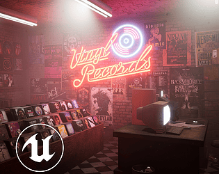
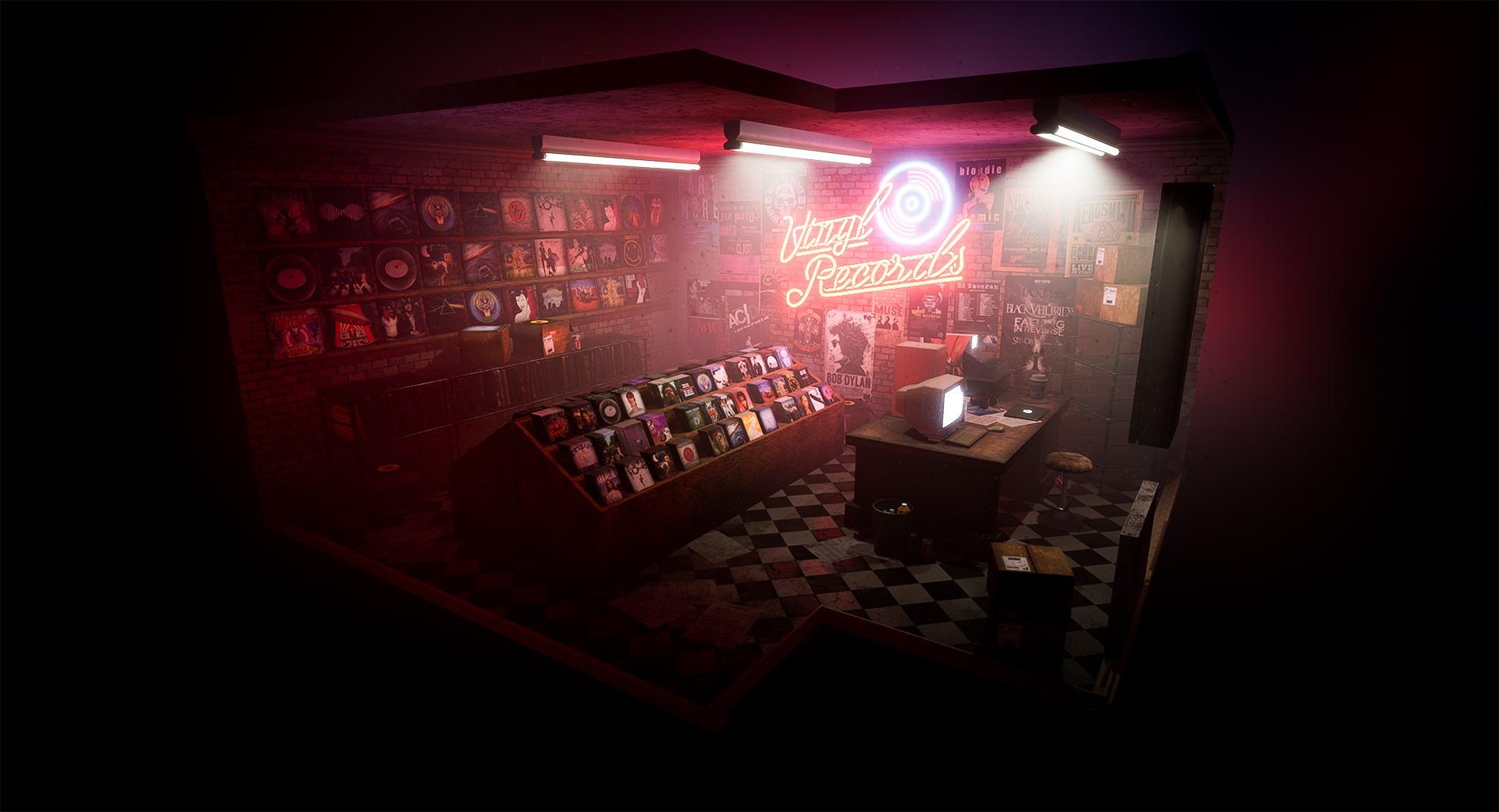
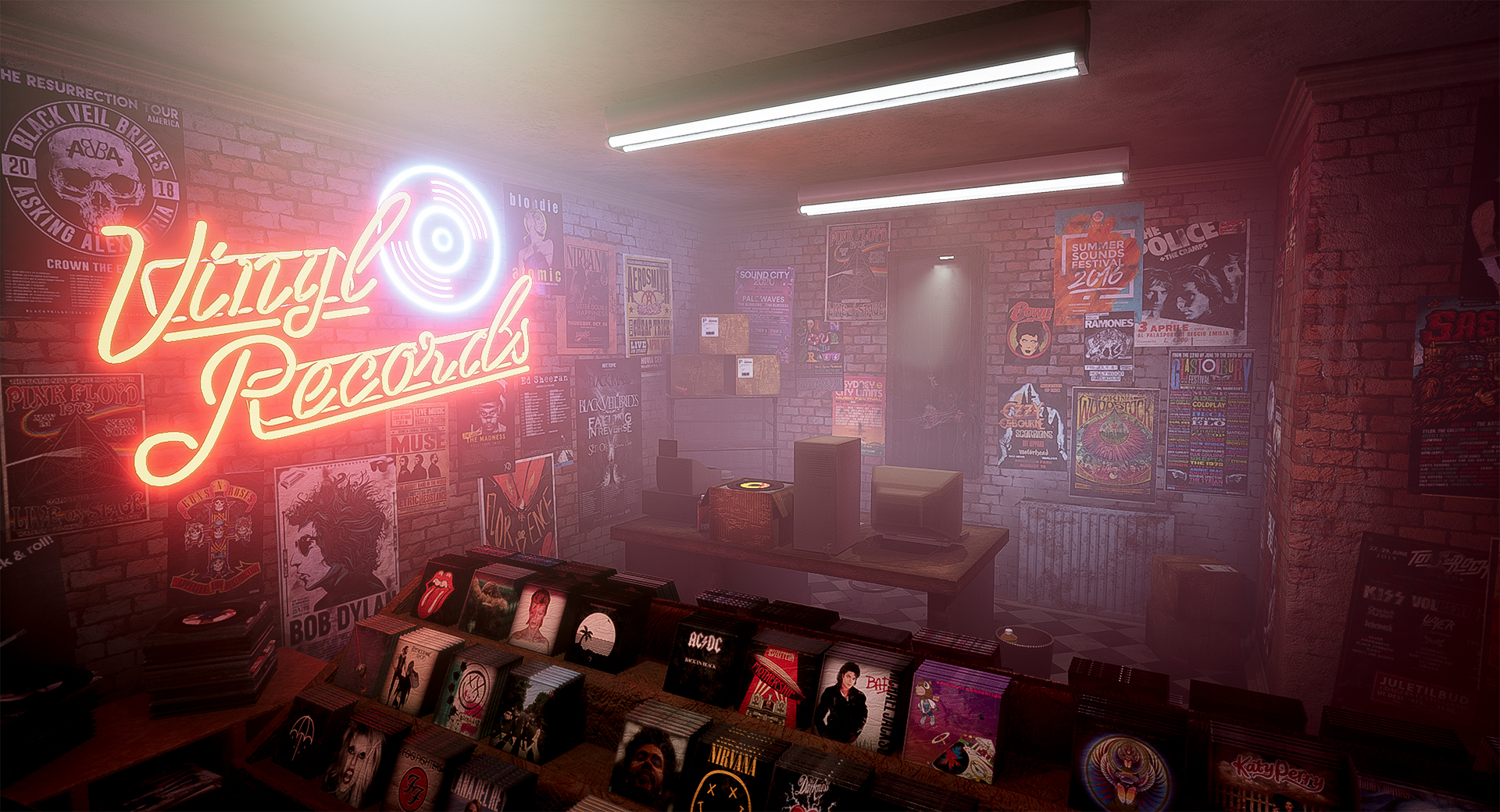
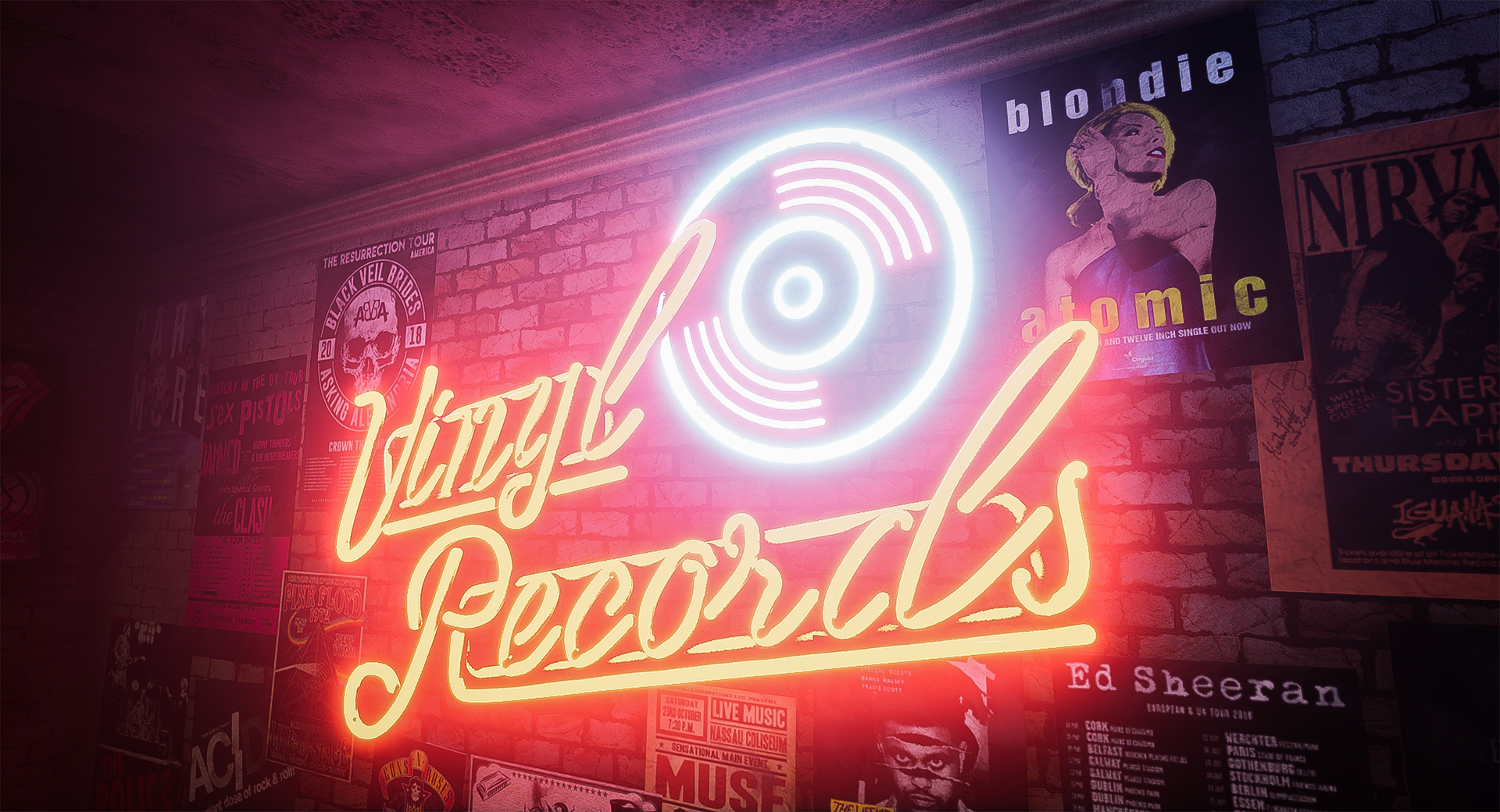
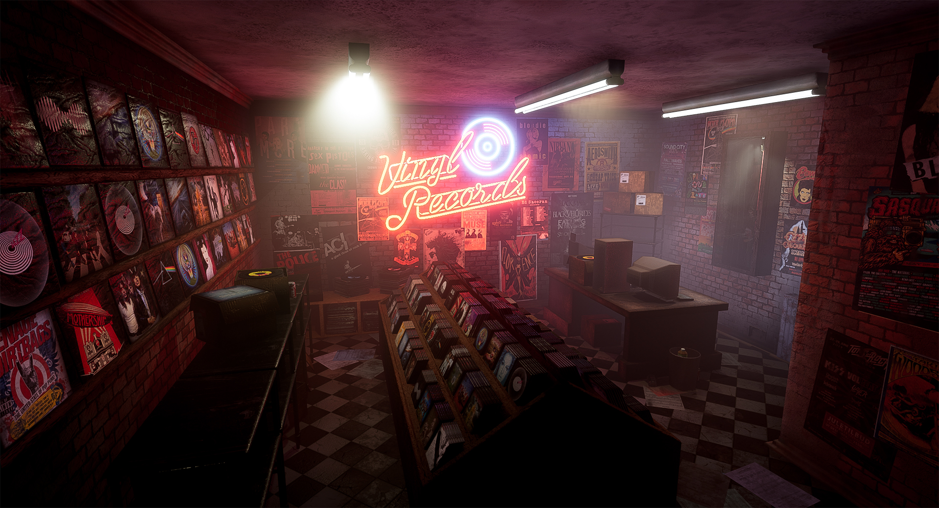
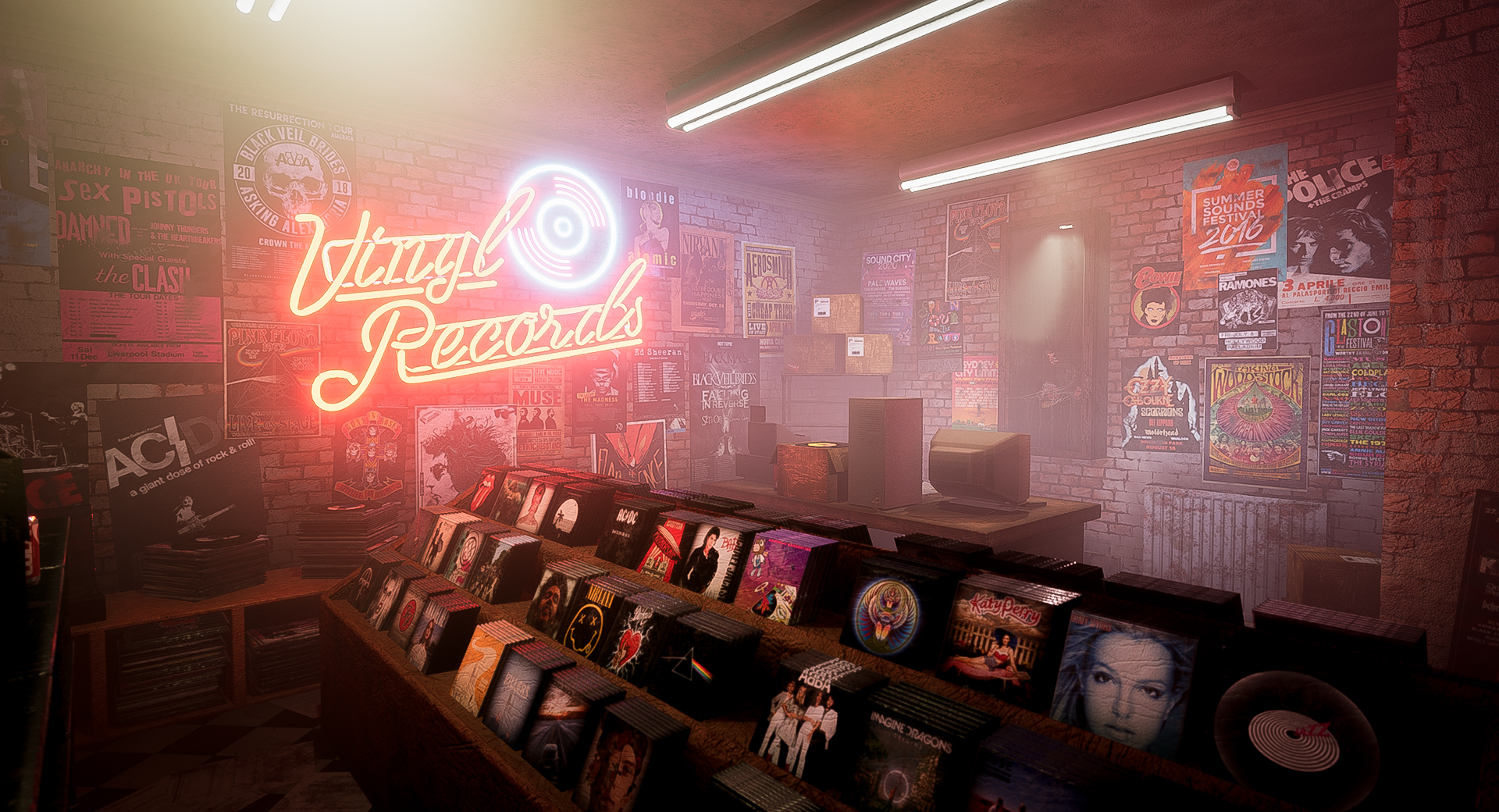
- Hi Shay! First up, I clicked through your submission from a comment on another submission, and this was a really great start; it sounds corny but supporting and encouraging your team is a really key part of working in industry and you have a great attitude in championing your peers. It’s really great to see! Your documentation is excellent, very clean and well-presented. You have a really clear idea what you’re looking to create and your research follows through on this. I like that you talk about personal experience; the final piece has a lot of heart and soul and I think this has come from you properly considering what constitutes a “happy place” for you. I love the consideration of the persona and backstory behind the record shop too, it’s given the piece a great sense of personality and has helped inform a lot of your decisions from early on; the decals and weathering on the guitar in particular are awesome! I also like that you’re aware of your weaknesses and talk about how you want to learn something from this project by approaching it a little differently in terms of optimisation and polycount, which is a mature mindset and has set you up for success from the get-go. Taking the initiative to teach yourself during the project was also great to see, with what I think are really successful outcomes. Vertex painting the grunge onto the wall is a great touch and looks amazing! Your work with the Unreal material editor is sophisticated across the board, even where you’ve chosen to go in a different direction; the experimentation for the flickering lights is great and well above the skill level I’d expect for a Rising Star submission! I was curious more than anything for the translucency in the diffuse for the neon light, as you have the alpha plugged into the opacity mask but from what I can see it doesn’t have an effect? You can use a masked material to create the illusion of translucency; I hope you don’t mind I added a Dither Temporal AA node to see how it would look with the translucency, though in the end I liked your version better. This isn’t a criticism at all, I’m just curious as to the thought process behind having an alpha on that texture. I like that you didn’t go for a translucent material though: they’re expensive to render and I think the intensity of the light is much more impressive when solid. Your optimisation is fantastic; the scene runs solidly above 100fps which is fantastic! You have a great understanding of a lot of the optimisation techniques used in industry and have planned them into your pipeline from the start, which is good practice. If anything, your scene could still afford to have more polys/ larger textures. I think this is the opposite of the problem most artists have, and from your documentation you seem very aware of it and are receptive to feedback from your peers and tutors on it. You’re right when you mention in your documentation that if you used LODs then you could increase the size of small assets etc; even small bits like plastic bottles could afford to have polys added to round them out a bit if you wanted. Your meshes are very clean and well-made so would work well with Unreal’s own LOD creation tools; you can use the LOD group presets as a starting point and adjust accordingly for some pretty good results with minimal fuss. That said, your higher polycount assets are your key assets, so you have a clear idea of what’s important in your scene and reflect this in the technical aspects of the work. I also wouldn’t be too hard on yourself for being good at low-poly styles (which you are); there is a demand for it in certain games and sectors of the industry, for example mobile gaming and stylised low poly (the example that comes to mind is “Virginia” by 505 and Variable State). Making these styles look visually impressive like you do in your smaller assets is a talent of its own, and well worth pursuing further if you’re interested in working in these areas. Your set dressing really sells the piece, making it feel alive with great sense of character and story. The scratches and streaking on the glass of the guitar case is a nice touch, and for some reason I really like the laptop with the glowing bit; it’s a simple asset but next to the old computer really tells you a lot about the shop and the person who works here. I love the post-its too, they give really good flavour to the scene and gloriously tongue-in-cheek. When set dressing, you can reduce the transform snapping in Unreal in the top right of the viewport which will help place things more dynamically and ensure nothing is clipping through anything else; although the instances where they do are very minor. And of course, the lighting and postpro work you’ve done is stunning. The fog is great, you can almost smell this shop, and it really brings out the best in the lighting. Watch out for the red crosses over your lights; this means too many lights are overlapping and you may need to do some juggling around (reducing the attenuation radius and increasing intensity if needed will often fix this pretty easily) to get the best results without any errors, as too many overlapping lights can be expensive and cause rendering problems such as weird artefacts. I think too, with the addition of the neon light, more could have been done to draw attention to the guitar: it’s a prized possession, maybe some more spotlights at the bottom to light it more, or perhaps even some LEDs round the edge of the case? The colours you’ve brought into the piece are wonderful though. Looking at the process of this is really satisfying too; again you’ve properly considered feedback from your peers to really push the lighting in this scene to its best. This together with the placement of the shelves, particularly the middle shelf running perpendicular to the neon light, draws the eyes across the room really well. Overall, an incredibly successful project! I really can’t get over that this is a submission for Rising Star, because with a little polish this is easily industry-ready work. Not only is the final piece impressive, with a great sense of mood and gorgeous colours, you’ve also used this project as a learning experience and have pushed your abilities and really shone. You should be proud of what you’ve produced, congrats!
- Submission Title: Record Shop Submission Tier: d3t Rising Star Assessor: Dominic Shaw Environment Artist @ Firesprite Research + Development You have researched some good real world reference for each prop that you needed to make which is great to see. I think that you could have benefited from also created a mood board of the style that you are aiming to achieve with the project. Creative Art You have done a really nice job with this environment and there is some good composition and story in this level. The focal points are clear and it’s an interesting environment which is great. The lighting and mood is also really nice and it feels like a grungy music store. There are a few things that you could do to help improve this environment moving forward. The main thing that stands out to me is the texturing of assets, you have done a good job and understood the workflows using trim sheets, designer and painter but the normal map of everything is a bit too intense so I would dial this back a lot and keep stuff really subtle. A good example of where you can see it being way too strong is on the wood surfaces and records in the shelves. To help improve your texturing even more, I would take more attention to the age of the environment, a lot of the asset textures are treated like you would treat a post-apocalyptic environment, there is way too much dirt and grunge on everything. A good example of this is computer desk and chair are really dirty and old whilst the props on them are new. I would take another pass at the textures and just keep in mind the age of the environment, be more subtle with things, such as the desk in a store like this may only need a bit of dust on it rather than a lot of grunge and dirt. I also think that there is an inconsistency of style within the environment as you have realistic props such as the guitar, sign and till which would be suited towards AAA games but then you have really low poly props right next to them such as the drinks and pc tower that are treated like they meant for a mobile game. You have shown good baking on the props but I would do another pass and make everything more consistent, add more polys to the cups and model more detail into the PC tower. Technical Art You have a good understanding of game art workflows with the use of vertex painting and trim sheets so you are keeping optimization in mind. However, I noticed that you modelled everything in one 3ds Max scene and imported everything at once which is causing a lot of issues. The trim sheets, for example, you have imported separate models for each UV shift whilst you should have imported one record then shifted the UV’s inside of a master material in the engine. I also noticed that you have meshes that you have imported in twice such as the bottles due to exporting from the 3D package at once. What you want to do is only model and import one of these assets and compile everything inside of Unreal and let unreal handle the duplication of assets. Documentation I think there was some good documentation done for this project and it was nice to see all the prop breakdowns. Final Presentation You have made some really nice final images and a video with pretty good composition, mood and lighting. Moving forward, I would focus on improving your texturing and using Unreal to assemble everything rather than 3ds Max. You have done a really good for your second year at Uni so you should be proud and I know that I’ve gone over a lot of things here so if you want more help, please feel free to contact me on Artstation.
Challenge Tier
d3t Rising Star
Leave a comment
Log in with itch.io to leave a comment.
Comments
Watching the development was really exciting. It came out so well and I love the vibes!
Best of luck Shay :) The video is stunning!
Love how this has came along. I love it!
Thank you! I'm really happy with the final outcome and how much I've improved in the span of a couple of months!