


Play asset pack
Lucy's Apartment UE5's itch.io pageResults
| Criteria | Rank | Score* | Raw Score |
| Creative Development | #4 | 4.333 | 4.333 |
| Project Documentation | #11 | 4.000 | 4.000 |
| Final Presentation | #12 | 4.000 | 4.000 |
| Overall | #12 | 3.933 | 3.933 |
| Technical / Workflow | #16 | 3.667 | 3.667 |
| Research + Development | #21 | 3.667 | 3.667 |
Ranked from 3 ratings. Score is adjusted from raw score by the median number of ratings per game in the jam.
Judge feedback
Judge feedback is anonymous and shown in a random order.
- Great work as usual, I would give a bit of extra love to the smaller props you showcase but I love your lighting and presentation. Always a pleasure to look through your work.
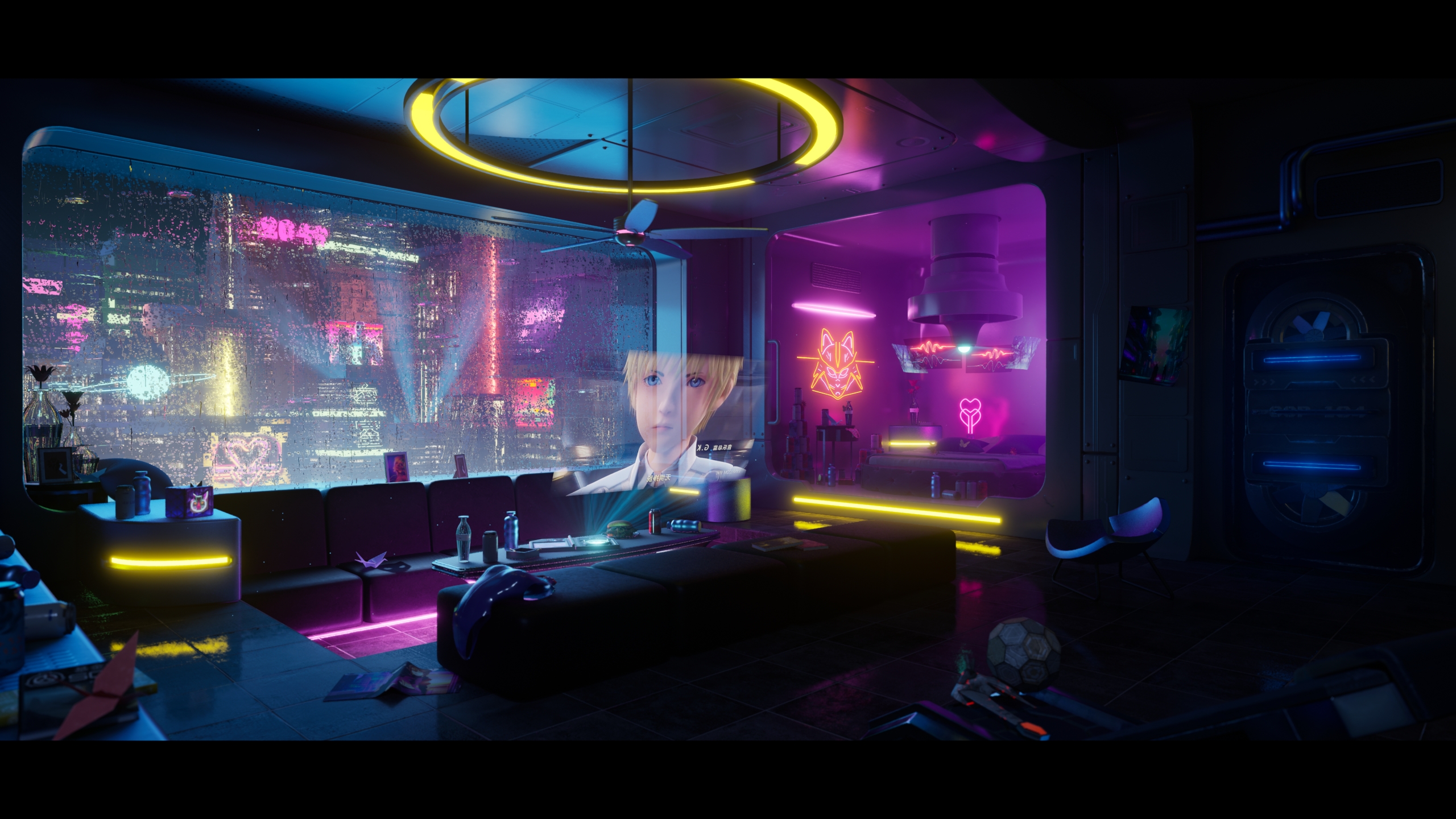
- Hi Ziyi! Firstly, well done for your hard work on the project, it shows how passionate you are about environment art, as well as your love for the show :) I really liked the video along with the gif on your artstation. The scene is amazing, but I do have some advice to help bring it up a notch. Your presentation was a pleasure to read. It was enjoyable hearing about where you gathered your references from, along with hearing where your inspirations came from. For next time, I would have liked to hear a little more about you and your thought process going into it, rather than just what Cyberpunk 2077 is; your thoughts are more valuable and interesting. Furthermore, it is important to have references for individual props, including having references for small details such as the water marks on the window. When aiming to make something look realistic it’s all about these finer details, so building up a catalog to pull from at any time will be beneficial in both the short and long term. This brings me to the art style. You’ve decided to go with a more realistic art style, which for Cyberpunk 2077 is quite grungy and dirty, but have your main reference from a stylised TV show. This creates some conflicting factors when you’ve recreated the room as it feels almost like a dolls house/plasticky. It feels like you’re slightly on the fence between the 2 art styles. Next time try to completely dive into the details! For example, you’ve got a lot of photogrammetry assets: To match this artstyle, if you add a little bit of wear to the scene, it will lift it to the next level: dust in the corners, colour variation on the wall, roughness variation on the floor, light stains on fabrics, water mark/ring next to the cans etc. This will make it feel lived in, rather than a set. You’ve done an amazing job of the exterior! I do love the window, as that’s the most impressive part for me. Your modelling, wireframes and UVs are all super polished, I wish you had the chance to model a little more. Photogrammetry is amazing, but has to be done right to make it game ready. Although the advantages of nanite can be game-changing, there are practical limits that still remain. For example, instance counts, triangles per mesh, material complexity, output resolution, and performance should be carefully measured. Therefore, I would have liked to see a couple more assets retopped a little more, especially as nanite doesn’t work well with ray tracing. For example, the chairs could probably have been modelled rather than scanned. You gained points for your amazing lighting and blueprint setups. These were the highlights of the scene, as although in some areas it was simple, they were very effective! Overall, great presentation pdf :) I would have liked to see a little more technical breakdowns including tri counts, map sizes used, texel density etc, but overall it was excellent 5/5
- Overall the scene is very good. It is clear a lot of passion of the show/game went into this scene. Workflow wise, it appears a lot of time/effort was spent on the backdrop buildings, which appear to be very detailed in the mesh, where they could very much have just been cubes with textures, or simply a skybox/hdri backdrop. The room itself seems to be an in-between of artstyles which is a little conflicting, having an anime character in the scenes central focal point, but having more realistic textures else where, and simple surfaces. The textures could do with a lot of breakup in roughness and colour variation, through decals, added into the textures, or using 2nd UV channels with masks to drive variation. The lighting of the scene is very good, and draws the eyes, but the shadows are a little strong and hide a lot of the scene.
Challenge Tier
Search For A Star
Chosen brief
Environment Art (Standard)
Leave a comment
Log in with itch.io to leave a comment.