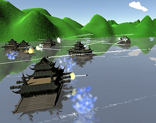
Play game
The War Diary of Yi Sun-sin's itch.io pageResults
| Criteria | Rank | Score* | Raw Score |
| Creativity; innovation & originality across design, concept & execution | #1 | 4.000 | 4.000 |
| UI & UX; visual design, clarity & ease of use, guidance, accessibility support | #1 | 3.250 | 3.250 |
| Features; gameplay enhancements, integrated systems | #2 | 3.250 | 3.250 |
| Gameplay; core mechanics, objectives, balancing, progression | #4 | 3.000 | 3.000 |
Ranked from 4 ratings. Score is adjusted from raw score by the median number of ratings per game in the jam.
Judge feedback
Judge feedback is anonymous and shown in a random order.
No Documentation
- First play
- Firewall alert. Wants to connect to the internet.... not sure why. Blocked
- Intro - very professional feeling cut scene. Gives the backstory and dives right into tutorial.
- Nice tutorial. Ended up in battle. That was pretty bloody. Down to 34%.
- Found my buddies, now more battles. Got the hang of it this time. Sunk em.
- Off to Okpo.
- Gah 3% left....
- Controls
- Playing in windowed mode, keep clicking off screen, nearly clicked the close button.
- Ship doesn't really have a sense of motion. Have to use camera to get land or buddies in view else can tell that I'm moving.
- Ctrl and Shift don't seem to do anything.
- Gameplay
- battleships feels very cool.
- bares basically no resemblance to the starting project. difficult to compare with other projects as its so different BUT had fun playing it.
- very focused theme
- Not sure what the overall goal is. I thought it was to complete objectives.
- I did the first mission, then died at Okpo and then wasn't really sure what to do next, kinda ended up floating around for a bit on my own. didn't wanna get into a fight because i would have been slaughtered.
- On my second attempt i cleared Okpo but the game didn't progress. So started killing additional forces around Okpo but still the game didn't progress.
- Overall i though it was quite fun but started getting repetitive and didn't feel like there was anything to aim for.
- Overall
- Fun little demo
- Very functional prototype with some good elements of polish and the theme and style starting to show potential.
- Some of the basics could be tightened up with very little effort. Such as fixing issues with controls, sense of speed on the water.
- More broadly speaking the next thing would be to develop the content; progression, art and ui.
- First play
Feedback
The game begins with an introduction to the story which is a positive part, however a Main Menu system (even a basic one with a simple start/exit button) is needed in all games. The story is shown with subtitles in a clear type face with a good choice of colour in contrast to the background making it easier to read, however there were a few spelling and grammar issues which were overlooked, it is always advised to proofread all the text in your game with several people just to be sure of any errors within the game, in most cases you will not notice them yourself which can prove to be frustrating.
The gameplay itself I believed to be very good at your current level of experience with building a 3D game. There were some minor issues with other boats colliding into me and pushing me away from my objective but I was eventually able to get around them. Weapons control appears to fire the cannons in a random pattern in approximation to a firing arc which creates a little more realism (no cannon will hit the exact same place twice). A random generation of any game variable is always a good method to create realism.
I was a little annoyed that my own boats cannon fire would hit me if I was taking the lead. I had to stay clear of them to avoid taking damage from my own boats, I found 2/3 of the damage I took was from my own fleet.
The tutorial was simple but easily understood. However attempting to click on buttons in my UI resulted in the firing of my cannons, ideally this should be disabled when clicking buttons. The 3D models themselves although basic in construction were used effectively. Unfortunately I found no evidence of documentation attached to your submission page so I was unable to view more specific details, documentation of any kind is always key when presenting a game so this should be considered in the future.
If there was a “quit” button in your game I was unable to find it, there did not appear to be a pause menu and as there was no main menu to return too so I felt a little restricted. Your choice of music is good and it fits well with the game, however I felt it was very loud and I had no control to adjust it. A simple volume control added would help to customise the game experience however if none can be developed then the music should be considered a secondary source of sound running faintly in the background.
Summary
While the game itself appears to function well and is engaging to the player to continue playing, there are some smaller details left out which is needed to make a game feel like a full game such as:
· Main Menu system is needed and a method to quit the game.
· Documentation to support your project build.
· Game objectives need to be updated each step of the way.
· Sounds and music need to be balanced in volume.
· Game settings should be an option in-game and not just in the Unity start up window.
It can be very easy to forget these details and can sometimes take a bit of time to work correctly but they can make a big difference to the gameplay experience. Overall I believe this game was built well and the important thing is I enjoyed it.
As a YouTuber and game developer myself we consider it a pleasure to try your games and I am pleased to have had the opportunity to try your game.
Thank you. LCripps.
Website: http://fellowplayerstudios.com/
YouTuber – FellowPlayer: https://www.youtube.com/channel/UCXzcduiD99hcDMhhCzByRiA
Great concept and love the historical setting. Ship is soooooo slow though! Nice visual touches, and I especially liked the map view implementation. Sadly let down by gameplay/UX as it was just too cumbersome and not enjoyable. The orbit camera was also unintuitive. However, a great effort from a creative and visual standpoint, and my favourite so far!
Loved the game. Some points to consider at this stage:
- Onboarding/tutorial needs to be better
- Control system needs reviewing, not sure why but could not shoot when I wanted, there must be something not quite right with it
- When in the map would be good to highlight where the enemy ships are
- Consider adding gamification
I really liked how you framed the game with the initial story, well done!
Leave a comment
Log in with itch.io to leave a comment.


Comments
No one has posted a comment yet