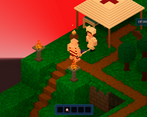
Overall, I think this was a fun adventure game and a great submission to the 2024 Summer Splash Game Jam. My favorite part was the sunburned enemies, and overall, a few simple changes to the UI and the addition of a custom main menu would have helped the score greatly.
Play trip to the beach
Dark Debacle at Voxel Beach's itch.io pageResults
| Criteria | Rank | Score* | Raw Score |
| SUMMER THEME | #1 | 3.600 | 3.600 |
| ITEMS | #1 | 3.600 | 3.600 |
| COMBAT | #1 | 3.400 | 3.400 |
| Overall | #1 | 3.280 | 3.280 |
| STORY | #1 | 3.200 | 3.200 |
| UI | #2 | 2.600 | 2.600 |
Ranked from 5 ratings. Score is adjusted from raw score by the median number of ratings per game in the jam.
Judge feedback
Judge feedback is anonymous and shown in a random order.
- It's a fun little game. Level design looks interesting in an isometric style. Alas, there's very little plot here and as I understand the quest cannot be completed. There are also unnecessary elements, such as collecting acorns and souls from enemies, which also cannot be used anywhere. It is better to add only those elements that can be directly used in the walkthrough. To simply not waste time on them. It's a strange way of revival that is not justified in any way. Who's the nurse who's treating us. The potions themselves could be sold for acorns or souls, which somehow justified their presence.
- SUMMER THEME: 4/5 "Dark Debacle at Voxel Beach" may possibly get its name from the shadowy and dim lighting in its grassy world, or the fact that the enemies are sunburned lunatics who dash across burning-hot sand to attack the player... hard to say! Either way, the game fits in well with the "Summer Splash 2024 Game Jam" theme. The player character is even dressed in a 1920s full-body swimsuit with stripes. At first, I thought the fully-robed enemies at the end were unrelated to the other enemies, but I have a theory that they are wearing robes to protect themselves from the burning sun. I just wish that instead of collecting acorns, the player was collecting something more summer-themed (or maybe just less fall-themed), like soda cans or popsicles... or sunblock! STORY: 2/5 RPG in a Box has a very specific "Quest" system with its own tab in the program, as does the Dialogue Editor. Unfortunately, Dark Debacle at Voxel Beach did not include any such quests. Additionally, the use of dialogue (display_message or the Dialogue Editor) was sparse with just one NPC to talk to. There were other NPCs, but the player was unable to speak to them. However, the player was able to interact with a few objects, and those gave clues as to what to do next. I think that adding a single "display_message" for the guy on the beach and the nurse at the infirmary would have helped, as well as a starting message that explained the story (even if just a single paragraph). UI: 1/5 Just like with the Quest tab and the Dialogue Editor tab, there is a tab called "UI Editor" which has sub-tabs "Themes" and "Main Menu" that allow you to customize the look, color, etc. of your game's theme(s) as well as creating a built-in main menu, respectively. Dark Debacle at Voxel Beach does not have either an original theme or a main menu created with the Main Menu sub-tab. Even changing the color of the theme would have been nice. ITEMS: Items/Gear 4/5 In Dark Debacle, you must cross the blazing-hot sands of the beach and fight against enemies to reach a necklace that will protect you from the final bosses. But to do this, you must first equip some sandals. This made equipment an important part of the game and gave it a sense of progression throughout the adventure. Fighting enemies would drop souls, which I was not able to find a use for. The game also had acorns that were scattered throughout it, and you could trade these in for a weapon. I just wish that there was a use for the souls and that the acorns were summer-themed collectibles, even if they were for Stumpy. COMBAT: 4/5 Possibly the brightest part of Dark Debacle at Voxel Beach is the combat, and that is where it seems to shine the most as combat is required to "beat" the game. I say "beat" because there is no final end condition, but I would personally consider finding Sarah the end of the game. The enemies are twofold: 1) Beach-goers who start off normal and quickly become red with a sunburn, quickly running toward the player. They seem to spawn rapidly, like zombies at the beach. Getting past these sunburned beings is important as you will find a way to get an important defense-upgrading necklace. 2) Additionally, there are robed people. They had very high damage, which was ultimately mitigated by the defense necklace found on the beach. There is also a final boss after this group of robed people, but it just had slightly more HP and damage. I would have liked to have seen (perhaps) an ability such as a status effect, which seemed to have been missing from the game. Rather than giving this a 3/5, I have given it a 4/5 because the beach had its own faux status effect (stepping on a sand tile caused damage, preventing the player from reaching the necklace).
- This game was a amazing use of camera angles, and using the ingame assets to make a engaging game loop. I really like the use of the free movement to show different paths and secrets. Also, the plot was fun and easy to follow. The game loop was fun to play!


Leave a comment
Log in with itch.io to leave a comment.