Really in-depth and has a lot of intention with the mechanics! I can tell there was a lot of thought in this demo, modeled after games like Mortal Kombat.
This game has a 3D version and it has two characters so there are a lot of movements and effects involved in the game which was very good. Also, the sound effect of the game was really good when I hit kitsune sound button it was very amazing.
It was in 3D, which is cool. The kitsune's attack felt very cool as well.
I like how you guys used the sword slashing in many ways to provide a different game feel. I also like how you guys tried to use 3D to showcase these juices.
The effect is truly shocking and impressive.
I really liked the multiple slashes to the screen effect. The sound effect of sword slashing was also perfect for this theme. The ground shaking sound effect also went nicely with the camera shake.
The sky fall really looks cool.
I like how they used a basic boxy model and then a more realistic model to highlight the smaller effects. I also think all effects are valuable and add to the basic slash.
A cool idea, and I can definitely see the concept behind this being very cool. The slashing effect is cool and seems to be relatively complex given the scope of the project.
I think this is an excellent demonstration of game feel. The complete jump from the figure simply swiping the sword to the character model with all animations enabled is incredible.
========================================
What could this game have done better?
****************************
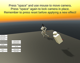
Controls for clicking/space is a bit weird, also not sure why there are two player models.
I think the font of the choice menu could be a little be larger so that it was easier for audience to read and click on. Also, I think that the camera movement could be a little bit rounder so that the audience can look at the game at different degrees and angles. It is a very interesting and creative game!
Some more indication for sound would be nice, it made me jump a bit when I first heard it since it suddenly popped up.
For some of the buttons, when I click on them, it just stays the same so it makes me think that it's not on or off. Also I was confused what buttons were for each character at first, so maybe a little bit more visual indicator?
The game itself is hard to operate. We cannot play it without full screen. And the menu didn't give a clear instruction on how to play the game. The overall experience is not good.
I think the camera shook too much. I would have liked a less intense shaking. I also think the user interface could be better. I didn't know when I pressed a button for an effect. There was no clear feedback telling me that I had actually selected an effect.
Character moves smoother.
It was a little difficult to know which effects you had selected, maybe highlight the ones currently selected to help identify them.
Overall UI experience is somewhat poor and somewhat unintuitive. I had a lot of trouble figuring out what effects were on and off. Similarly, the separate models (the girl and blocky model) seem very different and progression of the effects don't feels like they stack additively in a satisfying way.
The buttons are hard to understand what I'm turning on/off. Personally, the screen shatter doesn't make sense to me. I think that is the weakest feature among the rest which are all equally strong.

Comments
What did this game do well?
****************************
Really in-depth and has a lot of intention with the mechanics! I can tell there was a lot of thought in this demo, modeled after games like Mortal Kombat.
This game has a 3D version and it has two characters so there are a lot of movements and effects involved in the game which was very good. Also, the sound effect of the game was really good when I hit kitsune sound button it was very amazing.
It was in 3D, which is cool. The kitsune's attack felt very cool as well.
I like how you guys used the sword slashing in many ways to provide a different game feel. I also like how you guys tried to use 3D to showcase these juices.
The effect is truly shocking and impressive.
I really liked the multiple slashes to the screen effect. The sound effect of sword slashing was also perfect for this theme. The ground shaking sound effect also went nicely with the camera shake.
The sky fall really looks cool.
I like how they used a basic boxy model and then a more realistic model to highlight the smaller effects. I also think all effects are valuable and add to the basic slash.
A cool idea, and I can definitely see the concept behind this being very cool. The slashing effect is cool and seems to be relatively complex given the scope of the project.
I think this is an excellent demonstration of game feel. The complete jump from the figure simply swiping the sword to the character model with all animations enabled is incredible.
========================================
What could this game have done better?
****************************
Controls for clicking/space is a bit weird, also not sure why there are two player models.
I think the font of the choice menu could be a little be larger so that it was easier for audience to read and click on. Also, I think that the camera movement could be a little bit rounder so that the audience can look at the game at different degrees and angles. It is a very interesting and creative game!
Some more indication for sound would be nice, it made me jump a bit when I first heard it since it suddenly popped up.
For some of the buttons, when I click on them, it just stays the same so it makes me think that it's not on or off. Also I was confused what buttons were for each character at first, so maybe a little bit more visual indicator?
The game itself is hard to operate. We cannot play it without full screen. And the menu didn't give a clear instruction on how to play the game. The overall experience is not good.
I think the camera shook too much. I would have liked a less intense shaking. I also think the user interface could be better. I didn't know when I pressed a button for an effect. There was no clear feedback telling me that I had actually selected an effect.
Character moves smoother.
It was a little difficult to know which effects you had selected, maybe highlight the ones currently selected to help identify them.
Overall UI experience is somewhat poor and somewhat unintuitive. I had a lot of trouble figuring out what effects were on and off. Similarly, the separate models (the girl and blocky model) seem very different and progression of the effects don't feels like they stack additively in a satisfying way.
The buttons are hard to understand what I'm turning on/off. Personally, the screen shatter doesn't make sense to me. I think that is the weakest feature among the rest which are all equally strong.