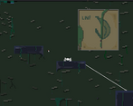
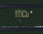
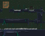
I liked the idea behind the mechanics! Sometimes I wished the web shoot worked if you only pointed in the right direction without actually pointed at a thing cuz it's kinda hard to keep the pointer on the platforms consistently while also swinging on the web. But I like how it's both a platform game and a puzzle game
Play game
future : : silk's itch.io pageJudge feedback
Judge feedback is anonymous.
- Thanks for joining our jam! I loved the gameplay, it was a fun and unique puzzle concept. The controls were very intuitive and it was easy to get a grasp of. The only issue I had was very rarely, it wouldn't shoot the web even if the red dot was lined up with a wall. I had a lot of fun swinging around the map, and the camera was great. Love that every time you came across a puzzle it would show you the whole section. Great job on the theme, I think the interpretation was well done. The game also ran very smoothly, the UI was very non-intrusive. There was one part where the text for the pause menu was hidden behind a vine, but not a big deal. The text in the the pause menu was also blurry. I think the only thing missing from the sound design would be that it would be nice to have some sound feedback when you shoot out a web and when it hits something. The level designs themselves were very fun, and the environment was varied enough to keep it interesting. Everything was clearly laid out, easy to see and figure out what was going on. Overall, the game was very fun. Didn't have any issues with the puzzles or the swinging mechanic, thought it was great!


Leave a comment
Log in with itch.io to leave a comment.