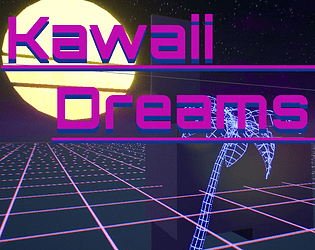
Play Vapor Wave
Kawaii Dreams's itch.io pageResults
| Criteria | Rank | Score* | Raw Score |
| Concept | #4 | 3.875 | 4.143 |
| Enjoyment | #9 | 3.341 | 3.571 |
| Overall | #15 | 3.441 | 3.679 |
| Presentation | #20 | 3.474 | 3.714 |
| Use of the Limitation | #46 | 3.074 | 3.286 |
Ranked from 7 ratings. Score is adjusted from raw score by the median number of ratings per game in the jam.
Team members
1-me
Software used
UE4
Cookies eaten
Cookies are for Wookies
Leave a comment
Log in with itch.io to leave a comment.



Comments
Concept was great but UI could have been better to improve the UI using icons and explaining the objective in the game but overall I liked your game unique concept and art.
First off, I couldn't install this through the itch app because you haven't marked it as executable in page settings. But the screenshots intrigued me so I performed a manual install. Almost 500 MB? Seems a bit excessive. I think you might have uploaded a debug build by accident.
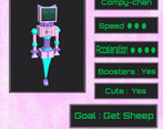
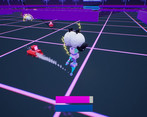
I like the aesthetic, the characters are very cute and unique. I think you cheated a little by having text on you page to explain what you are supposed to do. I didn't figure out the goal of the game because I can't read! The gameplay is fun, though I don't exactly feel like doing the same thing 50 times. Also the red button in the main menu crashes the game.
Sorry I forgot to click the executable. It is now added. Also you should not have had to install anything, just download it and run the executable. Did it actually prompt you to install something? It very much should not have.
Unreal Engine has a real problem with executable sizes. For example a blank UE4 executable is 210 mb (with compression settings to default). If you took every measure to reduce this, I would guess you could get it down to around 25mbs. That's still 25mbs for an empty game, with nothing in it.
I am by no means an expert on this so here is a link to Epic Games doc for packaging.
https://docs.unrealengine.com/en-US/Engine/Deployment/index.html
I didn't exactly understand The rest of your comment as it was a bit contradictory, but I will try to address the issues you had.
1. I think the main point is that you didn't like the game? If that's the case, then sorry you didn't enjoy it.
2 .I assumed that the "no text" limitation was exclusive to the game itself. After re-reading the Jam's main page it turns out you are right. I will remove the text.
3. Last the red button in the main menu closes the game. I find it a little hard to believe that you have never played a game that includes an exit button. Which kinda makes me think that this entire post is a troll post, but I guess it is possible. So either way here is a detailed explanation of the history and usage of the exit button in games.
The quit game button originated in the early days of DOS applications. Most Applications used the Esc key as a universal quitting key, but some applications went against this standard and would use Ctrl + p, or Ctrl + x. Due to confusion at the lack of a universally adopted quitting key, some users felt the need to power cycle (or just unplug) their PC's, in order to quit some programs. In order to prevent this and to help increase mass market appeal, most software developers began to add a button in game that would properly exit to DOS.
Most of these exit buttons would just include the text EXIT GAME, or Exit to DOS, so there has never been a set standard for "how to design an exit button". Although ISO standards for exit signs are green= EXIT, most video games have adopted the traffic light standard of Green = go, Red = Stop. While this may be slightly confusing on an international level, when you take into account the prevalence of racing games it all becomes clear. When someone sits down to play a new racing game, and clicks the green(go) button they expect to start playing the game, not to be staring at their desktop, wondering what happened.
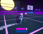
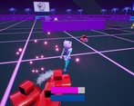
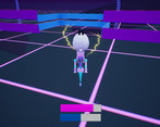
In electronics the standards can be the same as in traffic light standards, but can also include the blue = play, and red = power off method. Considering that my game is about Robots fighting over electric sheep, I thought it was a fitting choice . Also it better matches the vapor wave aesthetic.
Hence that is why the red button at the main menu "crashes" my game.
Whoa, that's a lengthy reply, I have to give you credit for typing it out! Here is my own lengthy reply, but first let me say I didn't mean to be overly critical, I just like pointing out every little inconvenience I find, because they tend to be easy to fix but not immediately obvious to yourself.
Sorry if I made it unclear. I couldn't download it from the itch app, so I had to download it manually from the page. I mention it because the itch app simplifies the step where you have to unpack the .zip and run the executable to a few clicks. This is resolved now that you checked the button.
Wow, I had no idea. In any case I was just pointing it out in case the large size was a mistake.
I thought it was pretty fun, but like I mentioned the goal isn't that clear from within the game, and getting 50 sheep might not feel that different from say, 15 of them per match.
Well, the rules don't strictly forbid you from having text on the page, but I like when a game doesn't need a manual, just in general. I think the intention was that you should keep the page minimal. I don't think you had to blank out the text on the images, I think they help to provide some context to the game.
In short, I thought it might have been a second game mode since it was in line with the blue button, and similar size and shape. Without text I was kinda making assumptions purely from the design language. When I clicked it, the game quit with some error-message-looking numbers on the output (Yes, I ran it in CLI). Hence why I thought it crashed, but that's no big deal either. I just mentioned it in case it was a bug.
Again, don't take my nitpicking personally. I'm sorry for the tone I used in my original comment, I guess it didn't come across in writing like I wanted.
Is this a Philip K. Dick reference. Great game btw only thing i found is adding icons to menu buttons can be a good small addition for the game. It was so funny that it was really hard to exit the game congrats.
Yes small reference to robots dreaming of electric sheep. Thank you, glad you liked it. I will have to add an update with some icons for the buttons.