Play game
You were too slow, try again.'s itch.io pageResults
| Criteria | Rank | Score* | Raw Score |
| How creative/original is this game? | #1 | 4.000 | 4.000 |
| How technically impressive is this game? | #1 | 4.500 | 4.500 |
| Overall | #2 | 3.500 | 3.500 |
| How much fun is this game? | #6 | 2.000 | 2.000 |
Ranked from 4 ratings. Score is adjusted from raw score by the median number of ratings per game in the jam.
You name
Lucas Dane
Leave a comment
Log in with itch.io to leave a comment.


Comments
Jesus H Christ, Lucas ...
Something tells me you had some of these things lying around already, pulled some stuff from an asset pack, or you work REALLY damn fast!
There's an absolute butt-load of style and pizazz on display here, enough logic design to make it a fun little puzzle, and a lot of polish and feel going on, and even though you're clearly a few steps ahead of the class on technical skills you still used the basic premise of the workshop which is a really nice touch. So you can colour me really impressed,
But, while in the classroom I'm forced to assess all students equally, I'm going to adjust my usual level of criticism here to "semi-professional". Please don't think I'm trying to cut you down, but just meet you at the level you need to be met at based on this! ;)
Firstly, lets address that meta-joke at the end: don't do that. You're trying to land a complex multi-layered "feel" of a joke, and you're barely able to tell a knock-knock joke right now. Learn to run before you fly, walk before you run, crawl before you walk. Unreal skills and art skills are NOT game design skills.
That inventory interface ... looked nice, was functional (haven't gone back to try and break it), but the keys were all over the place, and ultimately it was pointless since you never hold more than one object at a time. Again, feels like maybe you pulled a plugin in from the store, or from another project? Remember what I said about how applying tutorials directly to the project abdicates your design process? There's your issue. That, or you didn't think it through from a player's perspective (but you did build it fast! Sometimes working smarter is more efficient that working hard ...)
And finally, visual language. You've got some of the basics (you had that yellow highlighting going on) but some drawers you can open, some you can't, some doors you can open, some you can't ... again, if you pull in assets from somewhere, you abdicate your design process. I'm not saying custom build everything, but ... yeah, that was another snag.
So impressive work, but still a long way to go as a designer. You've got a really great eye for that "indie PC style" going on, some clear artistic intent, and some creative ideas - but don't fall into the "style over substance" trap: Nick Dry (LD teacher joining us in Block B) will eat you alive for that over the next 2 blocks!
Hey Alan,
i’m very proud to be assessed on the “Semi-professional” level your setting. So I want to bring some light on the points you mentioned and give my reflection. This is going to be fun!
The whole “You can’t play it again” is something i was on the fence with till the last minute. Its very brutal and totally not good game design. But i still wanted to add something meta-weird-bad design. One of my all favourite videogames is The Beginner’s Guide. I don’t know if you’ve played it but it’s great and you can see what i was going for.
After seeing everyones response, i see its something i will remove from the game and change it into something else.
And yea you guessed it, the interface and all the assets that were used, were free on the marketplace. Soo yea, nothing self-made. It took a lot of time to adjust the plugins used for my game.
I focussed too much on the ‘Style and Pizzaz’ and adjusting than on a good, functional escape room and great level design.
I’ve watched alot of videos on visual language and i know exactly what it means. It’s something i should have seen coming, and where i didn’t put the amount of effort in it clearly needed.
I didn’t add the additional drawers because i was too scared it would become too cluttered and too confusing. It’s something that could have been easily fixed by some playtests.
Thanks for the in-depth feedback, and thanks for putting in time to write it!
So, this is very impressive, it seems like you put a lot of time and effort into it. It's mostly very well made. What kind of killed the fun for me was that it asks you to "try again" when you fail. You are then not allowed to try it again unless you re-install it, and then it's still physically impossible to complete. I speedran this, had a time of 31 seconds and I still lost. Also, I've got to say, the camera movement/bobbing was a bit grating. Besides that, really great game, and like Atilla said, you've easily beat all of us here, haha.
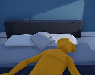
It means alot that you like it. The whole “Not being able to try again” thing is a little bit meta that i maybe needed to explain more in the game. The game is like a memory of an event. The small story about the 2 yellow people in the house and the red gunman outside is the main event. You(The green man) decided to run away. You left the people in the house to fend off for them self. So the reason you can’t play the game again is because like in real life you only have one try, and the green person was too slow to react. There is no faster time, because there’s no alternative. And the mean message after you try to play the game is like your ‘guilt’ saying to you that you f-ed up.
This might be a little bit too vague, and i really wanted to flesh out the story more. But yea i didn’t have enough time haha
This submission is like bringing a T-34 to a paintball match.