Play game
Dungeons & Dice's itch.io pageResults
| Criteria | Rank | Score* | Raw Score |
| Presentation | #3 | 3.400 | 3.400 |
| Creativity | #3 | 3.400 | 3.400 |
| Mentoring | #4 | 4.200 | 4.200 |
| Theme | #4 | 3.800 | 3.800 |
| Overall | #5 | 3.467 | 3.467 |
| Team Composition | #5 | 4.000 | 4.000 |
| Playability | #6 | 2.000 | 2.000 |
Ranked from 5 ratings. Score is adjusted from raw score by the median number of ratings per game in the jam.
Judge feedback
Judge feedback is anonymous and shown in a random order.
- Great idea with the theme! With some additional mechanics to spice up the gameplay, it could be a really fun game. You could develop it further to be something like a co-op Mario Party style game with procedural elements (I love a procedural game :) ). The gameplay side is rough as I'm sure you're aware. Sometimes the dice element of your game was quite hit or miss. Relying on pure RNG for a game will always result in the player feeling cheated - you have to use it smartly. Either tie it in with other mechanics like player stats, or make standard actions really easy to achieve and provide riskier, more rewarding actions alongside them. The UI could have been improved as well, as I wasn't sure how much damage was being dealt. Perhaps the standard Zelda hearts would have been much better here? The game itself looked pretty good, especially with the various lighting set-ups in the rooms. I think the dice would have worked better as a 2D element, especially since it would have been easier to add visual flair. The team situation seems unfortunate and I'm glad at the very least it was all salvaged. With this team composition however, planning was much more vital. The games scope just seems too large for the team. It likely could have used a Level 6 programmer to help guide the code. Perhaps if the team had selected a project that enabled them to use a thorough tutorial as a base, a more complete game could have been achieved. Overall, great idea - but don't be afraid to have a smaller scope! Smaller complete projects will always be more fun.
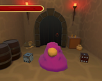
- The concept for this was really good, one of the best in my opinion. I love dice, and I love dungeon themed games. The art work and modelling was really good, the rooms were such high quality, and getting the dice to move smoothly was a nice touch. The UI at the start was clean and in game was just as good. The game just needs some actual gameplay, as it seems rolling the dice without knowing what scores do seems a little confusing and there is quite a lot you could expand on such as changing dice for effects and modifying the luck with skills that would all keep to the same mechanic of using dice as the damage. Overall its a really good idea and some tlc would take this pretty far for a starting point.
- Very nice idea with the dice being the only mechanic, understand there were some issues with the loss of a team member, however, feel the game could of been expanded on if given the chance, adding maybe some more encounters or choices the player could make with the roll of the dice, while keeping the dice the main and only mechanic in the game. Also, feels as if there was some inconsistanct when it came to the dice rolls, as I got double six in one case but it failed on opening a chest. The art was very well done and the models for the background and the monsters are lovely to look at when running through the game
- Theme The user only had one mechanic so I see how its true to the theme however just being a randomly generated dice roll doesn't offer much playability for the user the one mechanic should have been expanded upon some more to create a better game loop that's rewarding for the player. Playability It was an interesting idea that I feel needs to be fleshed out some more. As a player I felt the outcome of my dice roll didnt matter unless I was rolling for a chest. Twice I rolled a double 1 and one of the times was against the final boss which won the encounter which made me feel like my input didn't really matter. Taking some gameplay from dungeons and dragons inspired games showing the backend of what's happening would have made the game more enjoyable. For example a text box showing my roll + hit / miss and the damage I did. Then showing the roll for the enemy if they hit + miss and the damage I took would have made the gameplay more fun and give me a better understanding of what was happening and why. Creativity I liked the idea of the game and felt like it was a mechanic that could have more potential but it didn't really offer me too much choice or impact on what was happening. The environment fit the theme but could need a lot more polish, taking advantage of static objects and baking lighting along with some simple post processing could make the environment stand out more and the scene would feel a lot more solid and creative. The scenes with the monsters needed some more objects, the chest scene is a great example of the room feeling full and more like a room again some lighting tweaks and post processing could help set the mood. Having a unique enemy for each level would have also got extra points from me in this category. There was an opportunity to slightly modify some of the assets into a new enemy really easily such as a mimic chest, scale the bottom of a ghost in and put the pot asset underneath and you have a genie. Taking the assets that were already made and creatively making an enemy could bring some light comedy and stretch the creativity to expand on the content with really minimal effort. Again has potential and is a great achievement given the time. Presentation I liked some of the assets that were created and more variety in the enemies would have been welcome. Small details like the ghost bobbing up and down would have been nice and something really simple to do. I liked the UI text boxes that were giving me the story, the font was nice and the transition between scenes was good. Extra polish on pop up animations for these UI elements would take them to the next level but I did like the use of the image filled health bar a lerp of the value to animate the bar increasing and decreasing is a great way to push this further.
- Whilst the game had a nice concept that I think could do well in the current market as a rogue-like, the content shown was a little underwhelming. It personally felt as though I had no control over the results, on a draw sometimes I would win and sometimes I would take damage. Sometimes the dice rolled off the screen leaving me unable to see my result, as easy fix for this would be creating some collisions to stop them leaving the screen. The art was basic, but worked well with the style. If the enemies had a health bar and took damage based on the dice results I could see this being a much more interactive experience. The team had a solid mix of students and the report was detailed, however I feel the team would've benefited for more higher level members to flesh out their idea. Overall a solid idea but the execution left me unsatisfied, definitely a large amount of potential for a game like this however.
Leave a comment
Log in with itch.io to leave a comment.


Comments
Cool concept and arts, I think some things don't really work, or I don't quite understand the logic of the dice. Still very interesting as an idea, good.
It was made to a the theme of 'One Mechanic' so we could only have the player interact with the game in one way, so we chose dice. :D
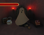
Really cool concept Ghost model was really cute and cool. Not sure the dice worked correctly though? I couldn't open either chest (got 6 first one, 1 second) and draws most of the times I got through a stage. Rooms looked awesome :D
The loot chest decides when you can open it haha XD
We ran out of time to properly bug test the game, as we had lost a teammate due to computer issues. So the dice might be inconsistent, but I hope the concept was shown (: