Play game
Big tower, tiny robot's itch.io pageResults
| Criteria | Rank | Score* | Raw Score |
| Theme Implementation | #6 | 3.500 | 3.500 |
| Playability | #14 | 3.000 | 3.000 |
| Artistic Expression | #16 | 2.929 | 2.929 |
Ranked from 14 ratings. Score is adjusted from raw score by the median number of ratings per game in the jam.
Judge feedback
Judge feedback is anonymous and shown in a random order.
- People love dance buttons very clever adding that in! Was a simple and fun tower climbing adventure. Designs in the background did feel a bit meshed at times.
- This was interesting, the jumping being mapped to "Z" made it hard to actually jump. The art style was really rough on the eyes and made it hard playing for long periods of time. Thank you for submitting the game looks great for a 1st time game.
Did you use the Additional Theme(s) ?
I Used the Additional Theme
Give a quick overview of your game, and how you worked the theme into it
There is a big tower. The robot is mechanical, and you must explore the tower to unlock new abilitys.
Leave a comment
Log in with itch.io to leave a comment.


Comments
This was a cute project! I liked unlocking new abilities and then learning how to use them with the level design, you did a good job with that!
Really cool game! The level design feels really nice and flow well with the introduction of new ability. Also I think the robot animation is really cute :)
The control does feels a bit too floaty for me but I get used to it after a while plus I think everything does kinda blend together and make it hard to distinguish obstacle.
But overall, this is a really fun game! Great work :D
Thanks I aprreciate the feedback! Yes I know it's not perfect there are alot of things that I could do better like maybe playing around with different colours or improving the movement.
Nice game!
Thanks!
Its a good game, simple and sweet. Here are the pros and cons:
Pros:
- I like the lil dancing you can do
- Reminded me of big tower tiny square
- The upgrades are simple but change the play style
- The music is a nice background music that fits the game
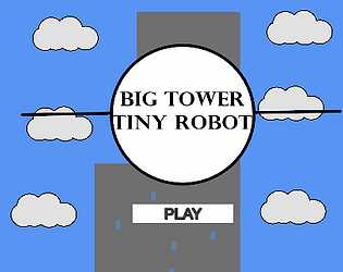
- I like the title screen
Cons:
- Movement feels floaty
- Background objects can blend with foreground objects
Thanks I aprreciate the feedback!I did take a little bit of inspiration from big tower tiny square. For the movment I kind tried to make it simalar to other games iv'e played such as hollow knight and super meat boy (which can be a little floaty), And I did notice that the spikes are the same color as the background and it makes them kind of hard to see.