

Play asset pack
Azealia, The Crime Daughter's itch.io pageResults
| Criteria | Rank | Score* | Raw Score |
| Creative Development | #34 | 3.000 | 3.000 |
| Final Presentation | #38 | 2.667 | 2.667 |
| Project Documentation | #42 | 2.667 | 2.667 |
| Research + Development | #46 | 2.667 | 2.667 |
| Overall | #48 | 2.667 | 2.667 |
| Technical / Workflow | #54 | 2.333 | 2.333 |
Ranked from 3 ratings. Score is adjusted from raw score by the median number of ratings per game in the jam.
Judge feedback
Judge feedback is anonymous and shown in a random order.
- A very nice effort, and a very promising start. There's a few technical issues that hold this entry back. The main issue is the retopology, its far too high poly for shape for the character, and relying on decimation master to produce final game quality results alone is not going to give you production level quality results. Texture wise there are 3 different 2048 sets, these could easily have been all on one single 4096, and given you room for additional details, or to resize some of your existing islands. That said, this is a very promising start. I'd really encourage you to go back to the original sculpt and work on the form some more and then spend a bit more time on the low poly version and you'll have a really impressive portfolio piece.
- Submission title: Azealia, The Crime Daughter Student name: Morgan Crossley Challenge tier: Rising Star Assessor name: Caleb O’Brien - Junior Character Artist @Firesprite Research & Development Good research into the theme to help inform the characters design. I like your Silhouette sketch which captures the essence of the character; however, it would have been great to see how you took this idea and iterated on it to settle on a final design. Perhaps through exploratory sketches or rough 3D blackouts with 2D paint overs etc. Nice work and it’s great that you’ve been really ambitious, challenging yourself with creating a character to fit within a specific art style and world. This was a really smart move as it provides you with clear and defined boundaries in which to work within that has helped you to focus in on your own interpretation and have fun with it. Technical Art Game mesh and UVs Some areas are working well and demonstrating examples of good topology, such as the face, lower arms and upper legs which feature evenly spaced loops and a more appropriate density of quads. However, the mesh is slightly too dense and non-uniform overall. One area that stands out the most to me is the shoulders/upper arm which is lacking flow and consistency. This is an area that you would ideally benefit from clean loops running around the shoulder so as to allow for the best result when the character deforms. In most cases, decimation master isn’t suitable for creating game meshes for characters as the meshes will simply not hold up well during deformation. Decimated meshes are also extremely difficult to UV map successfully and you may be left with a faceted surface in engine. Totally understandable to try and save time here, especially working on such a tight timeframe for the challenge. In future I would suggest giving more priority to the retopology/game mesh stage as it really is the key element to ensure your work would be suitable in a game setting. I’d highly recommend using something like quad draw in maya and going in by hand to place quads for a more consistent and successful result. Think of this stage like sculpting, laying down your primary forms broadly with quads before increasing the density to support secondary/tertiary details with geometry. Something else to consider which may help and make things more manageable to work with is splitting you meshes where they would naturally be separated in real life, for example you could break the forearm off from the jacket sleeve to create a cleaner transition across the elbow. UVs are grouped appropriately into separate texture sets for each element. The UV layouts themselves could do with neatening up a little as the angle/direction of UV islands feel quite random. Try to avoid odd angles for UV islands as stepping will occur, especially at lower resolutions. Consider studying successful game meshes with clean gridded out quads and efficiently packed UVs, here’s a great example www.artstation.com/artwork/g8oDYG Rig Great to see you posing your character and the blender solution seems to have given you a successful result despite potential issues with the game mesh. Creative Art Overall I think this is where your project shines brightest for me, most notably in the strong personality you’ve captured. You’ve created a really interesting character with lots of unique elements. I especially love the design of the steampunk style parts like the leg which are cohesive with your original theme and inspiration. The character has a lot of personality which is pushed further with your poses and it’s great that you’ve created a prop asset to help present your character in context. Sculpt The sculpt is successful overall and I can tell you’ve put a lot of work into the head and hair which are setting a good benchmark for your desired style, sitting closest to the Arcane treatment. I feel that you could have pushed a few areas further with the rest of the body in order reach the same quality bar you achieved with the head/hair. Some sculpted forms are feeling quite soft overall such as the shoulder pad and shorts. Sharpening up certain surfaces and defining sharper edges may help to bring in a nice balance between organic and hard surface elements. Don’t be afraid to really push certain shapes to strengthen the visual read and silhouette, like for example enlarging the shoulder piece. The character may also benefit from more asymmetry in certain elements, such as the scarf. Documentation A clear and concise insight into the characters development with supporting annotations going into more detail. Pre-production Really solid intro with some nice insight into your chosen theme and inspiration. It’s great that you took the time to create some mood boards and gather reference to help achieve the specific Arcane art style. Production Clear overview of development with some nice insight into specific tools and processes used. Post-production I think some insight into the engine set up and lighting rig would be a bonus here as the document rounds off sharply to a finish after the rigging phase. I’d have loved to see a brief summary of your tools used to create this piece, along with a short retrospective discussing your lessons learnt and how you will improve on your next character. Final Presentation Nice work creating a number of poses to portray the personality of your character. The lighting is feels moody and dark which is in keeping with the project themes and the composition of the final renders is strong. I think the renders could benefit from a slightly different background and lighting set up as some of the features of the character blend into the backdrop and are a slightly hard to read. The lighting feels slightly blown out especially against the skin, perhaps leaning towards a more traditional 3 point set up would give you a clear result. I think your final shots could feature an image with multiple turnarounds on one page in order to give a good look at the character from every angle. Currently the viewer is constrained to one angle from which to view your work. If this were for a character art portfolio, I’d love to see your final renders supported by some more breakdown type shots of your character in A-pose with wireframe overlayed and turnaround shots from different angles. Be sure to show off some renders of your final sculpt too as it’s nice to see how this has translated into the final game res character. Overall some really nice work. The project demonstrates a lot of great potential and a good understanding of the character creation workflow for games. I recommend that you keep at it and continue creating awesome characters, you will only improve the more you tackle interesting challenges and work through the pipeline. Stay inspired and keep making awesome art I’m looking forward to seeing what you create next! Feel free to reach out to me if you have any questions or would like any further feedback.
Challenge Tier
Rising Star
Leave a comment
Log in with itch.io to leave a comment.
Comments
re-posting feedback with spacing, hopefully this is a bit easier to read through!
Submission title: Azealia, The Crime Daughter
Student name: Morgan Crossley
Challenge tier: Rising Star
Assessor name: Caleb O’Brien - Junior Character Artist @Firesprite
Research & Development
Good research into the theme to help inform the characters design. I like your Silhouette sketch which captures the essence of the character; however, it would have been great to see how you took this idea and iterated on it to settle on a final design. Perhaps through exploratory sketches or rough 3D blackouts with 2D paint overs etc. Nice work and it’s great that you’ve been really ambitious, challenging yourself with creating a character to fit within a specific art style and world. This was a really smart move as it provides you with clear and defined boundaries in which to work within that has helped you to focus in on your own interpretation and have fun with it.
Technical Art
Game mesh and UVs
Some areas are working well and demonstrating examples of good topology, such as the face, lower arms and upper legs which feature evenly spaced loops and a more appropriate density of quads. However, the mesh is slightly too dense and non-uniform overall. One area that stands out the most to me is the shoulders/upper arm which is lacking flow and consistency. This is an area that you would ideally benefit from clean loops running around the shoulder so as to allow for the best result when the character deforms.
In most cases, decimation master isn’t suitable for creating game meshes for characters as the meshes will simply not hold up well during deformation. Decimated meshes are also extremely difficult to UV map successfully and you may be left with a faceted surface in engine. Totally understandable to try and save time here, especially working on such a tight timeframe for the challenge. In future I would suggest giving more priority to the retopology/game mesh stage as it really is the key element to ensure your work would be suitable in a game setting. I’d highly recommend using something like quad draw in maya and going in by hand to place quads for a more consistent and successful result. Think of this stage like sculpting, laying down your primary forms broadly with quads before increasing the density to support secondary/tertiary details with geometry.
Something else to consider which may help and make things more manageable to work with is splitting you meshes where they would naturally be separated in real life, for example you could break the forearm off from the jacket sleeve to create a cleaner transition across the elbow.
UVs are grouped appropriately into separate texture sets for each element. The UV layouts themselves could do with neatening up a little as the angle/direction of UV islands feel quite random. Try to avoid odd angles for UV islands as stepping will occur, especially at lower resolutions.
Consider studying successful game meshes with clean gridded out quads and efficiently packed UVs, here’s a great example www.artstation.com/artwork/g8oDYG
Rig
Great to see you posing your character and the blender solution seems to have given you a successful result despite potential issues with the game mesh.
Creative Art
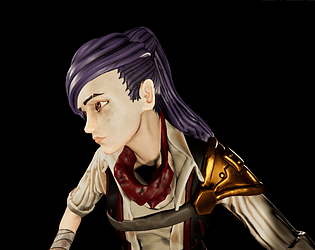
Overall I think this is where your project shines brightest for me, most notably in the strong personality you’ve captured. You’ve created a really interesting character with lots of unique elements. I especially love the design of the steampunk style parts like the leg which are cohesive with your original theme and inspiration.
The character has a lot of personality which is pushed further with your poses and it’s great that you’ve created a prop asset to help present your character in context.
Sculpt
The sculpt is successful overall and I can tell you’ve put a lot of work into the head and hair which are setting a good benchmark for your desired style, sitting closest to the Arcane treatment. I feel that you could have pushed a few areas further with the rest of the body in order reach the same quality bar you achieved with the head/hair. Some sculpted forms are feeling quite soft overall such as the shoulder pad and shorts. Sharpening up certain surfaces and defining sharper edges may help to bring in a nice balance between organic and hard surface elements. Don’t be afraid to really push certain shapes to strengthen the visual read and silhouette, like for example enlarging the shoulder piece. The character may also benefit from more asymmetry in certain elements, such as the scarf.
Documentation
A clear and concise insight into the characters development with supporting annotations going into more detail.
Pre-production
Really solid intro with some nice insight into your chosen theme and inspiration. It’s great that you took the time to create some mood boards and gather reference to help achieve the specific Arcane art style.
Production
Clear overview of development with some nice insight into specific tools and processes used.
Post-production
I think some insight into the engine set up and lighting rig would be a bonus here as the document rounds off sharply to a finish after the rigging phase. I’d have loved to see a brief summary of your tools used to create this piece, along with a short retrospective discussing your lessons learnt and how you will improve on your next character.
Final Presentation
Nice work creating a number of poses to portray the personality of your character. The lighting is feels moody and dark which is in keeping with the project themes and the composition of the final renders is strong.
I think the renders could benefit from a slightly different background and lighting set up as some of the features of the character blend into the backdrop and are a slightly hard to read. The lighting feels slightly blown out especially against the skin, perhaps leaning towards a more traditional 3 point set up would give you a clear result.
I think your final shots could feature an image with multiple turnarounds on one page in order to give a good look at the character from every angle. Currently the viewer is constrained to one angle from which to view your work.
If this were for a character art portfolio, I’d love to see your final renders supported by some more breakdown type shots of your character in A-pose with wireframe overlayed and turnaround shots from different angles. Be sure to show off some renders of your final sculpt too as it’s nice to see how this has translated into the final game res character.
Overall some really nice work. The project demonstrates a lot of great potential and a good understanding of the character creation workflow for games. I recommend that you keep at it and continue creating awesome characters, you will only improve the more you tackle interesting challenges and work through the pipeline. Stay inspired and keep making awesome art I’m looking forward to seeing what you create next!
Feel free to reach out to me if you have any questions or would like any further feedback.