Play game
BLINDED BY THE LIGHT's itch.io pageResults
| Criteria | Rank | Score* | Raw Score |
| Graphics | #39 | 3.300 | 3.300 |
| Audio | #53 | 2.700 | 2.700 |
| Overall | #58 | 2.733 | 2.733 |
| Game Design | #70 | 2.700 | 2.700 |
| Fun | #77 | 2.500 | 2.500 |
| Innovation | #79 | 2.400 | 2.400 |
| Theme | #80 | 2.800 | 2.800 |
Ranked from 10 ratings. Score is adjusted from raw score by the median number of ratings per game in the jam.
Leave a comment
Log in with itch.io to leave a comment.


Comments
Thanks for playing and rating :)
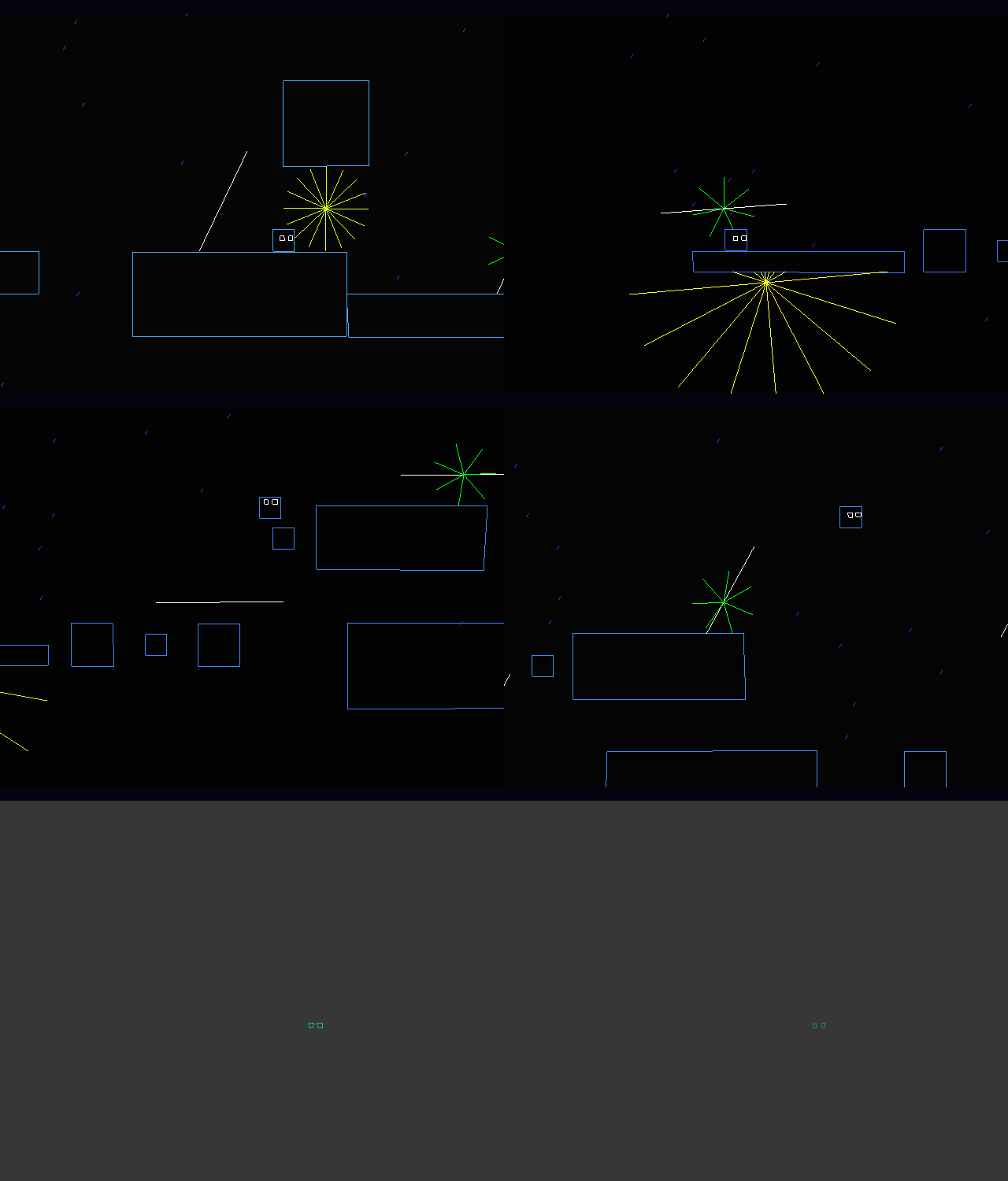
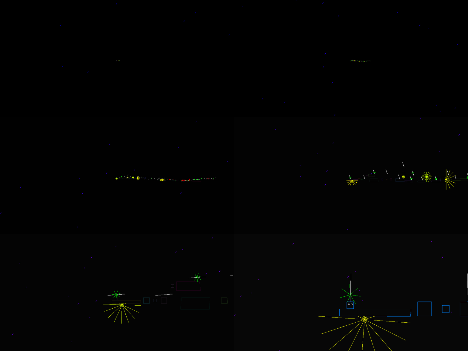
I like the aesthetics, it's simple but appealing. But, man, the navigation is so confusing. The camera movement at the edge of screen makes me lose spatial sense. When this movement is combined with a blinding light I just can't tell what's happening. Also there's a jump I can't figure out how to make.
Thanks for playing! I know the game is a bit weird, but I tried to make it difficult to just phase through everything. I tried to design the game, so the player had to think about how to navigate, so actually the losing spatial sense part was intentional, but I also tried to make interesting gameplay, which was hard for this design. I ended up not having enough time to execute the design, but I got visuals/audio which was neat. Glad you enjoyed the aesthethics!
I really like the aesthetics! The jump mechanic need to be a little polished and maybe a more intuitive UI would help. Nice job!
Yeah I definitely agree. I am happy you liked the aesthetics as that was my focus! Thanks for playing :)
There was a jump I couldn't make, it felt like the cube couldn't jump high enough. This is where you have to jump on the little cubes, you have one above you and one far to the right with the white lines spinning. Couldn't reach any of the two, am I doing something wrong?
What you are supposed to do is to use the tp/respawn mechanic to get the extra height. But it's not really that obvious i know :p Thanks for playing!