Play game
The Dark Count's itch.io pageResults
| Criteria | Rank | Score* | Raw Score |
| Completeness | #13 | 3.667 | 3.667 |
| Fun | #21 | 3.000 | 3.000 |
| Innovation | #26 | 3.000 | 3.000 |
| Overall | #52 | 3.000 | 3.000 |
| Roguelikeness | #63 | 3.000 | 3.000 |
| Scope | #66 | 2.667 | 2.667 |
| Aesthethics | #84 | 2.667 | 2.667 |
Ranked from 3 ratings. Score is adjusted from raw score by the median number of ratings per game in the jam.
Judge feedback
Judge feedback is anonymous and shown in a random order.
I think that breaking combat down into an “Attack” and “Defense” phase is an effective way to add tactical decision making into a roguelike. I appreciated the different enemies- the brutes have knockback, the smaller enemies can be stunned but are dangerous in groups etc. These simple characteristics add a good amount of depth to skirmishes with multiple enemies, and the the momentum system incentivises aggressive play.
Unfortunately I think dominant strategies that are present in traditional bump to attack systems are still present here. I ultimately won by maneuvering all the enemies into a line and stunlocking Zulu to death.
Outside of the combat I think the overall game arc could use some tuning. As far as I could tell the only way to progress was to defeat enemies until Zulu spawns when a certain threshold has been reached. I understand generating a city for thematic reasons, but I think its size led to a lot of aimless wandering while looking for enemies. If the focus of the project is on moment-to-moment decision making in combat, then the large size and relative vacancy of the city does not contribute to this goal very effectively.
The combat feels like a beat-em-up/brawler game, and in that vein I think a smaller map, or a more condensed experience would really help the combat system shine.
Other bits:
-Winnable but challenging, whenever I lost I felt the urge to play again.
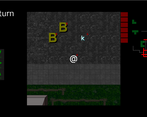
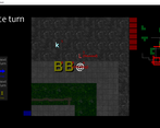
-UI for movement and attacking is very clear
-Despite my complaints about progression this feels like a complete, well considered experience
-Tiles felt a little muddy, there was a dark grey structure that occurred sometimes that looked like it should be walkable
-I am not sure what the red streets on the minimap are
-I was not sure in which scenarios I could parry, it seemed like most of the time but not all of the time. This made it a little bit harder to plan effectively.
I came into this feeling pretty wary over the idea of something turn based trying to take gameplay elements of combat from real-time action games. I came out of it still a bit wary, but the execution isn't too bad after a couple of playthroughs. I imagine the combat system would work better with more visual cues from the game screen ( such as character animation ) than just text prompts and the movement prompts on the side.
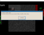
The interface and graphics are about what I expect from a 7DRL, nothing spectacular, but actually functional. The pop-ups of what I assume were ZULU talking were a nice touch in design.
Didn't manage to beat ZULU but did get him to appear.
I'm definitely intrigued by the combat system, and hope to see a post judging version with improvements.
A perfectly-sized 7DRL focused on tactical combat. The breakout between attack and defense turns is really cool and adds a lot of strategy to the combat. Movement and placement becomes important - so is keeping the right space between you and your enemies. There isn't much else here in terms of roguelikeness but what is there is executed flawlessly.
Successful or Incomplete?
Leave a comment
Log in with itch.io to leave a comment.


Comments
Neat story. I included it in my 7DRL Challenge compilation video series, if you’d like to take a look. :)