


Play asset pack
System Control's itch.io pageResults
| Criteria | Rank | Score* | Raw Score |
| Technical | #9 | 3.464 | 4.000 |
| Presentation | #13 | 3.175 | 3.667 |
| Overall | #13 | 3.118 | 3.600 |
| Documentation | #13 | 3.175 | 3.667 |
| Creative | #16 | 2.887 | 3.333 |
| Research & Development | #19 | 2.887 | 3.333 |
Ranked from 3 ratings. Score is adjusted from raw score by the median number of ratings per game in the jam.
Judge feedback
Judge feedback is anonymous and shown in a random order.

Submission Title: System Control
Submission Tier: Search for a Star
Assessor: Anthony O’Donnell Lead Artist Firesprite
Concept design & Development:
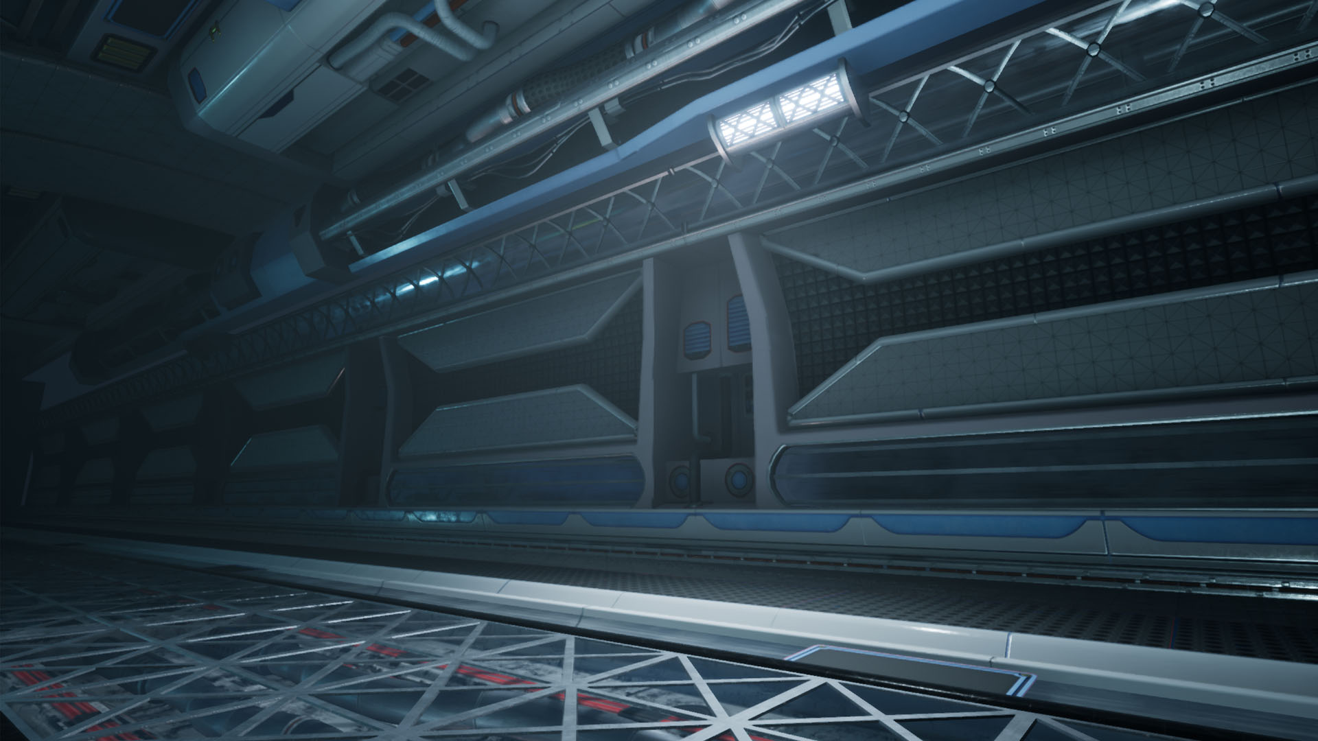
Reference gathering was seemingly kept to fictional sci-fi material. One tip is to also research real world elements as there are many sources of inspiration out there from industrial machinery to modern architecture that may lead you to a more unique end result.
The blockout phase was handled well and iteratively developed. The traditional sketches to work out the finer points of the panel designs is a good approach.
Technical Art:
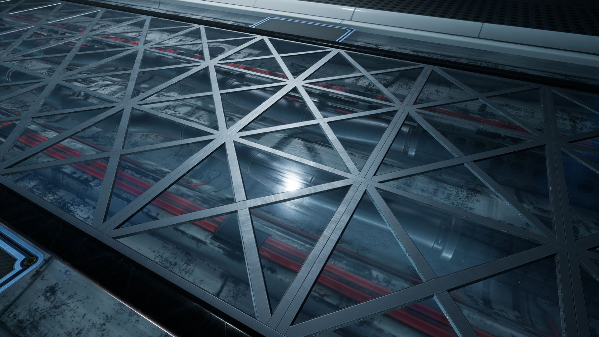
Correct trim sheet usage is a major plus. This approach is used in the majority of games due to memory limitations and the desire to have high fidelity art.
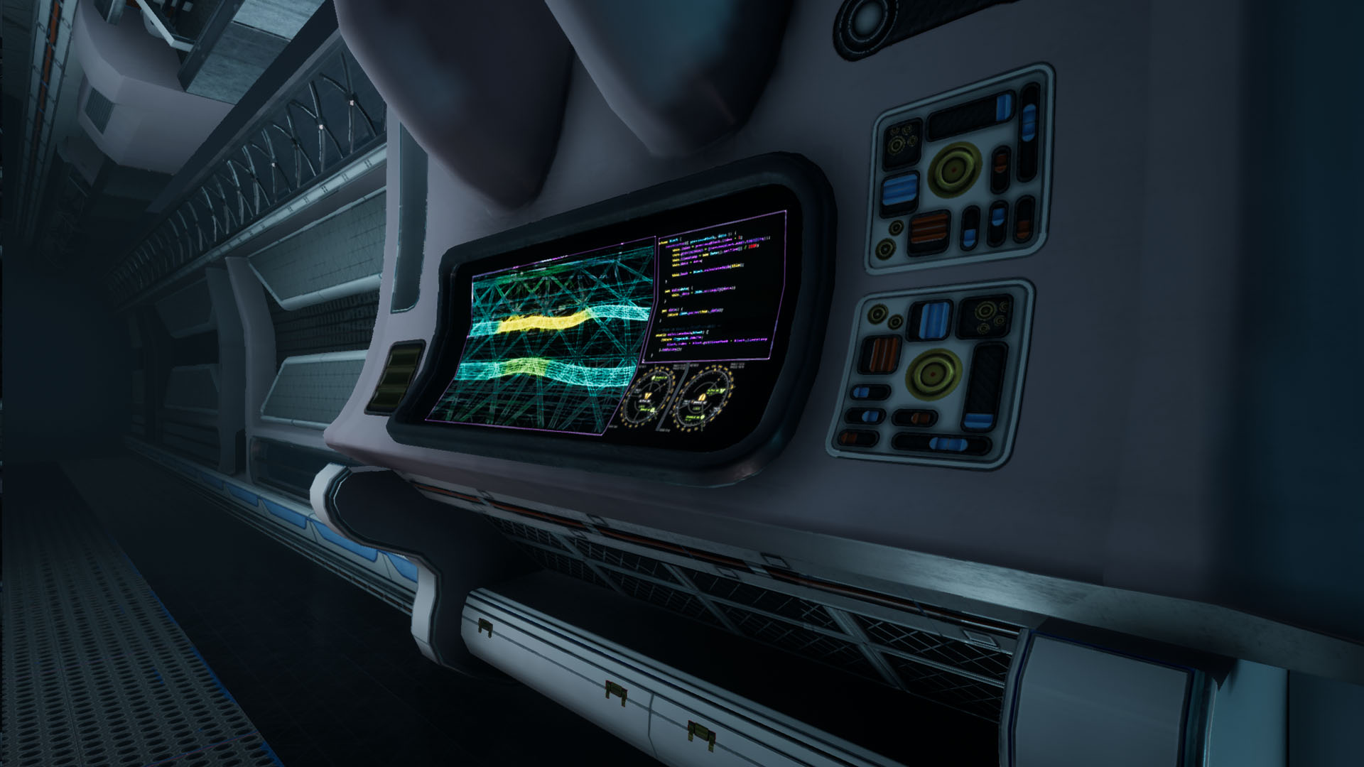
Lightmap density was kept very consistent. The albedo values sit well together and also had some variation.
The generation of an ID map for use in Painter at the high poly trim sheet stage showcases knowledge of this workflow.
Given the extra memory cost of an Alpha channel (especially on a 4K texture) I would suggest in future to separate the decal ( Alpha elements to their own 512 X 4096 ) texture this would save 10MB from the 4k Trim sheet.
Channel packed textures are used well, these data maps were correctly set to “Mask – no SRGB”.
Materials are straightforward. They did have some nice roughness and metallic variation to give off some aesthetically pleasing surface responses to the light.
The use of face weighted normals is on point for hard surface modelling.
Models were clean with sensible poly distribution.
Creative Art:
One of the obvious missing elements as discussed in the production diary was the hero asset ( Cryo Chamber ) it is likely possible to have built this using the trim sheet and decals and other materials in the scene thus taking advantage of the flexibility of this workflow.
Lighting wise more could have been done to get light further down the corridor instead of having this “stage lit” style setup which works to focus the viewer in this one instance. Reducing the light intensities as they recede into the distance will give the space a better sense of scale. Also some light emitting from the screen and affecting the environment would help.
Written Documentation:
The production diary is simple and clear offering some insights into workflows used and the development of the environment.
Final Presentation:
The final images look good but lack a strong focal point , narrative context and life. Additional assets to dress the scene may flesh it out more and add this. Camera effects such as depth of field could have added a little. Being a maintenance / industrial corridor some suggestions would be to add a maintenance droid fixing something, exposed panels where work is being done. Some directional signage to show which floor / corridor / section will add context.
Research and Development - I would of liked you to of explained your research some more as it was obviously something you were passionate about. What movies were you watching and did you have a main source of inspiration? What was the purpose of this hallway? the project is labelled Cryo chamber but I don't actually see this mentioned anywhere during your research and development.
Technical - Given the limited amount of time you had for this it was a wise decision to cut your scope and I think you pulled off your assets very well with the method you outlined. Materials read as they should mostly but I think some of them are a little flat and missing some of that grunge that the lighting setup implies.
Creative - I unfortunately dont think your scene was particularly creative as these kind of sci-fi hallways are a very popular at the moment due to the ease of UE4s modular workflow. That being said the machine in the middle is of an interesting design and the mood you have created with the lighting is interesting also.
Documentation - I have taken a couple of stars off here as it was a little difficult to read. It wasn't clear if some of the images shown were of your development work or a moodboard of inspiration.
Presentation - Overall the scene was presented well. A playable exe would of been preferred to demo your scene.
Challenge Tier
Leave a comment
Log in with itch.io to leave a comment.