


Play asset pack
Realistic Dentist Office's itch.io pageResults
| Criteria | Rank | Score* | Raw Score |
| Research & Development | #2 | 4.400 | 4.400 |
| Documentation | #5 | 4.000 | 4.000 |
| Presentation | #6 | 4.000 | 4.000 |
| Overall | #7 | 3.800 | 3.800 |
| Technical | #11 | 3.400 | 3.400 |
| Creative | #14 | 3.200 | 3.200 |
Ranked from 5 ratings. Score is adjusted from raw score by the median number of ratings per game in the jam.
Judge feedback
Judge feedback is anonymous and shown in a random order.
It's a nice scene and you are close to your goal. A few areas let it down that you should investigate.
The lighting feels just a little too bright - you lose some shape definition on the white walls/ceilings.
The floor looks too matte - feels like it should be more reflective/shiny.
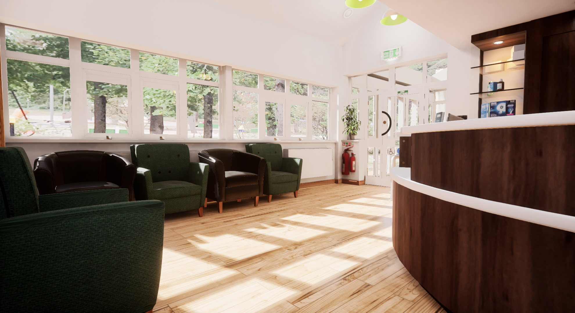
The exterior through the windows breaks the realism goal the most - it looks low resolution, and with that amount of light inside the building you'd expect a camera to adjust and the outdoor area to be overexposed.
Submission Title: Realistic Dentist Office
Submission Tier: Search for a Star
Assessor: Anthony O’Donnell Lead Artist Firesprite
Concept design & Development:
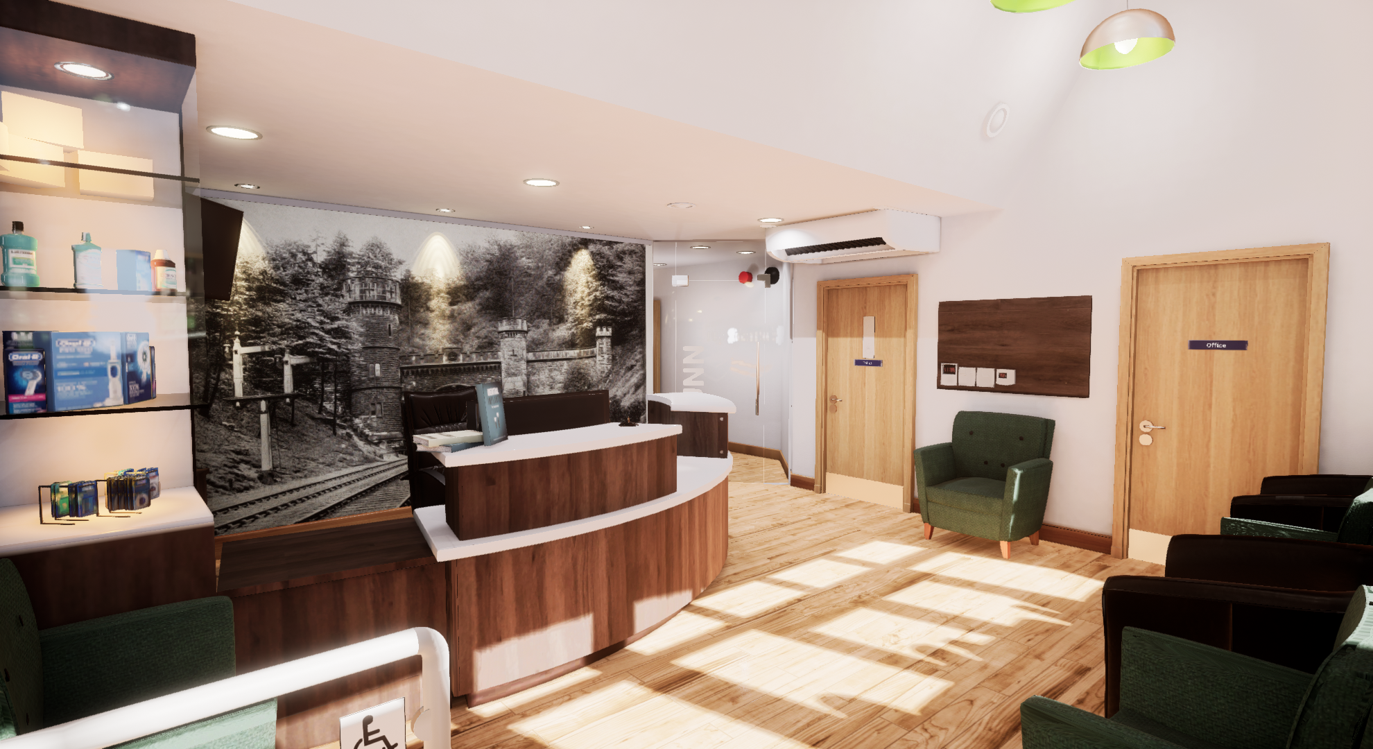
This project taking a real-world environment is quite challenging as a lot of the work is done via subtle detailing and requires close observation of the reference. It was good to see many iterations of this scene throughout the production diary as materials / lighting and geometry detail was iterated upon. The scene gradually improved as it progressed to its final state.
Technical Art:
UV layout for baked assets such as the chairs are somewhat inefficient as many longer thinner UV shells are left curved thus reducing the overall space available for other UV shells. One way to get around this is to cut these longer thinner sections at the corners creating straight shells. These will be better for UV packing.
In terms of lighting the scene has worked well overall. A few minor points would be to refer back to the reference to see how intense the effect of light on the back wall is from the ceiling spotlights. In the 360 google map images the intensity is lower with a subtler effect as opposed to what appears in the final render. It is easy to over egg these kinds of things in CG but if a more realistic look is desired a lot more fine iteration and regular referral back to the reference is key.
The chair meshes were very excessive in terms of poly count and could have easily been reduced. Also they have multiple unused UV sets adding to the already high vertex cost. A more efficient approach to the chairs would have been a macro normal map ( unique unwrap UVs ) for bespoke detailing. On top of this a tileable fabric texture could have been used as a detail map.
Assets such as the doors, skirting and reception desk were baked but would have been better suited to tileable textures. Especially for VR where you get close to surfaces the current approach would not hold up as well.
In terms of scale accuracy within the scene the artist has done a fairly good job. There are a few areas where elements are slightly off which could be improved later such as the depth of the tops of the reception desk. These are thicker in the UE4 scene.
Material definition – The roughness values were mostly solid with little variation per surface aside from the floor and chairs. To improve the quality of the scene some surface variance to show wear and tear from foot traffic etc can be introduced in the other areas. It was good to see variation across the many surface types such as the rougher wall and smoother floor.
Creative Art:
Building a realistic environment in a game engine is always a challenge. This attempt succeeds in the final images. To hold up in a VR environment some different approaches would need to be utilised for asset creation.
It’s likely an aesthetic choice but compared to the reference the exposure has been cranked up blowing out a lot of visible detail in UE4. Instead of relying on the post process to deal with the darker areas of the lighting. Using a skylight and increasing the number of bounces would have also worked.
Written Documentation:
The production diary is well presented and goes into some detail regarding the approach taken to reconstruct the environment in 3D. The research gathering of surfaces and props was well rounded offering enough information to produce an accurate asset.
Final Presentation:
The final images work well and the scene matches the source reference pretty good. The lighting setup took advantage of the scene layout and existing artificial light sources.
Recreating somewhere or something you can visit or see first hand is always good practice for trying to create something as real as possible. It looks like here it has paid off.
Your scene is very nicely lit and really feels like an arch/vis render in terms of lighting and presentation. I do think this would work well in VR for exploring the room especially as everything is to real world dimensions and scale.
Your mesh density is a little high for game ready assets but is a little more acceptable in a true arch/vis render setup (however considering a scene like this for VR will have more strict limitations to polys etc for performance reasons). Also watch out for repetition in the floor texture. Taking a larger photo or removing more of the repeating elements would help this.
You look to have learnt a lot during this process. Looking back at those first attempts you did you can see just how out of scale they were, even if at the time they may have appeared correct. Your final result feels correct and unified.
I would have like to have seen a breakdown of more assets, including your organic asset and i agree your texture resolution should have been higher on several assets, but the lighting of this scene is defiantly a stand out aspect and makes up for a lot of those lower textures.
Good luck,
Really nice to see some archviz level of environment. Really well laid out assets and foundation for this type of environment. Scale material definition is spot on. I would be careful though how you UV unwrap certain assets such as the leather chair as the UV sheet had a lot of UV shells. Not sure if this impacts the quality of the asset but in general practice, its good to have as few as possible UV shells. I would also expect scientific calibrated material values for this level of archviz quality which is has. Finally I would have prefered the renders to have been a sharp as possibly, go above 4k res if need be. Those images need to pop.
lovely work all round. its beautifully photo real, and i can see thats the avenue you should be striving for. It opens up alot of doors, like architure mockups, in game, even film.
But for note. the uvs seem a little unneccerily spaced out in some area, and i understand why, but as the chair, the example, you can still cut those small bits down futher, and place them around the large. uv isalnds for small componenets can be broken up more if using a program like substance. as long as you watch out for mipmapping
i loved the whole scene, but copyright issues (i belive when copying say the tooth brushes there is a element you can copy, to say its similar, but not the same, ie 20% differnt or more, but that needs researching for labeled products). make it very similar but not the same. unless requested.
and finally the light for me is ever so slightly too bright. but it does make it look clinical. The outside sun to me on the floor is so bright it distracts from the beauty of the scene. just something to watch out for in future.
superb work, keep it up
Challenge Tier
Leave a comment
Log in with itch.io to leave a comment.