


Play asset pack
City Bowels (Cyberpunk Environment)'s itch.io pageResults
| Criteria | Rank | Score* | Raw Score |
| Research & Development | #1 | 4.800 | 4.800 |
| Technical | #1 | 4.800 | 4.800 |
| Creative | #1 | 4.600 | 4.600 |
| Overall | #1 | 4.600 | 4.600 |
| Documentation | #2 | 4.600 | 4.600 |
| Presentation | #4 | 4.200 | 4.200 |
Ranked from 5 ratings. Score is adjusted from raw score by the median number of ratings per game in the jam.
Judge feedback
Judge feedback is anonymous and shown in a random order.
Brilliant
Submission Title: City Bowels
Submission Tier: Search for a Star
Assessor: Anthony O’Donnell Lead Artist Firesprite
Concept design & Development:
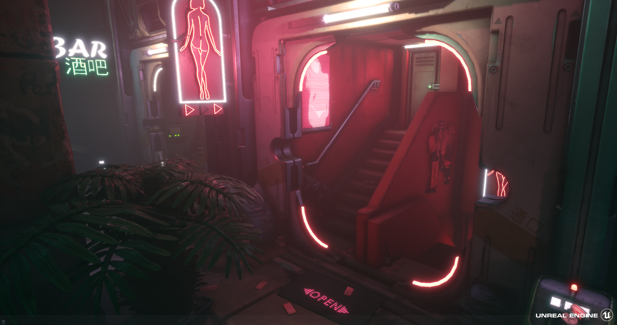
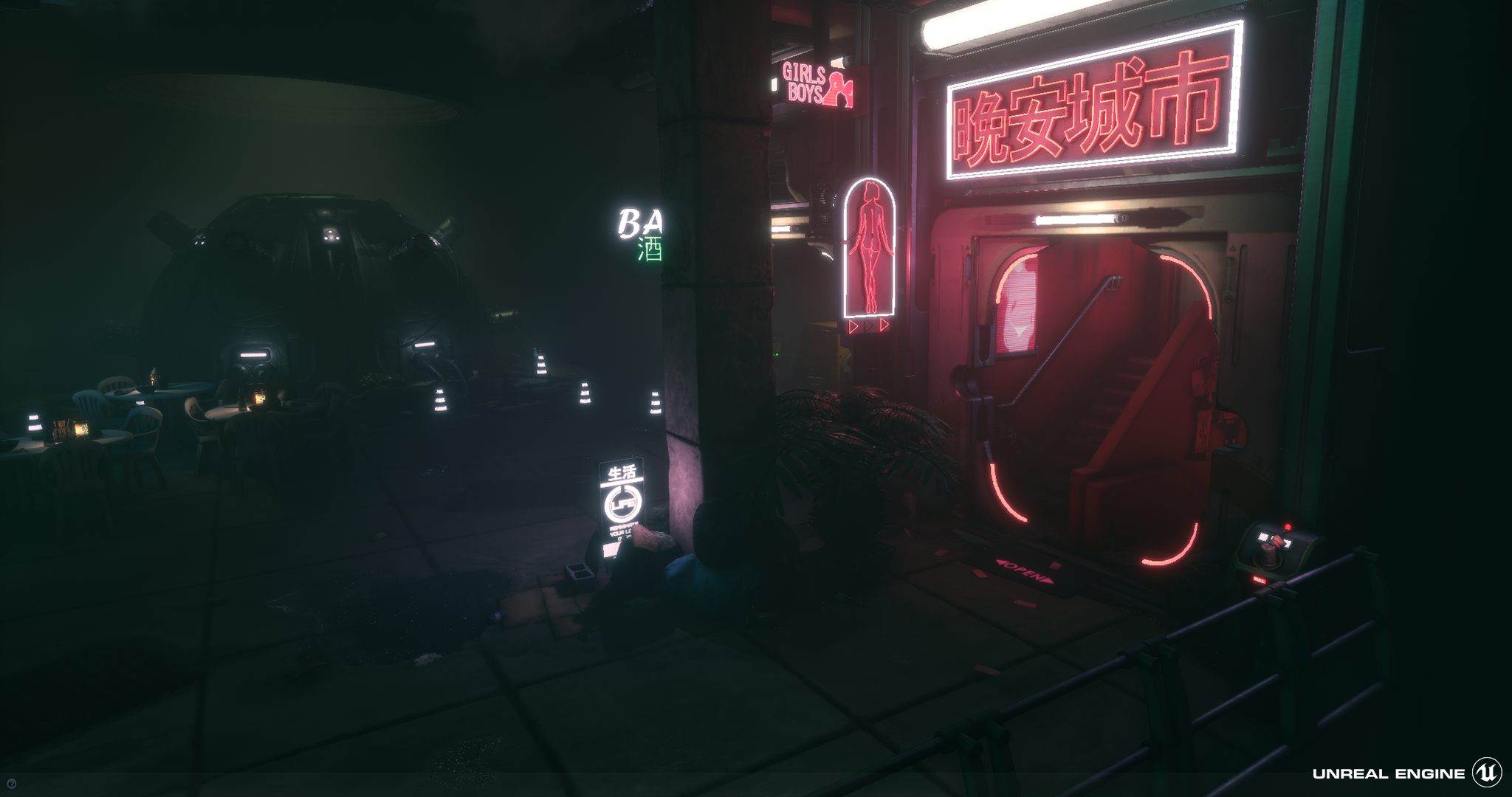
Extensive research was carried out centred around the Cyberpunk theme. The influence of this research can be seen in the final images. It was good to see the progression of the rooms in the production diary. Having clear purposes for each area is a good decision as they are distinctive.
Technical Art:
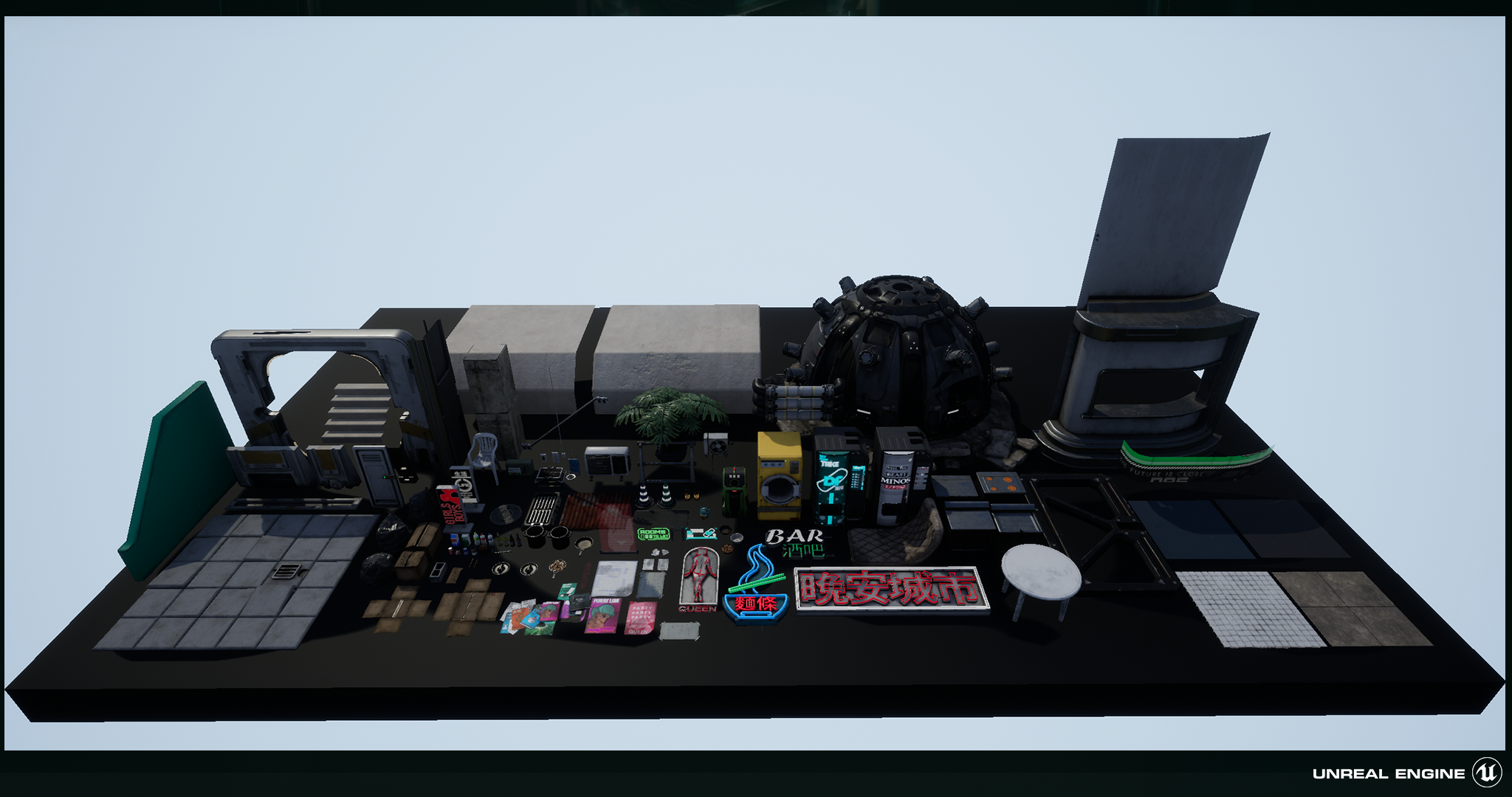
It’s evident a lot of work was put into this scene. A variety of valid game art production techniques were used to create it.
The assets submitted for the Marmoset Viewer seem to be cleanly modelled and have good material definition with nice roughness variation.
The use of Substance Designer for tileable textures is a plus. Material blends were used to add variation to the surfaces along with decals which add a lot to the ambience within the scene.
Texture masks to apply dirt in UE4 in a more granular way is a good technique albeit memory heavy. A future consideration would be to channel pack these together or add them to the assets Data texture especially as the red channel was not used.
The majority of the assets were baked down. The use of trim sheets for the door and other areas would be a more efficient approach and allow for more reusability.
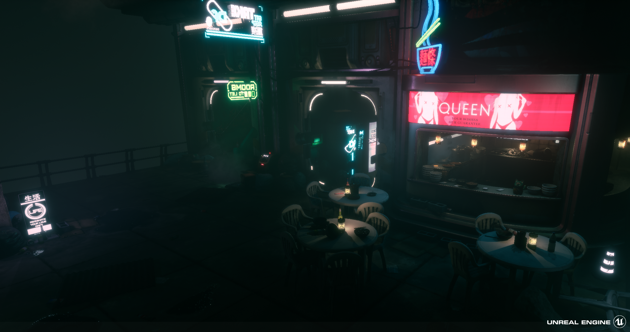
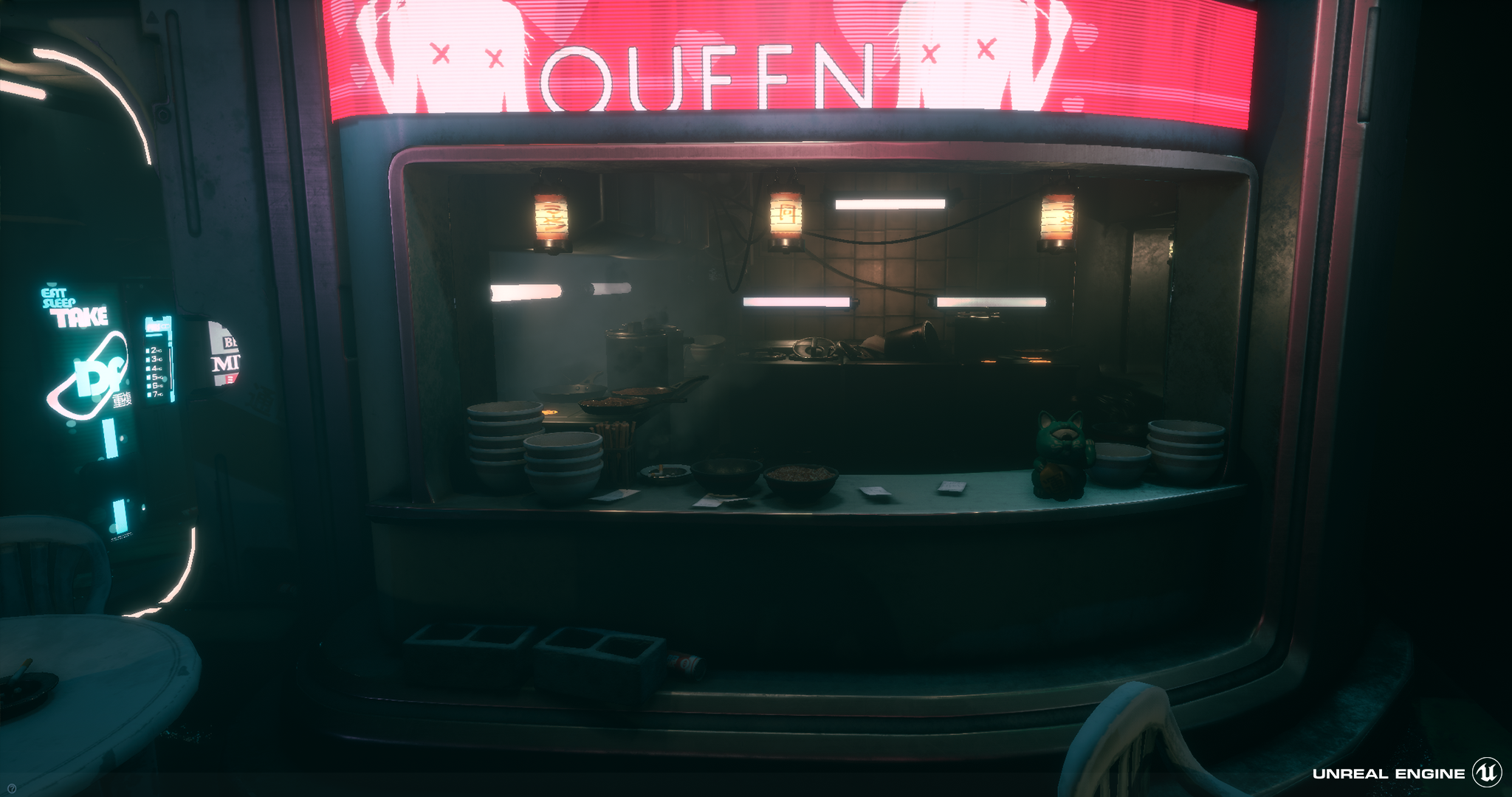
The kitchen assets production techniques were appropriate for their location in the scene. The artist’s decision not to spend unnecessary time on them shows an understanding of how a scene may be viewed and how to take advantage of this to keep the scene efficient.
The neon signs could have used “Use Emissive for Static Lighting”
The use of tessellation on flat surfaces for vertex blending is heavy handed. Much less geometry and the use of a texture noise mask to breakup the vertex colours via the material would have achieved a similar result for a lesser rendering cost.
https://80.lv/articles/tutorial-vertex-painting-in-ue4/
Lightmap density was a bit inconsistent. Channel packed textures were used.
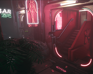
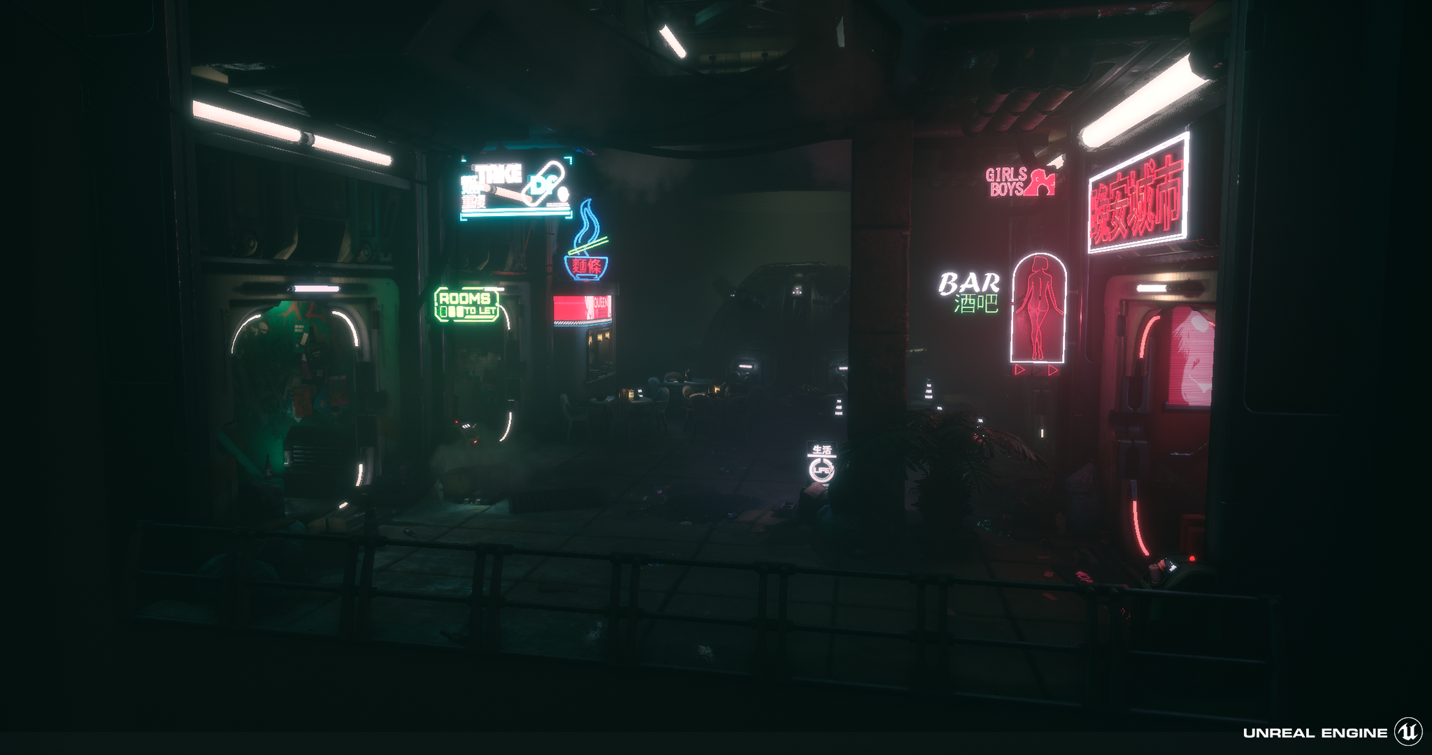
The use of particles and UV panners on signs add life to the scene.
Creative Art:
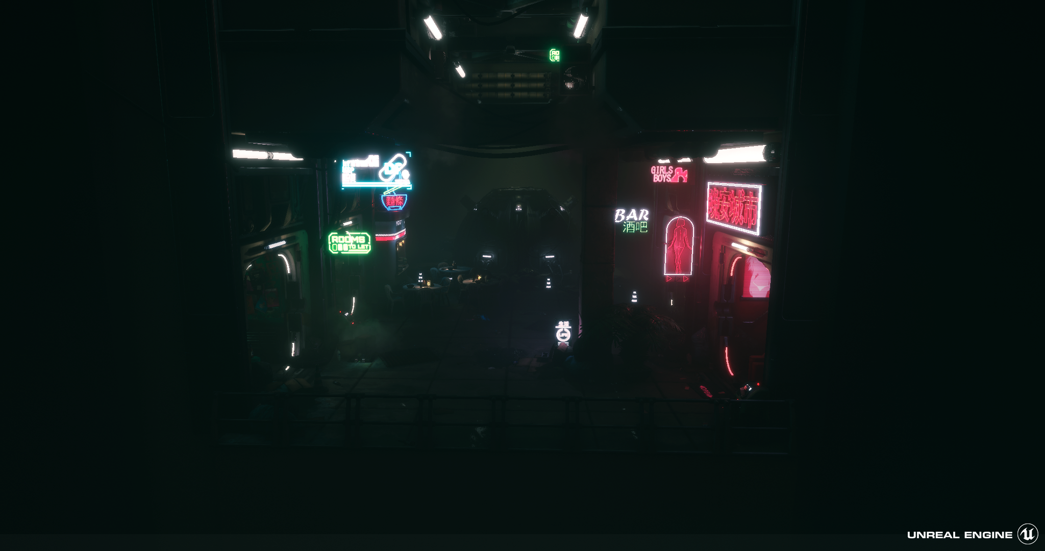
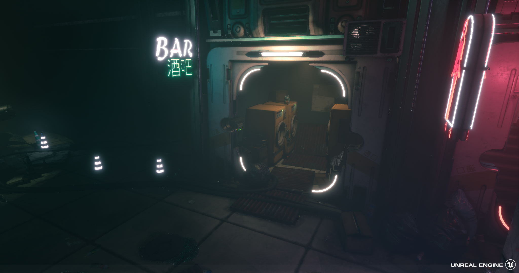
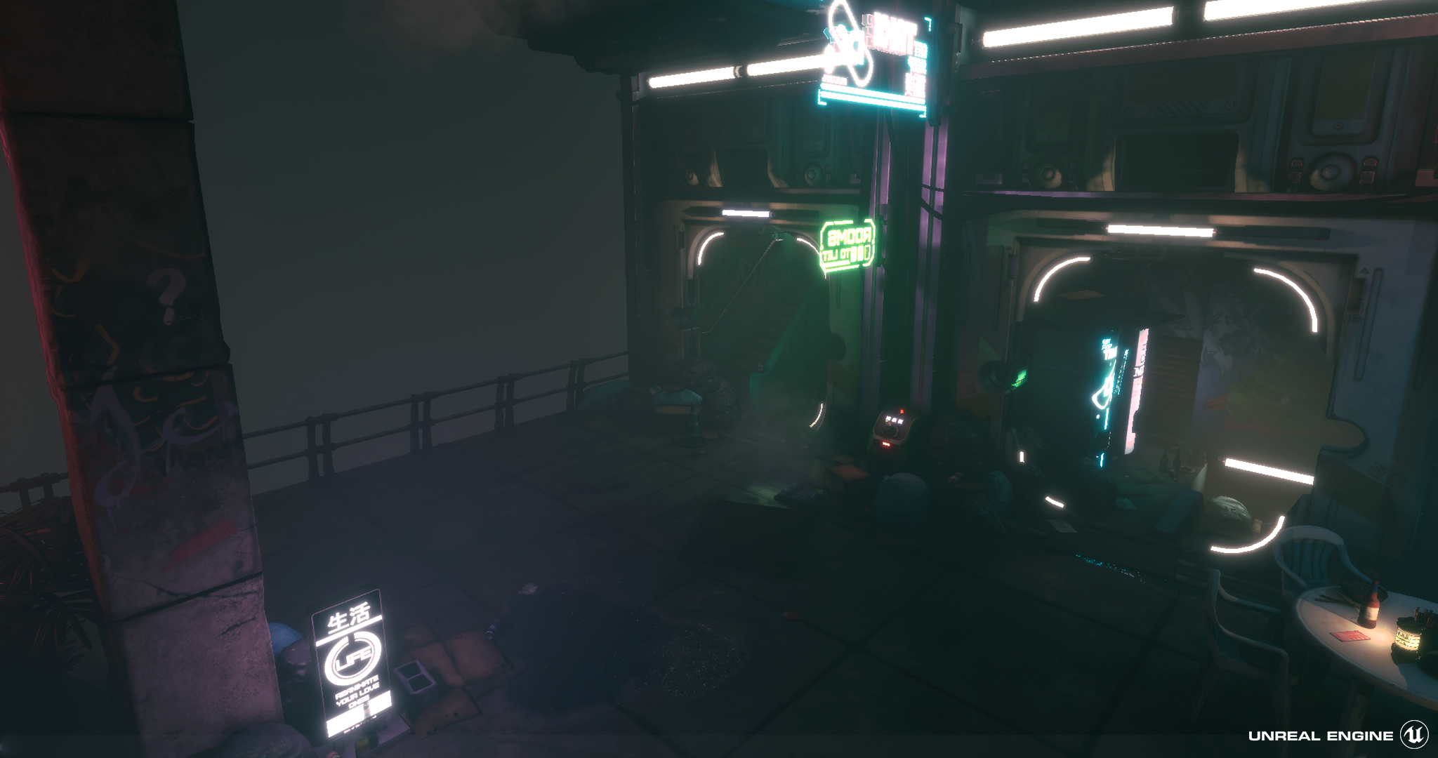
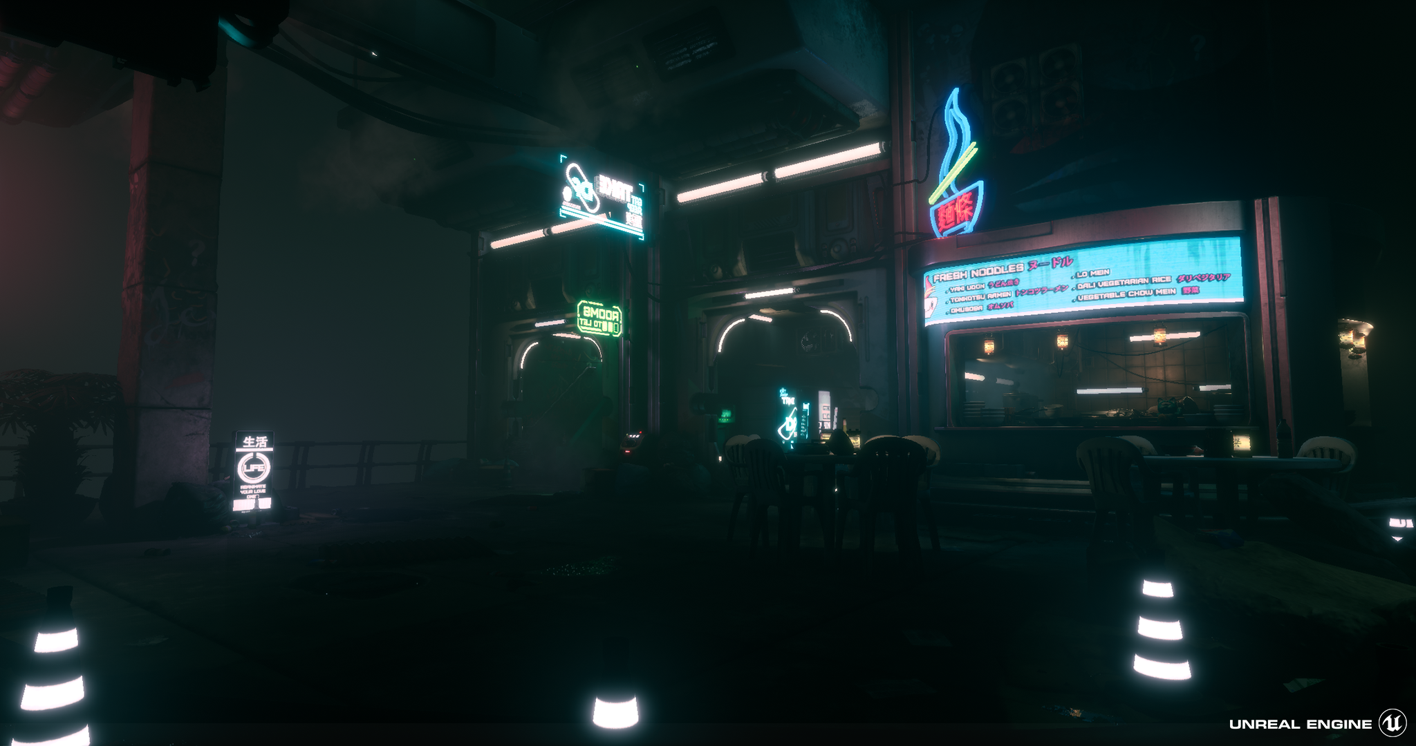
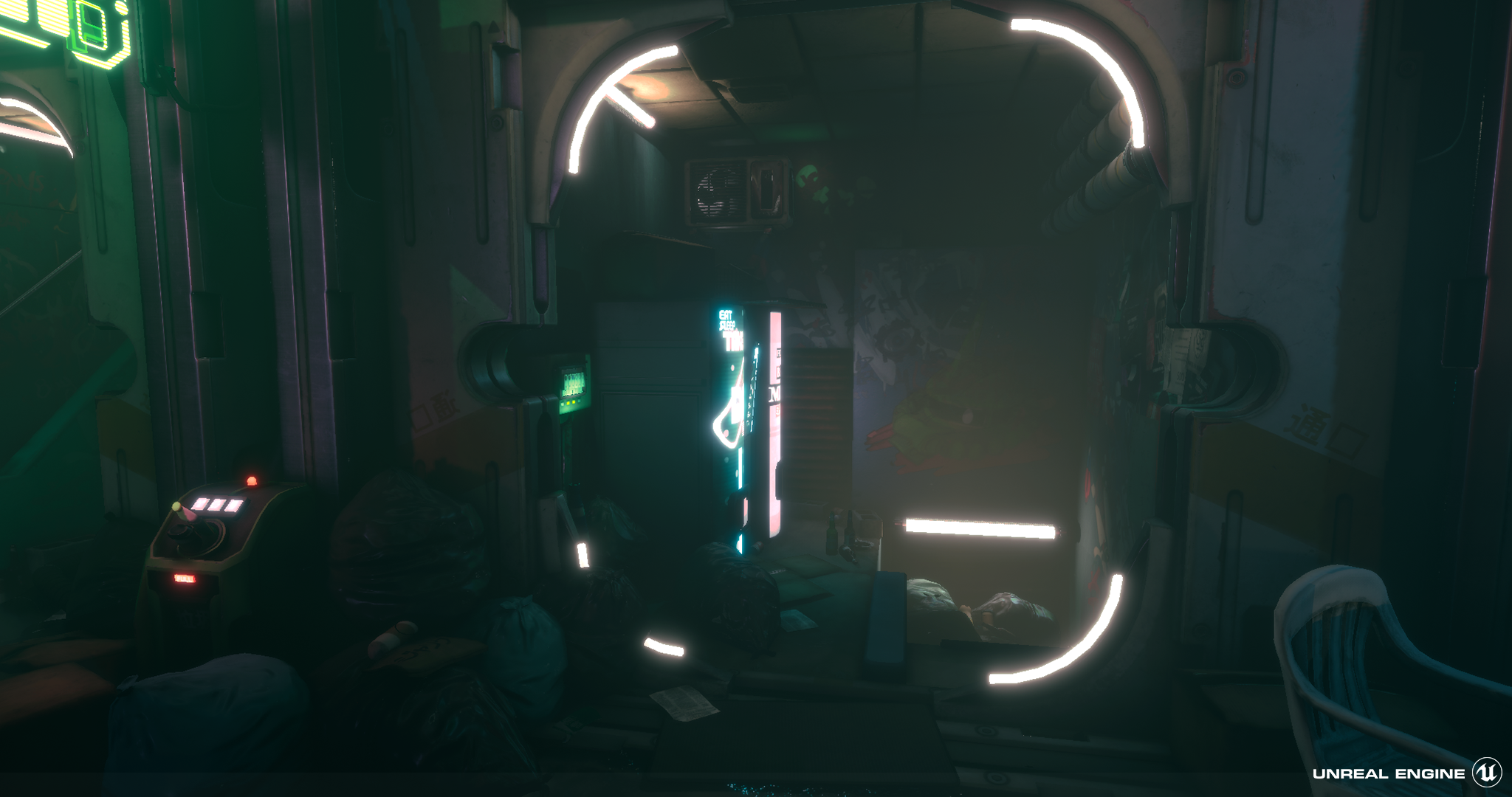
The scene is visually interesting and well made. I would sit in the camp that feels it is a touch too dark in areas. Increasing the light in a few spots would show off the nice detailing work and assets. The lighting moodboard examples were dark but still allowed the viewer to see the “darker” areas. One area worth brightening up would be the noodle bar kitchen. I’d hate to work in a kitchen as dark as that. Health and safety would have a field day J
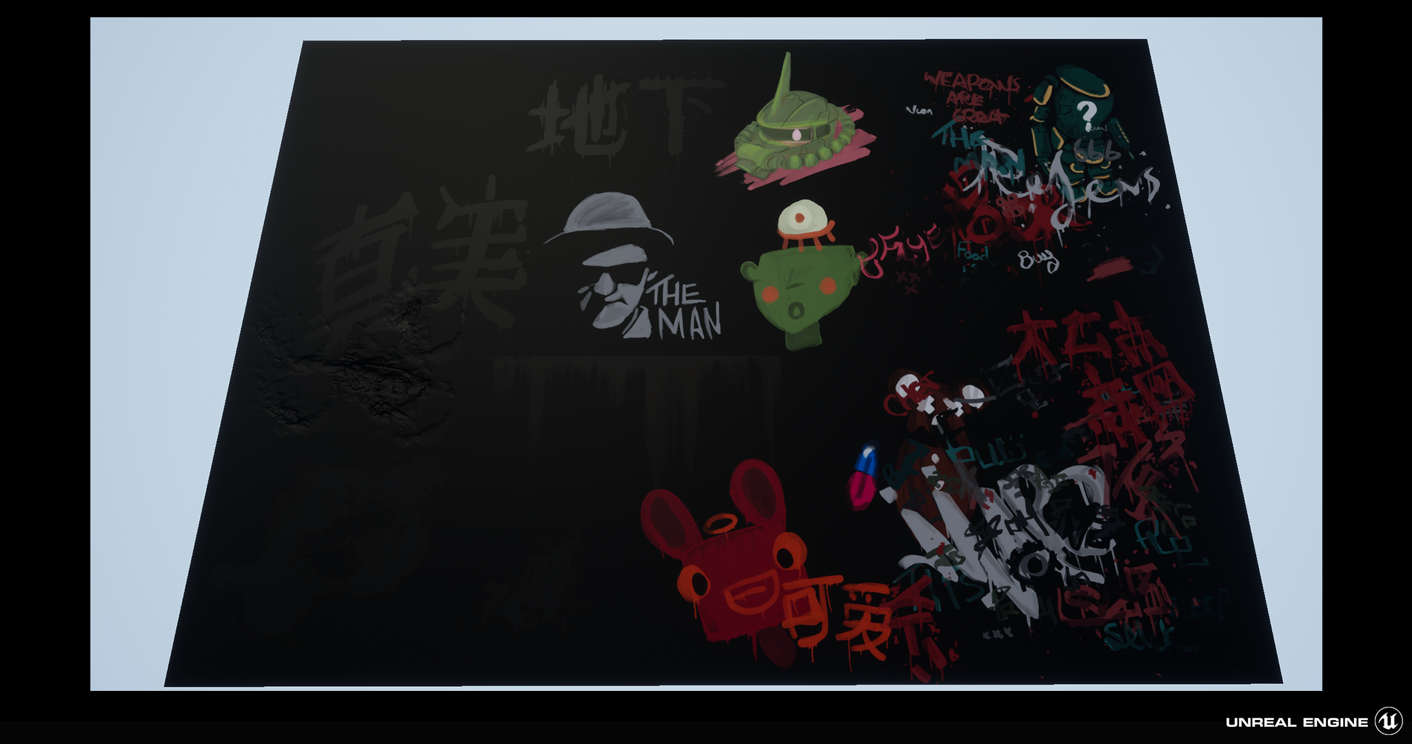
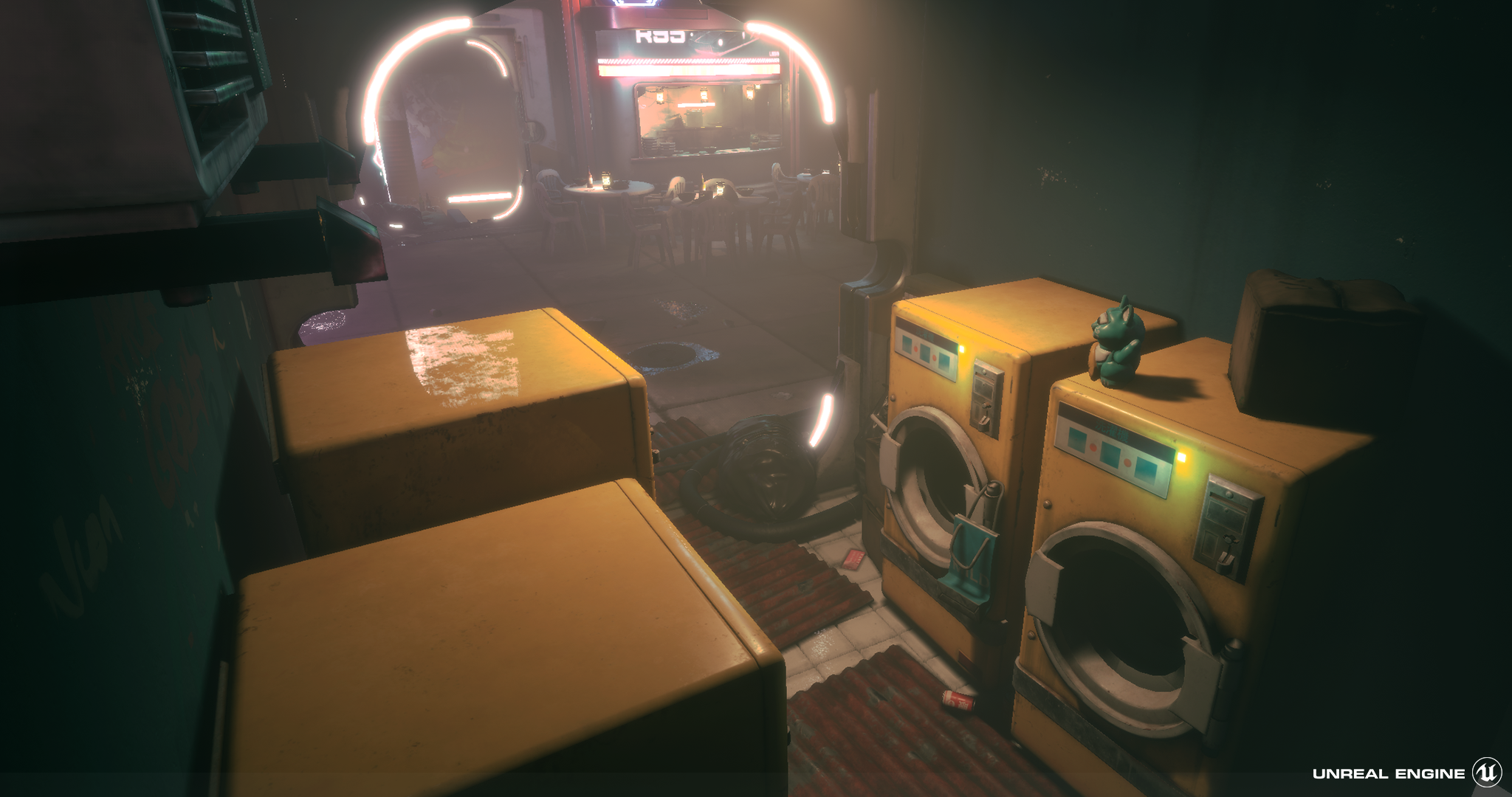
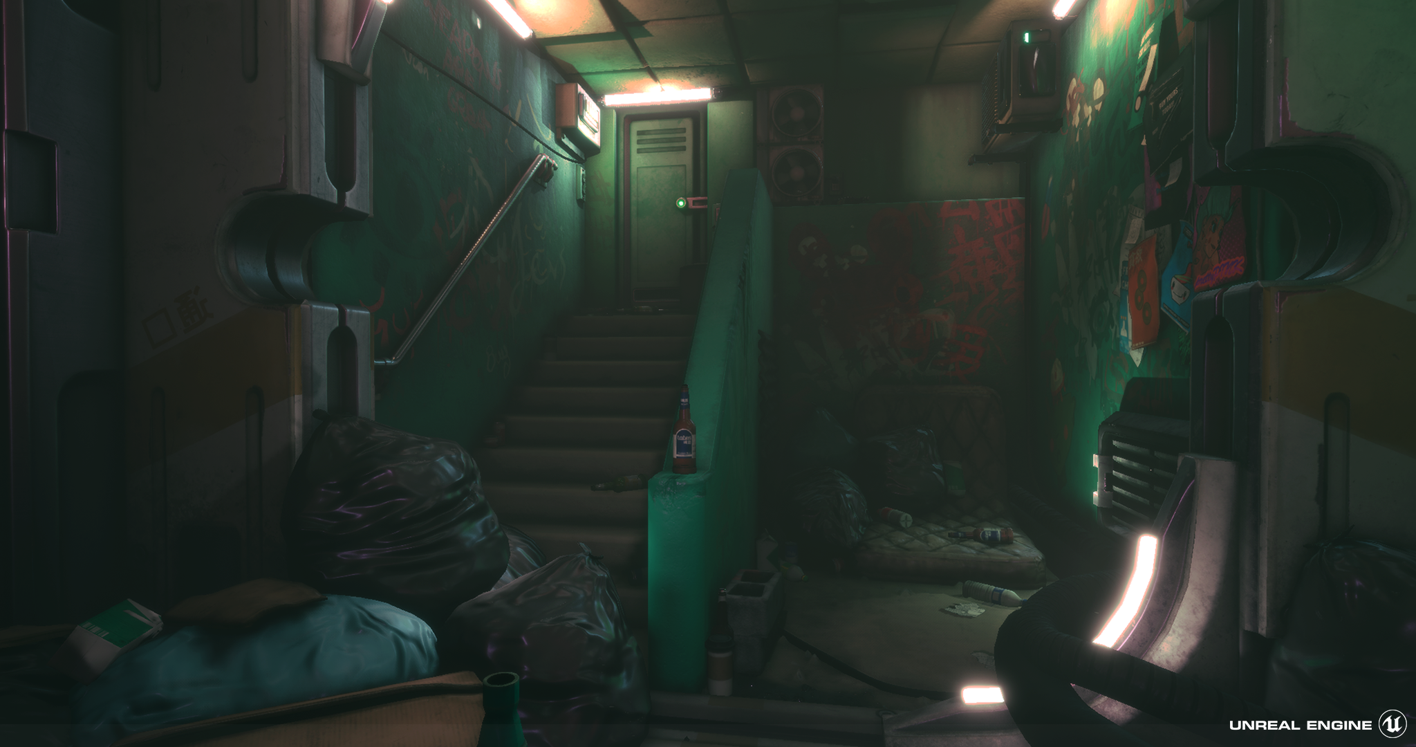
The addition of the posters, grunge decals, graffiti and holographic signage add a lot of narrative and context to the scene. Many smaller props such as the noodle bowls, lucky cat statues and bottles flesh out the scene. Even the bins with some rubbish sticking out work well.
The decision to have each area lit by a distinct light colour is a nice touch and would allow players to quickly navigate and learn the layout of the space.
In the research there were many more colourful and bolder images. It would have been interesting to see some of this in the final piece.
Written Documentation:
The written document is very informative regarding techniques used and is well presented.
Final Presentation:
The artist set out to create a cyberpunk scene and succeeded. Attention was paid to the elements that define what a scene like this should contain. The final images are of a high quality and are well composed and lit. The scene itself is full of many nice little details and touches in the environment, there’s a defined atmosphere / mood along with many little touches to add some narrative to the scene. Overall a really nice body of work.
Extremely well thought level with detailed pre production and almost AAA quality level. The show of this level is the consistent fidelity in the asset quality, almost all of them are just as high as the next. Its a shame that the overall lighting lets it down as I was expecting a lot of neon POP, reflections, puddles, etc.
A really great theme to explore. You've really researched the subject and i can tell you have a passion for this subject matter beyond this project that you have been able to tap into and develop.
The scene size is nice and contained, setting small sections branching from within a small courtyard allows for everything to be thematically diverse while unified around a central point. This central point however does become somewhat lost in the dark lighting. Your original concept sketch looked so vibrant in comparison. Individually however your assets are very high quality and each stands out with distinct style and polish. Its just a shame I didn't notice or couldn't find some of them right away from your dark screenshots.
I think some of your interior shop close up scenes have a good level of "darkness" to them and for this reason i can see why you went for the darker lighting but i think it is just the dark void in the center, especially around the generator that could be brightened (the skylight over the generator in the concept).
A lot of your techniques and workflows are of industry standard and you demonstrate a lot of common industry practices, keep these up and just work on a final presentation that compliments all the effort you have put in to all the other aspects of the scene.
Good Job, and good luck,
Challenge Tier
Leave a comment
Log in with itch.io to leave a comment.
Comments
bloody fantastic.