Play asset pack
Captains Cabin's itch.io pageResults
| Criteria | Rank | Score* | Raw Score |
| Technical | #6 | 3.500 | 3.500 |
| Research & Development | #7 | 3.750 | 3.750 |
| Documentation | #8 | 3.500 | 3.500 |
| Creative | #8 | 3.750 | 3.750 |
| Presentation | #8 | 3.750 | 3.750 |
| Overall | #8 | 3.650 | 3.650 |
Ranked from 4 ratings. Score is adjusted from raw score by the median number of ratings per game in the jam.
Judge feedback
Judge feedback is anonymous and shown in a random order.
Nathaniel's documentation gives a good background as to why he chose this theme for his environment. He has collected a good selection of moodboards for the asset and has obviously done his research. Talking about the issues from the block out is great, picking out the bits he wanted to change, showing good reasoning behind his thoughts.
Nathaniel demonstrates good industry standard technical knowledge, from modelling techniques, texture creation, along with lighting and PFX.
The environment looks atmospheric and detailed, great effort, nice work!
Submission Title: Captain’s Cabin
Submission Tier: Sumo Digital Rising Star
Assessor: Anthony O’Donnell Lead Artist Firesprite
Concept design & Development:
The concept chosen is interesting and the reference provides a good source of visually stimulating objects and materials to create. The reference boards per asset contain the right information to build the asset and are a sign of intentional artistic choices towards choosing shape, detailing and surface types.
It was good to see the artist fix issues with the blockout stage when they realised the scene was lacking life. Game development is very iterative and is not always straight forward.
Technical Art:
The usage of texture bakes on hero props and tileable assets for the larger architectural elements such as the wooden windows is a good choice to balance memory usage across a scene like this.
The adherence to a set scale and texel density of 512 X 512 per metre square is a definite plus point.
Channel packed data maps were used. The rope texture could have been 128 X 512 as the rest of the texture appears to be unused. Likewise the ruler has redundant space in the textures. The rope and ruler would be ideal to place together on the same texture sheet.
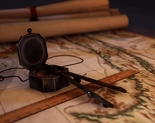
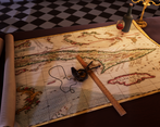
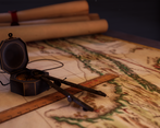
Poly distribution in the scene is good and well allocated. The rolled up maps with seals are nicely made.
Material definition has clear variation in value across the surfaces as you'd expect from smooth polished wood to the rougher maps surface. With that said I did notice the DATA maps did not have sRGB unchecked therefore the values being seen in UE4 are not accurate as they should be in a Linear Space. These would not match up to what would have been produced in other programs such as Substance Painter.
Creative Art:
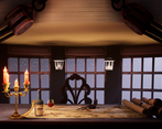
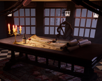
The initial concept of a moon lit scene punctuated by candle light is evident in the final work but the choice to up the scenes exposure via the post process has made the overall image too bright for this setup and fights against the initial intent. A skylight used to manage the luminance of the shadowed areas would have been a better option here.
The light colours / intensities were used to create a focal point in the desired areas. Increasing the lightmap size for the map given the cameras proximity to the surface would have allowed for better defined shadows in the final image.
The exterior spotlight movement is a nice touch to add life to the scene and sell the on board a ship scenario.
The post process volume was used to address issues with the underlying lighting instead of fixing the lighting itself.
Written Documentation:
The production document was well written, simple and clear in its presentation. The artists thought processes were clearly explained.
Final Presentation:
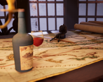
The final shots especially the close up shots showcase the hero props well. Depth of field usage was handled nicely. The lighting and colour choices by the artist have contributed well to the final images.
lovely peice, watch out for smoothing issues on assets (i have a feeling it was a quick mistake) and it would have been interesting to see a subtle blend off from the sides of the floor tiles. like dirt between the floor and wood. but its lovely anyway
Challenge Tier
Leave a comment
Log in with itch.io to leave a comment.


Comments
No one has posted a comment yet