First issue
Back during pre-production, there was an understanding that we were planning on using the 3D models for the dialogue interactions. Leaving my main focus to be on project management and narrative design at the time. It wasn’t until 4 to 6 weeks into the pre production that we pivoted to having 2D dialogue sprites for our narrative. A position that I was given which led into the design problem I am talking about in this devlog.
I have already tackled the design problem in my previous devlog about what was the best layout approach for our dialogue. Now with the addition of using 2D sprites, the new problem was how did I want to go about the art direction for them. Our game models were designed to be simplistic, low poly, and chibi size (which is basically a 2 head size character). So I had two options in terms of how I could go about the appearance of the dialogue sprites: chibi style to match the look of the 2D concept art / the 3D models that we have or create normal scale dialogue sprites. So I had to reflect on what the pros and cons for each direction would be for production.
If I had went with the chibi style sprite
Pros:
Cons:
On the other hand the pro and cons list I came up with for the full scale sprites were
Pros:
Cons:
After mulling over the decision, I ended up going with creating full scale sprites since narrative was to be one of the team’s design pillars. I wanted to give the players a better understanding of how the characters they will meet truly look like. As the player was going to be only seeing these characters during dialogue areas, I wanted them to be memorable. This ended up leading into the following issue that I put upon myself which was how did I want to have the characters styled.
Walk Fashion Baby Walk
Style for a game is very important for more visual media but greatly so for games. A strong visual appearance for a game is part of what makes it memorable. Using a few games that we had for our inspirational mood board like Neon White, Jet Set Radio and Splatoon, all which have quite distinctive styles to them. While the fashion style of the early 2000s aren’t something I would wholeheartedly describe as great style nowadays, it did help dictate my design decision with the attitude I wanted the sprites to have.
So I thought about how I wanted to tackle the art direction. My personal art style would have been fine but I did want to challenge myself. Taking a look at the initial mood board, there was something that kept bothering me throughout the team discussions and that was how often The World Ends With You was brought up in conversations. Now of course the games that we have gotten inspiration from would pop up in development conversations but I was worried about if that would end up being too much of a strong focus. So, to avoid that being a strong influence on myself I looked outside our initial references and went researching drastically different art styles.
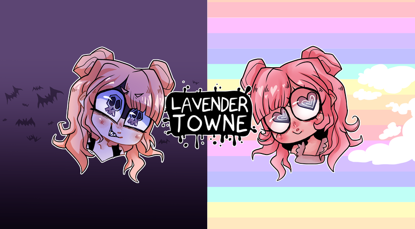
My first thoughts were to look at two artists named Lavendertowne and TwistedDisaster. Being so vastly different from our initial sources I thought they would be a good start. Lavendertowne is an artist that I have followed occasionally on youtube, who does a lot of “What if [insert subject] as a girl” and other art related content on her youtube channel. Her art style is more akin to a western cartoon style with a slight nod to Tim Burton. I loved how expressive her eyes were and seeing the odd pupil shaping was something that I didn’t recall seeing much before. As well as the use of texture overlays to give more dimension to the simple designs. I thought that playing around with these features would help to make the sprites feel more spirit-like?
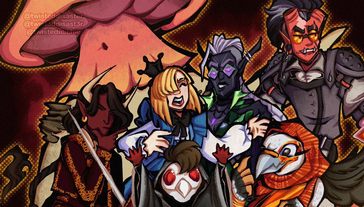
TwistedDisaster is another youtuber artist/vtuber streamer that I had looked at for a different look of inspiration. Much like Lavendertowne, her style leans more towards a western cartoon style. I really enjoyed how she balanced out rounder points of her art with sharp pointed areas. It brought about a not entirely comic book look to her art.
In the end, this ended up being the style exploration results that I went with. Being a strange mix of anime and cartoon styles. Almost the type of art style that could be seen on early 2000s tv shows.
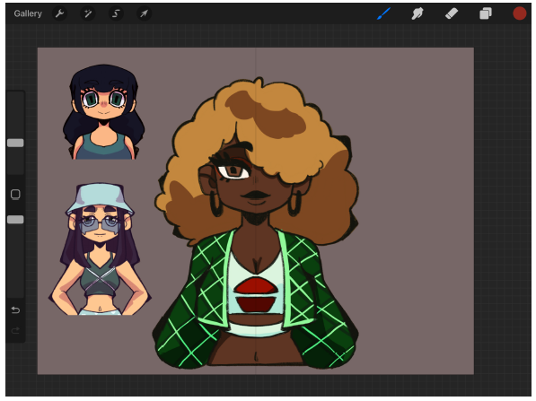 Early style exploration
Drawing based on the 3D versus the 2D concept art
Following the style exploration, I started on the sprites for our main character Alex and our mean girl ticket teller Lilian. She was a NPC that I had designed and by the time I was tasked with creating the dialogue sprites she was already modelled. So I was presented with the challenge of trying to push the style I was working on but having to match the 3D model. Below is my first attempt at her sprite (top) and that was then given feedback by our 3D artist for changes (bottom).
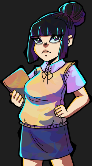
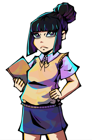
This is where my previous worries about TWEWY being such a strong inspiration was proved right. While the shown changes are not bad, it did take a lot from the art style of TWEWY.
With the sharp black shading and more angular facial features being the standout similarities. Now I could have easily adjusted to the proposed changes but the connection was too strong for me to overlook. Not to take my personal thoughts as a complete reason to forgo the proposed changes, I had shared the two sprites to outside individuals to hear what their thoughts were as well. The answers that came back were about the same, the proposed changes were TWEWY reminiscent. As such I had to see what would benefit the style that I was creating for the game.
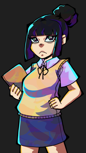
In the end, I settled on this style for the ticket teller which blended the darker shading, more line weight and lowering of the facial features that were proposed. As an artist I know we can be the type that wants to hold onto the designs we create. I knew that there was some adjustment needed so the future 3D models textures wouldn’t be too far from the 2D art. Though it was indeed difficult attempting to replicate the style of the 3D model faces as they had originally conflicted with the developed style for the sprites. It was later working from strictly the 2D concepts that I found my footing with pushing the visual style for each character.
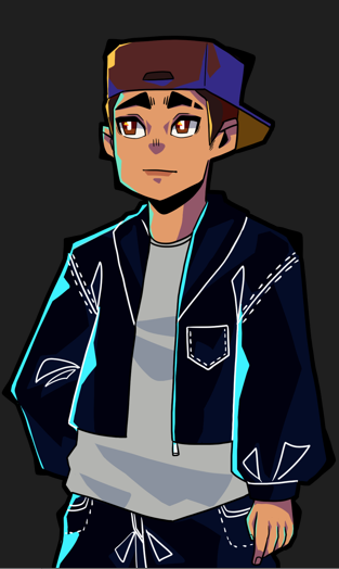
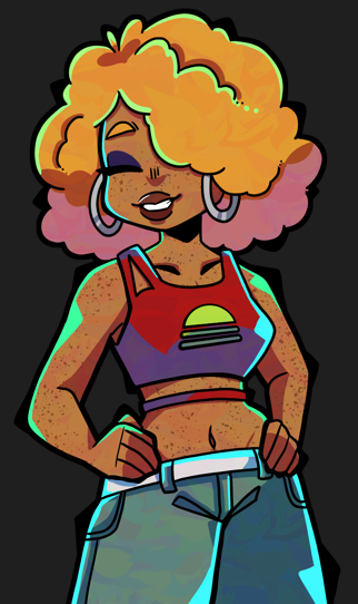
So What’s the 411?
It might look like this is a long form explanation of how I chose the art style for our game and it probably is. But that’s the thing, a game’s art style is important as not only is it the first thing that players will notice, it is a way of giving your game a sense of self. With narrative driven players in mind, I wanted to make sure that these characters were eye-catching and interesting to make players want to connect with them. With style being one of our main design pillars, I took it as a good challenge to move beyond my usual style and explore another avenue. To embrace the full vibes/attitudes that came from that era I embraced a new style.
Thanks for reading!
Did you like this post? Tell us
Leave a comment
Log in with your itch.io account to leave a comment.