After about an hour of playing I can say that it is a strong foundation but lacking in execution, and frankly not fun to play at the current state.
I'm gonna split my thoughts into 6 categories:
Game design
The tutorial is pointless as the first level can wordlessly explain the main concepts, and then additional stuff, like all the different blocks can can be showcased in further levels.
Too many similar blocks, creating confusion and is just messy. Either differentiate them better or maybe just remove some.
Blue teleport pad and blue block that moves
Light blue block that you carry and light-light blue ice block
Purple block for red blocks and purple to press as a button
Ice block is not fun and is never used in a unique way. Pushing it and hoping it lands on a button just makes the action frustrating, especially when there is no reason for the ice block to be there instead of a regular blue block.
Blue block dropping out of your hands when it touches something is not fun, makes traversal with it unnecessary difficult.
Walking on the edge of the level is interesting, but not when it's used in every level. That's better left for secrets and easter eggs instead of the main puzzle solving path.
Level 4 ends when there is clearly more to the level. Makes the player want to find some hidden path when there is none.
Level 5 is pretty much unbeatable if the right way to do the enemy cube part is to hope that it lands in the right spot to step on it. Especially when it's the first time you have to do it. If you want to use that 'matador' mechanic, then it needs to be introduced in a safe simple way before making the player do it with the risk of falling off.
It's better to disable the teleport pad if it's not a part of the puzzle, it gets disorienting when you accidentally step on it and get thrown back.
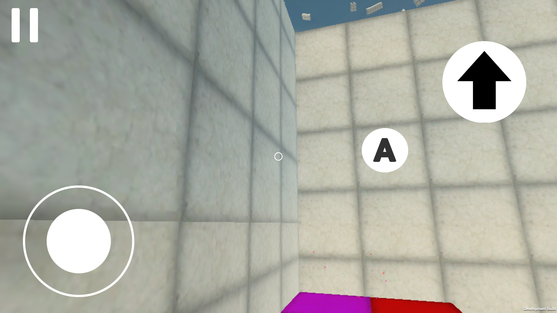
There are some gaps where a player can get stuck, like this 1 block gap you can't fall through.
Movement
Control is really floaty. There is a noticeable delay between moving the stick and starting to move, same with releasing it. Which makes doing precise jumps really painful
First person parkour is difficult, especially on a phone, so having multiple 1 block platforms, and needing to do precise jumps feels awful.
Player has a round bottom, so if you stand on the edge you start to slide off.
Player is not round, if you stand near a wall and rotate your view you get pushed out. And in some cases you can get through a gap sideways but not forward.
Little things
If this is a beta then why is the version number 1.0?
English
"warning" needs to start with a capital letter
"If you find a bug or some flaw, send it to [email], and also describe where and how you found this bug"
Also bilingual text implies that the game will be in English too, but after that it's all in Russian
It's better to show the music volume as a percentage in the settings.
Tutorial text needs better placement, it doesn't look good bunched up in a corner.
In the main game the skybox box is visible.
The shiny white cube either needs to do something or be less shiny.
The goal portal needs to be more noticeable, with the style (maybe like the shiny cube) and during the gameplay so that you know where you need to go.
Teleport pad needs more noticeable particles and some effect to cover up the instant teleport
Bugs
There is a constant light "shadow" following the player
Green block in the tutorial doesn't do anything (and there is an invisible ramp)
If you go near a wall with the blue cube and jump you can clip it out of bounds.
Skybox blinks black occasionally
Level 3 has a texture misalignment
[A] button doesn't reset its color if you look at a colored block and then a regular wall.
Jumping over a ledge and going forward makes you stuck on the edge.
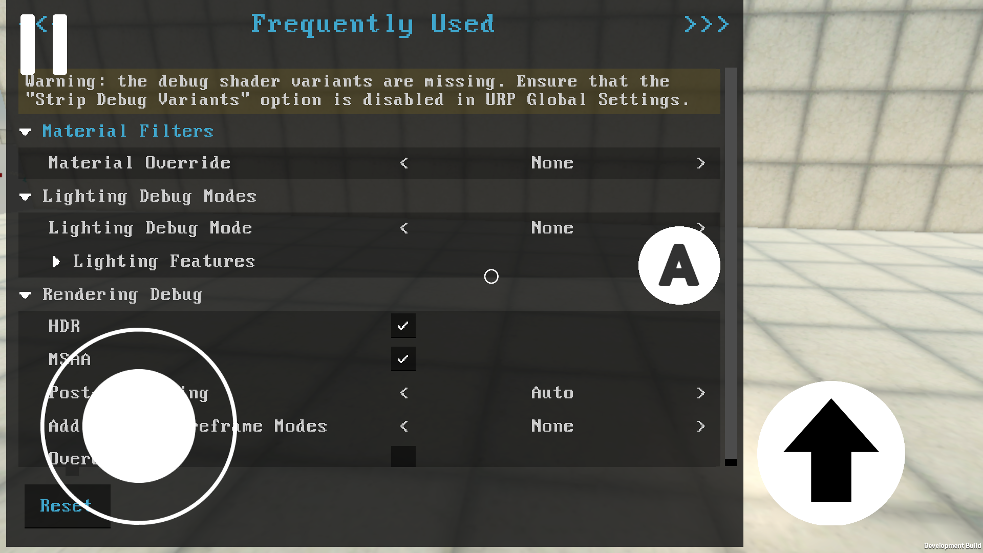
You can somehow open up a shader debug menu and it's impossible to close it. (don't know how it happend, it was on level 2) (and turning HDR and MSAA off gave a big boost to performance)
Standing on the edge of a button makes it rapidly turn on and off.
In the tutorial, the game can freeze if you go near the enemy (not sure, but it froze twice in that area).
Slow performance in general. For some reason worse in the tutorial area. Probably related to game logic rather than graphics.
Good stuff
Customizing button locations is nice, haven't seen that before.
Seeing someone walk on the 4th level was interesting.
Green blocks flinging you across the map is fun, but not when they miss and you fall down without being able to do anything
The aesthetic is pleasant
Tips
It's good to be able to access the settings during the game, without needing to go back to the main menu.
Instead of having the [A] button always on the screen, you can make it so that you tap the intractable cubes instead.
A little line, or any indicator to show what the yellow and purple buttons are controlling would be good.
Maybe a gyro control for looking
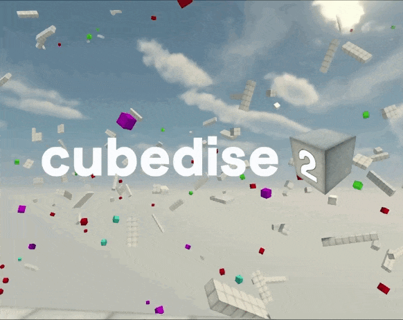
I don't know what's the story with the game development, but I assume you don't have the permission to use this name, if you aren't then it's better to change it to avoid any future problems.
I recommend checking out this video (and the whole channel in general) and apply it to your design. It should help you make the game more understandable and friendly.