

~~~IMPROVED, AND BETTER RESULTS ON THE PROJECT CAN FIND HERE : https://www.artstation.com/artwork/baknGo ~~~
Play game
Neoclasci-fi's itch.io pageResults
| Criteria | Rank | Score* | Raw Score |
| Creative | #47 | 2.600 | 2.600 |
| Presentation | #63 | 2.200 | 2.200 |
| Technical | #69 | 2.000 | 2.000 |
| Overall | #82 | 1.800 | 1.800 |
| Documentation | #88 | 1.200 | 1.200 |
| Research & Development | #90 | 1.000 | 1.000 |
Ranked from 5 ratings. Score is adjusted from raw score by the median number of ratings per game in the jam.
Judge feedback
Judge feedback is anonymous and shown in a random order.
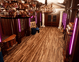
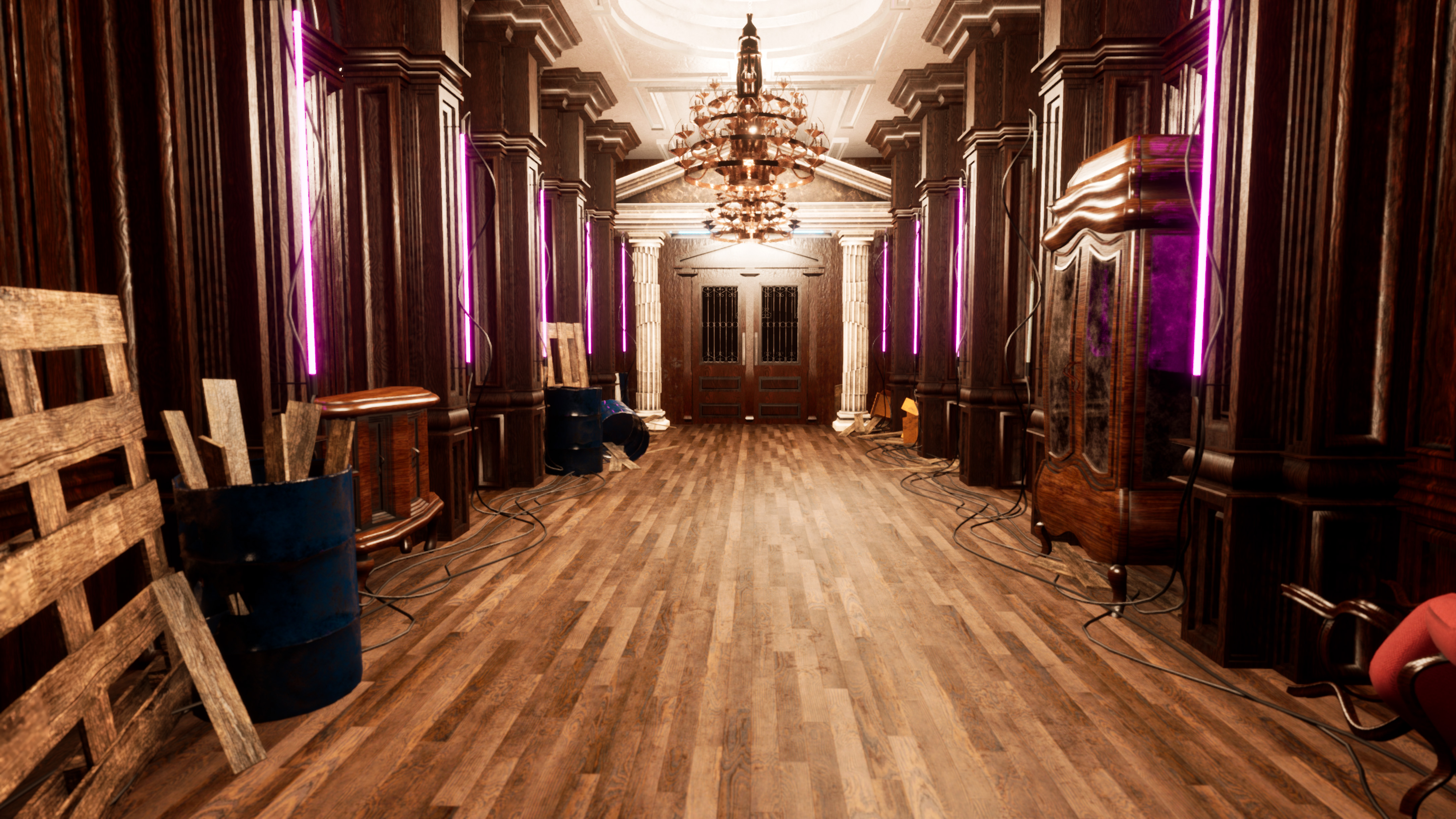
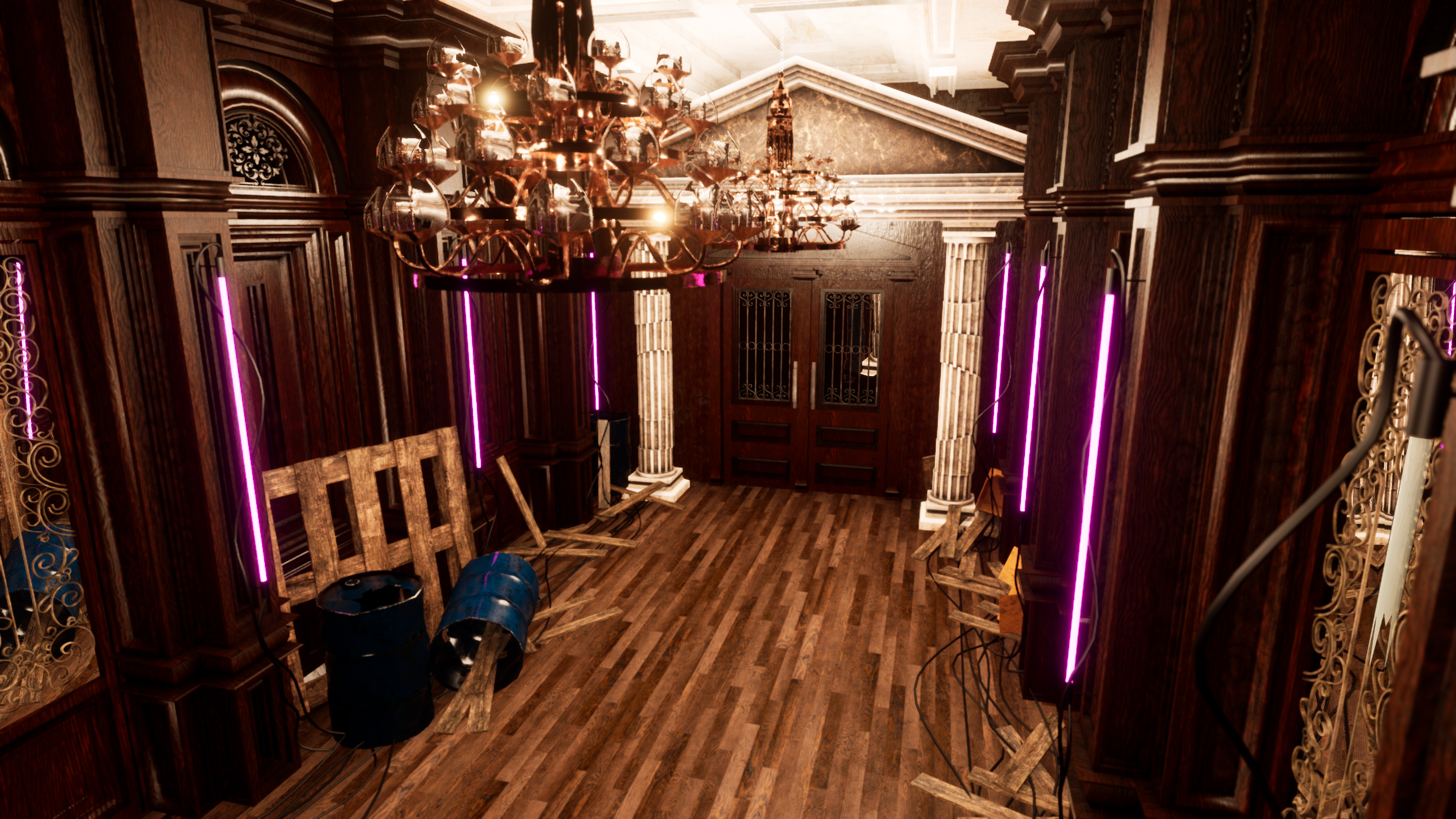
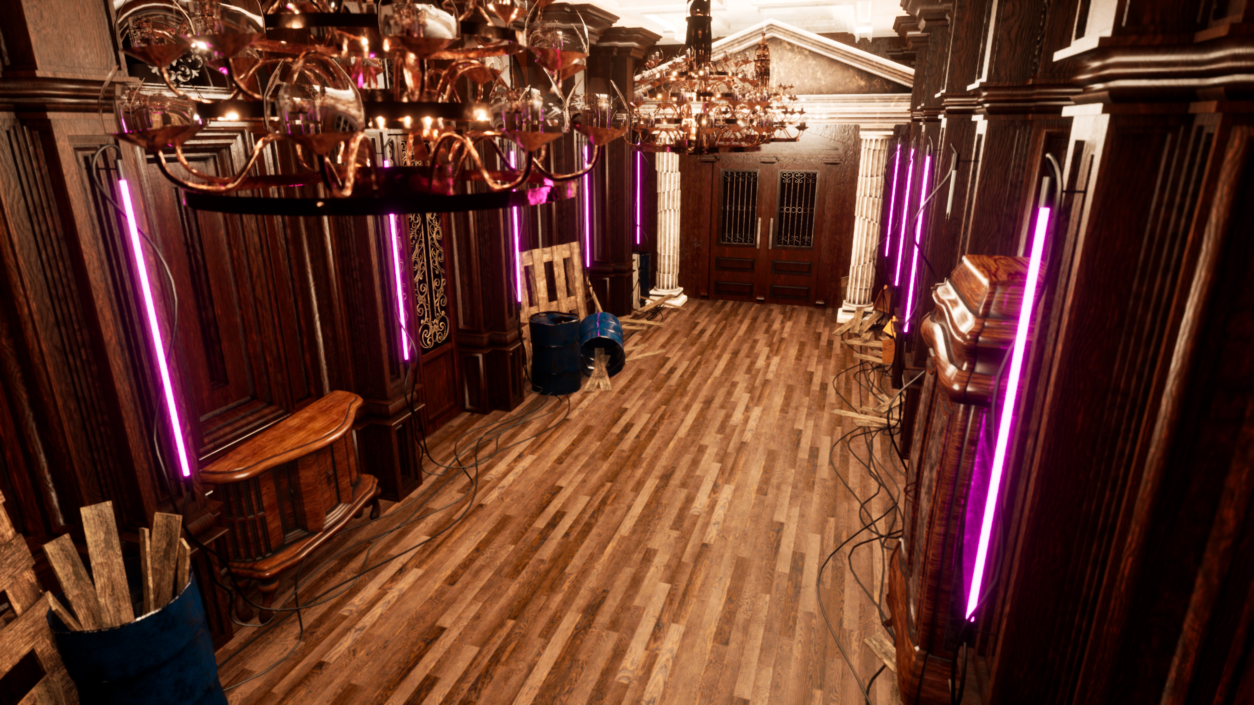
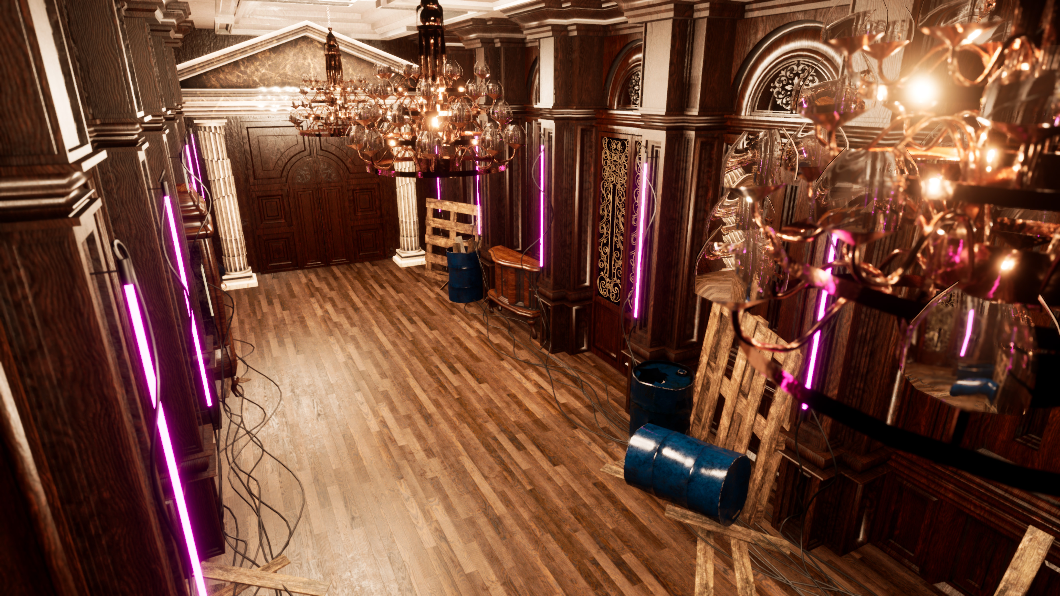
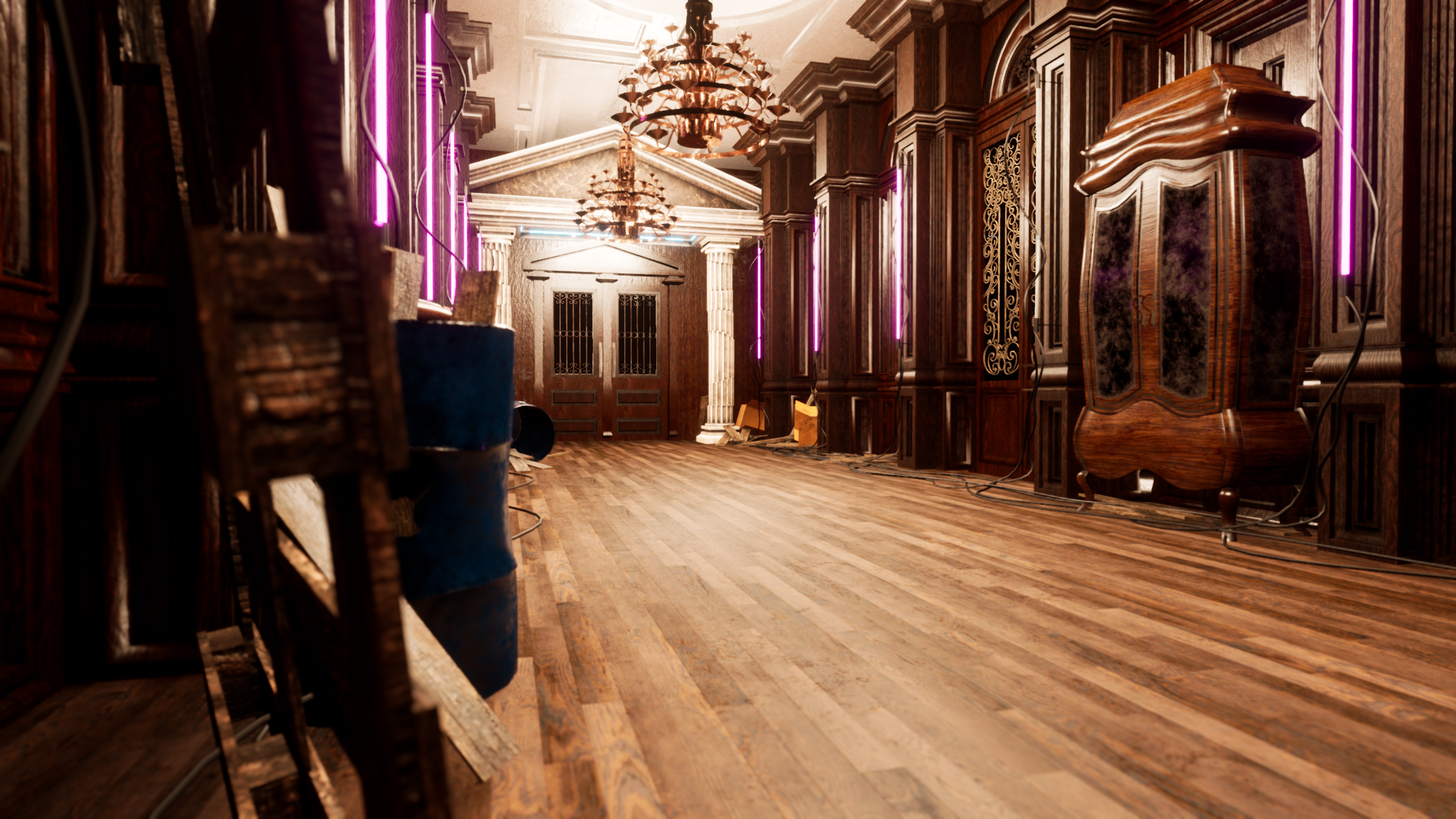
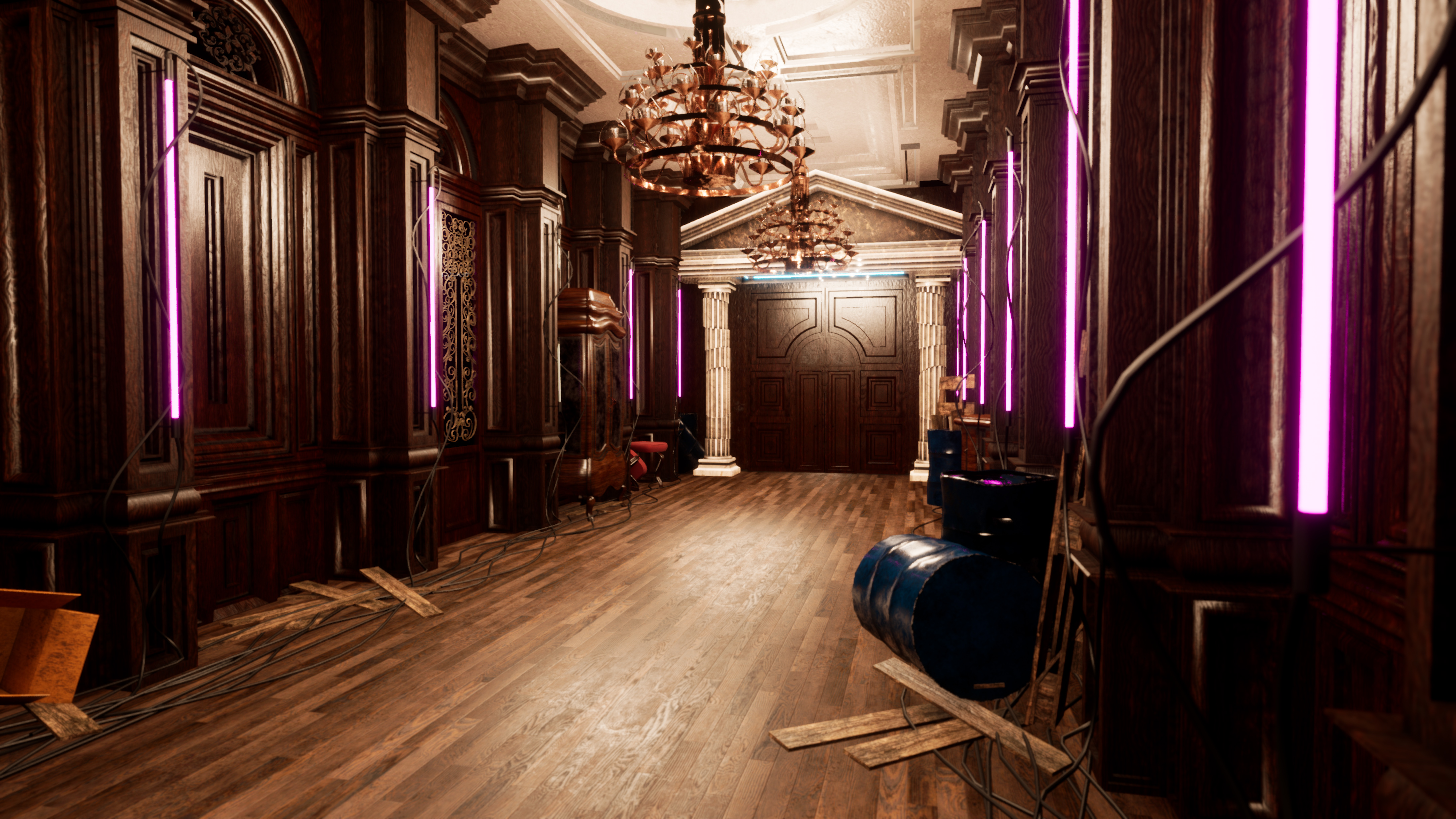
- Missing documentation so unable to judge the process of making the scene effectively. I like that you’ve stuck to making a hallway with lots of repeated elements. I’m not sure what the aim was of the piece and I feel like the stone arch/columns don’t really work that well with the rest of the theming. Also the lighting is very bright which makes the scene flat. Only having one light source would have been better and having it from a portable flood light opposed to the chandeliers would make the scene feel more abandoned (like the set dress is is leaning towards). I don’t think the purple strip lights work as they get lost in the light. Good to see use of PBR but it does look like some of the props are lacking hard edges.
- Submission Title: Neoclasci-fi Submission Tier: Assessor: Dominic Shaw Artist @ Firesprite Research & Development There is no documentation or project files provided for this project so it’s a bit hard to give feedback on but based on the updated Artstation post provided I will try to give some areas to improve on. Creative Art I like the idea of the corridor with the neon lights but the overall image is a bit hard to read due to too many competing light sources and value issues. The chandelier meshes are way too busy and noisy which makes the image quite hard to read so I would recommend simplifying these or removing them. There is too much contrast in the some of the textures such as the really dark wood next to the really light marble/stone. I would try making the wood a bit brighter so that there isn’t as much contrast in the scene. There is a bit too much competing light sources which makes it hard to tell where to look as you have the lights on the walls, the fire and then the chandeliers. I would remove all the other light sources and just keep the neon lights on the walls as sometimes less is more. I would also change the value of the wood on the furniture meshes such as the cupboard so that it stands out more because at the moment it’s getting a little lost in the walls as they are all pretty much one value. Technical Art To optimize this level more, it could be made out of trim sheets as there is a lot of wood elements. In the Artstation post provided the meshes are all unique and if you are going to go this route, try to fill up the 0-1 space and not waste any texture space. There is a lot of details extruded into every wood panel, I would remove these details from the asset where the neon lights are so that it breaks up the image up a bit more and the other ones that are there could be bake down into the texture. It’s important to have areas of less detail in the image so that your eyes have room to breathe which will make the overall image more readable. Final Presentation Overall the image is just a bit hard to read due to the values so I would really focus on improving this area. The modelling seems alright but I would look into trim sheets and baking down assets.
- Artist – Evgenios Kakolyris Category: Sumo Digital Rising Star Assessor: Anthony O Donnell – Lead Artist at Firesprite Work name: Neoclasci-fi Hallway Research and Development /Documentation There was no document submitted but I found the Artstation page which contained some limited insight into the creation process of the piece. Technical Art No source files were submitted so only a partial assessment was possible off the Artstation page. Final Presentation The overall idea and mix of visual design is interesting. It would have been nice if the light setup allowed for the vertical pink strip lights to emit light along with being emissive. There are some nice materials in this scene. There are also issues with UV mapping. The cabinet as an example has the grain running horizontally where one would expect to see it running vertical based on how it would be constructed. The images are using strong post process effects which to me take away from the image and are distracting.
- This is an interesting environment with lots of potential. One core feature that is holding it back is the lighting, at the moment it is too bright and lacking shadows. Turn down the ceiling lights and let the neon lights add some colour and atmosphere to the scene. The cut pillars are cool.
Challenge Tier
Search For A Star
Sumo Digital Rising Star
Leave a comment
Log in with itch.io to leave a comment.