


Something like this, based on the things from the feedback ;)
Cheers!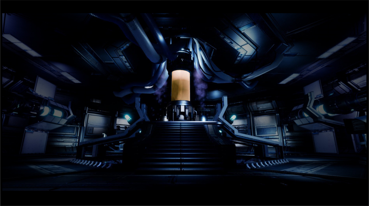
Play asset pack
Cryogenic Lab's itch.io pageResults
| Criteria | Rank | Score* | Raw Score |
| Research & Development | #12 | 3.800 | 3.800 |
| Documentation | #12 | 4.000 | 4.000 |
| Creative | #15 | 3.600 | 3.600 |
| Technical | #16 | 3.400 | 3.400 |
| Overall | #16 | 3.640 | 3.640 |
| Presentation | #21 | 3.400 | 3.400 |
Ranked from 5 ratings. Score is adjusted from raw score by the median number of ratings per game in the jam.
Judge feedback
Judge feedback is anonymous and shown in a random order.
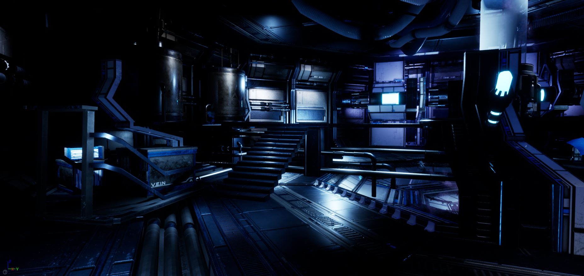
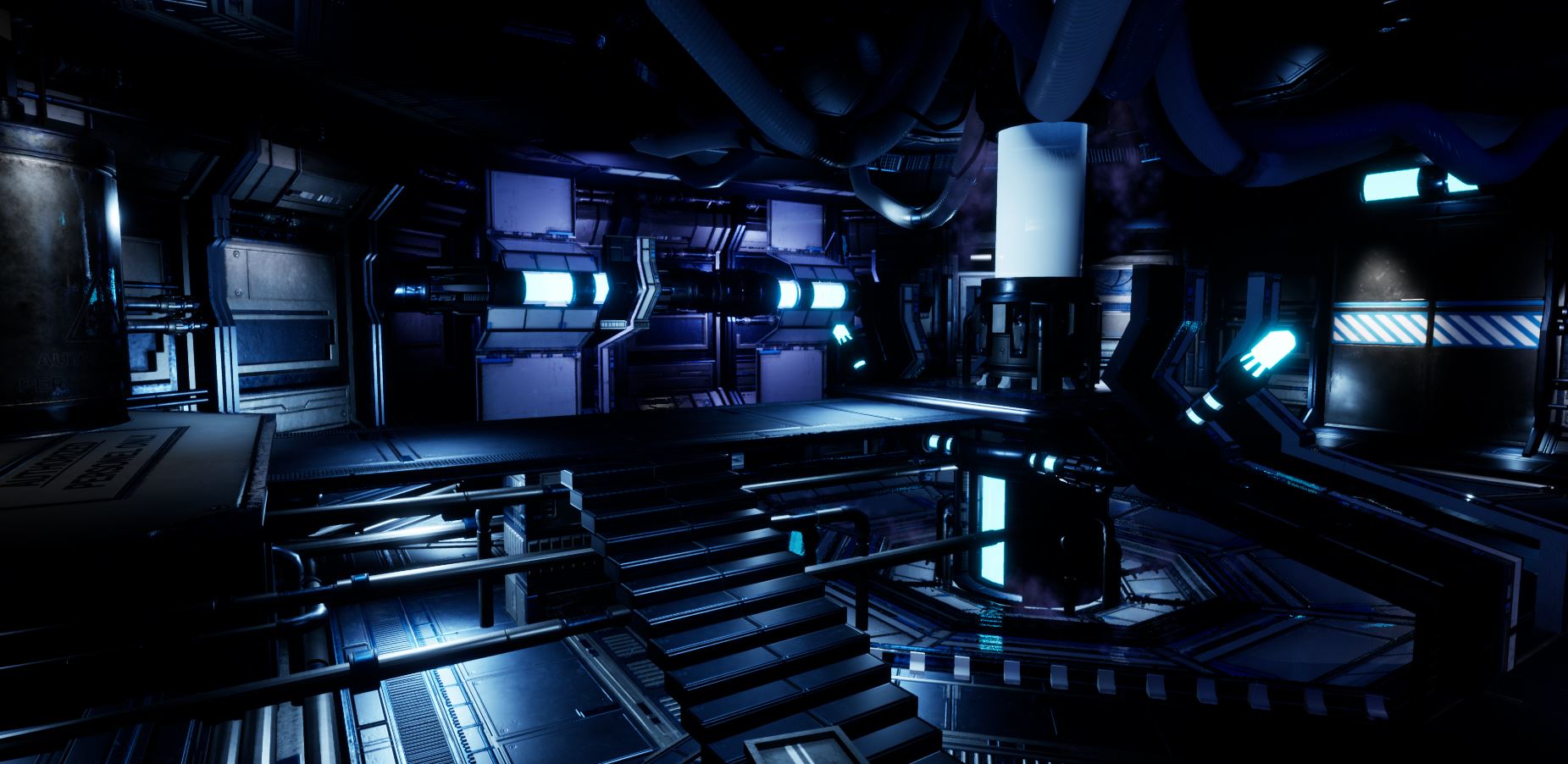
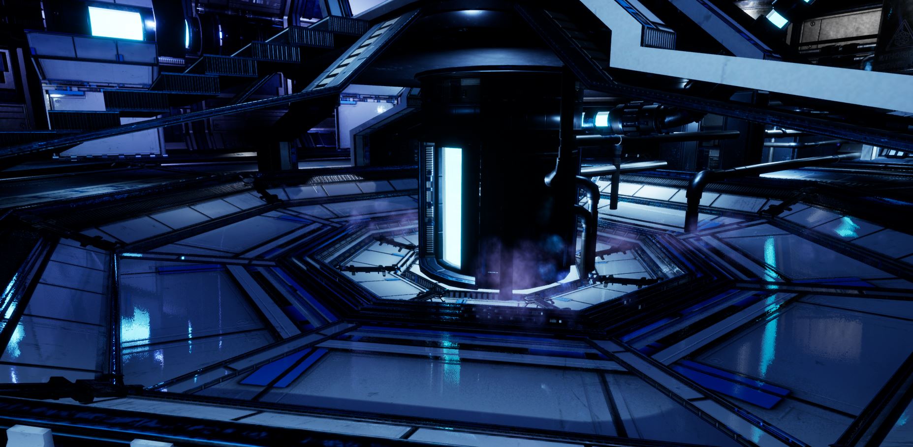
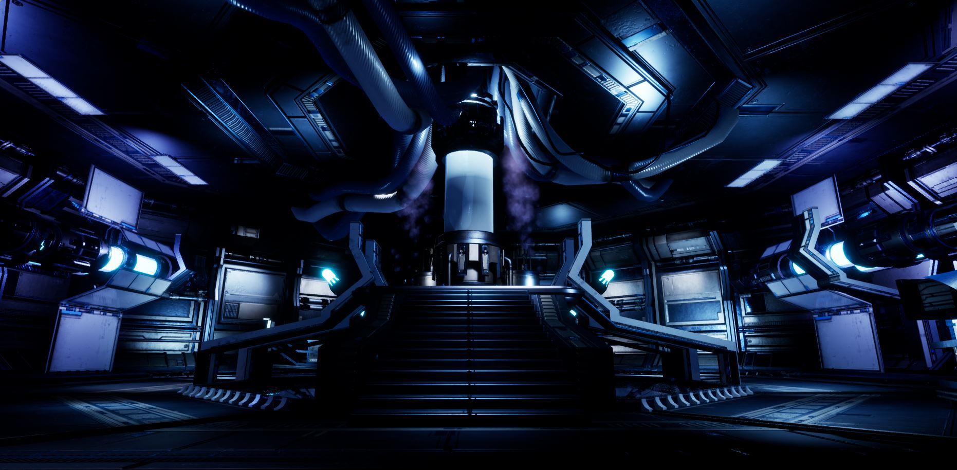
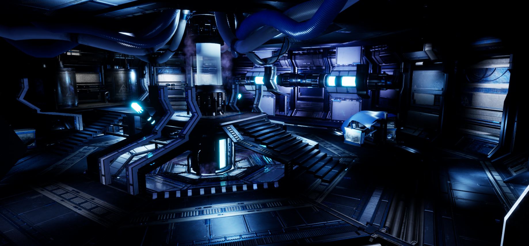
- The atmospherics and light values in this scene are wonderful. Technical artist here, so some optimisation points: -The roof tubes are elongated cylinders with caps on either end. Seeing as the cables stick into the ceiling you could delete the caps off either end, saving some polygons and reducing some of that distortion you can see at the end of their UVs where they pinch together. They could also probably come down in polygon count a bit in terms of radial divisions with them being so high up. -The scene uses a significant amount of materials which are more or less the same in terms of structure- a Color, Normal and ORM map. You should consider setting up a master material with parameters for these textures and then use material instances for all your different assets. Relatively straightforward to set up and will reduce shader memory usage, not to mention avoid a ton of shader compiling during development. -I can see you are using baked lighting, might be a good idea to check out the lightmap density view as I can spot a few small assets such as the floor studs with significantly higher lightmap texel density than other assets, these could just be dropped down to a smaller value. They're still at the default 64px a pop, but could come down to perhaps 16. Likewise merging actors could help reduce draw count. -Texture sharing. I notice that there are two textures called in here (Cnorm2 and Cylindertest_blinn29SG_Normal) These two textures are actually identical, and called by two variants of the same pipe. While the other maps change with the addition of the warning sign, the normals are identical and could just share one texture. You should establish some sort of naming convention for these, T_Name_Normal is the Epic standard. You've really managed to convey that sense of cold with the colours. Really well done overall.
- Great to see some annotated reference! I like that you’ve found real-world and games/film reference too. Block out looks good. It would have been good to see some base colour values and potential lighting at this stage too. Some of your models look like they need their corners smoothed out a bit or that they could have been broken into sections (meshes either side of the stairs and around pipes). You’ve added this to other elements in the scene so it would have been good to see it used on everything. UVs look good for the most part (try not to bake assets with diagonal UV islands). I think you would have really benefited from creating a trim sheet before unwrapping the assets to help speed up the texturing process (the trim sheet doesn’t have to be a perfect representation, a photoshop mock up would suffice at this stage). It’s good to see the use of a modular kit and that you do eventually create a trim sheet. You could have used tiling textures and trims to create your smaller assets instead of baking them individually. Good to see use of PBR and IES profiles on the lights. The lighting does help draw the eye into the scene but it would have been good to use some colour contrast in the lighting: a red warning light and cracked glass tube in the central column would add a bit of narrative and interest to the scene.
- The idea is good, well documented. I can say I researched a bit myself the activities of ALCOR, pretty interesting what is going on there. Getting back to your scene. At first glance, it's hard to tell what is your central focal object. Obviously it is the central object, I am with you on that, but the lights are all the same color and intensity in the scene. I will put a comment with a fast preview of a fix, possibly you already did this after submission. You could always check this zooming out and seeing the renders in a thumbnail size. So, you could lower the intensity on all the lights, except the main cryo-pod. Or as you have selected in your document, you can see how Wiktor Ohman worked with the intensity of light creating a vignette, or as Paul Pepera did in Halo using a complementary warmer color on the main focus object. Another small thing, I think it would make more sense to have a ramp instead of stairs, going up to the cryo chamber. If you think about it, the patient or..Han Solo, would be transported with some sort of table with wheels, or if it's a hover thing, it would still be safer for the scientist not to trip :P . Getting back on the tech part, there are a few elements that are worth some extra attention on the UV unwrap part of things. You should't have elements at random angles, most of them should be as straight as possible, either vertical or horizontal. Also I have seen some hoses and small things overlap and that will automatically create a bug in the production process. One simple example would be the tarp. I think that would have better detail and work much better if it would have been flatten and squared out in the UV. On the geometry part, the modules look good, the trolley has some weird things going on, the horizontal supports seam a bit twisted and you can see the UV going mess, the result of the elements not being straight in the mapping. Also it could use some vertical elements to support that frame. Other then that, give it a bit of polish, throw it on Artstation and jump on the next project. Always bounce ideas with your friendly neighborhood Concept Artist and keep in mind, your best project will be the next one ;) .
Challenge Tier
Search For A Star
Leave a comment
Log in with itch.io to leave a comment.