Indie game storeFree gamesFun gamesHorror games
Game developmentAssetsComics
SalesBundles
Jobs
Tags
A jam submission

Repair Ship InteriorView project page

ARK Repair Ship
Submitted by king_crabb — 7 days, 6 hours before the deadline
Add to collection

Play asset pack

Repair Ship Interior's itch.io page

Results

CriteriaRankScore*Raw Score
Technical#442.5823.333
Creative#482.5823.333
Presentation#492.5823.333
Overall#512.5303.267
Documentation#532.5823.333
Research & Development#562.3243.000

Ranked from 3 ratings. Score is adjusted from raw score by the median number of ratings per game in the jam.

Judge feedback

Judge feedback is anonymous and shown in a random order.

  • In future add all documentation pages to the same file. Reference found but would have been good to see annotation of what you liked/wanted to replicate. Really like that you focused on a small environment and that you used additional assets to set dress the space. Would have been good to see more images of the progress of the scene. Modelling looks good though the assets would have benefitted from using tiling textures and trim sheets opposed to baking everything down into textures. Group similar assets onto the same texture sheets if you are baking them eg. all UI panels on one, all foliage on another. Definite use of PBR and theming is consistent throughout. Lighting and fog works well though I would use it to better frame the central control panel eg. having less light in the background/top of the image. Fog helps to add depth to the scene and the reflections add to that scifi look. Good work!
  • Now the scene is complete, you can take a step back and consider how to push it to the next level. There are a number of core design and logistic issues which I think need to be addressed first. Think about how the space would be used in real life and how people interact with it. Make sure to study reference of real world labs, control stations and the ISS carefully. Pay attention to how things are laid out and use they feel lived in. I have done some paint overs for you to help explain these points. Itch does not support image embedding so you need to paste this link manually. https://drive.google.com/drive/folders/1-5wma1DHU3jTDlBLsE8leiIhxffX7Css
  • Hello silaspaige1998, First well done for the amount of work. Documentation is good but organization is a little bit scattered, maybe also having a layout documentation less "rough" will be a plus, but in general everything is interesting and the breakdown is good. Some nice references there! For the project himself, I didn't find your level, there is only "advanced_lighting, minimal_default, startermap" insidethe project. You should have lower rating for the presentation but the amount of asset you delivered to review is balancing the notation. Renders are interesting. If you check your references, you can notice that the lighting and color grading is always balanced between difference colors (complementary or opposed). It's one aspect missing of your project which could be a good improvement : balancing the colors. Currently your lighting is flat because the constant mood/orange color. Best way to add some contrast and interest to object will be to play with opposite colors, like blue and pick a third one to mix them. You should also for this scene probably focus more on your main asset (terminal), which is the master piece. Currently the eyes are disturbed by this linear lighting you can spot on your lighting documentation, you should work in layer in term of depth and priorities. The door/entries are obviously important as game play elements/critical paths, but in this scene they're secondary option, lighting should be there but lower and probably in a different teint than the rest of the scene "you need to go there". You could play with some volumetric fog to focus the interest on the terminal. I'll lower the bloom to have a more realistic effect, the current one is really strong, if you want to spread, you should use volumetric fog and tweak the detail bloom panel about the spreading. About the convolution bloom, the issue of this effect is that it's too expensive to be game-ready (cost around 7-9ms, budget for a game at 60fps is 16ms for everything). you can simulate the effect of the convolution bloom by some VFX planes rotating. Assets are in generation correctly created. Sometimes you use maybe modeling for no reason like for the keyboard of the terminal, you could lower a little bit the polycount and doing the trick by the material/textures. Same comment for other assets. You should put more important on texture detail (doesn't mean huge textures), you can see by focusing on the terminal (the main object) the pixels of the texture. It could be okay for a game without zoom, like a TPS but for a FPS in current generation it will be a little bit oldish to have these issues. Quentin Papleux, Sr. Lighting artist, Sumo Digital

Challenge Tier

Search For A Star

Leave a comment

Log in with itch.io to leave a comment.

Comments

Jam Judge

Research & Development

Reference shows lots of cool scifi scenes from movies and games as a reference. The research into subject matter is a bit on the loose side, and the title making it a repair ship shows mostly in not-too-aggressive shape language and color palette usually associated with construction vehicles. From what I know, most of the design work also for movies and other games comes originally from real-world in terms of functionality and then gets a shape language of something else implemented into it.

Creative Art

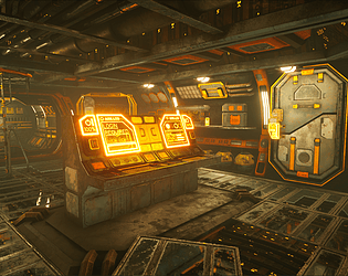
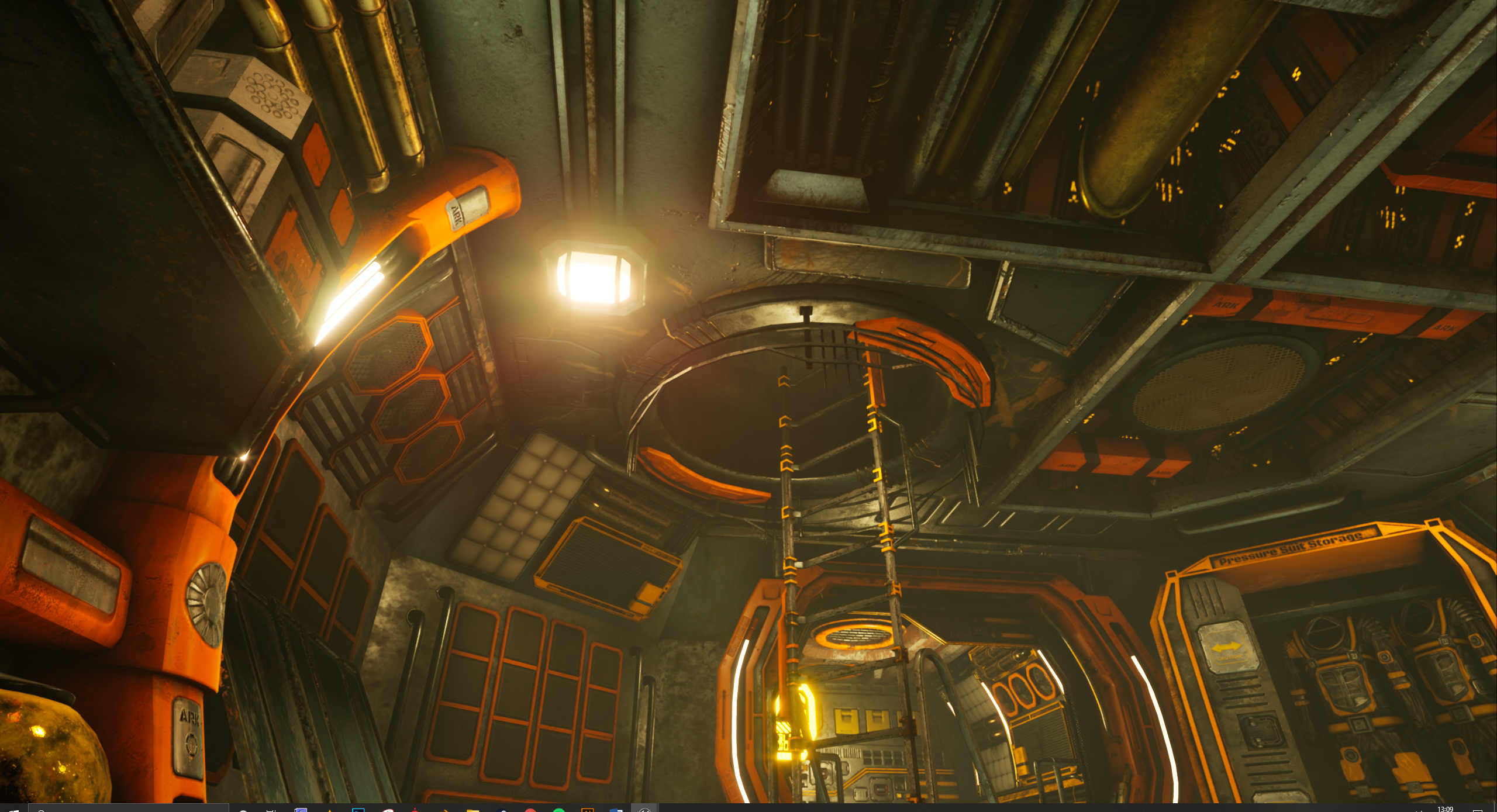
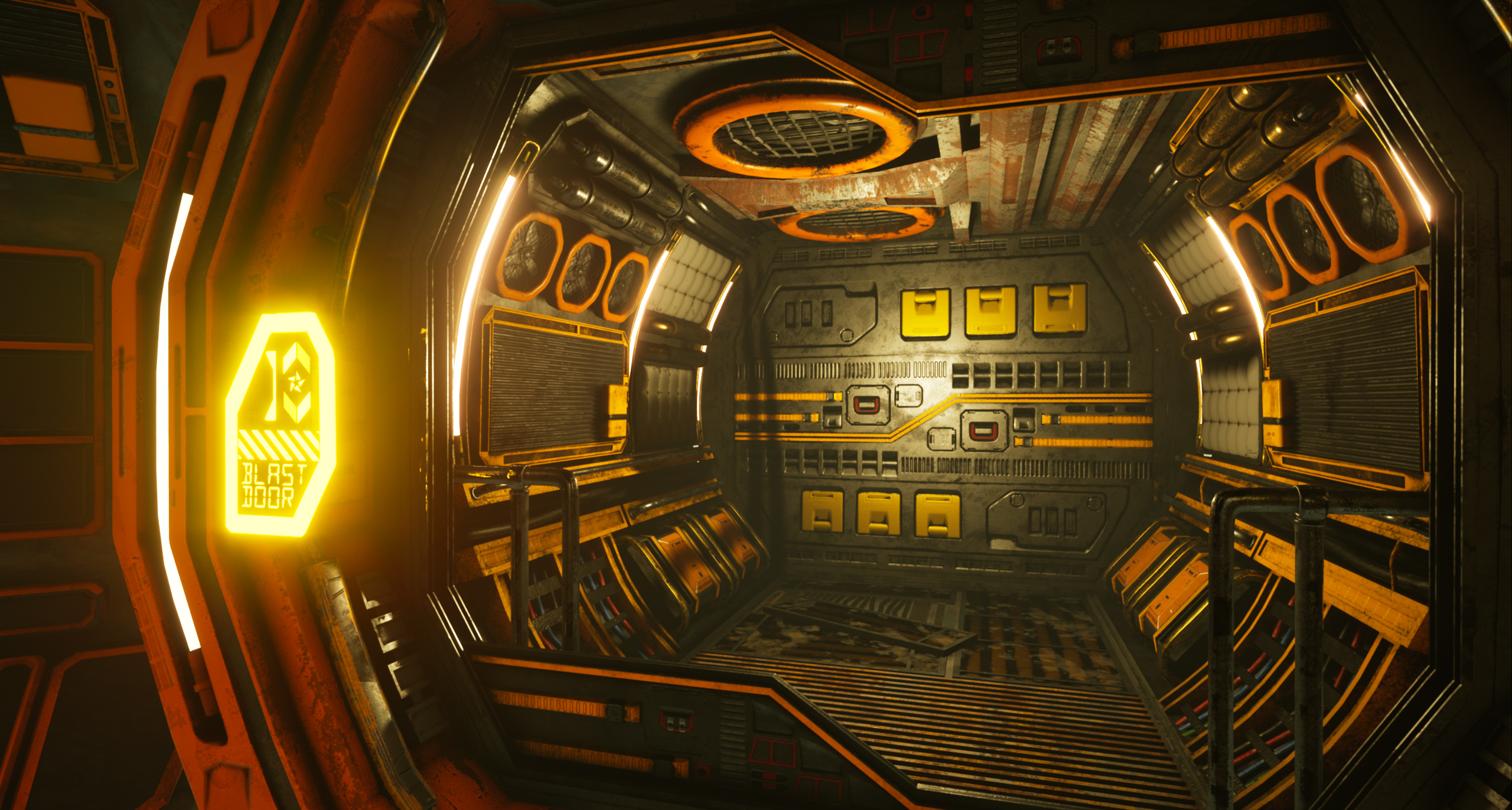
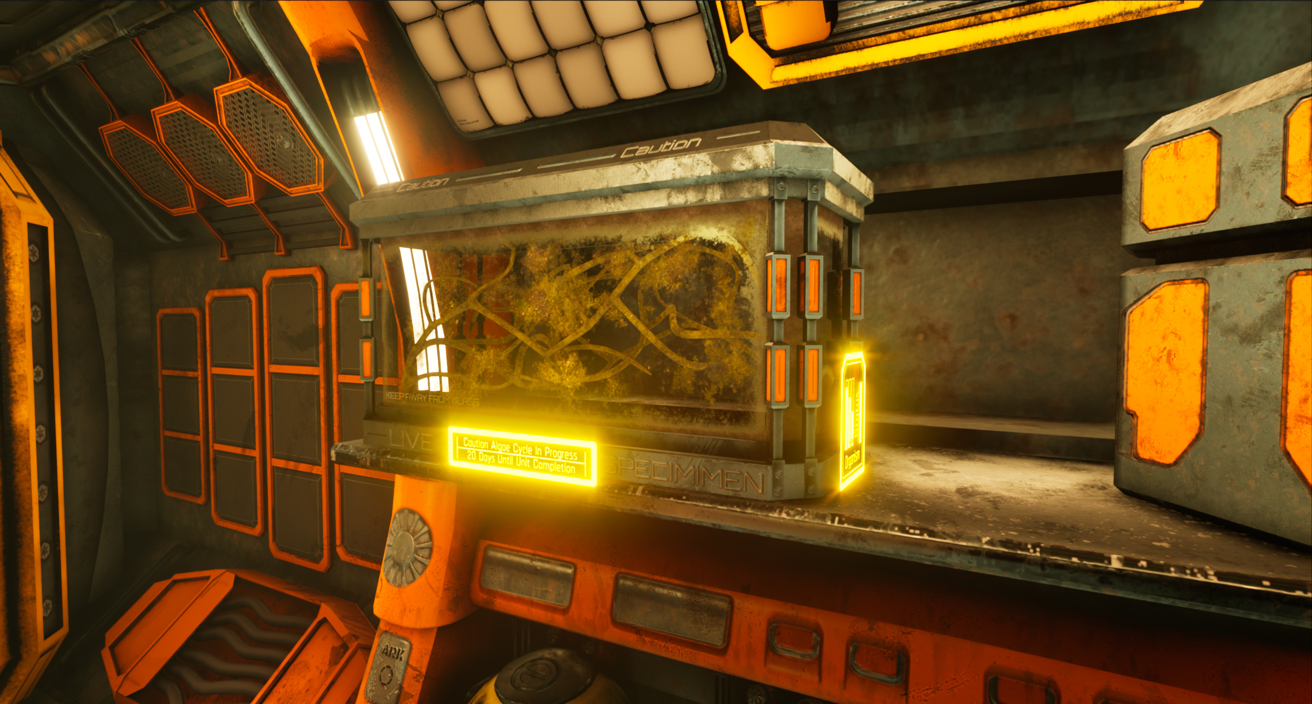
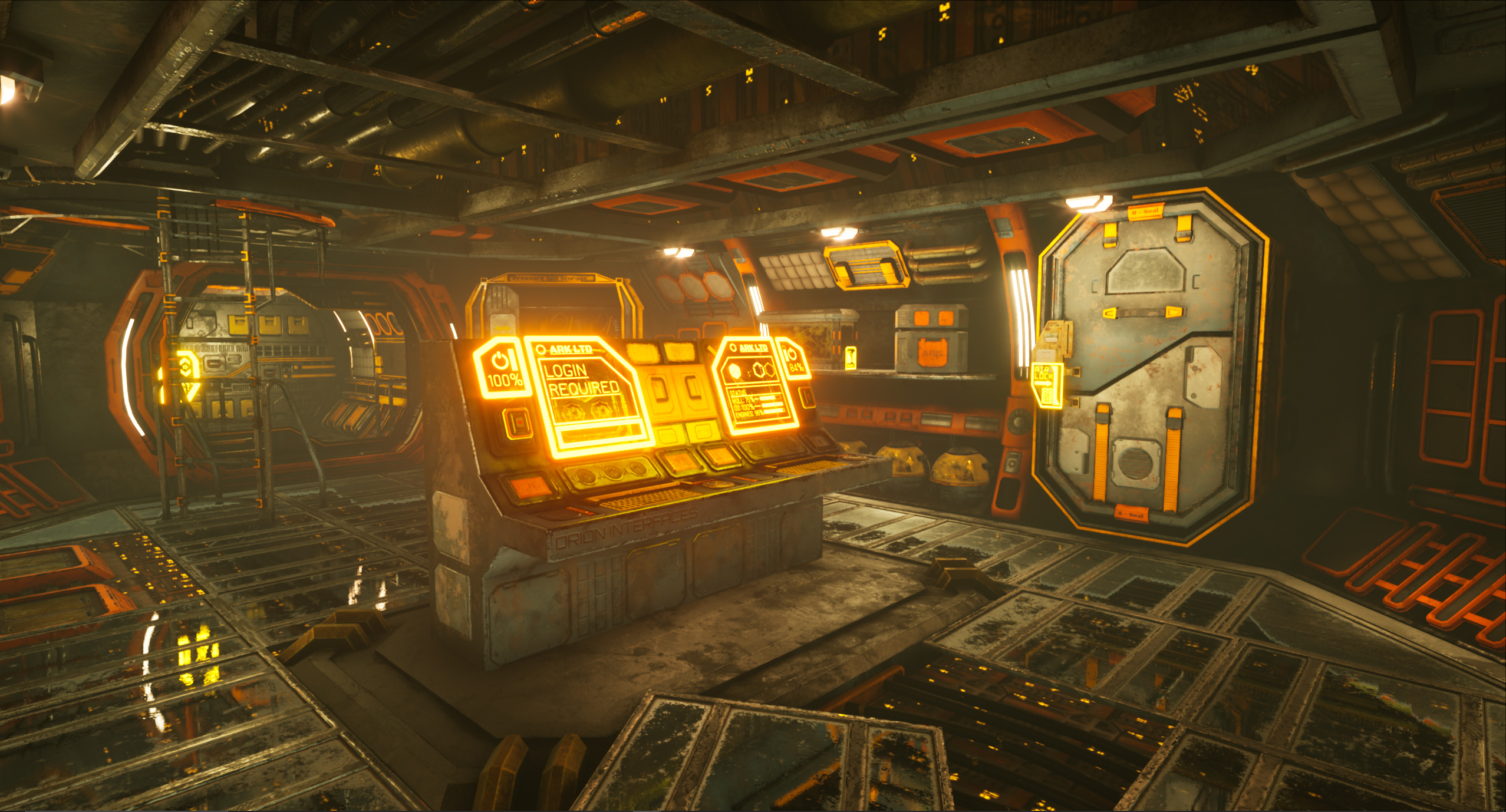
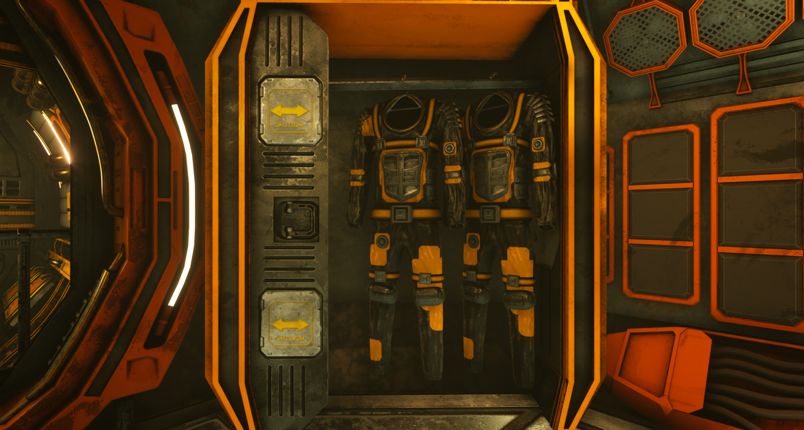
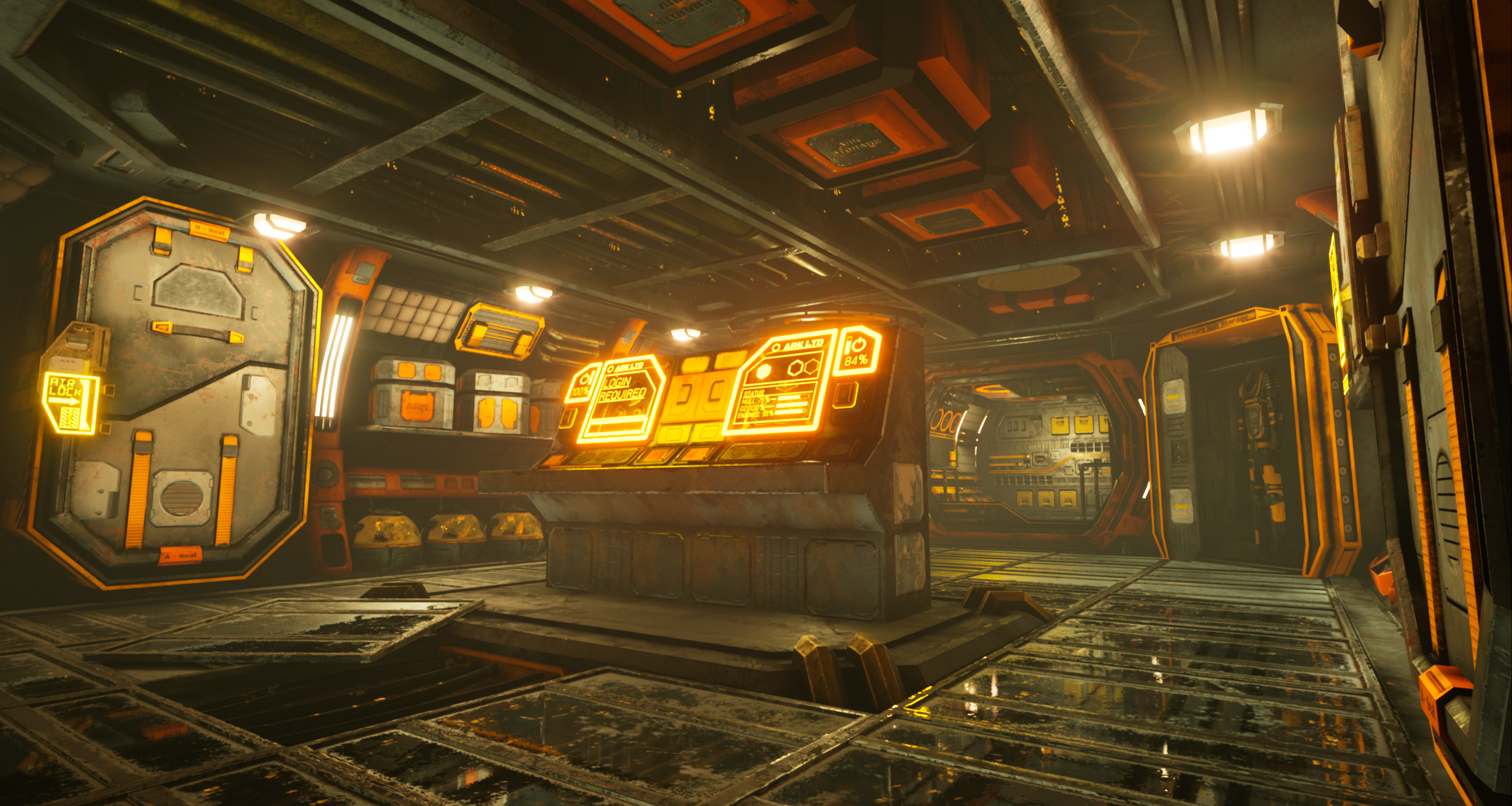
The scene is packed with lots of detail, there are many things to look at, lighting shows many aspects of the scene. Assets look interesting and the design of space looks intriguing. Functionality and reason for the detail is a bit on the loose side. Ratio between smart materials works, and the color palette gives a cohesive impression

The scene works well, but is definitely asking for a bit more polish and diving deeper into materials and bakes and how they work in the engine. When it comes to polish, you might want to also revisit scales of things and make sure to have the nice ratios, that you have going on with palettes and materials, going on with also those and in population of that detail.

Technical Art

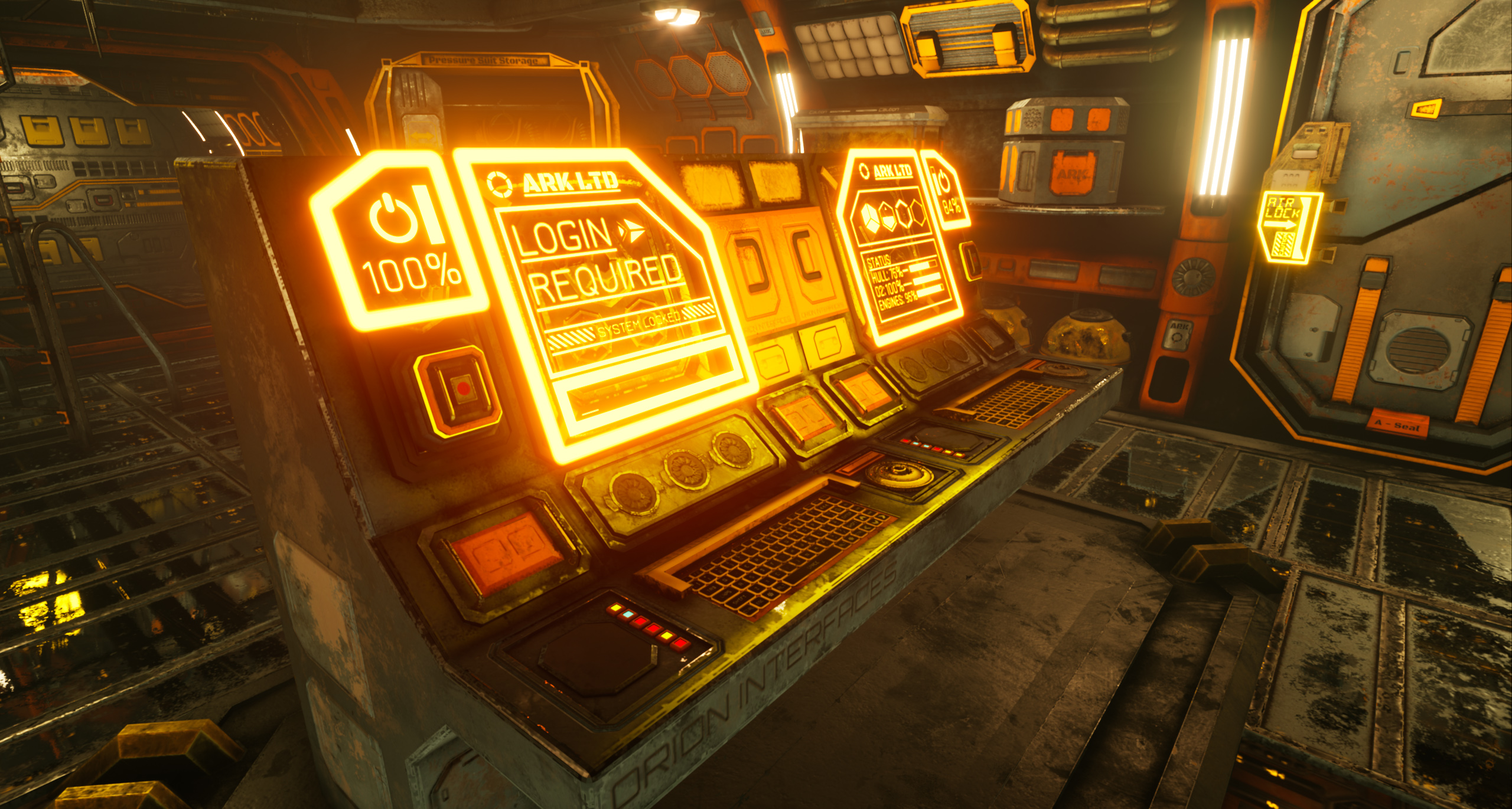
Polycounts are mostly on par with game art. Some rounded surfaces might have a bit too much roundedness. The delivered content shows a lot of Materials without Material Instance workflow, which affects shader compilation times. Most of the materials also seem to be using unique textures; it's okay to use only a couple of tiling textures and trims along with some unique textures for props.

Documentation

The documentation showcases creation of assets, steps to produce the final work and well written thought process and reasoning behind calls in the scene. It's worth maybe noting that it would be a bit easier to read through all of it if it was packed into a single document. The delivered project file also seems to be maybe missing the level file, from what I can tell, for closer look, and objects might have a hundredfold scale to them but they are cohesive and consistent of size.

Final Presentation

Renders are of high quality, the compositions work and everything reads well. Nothing is being tried to be hidden from the viewer, and it's easy to read what's going on.