Indie game storeFree gamesFun gamesHorror games
Game developmentAssetsComics
SalesBundles
Jobs
Tags
A jam submission

Mystic TempleView project page

A sandy portal room with mystical wisps.
Submitted by MattCane — 9 hours, 8 minutes before the deadline
Add to collection

Play Environment

Mystic Temple's itch.io page

Results

CriteriaRankScore*Raw Score
Technical#303.0003.000
Documentation#303.2003.200
Overall#352.9202.920
Presentation#382.8002.800
Research & Development#412.8002.800
Creative#422.8002.800

Ranked from 5 ratings. Score is adjusted from raw score by the median number of ratings per game in the jam.

Judge feedback

Judge feedback is anonymous and shown in a random order.

  • Artist – Matt Cane Category: Sumo Digital Rising Star Assessor: Anthony O Donnell – Lead Artist at Firesprite Work name: Mystic Temple Research and Development /Documentation The document is well presented and gives some insight into the creative and production process. The scene followed a standard approach from ideation to blockout to production. Some research was carried out to inform the final result. Technical Art Geometry The modelled bevels / weighted normals is a good approach. Polycount on the stones are excessive especially when compared to other elements in the scene. Materials and Textures Channel packing was not used. There was roughness variation between surface types but areas such as sand between the paving slabs lacked a higher roughness value which flattened the scene out a bit. The texturing is decent with some nice detailing. The scene has a stylized look I'm not sure this was intentional. The use of world aligned textures is good especially with the context of blending floating meshes to environment surfaces. The panning textures on the beams / portal add some dynamism to the scene. Creative Art The scene is an interesting concept that was made well with a clear focal point. With the portal being the key element it would be good to go back and make more of it by layering up effects to create a more visually interesting portal. Is it safe ? Dangerous ? Mysterious ? A quick google brings up many interesting references. https://www.pinterest.co.uk/pin/831195674960495865/?lp=true Final Presentation The final image work well for the original intention. The focus is firmly on the portal this composition is supported by the lighting. More visual interest in the portal itself and work on the material variation in appropriate places would add a lot.
  • Submission Title: Mystic Temple Submission Tier: Rising Star Assessor: Dominic Shaw Artist @ Firesprite Research & Development There was a good breakdown of everything that you have done, and I liked that you made a poly count thread for the environment. This is a good way to get feedback at each stage and be involved with the community. It would have been nice to see some more time management stuff such as asset lists and time plans as these really help with the development of a project. Creative Art There is a good focal point in this level and it’s a nice, interesting environment to view. I like the particles that you have the scene too which are quite cool. I think that the lighting is a bit dark in some areas so it would be cool to do another lighting pass to try lightening these areas up a bit. The main improvement that you could make on this scene is the way that you have set up the floor and sand material. You could have made a substance designer graph for the tiles with the sand in it and then exported a few variations of this texture and used vertex paint to blend between them. Rather than placing small meshes in the cracks where you want sand as this is very unoptimized. I would have three variations of the texture which would look like this: • Basic Floor • Cracked Floor • Sand When vertex painting the red channel could be the cracked version, green channel could be sand and then you have a spare channel which could potentially have wetness on the blue channel. Here is a good tutorial on this workflow: https://www.youtube.com/watch?v=zVCpHPM-1cc Technical Art The use of trim sheets in the project was a good workflow to use to help keep the level optimized and you have kept modularity in mind whilst making the environment. You could have brought in just one of meshes into the engine and then instanced this around rather than exporting all of them from your modelling package. If you set the pivot point to the centre of the circle, you would have no issue duplicating this stuff in the engine. The portal material that you made was cool and interesting but make sure that you are channel packing the textures for the roughness, ambient occlusion and metallic textures to further optimize the level. This would look at little like this:  Red channel- AO  Green Channel- Roughness  Blue Channel- Metallic Then when you import the texture, change the compression settings in the texture to ‘Masks’ making sure that the sRGB value is turned off. There was also a lot of unused material slots on meshes, make sure to delete the unused ones as these are adding unnecessary draw calls that will make the environment unoptimized. Documentation There was a good breakdown of all the things that you made and with the polycount thread, I got a good insight into your workflow. Final Presentation The final presentation was nice, and I liked the video that you made too, there was good focus on focal point in each render and overall not a bad job at all. Moving forward, I would just focus on improving the floor texture and the lighting as I mentioned above.

Challenge Tier

Sumo Digital Rising Star

Leave a comment

Log in with itch.io to leave a comment.

Comments

Jam Judge (1 edit)

Research & Development

Research is pretty closely

Creative Art

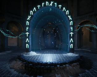
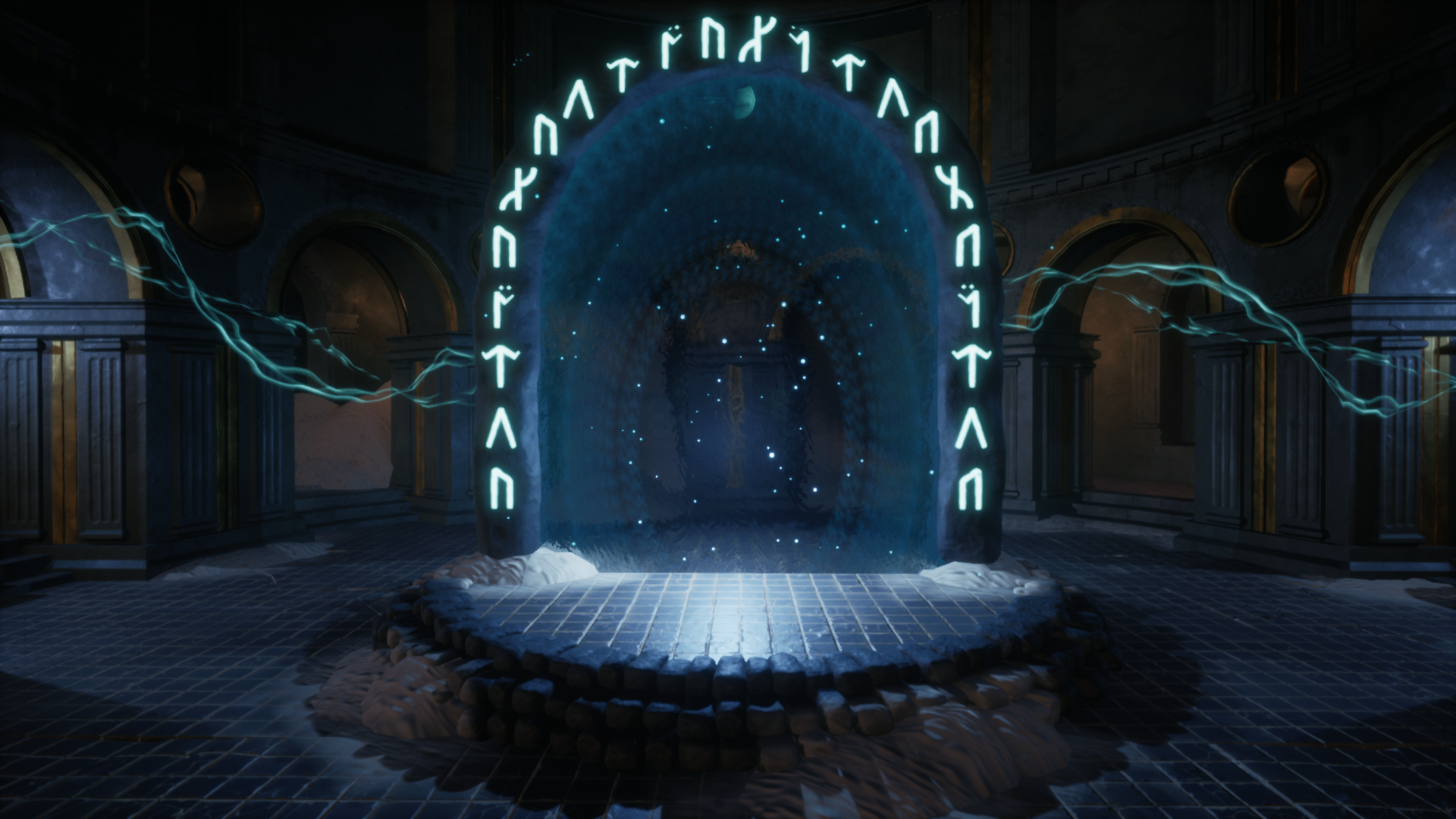
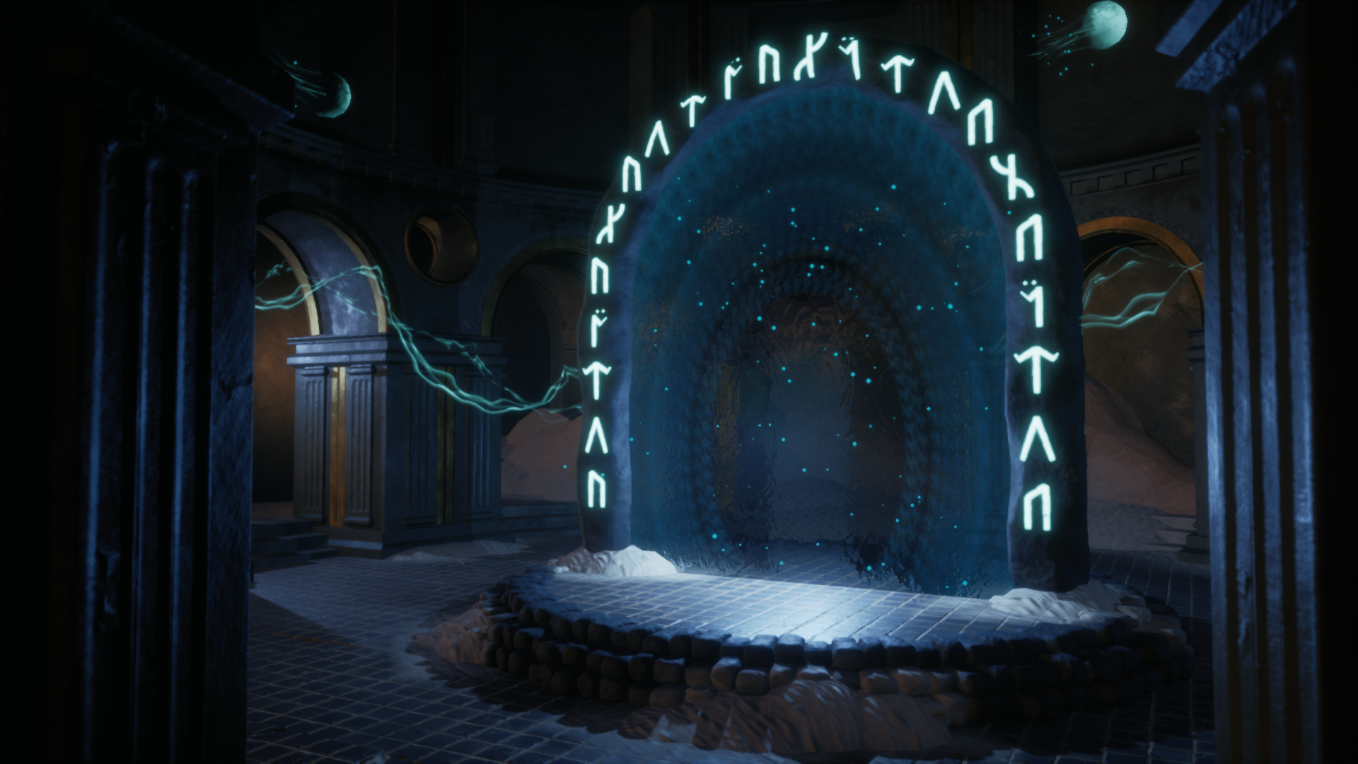
The scene is filled with magic - the scene reads, glyphs feel very interesting, effects are spot on. Metals contrast well with shiny tiles and wall materials.  To push the feeling a bit closer to God Of War's temple, you could introduce some organic elements (something to match the tree in GoW) and ornate trims to generate more interest to the floors, pillars etc. However, the results look absolutely stunning for short period of time frame scenes. To push the feeling a bit more, you could also add some mindful decay, wear and tear into some of the silhouettes, and maybe some extra decals and material blends. This could also give a bit more reason to show more props and how the place has been more shaped and used by its inhabitants. The sand piles might work also if there was maybe an opacity mask running along object's UVs, or maybe with use of Render Target to add interestin some sort of way (as food for thought)


Texture wise, the breakage of tiles is a bit extensive to me, and the baseColor textures could maybe use a bit of work on top of slightly notable gradient mapping effect. They work very well in the scene though.

Technical Art

There's good usage of tiling textures, trims, decals, lighting, blueprints, particles as well as custom shader effects. World-positioned sand material is also a nice show of technical aspects. The ceiling could maybe be a bit more optimized along with the portal surrounding rocks. Everything looks and feels well stylized and dream like with wisps and trails.

Documentation

Documentation is easy-to-read and images convey the steps taken to produce the end results. References and models used are shown very well.

Final Presentation

The center of attention is clear, images are of high quality and showcase effects well.

Developer

Thank you very much for the feedback! :) I have never seen the 2 videos you have suggested to me before and the render target looks pretty neat! I will definitely look in to these techniques more for future work.