Judge feedback is anonymous and shown in a random order.
Good to see lots of gathered references. It would have been good to see it annotated with what you liked and wanted to include in your scene. Good to see an asset list and reference for lighting. Your blockout has a good amount of detail in it and it’s good to see a lighting pass at this stage.
Good to see use of Houdini, tiling textures and decals (the damaged and curled wallpaper looks particularly good. The models and textures look good and there is consistency between them.
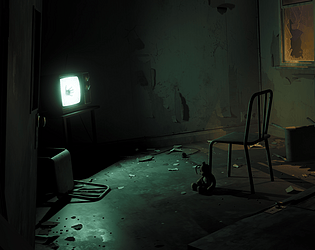
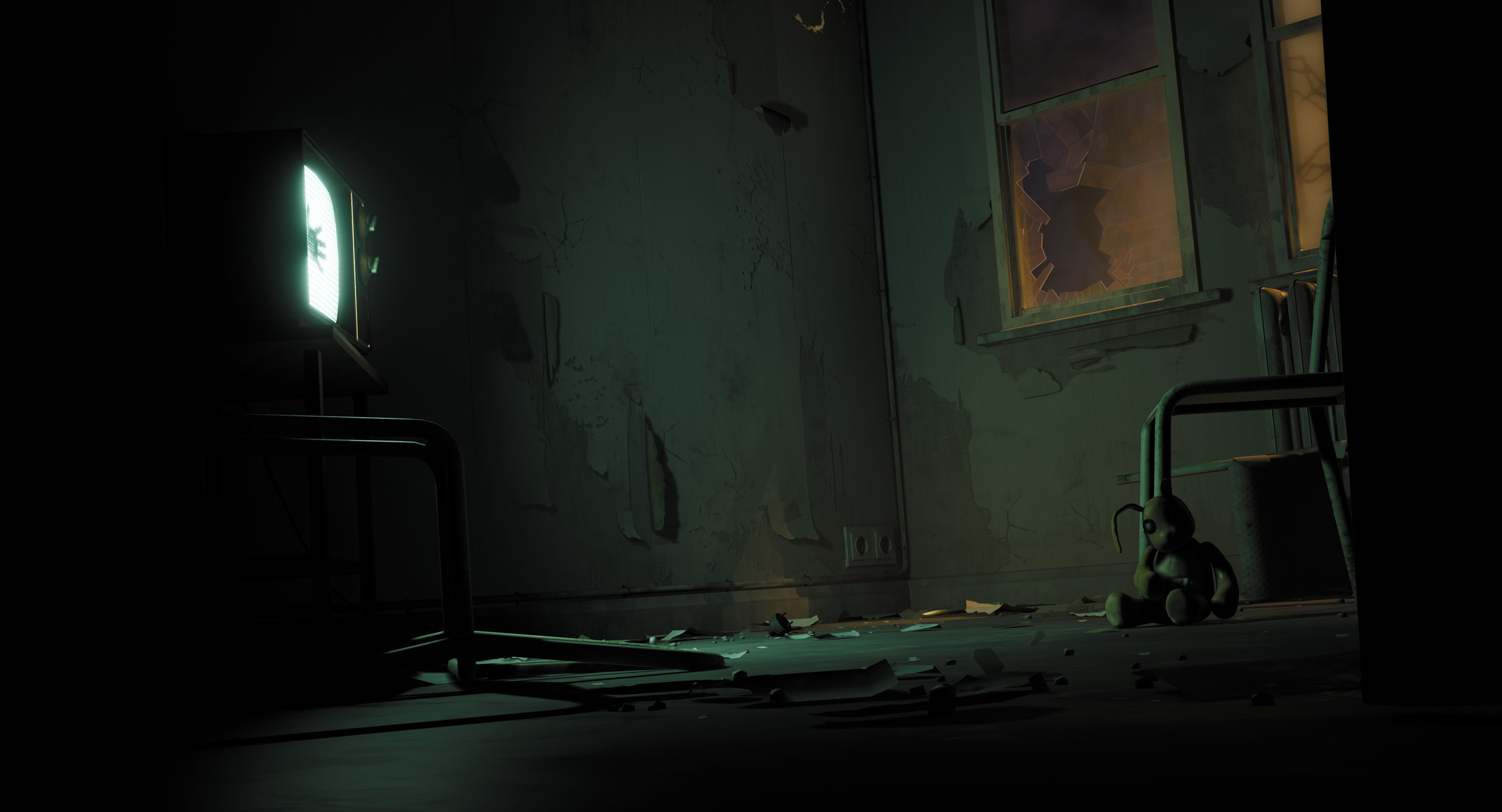
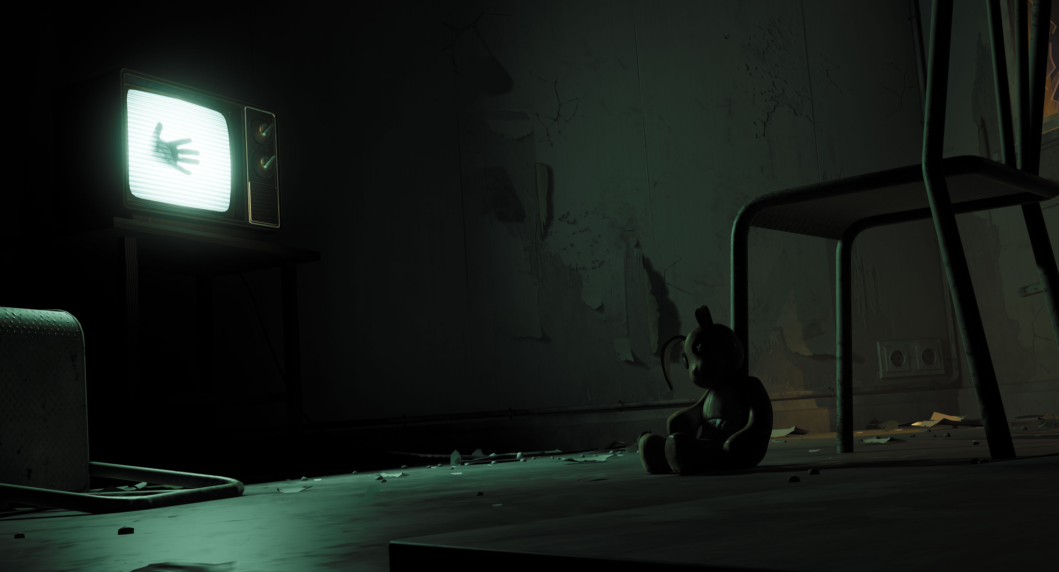
The hand on the screen is a great touch and adds a lot of narrative to the scene. The lighting is great (you can really see the reference being used here) and the post effect makes the whole scene pop a little bit more. Great scene!
Artist – Milan De Laet
Category: Search for A Star
Assessor: Anthony O Donnell – Lead Artist at Firesprite
Work name: Trapped
The final images are really strong. The lighting and composition both support the implied narrative in the scene. It's a simple scene but laser focused in it's intent.
Research and Development /Documentation
The document is presented well and goes into detail regarding the creative decisions made along the way which inform the piece. Research gathering and planning was done in a sensible way. Getting to the blockout stage early with first pass lighting is a good way to assess scope early and validate creative choices for camera angles and lighting.
Technical Art
Geometry
Overall the scene is fairly simple and does as much as it needs to make the image work. This is not a bad thing. The use of modelled decals are a good choice as opposed to trying to do this in textures only.
Materials and Textures
Textures are fairly simple. Channel packing could have been used for efficiency combining metallic, height and roughness textures. Dirt / rain streaks left on the windows would be expected to be vertical not mainly horizontal. This is a small detail but worth noting.
Parameters were used to get variety across material instances. The functionality of the decal shader is nice but I can’t help but see it as overkill versus just UV mapping the planes to the relevant UV space of the decal texture sheet. This would have meant one material used for all decals which would also be cheaper in terms of pixel cost. Currently there are 9 material instances for these.
The noise / dirt applied to the textures via the albedo and roughness textures does enough to suit the scene. More time spent on texturing to have clearer visual definition across surfaces would be a good next step for the scene.
Creative Art
The video via level sequence is well done. All the creative choices made are very strong and on point for the intended result. Enough work was done in each to make the image work well. It’s clear to see how the research influenced the final piece. The elements chosen from the reference were composed together in an effective way to achieve the final scene.
Final Presentation
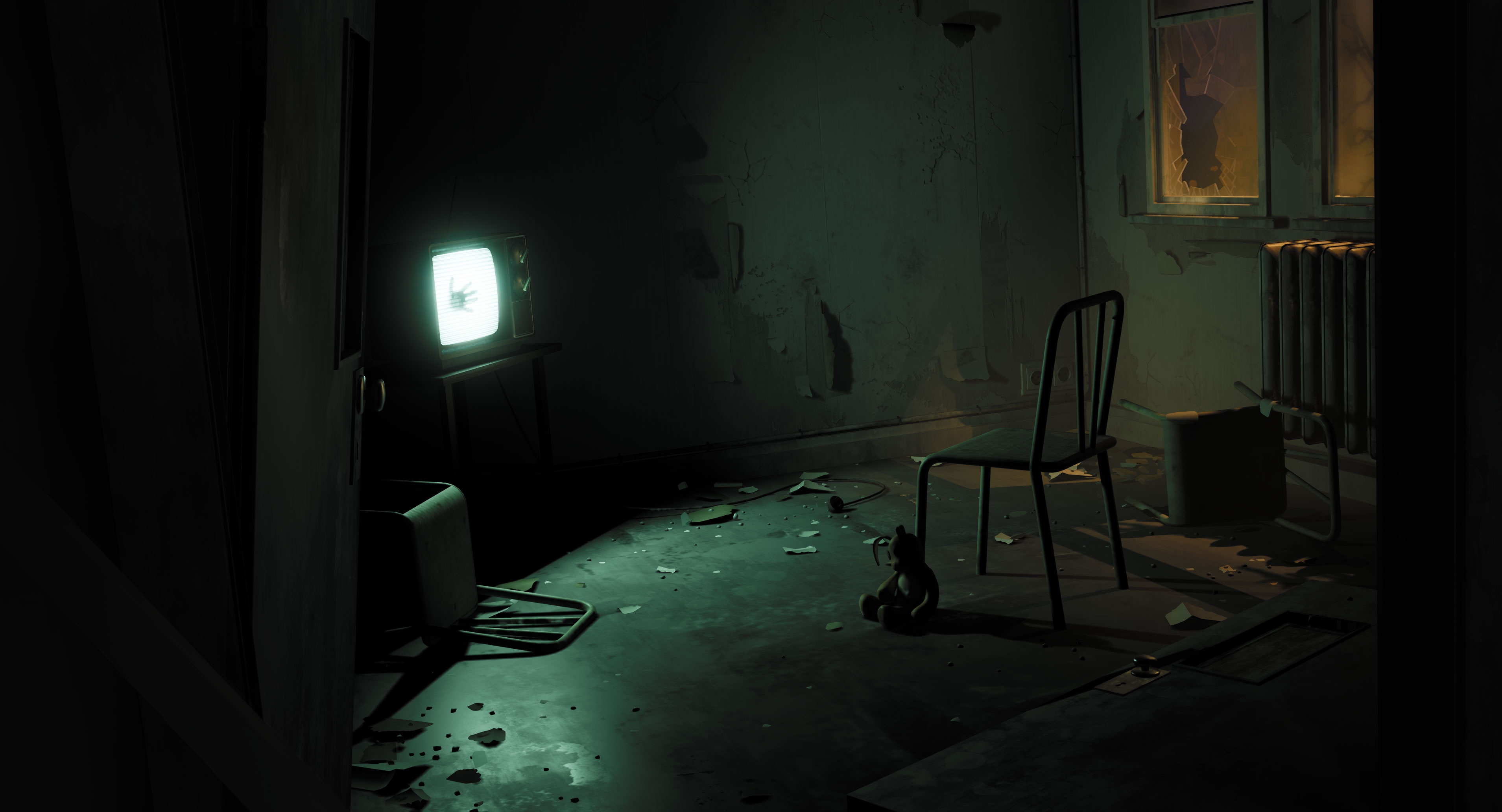
The final images look great. All the elements come together to create an atmospheric image with a narrative. The door hanging off the frame and another angled on the floor add to the unnerving requirements of the scene but also nicely lead the eye around the image. The lighting was handled very well to keep the focus where it is needed.
Hey!
First of all congratulations on a lovely piece of work.
Now on to the important parts of why and how can we push this further!
I think the scene composition through the door works nicely, the window material effect to highlight the edge of the glass is really cool as well. Where there are some issues however is with the overall story telling. I understand and can see the asylum nature, but what happened here? The TV is the focal point and it doesn't really say much, the toy when found makes it make much more sense, but it takes too long to see as the TV is distracting.
So, think again about what you are trying to say and then work out how best to say that.
Maybe the toy should also have a supernatural element, when the TV flickers, maybe the toy could too? Weirdly. Something small I noticed as well, if the person is trying to escape said TV, their hand is at the wrong position, try to claw your way through some glass yourself and notice.
Another question, did you use reference for the chair? It feels fake, like you guessed what a chair looked like from your imagination.
Also I didn't totally like that I couldn't full explore your scene in play mode, would have been nice to walk around it.
The little torn wallpaper meshes really helped sell that wall, it's really great, those are the kind of extra bits that add to a video game environment. The lighting is super atmospheric and also really sells the scene, great job!
As always, keep an eye on your polycount in areas that don't need it, consider asset reuse. Other than that, not bad in terms of Technical, the materials go a long way.
Chris Harper
Snr Technical Artist @ Splash Damage
This is a professional quality piece of work, and a superb example of less being more. It's a small piece, very simple, but effort has been put into the right areas, leading to an atmospheric and eerie environment.
My less is more comment is also applicable to the texture work and lighting - it usually takes a long time for artists of any stripe (not just 3d env people) to learn restraint, that often just because you can use detailed textures, many props and multiple light sources, doesn't mean you should. Let the eye and the mind of the observer do the heavy lifting - all you need to do is direct. The wallpaper here is an excellent example of this - just enough detail to sell it, but without becoming too noisy. The same can be said for the lighting - just two simple light sources, working in conjunction.
The artist has a talented eye for composition, scale, lighting and narrative, as well as being very technically accomplished in the creation of some fairly complex shaders. The final piece is far more atmospheric than the original concept inspiration, and this work shows that the artist is more than ready to become a professional in the games industry.
Awesome job man! One of the best so far. It got me from the trailer :D . A really thought out scene, from concept to testing out lighting, making a really atmospheric and powerful scene with very few elements in a very efficient way. Can't say there are many things that need improving but one thing that could give it a bit more "contrast" would be a bit more dirt, grunge and weathering on the walls and overall room. Again, good job! keep it up ! ;)
Research & Development:
The abandoned asylum subject matter will always be interesting as there’s so much opportunity to tell a story within the environment, and I like that you’ve also selected real life reference to work from instead of just going with the concept art, real life ref is so important to help make decisions that will contribute to it feeling more tangible.
Good choice of the key assets as they are all equally important to include. One thing that would be nice is to see a few more iterations of the layout early on as you then have a few options/ideas to potentially develop, usually because the first idea you have isn’t always the best one.
That being said, I like the small tweaks you did part way through to the composition to help the final shot feel more interesting, it’s always good to check every now and again as you’re producing it to make sure things feel good.
Creative:
The scene is very simple, but has a lot of personality and the additional clip really adds a nice story element to it. I very much like the way you’ve used the TV to light the room and having the complementary coloured light on the outside pouring in through the window.
The attention to detail with the work on the peeling wallpapered wall is great and you’ve made good use of the decals to break it up.
It holds up well in the thumbnails, however when you get close up it becomes very muddy and unclear with material definition, which is partly due to the texel density as mentioned below in the technical section, and so wouldn’t hold up so well in a practical game scenario where the player can get a lot closer.
The lighting has a good base and I understand that you’d like to have the harsh light to create contrast and the mood, however, the shadows are pitch black which isn’t realistic as there’d definitely be at least a little bit of bounce light from the tv and the outside to light them up slightly.
Technical:
The technical aspect to some of the elements such as the TV shader, scripted events for the video, tackling the broken glass with houdini is awesome to see and is used really well to add a lot.
You’ve made good use of using tileable textures and FWN, however, the texel density consistency varies drastically as the floor, door, and radiator look super low res in comparison to the other objects in the scene. Getting consistency with texel density is very important for overall quality and stops any issues of things looking like they are at different resolutions.
Another thing to watch out for is the triangle count, to get an idea for how many you need for an item, the amount of space it’ll take up on the screen is a good indicator. The wall plug for example certainly wouldn’t need 1k tris, and the radiator shouldn’t be 11k - Instead of using FWN, you could bake down a normal map and use it as a detail map to still get the high poly feel and use a tileable texture.
Presentation:
Very well presented project, and with the additional video it really makes the narrative more apparent, giving it a lot more personality & feeling.
Documentation:
The documentation is laid out nicely, it’s easy to read, and shows everything I would need to see to understand how you approached the scene and certain aspects.
Submission Title: Trapped
Submission Tier: Search for a Star
Assessor: Dominic Shaw Artist @ Firesprite
Research & Development
There was some good research done for the project and I like that you made asset plans of what was needed in the environment. It would be good to see more prop reference and it was a smart decision to keep the environment small so that it was achievable in the 11 days that you spent on the environment.
Creative Art
I really like the composition, mood, lighting and storytelling in this environment and I think that you have done a really good job making it. I think that you have also done a good job with the style of the project and overall, it’s a solid piece to go on your portfolio. There are a few small improvements that I would do such as improving the floor material as it looks quite low resolution and taking another crack at the windows as they look a bit too stylized compared to the cool wallpaper material next to them.
Technical Art
You have a good understanding of the workflows needed to make environments and good knowledge of how to speed up the process using workflows such as master materials. I would have personally added ambient occlusion maps and channel packed the roughness, ambient occlusion and metallic maps to one texture to help optimize the level.
I really like the wall paper material that you created but I would have gone a different way about making it as you using a lot of decals to make this look nice. You could have added a second texture in there for the torn parts and used vertex painting to blend between them. This would have cut down the decal usage a lot.
Documentation
There was a good breakdown of all the props and materials and I got a clear insight into how you made this environment.
Final Presentation
Overall, I that this is a solid portfolio piece, it has good mood and storytelling which makes the environment visually appealing and interesting to look at. Good Job!
A really strong submission, well thought out, researched and planned. Great to see so much though being put into scene composition and lighting at the blockout phase as this is often overlooked. Textures are well balanced and convey the feeling of decay and grime without going crazy with micro detail making the scene easy to read. There is also some impressive technical work here with the creation of some advanced materials and use of modelling techniques. Overall presentation is excellent and the process well documented and easy to follow. Personally I would like to have seen scratches on the floor suggesting someone was dragged into the tv.
Research:
Awesome breakdown of research and use of film and concept to influence your creative decisions. Would be awesome to see a few more examples of inspiration for other aspects such as camera placement. Awesome time management and planning in general.
Creative:
Scene looks really good. Lighting is spot on and you’ve made awesome use of the decals shown in your breakdowns. It would be awesome to see more prop variety (I’m looking at you second door and chair) although I am aware you joined the competition late. I see a second door inside the room which I am curious about considering there is already a door on the hinges still. Regardless you still did an awesome job.
Technical:
Use of Faceweighted normals was very effective. Again your shader work is very good. Shader complexity breakdown shots from UE would be nice to see. Not much to say here, you’ve got a lot of cool things going for you.
Presentation:
Excellent presentation. Love the lighting and even the subtle Dutch tilt. The TV moving in the video is a very nice touch. Maybe a little too dark on the left hand side, but it’s only a small area. Really nice composition.
Documentation:
Very detailed breakdowns, very nice. Individual prop renders are quite low res though, would be nice to see some shots of the assets in a showroom separate. Otherwise solid work!
Conclusion
Excellent planning, excellent execution. Great job.


Leave a comment
Log in with itch.io to leave a comment.