


Play asset pack
Magic Shield's itch.io pageResults
| Criteria | Rank | Score* | Raw Score |
| Creative | #6 | 3.750 | 3.750 |
| Documentation | #6 | 4.000 | 4.000 |
| Research + Development | #7 | 3.625 | 3.625 |
| Overall | #8 | 3.550 | 3.550 |
| Technical | #8 | 3.375 | 3.375 |
| Presentation | #10 | 3.000 | 3.000 |
Ranked from 8 ratings. Score is adjusted from raw score by the median number of ratings per game in the jam.
Judge feedback
Judge feedback is anonymous and shown in a random order.
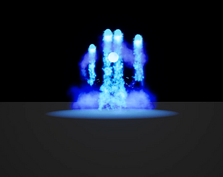
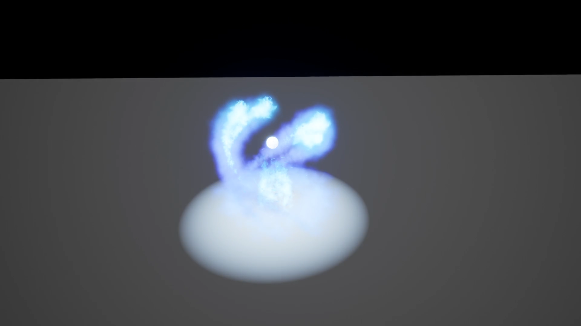
- Planning and concepting shows a good understanding of the effects you set out to make, and this is an important part of VFX creation that can often be overlooked. The choice to make a scene of effects is cool and shows a lot of creativity and demonstrates various technical skills. The cauldron bubbles and the projectile impact look great and are my favourite part of the scene. Presentation could’ve been improved by providing a video of the effects for easy viewing. It would be great to see a video of the entire scene, then shots of the individual effects. :) Feedback on individual effects: Cauldron fire: The way the fire peels from under the cauldron is really nice. To improve this effect I'd suggest working on the textures to make the fire feel more like flames. The flames and smoke could both have less linear movement. :) Projectile impact: The timing of this effect looks great and really conveys the intention. The way the dust expels could be improved - as currently all the sprites just fade out and are the same size. I'd improve this by varying the size of the dust and have them erode rather than fade, and perhaps increase in size as they erode/fade. Defensive ward: I love the way this effect stops the arrows mid air. However, the timing is a little off, and the different stages of the spell feel a little detached from one another. Perhaps some refraction might help with the feeling of it pulsing through the air as it explodes. :)
- I really appreciated the effort and research that went into both this effect and the entire sequence this is a part of. The documentation was really well thought out, and I thought the concept work was a nice way to block out your thoughts before trying to translate it into a game engine. Here are some notes on the presentation itself: -The different stages and overall intent of the effect comes across, but there are a lot of tweaks you could make to improve the read. I think overall it might last a bit too long and might even have too many stages; making this quicker and consolidating this down into fewer stages might help the flow of this. -The use of lighting and scene darkening is a great addition. It provides some additional context to the effect and helps ground it into your scene. See if you can adjust the timing of some of the lights in between the stages, sometimes they pop in and out and don't always match what's happening right away. -Some additional camera angles might help show off what this effect is trying to get across; especially when the shield orb expands outwards! -Try adding some fresnel/dot falloff to all of the orbs so they aren't so hard edged on the sides, and on the big shield orb, also try adding in some depth bias alpha so the geometry doesn't have such a hard edge when it cuts through the playsurface. Keep up the good work! -Ryan Hoss Senior VFX Artist Deep Silver Volition
- I really like the concept of your effect and overall movement. You have a good couple of textures but it becomes really repetitive especially when the four orbs are floating and you have those smokey textures that are going down. Try to work on those textures more. I really wanted to see the big orb that is stopping the projectile to have more of a cool look instead of a flat looking color. I believe there is a small amount of detail in there but you need to look for it to see it. It can look like a force field that has distortion and have some emissive elements streaking in it. There is so much more detail you can still add to this. Keep working on it! It is on the right track with some love it can be something amazing. (It would be really cool to see the projectiles breaking apart when they are turning back, just an idea:))
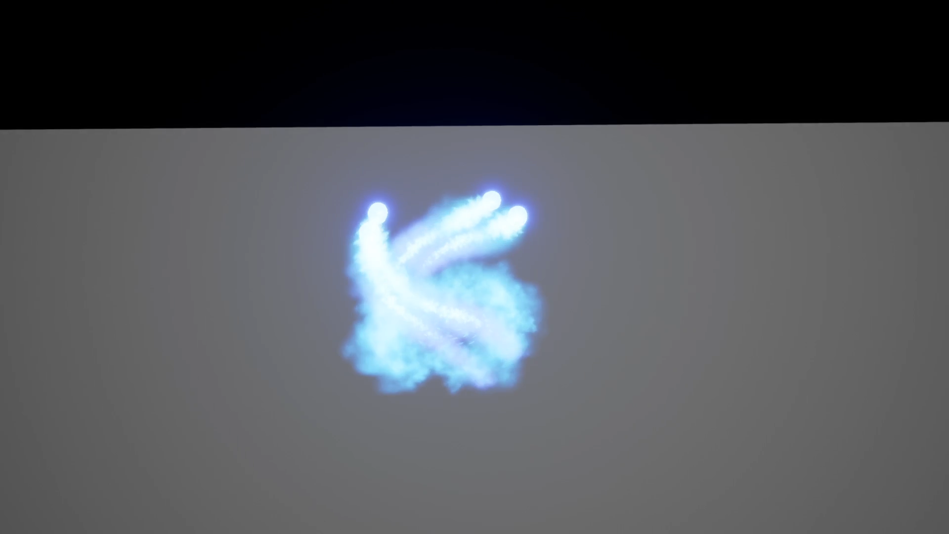
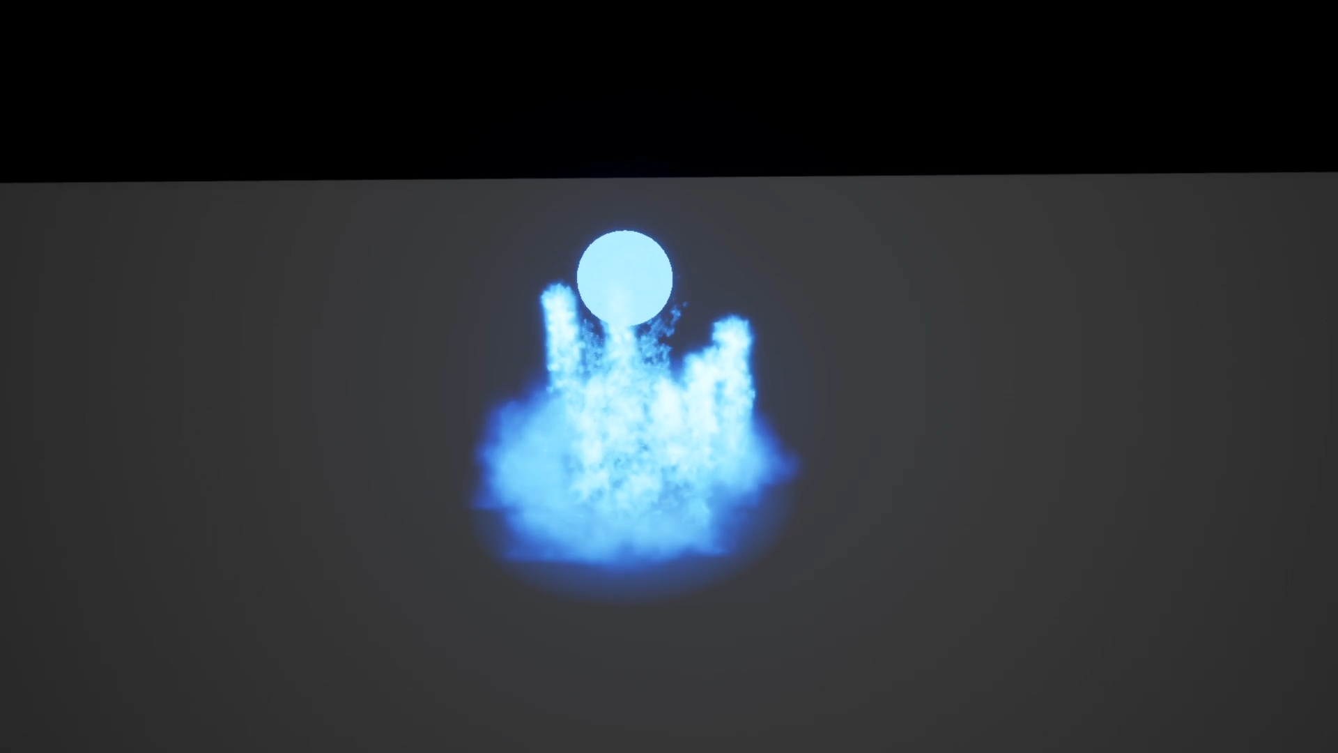
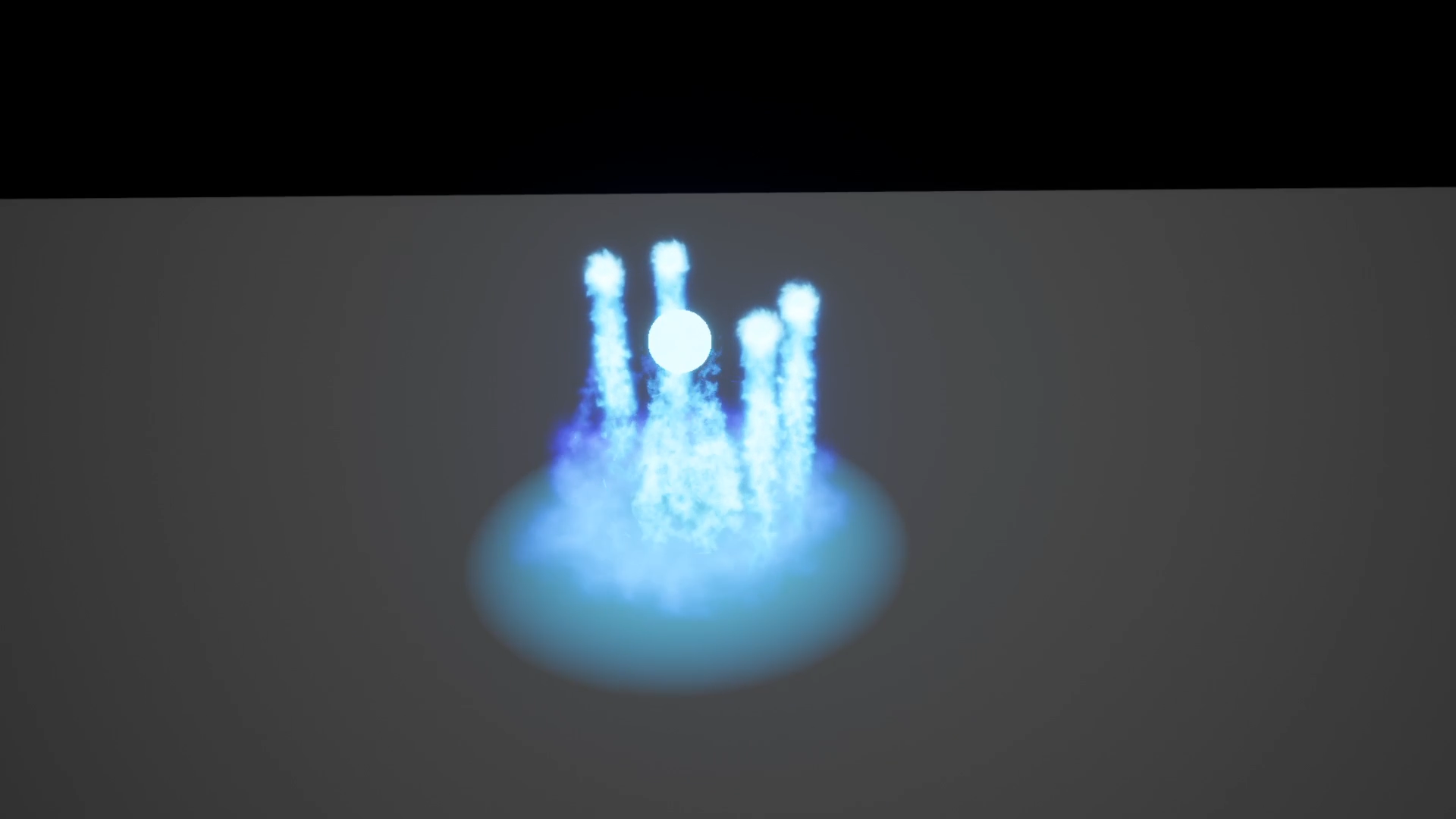
- Your documentation is clear and well thought out. Is has a consistent theme and brand throughout. It might be nice to add a little more personality perhaps using different colour headers or titles. You have some good research looking at a variety of different elements and different medias. The effect piece has a lot of elements and is very creative. There is a lot of different techniques used throughout the effect, with well timed animation. The initially energy is really great and has fantastic motion and timing. I really like the way it appears to stretch out and creates an initial area for the effect to grow from. The orbiting smoke then defines the area for the effect, or as it would seem. You have intersections with the ground, you can use a depth fade node multiplied by your alpha in the material to fade the intersection to help hide this. The rising orbs that spin have a nice movement, however all of the elements on screen are now very similar sizes, colours and values. This makes it very hard to find an individual thing to focus on and details start to blend together and get lost. The ball at the front is very solid and bright so commands attention but is quite a boring shape, although it has some nice subtle movement and deformation in it. Perhaps if this element was smaller and brighter it would help distinguish it. The ground smoke could also be a darker colour, perhaps containing a more purple colour and slightly darker. This would help emphasis the pattern above. The sparks and tornado central effect look really nice and build up really well. Unfortunately these elements start to get hidden by the falling mist. The sparks and tornado also have the same values and colour so they blend in again. Try to think about what colours would work together well or make certain elements show up better against each other. Different values of blues, green and purples or something contrasting like blue and orange perhaps. When the rising orbs get to the top, if they moved into the middle it would create a dome shape above the effect. When they vanish or pop, it might be nice to have the shield appear then at that point. Currently these elements rise up however the shield ball appears in a different location to where you would be looking. The shield takes a long time to form and loses the pace of the effect, until this point the effect has a nice rhythm and timing and seemed to be building at a similar pace and timing. The sphere is also very bold, perhaps a fresnel shader would help as the outside would be opaque however the centre would be more translucent so you would get a nice bubble effect. You could also use some noise and material similar to the tornado to add some subtle detail and tie those two elements together. The shield size is very large, there doesnt appear to be any elements within the initial phases of the effect that show this size. It would be good for either the shield to be smaller and match the size of the rotating energy before, or for a decal or the rotating smoke and orbs to rotate at the radius the shield will create to show the size of the shield area. This piece has some really nice elements and ideas, with some differentiation in colour and tone it will be easier to understand the different elements and show off your work better.
- Hi Elie; First, lot of work here, so well done ! Art : I will not lie , it's a little bit messy. Add more scale variation between elements, and more différent color. The timming is off too and it's very long effect, For cinematic it could be ok, but for gameplay it very long. In your documentation i can see drawing prototype : they are amazing ! the color are great the motion idea is very cool and accurate. if you do that (and You'll be able to if you continu) you have AAA effect. Tech : No optimisation, but is okay. it will coming with practice. You need to improve your technical skill, but you have very good creativity. In your documentation you talk about game that use Mesh and shader effect and they have good reason for that. Take a look : https://www.youtube.com/watch?v=eeLyOpFIr7Q Keep working, you do an amazing work on this ! Again, great job ! LOWYS Clément Ubisoft vfx artist MONTREAL.
Challenge Tier
Sumo Digital Rising Star
Leave a comment
Log in with itch.io to leave a comment.
Comments
No one has posted a comment yet