Indie game storeFree gamesFun gamesHorror games
Game developmentAssetsComics
SalesBundles
Jobs
Tags
A jam submission

Roller Coaster StationView project page

An abandoned Roller Coaster Station created for Sumo Digital Rising Star by Leo Skinner
Submitted by Leos0910 — 2 minutes, 31 seconds before the deadline
Add to collection

Play asset pack

Roller Coaster Station's itch.io page

Results

CriteriaRankScore*Raw Score
Technical#123.5784.000
Documentation#213.5784.000
Overall#223.4443.850
Presentation#233.3543.750
Creative#243.3543.750
Research & Development#253.3543.750

Ranked from 4 ratings. Score is adjusted from raw score by the median number of ratings per game in the jam.

Judge feedback

Judge feedback is anonymous and shown in a random order.

  • Rollercoaster station is a great idea. You need to ask yourself, how long has this station been left un-used. Months/Years/ longer? Is this a themed coaster? It says Journey to the center of the earth, so you could have themed it up to be more like an underground cave system or something - time depending. It doesnt look like the front car part is attacked to the main seating area. Either it would be all one piece or it would be bolted on to the seating area, or looking in UE4 its there is no connection arms attaching itself to the other carts. Small detail: But you could look at welds to the sculpts for where different solid parts of metal join, instead of just intersecting the meshes. The details on the coaster seating area and the car parts: All the areas where you have exposed metal coming through is abit unnatural. You need to ask yourself what is rubbing against the painted metal so much and so hard that its removing the paint, especially under the hand rail in front of the seat. Im guessing you used one of the smart materials in Substance Painter that added edge wear. You could have added abit more detail to the hood of the car, a bonnet, latch to open it etc. Minor detail but would be nice, if you have the time. You could add similar wear that you have on the track pipes to the hand rails every now and then, instead of a uniformed damage/wear to it. Remember that most man made things in life are made up of a number of different pieces and would be welded together or compressed etc, so you would have overlaps, bolts holding things in place etc. With something as large as your control booth you have it as all once piece with another piece sitting on top. When you should be made of of different pieces of metal pressed together, so you would have a few rivets holding it together, and maybe an access door to get to the wiring inside. You could maybe add some wear and tear on the concrete flooring, or cracks etc. Maybe making a set of alpha damage trim sheets that you can over lay ontop of the edges of the concrete? Nice detail on the top exposed part of the metal runner where the wheels rub against it, maybe try and have it so its not so perfectly uniformed. The parallax mapping can be nice, but if you look at the image of the red bricks you can see the mortar stretching up the sides of the bricks where it should all be red brick. Again, with your lighting how long has it been since this coaster was last operational. Would all the lights be working? Some on/off or flickering? Might have been nice to see some cables running up/along the walls connecting to a fuse box and onto the wall lights. Something to break up the large empty spaces on the walls. Posters/signs or even some themed items. With the track tunnel: in UE4 it looks like it goes on straight. I never knew it was a drop. Maybe add some soft lights to show your going down? Nice use of blueprints for some items. (Light mesh - decal - Pointlight) Overall its a very nice piece. All the feedback i have mentioned above are all small thinks, nothing major with is always good. Best of luck.
  • I like that you started with an idea of how you wanted the space to work but be open to inspiration while researching and finding reference. It would have been good to see more reference of various ride staging areas and then creating a new drawing of the space. I can’t see a block out. This is a vital step to the creation of an environment and not one to miss. Scale and topology of models looks good. I can’t see any wireframes but the silhouettes look to contain enough geometry. Good to see PBR being used in both asset texturing and tiling textures. I think more care could have been taken when building the environment so as to avoid intersecting geometry and making parts feel more grounded. The parallax of the brick work looks a bit too strong. The lighting works but it could have been more themed to the “Journey to the Centre of the Earth”. Dimming the lighting in the space and having a red/orange glow from inside the tunnel would have really enhanced the look of the scene. Good to see a small but detailed scene though.

Challenge Tier

Sumo Digital Rising Star

Leave a comment

Log in with itch.io to leave a comment.

Comments

Jam Judge

Research & Development

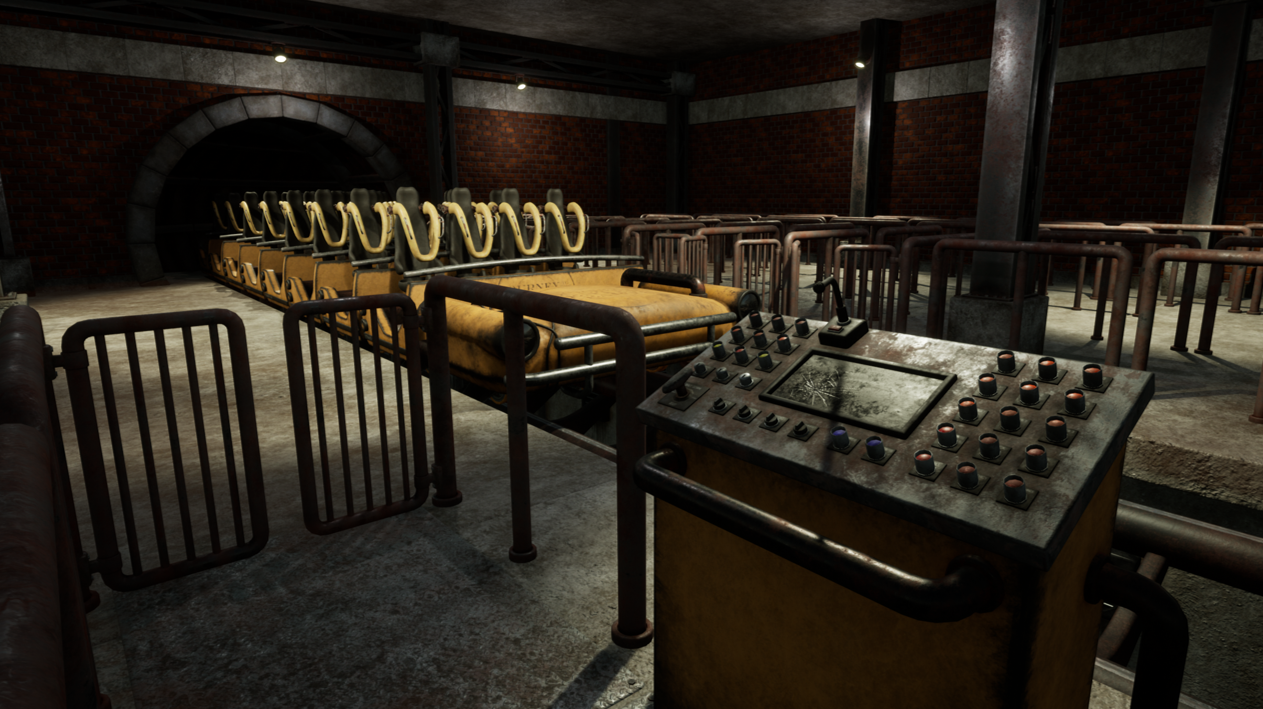
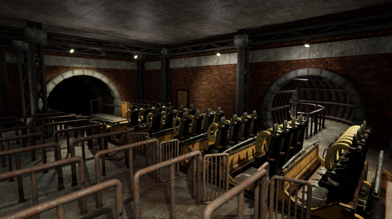
The research is a bit subtle there for how Roller Coaster Stations look like. I'd like to see a bit more research into why there are structures involved, such as the metallic support, that you are using also as a truss system for lighting. In some of your reference, it's used as a support to hold up the concrete slabs or corrugated metal plates of the ceiling, but seeing as how small your station is, it might be a bit of an exaggeration like this.

I'm also missing a bit of the narrative comearound here. A themed Roller Coaster Ride is a cool idea, and you could introduce some very intriguing ideas into the space with cutouts, flyers and using decoration and architectural materials of similar kind.

Creative Art

The space reads as a Roller Coaster Station. The lighting works well, and thumbnails look good.

The thickness of rails is one thing that I might suggest on making thinner, they feel a bit thick right now. The scene could also do with places for the eyes to rest; right now there's either detail from materials to interfere with rest or interesting silhouettes and color contrast of train carts. making the end result feel a bit like everything is fighting for attention.

On a more general level, to take the scene to the next level, I'd suggest you add carefully more interest into the silhouettes of objects with geometry, like you can see in titles such as Witcher and Red Dead Redemption, for example.

Technical Art

Texel density seems rather coherent and consistent. The scale of things feels a bit off, the door is a bit too small when playing the level and the relative size of fencing and cart seem a bit too big. The lamps look good  with geometry, but they are a bit small to have that many polygons, same applies to carts in contrast to the walls being simple planes without subdivisions to make use of vertex blend material. You might profit also from looking into Material instancing, as now all the materials are really separate materials. Control panel also has unique textures for very many separate buttons, and could benefit from reusing the same texture space.

Documentation

The written document is easy to read and follow. It showcases progress of props and beginning the layout with a sketch. Shader breakdown for the Parallax mapping is a nice thing. I would have liked to see a bit more of the prop and module progress.

Final Presentation

Contrast and lighting is there. Metals contrast with painted carts as well. The renders look sharp and showcase the results well.