


Play asset pack
Secret Desert Entrance's itch.io pageResults
| Criteria | Rank | Score* | Raw Score |
| Technical | #30 | 3.000 | 3.000 |
| Documentation | #36 | 3.000 | 3.000 |
| Research & Development | #36 | 2.833 | 2.833 |
| Overall | #39 | 2.833 | 2.833 |
| Creative | #39 | 2.833 | 2.833 |
| Presentation | #50 | 2.500 | 2.500 |
Ranked from 6 ratings. Score is adjusted from raw score by the median number of ratings per game in the jam.
Judge feedback
Judge feedback is anonymous and shown in a random order.
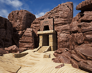
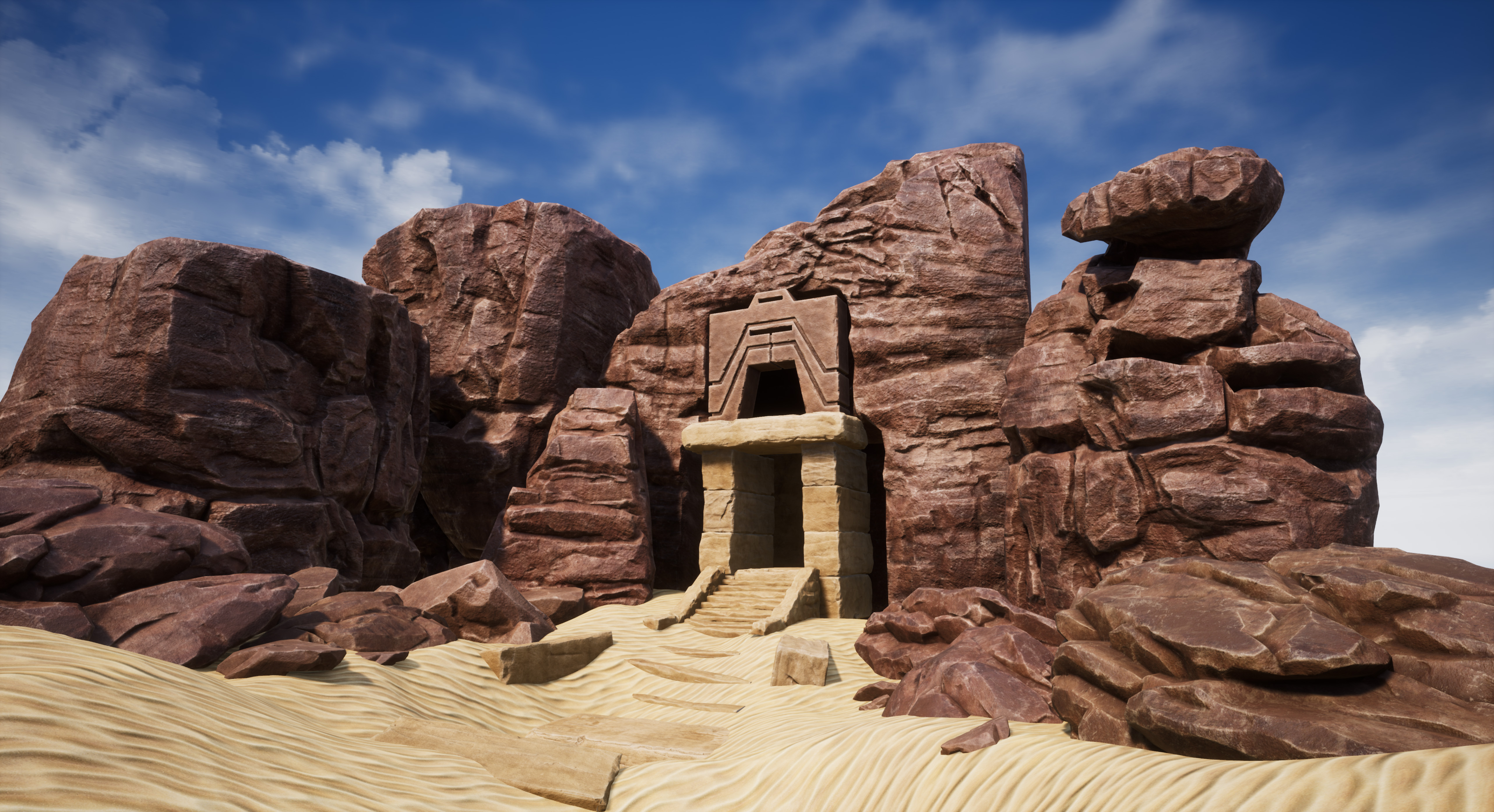
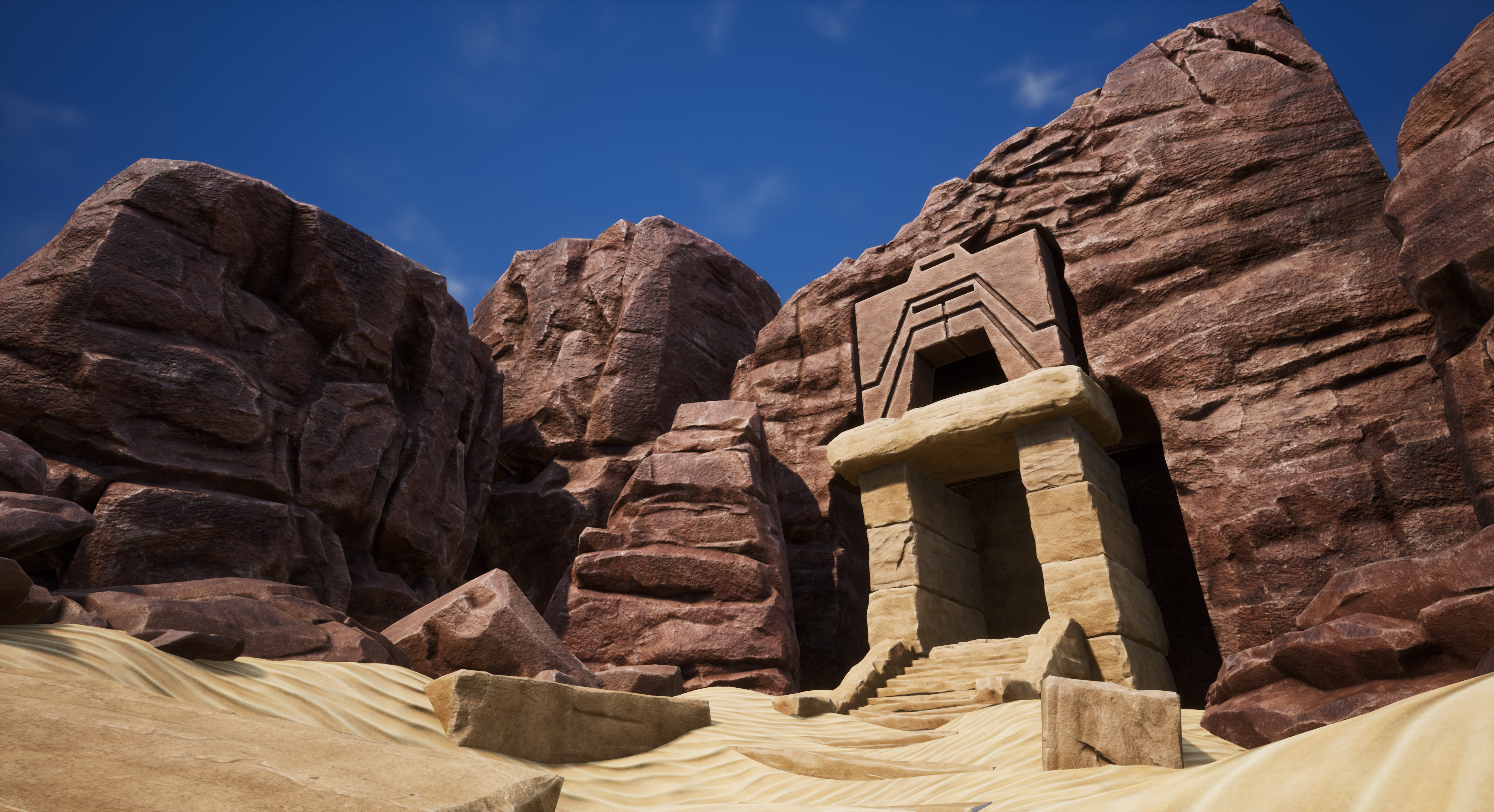
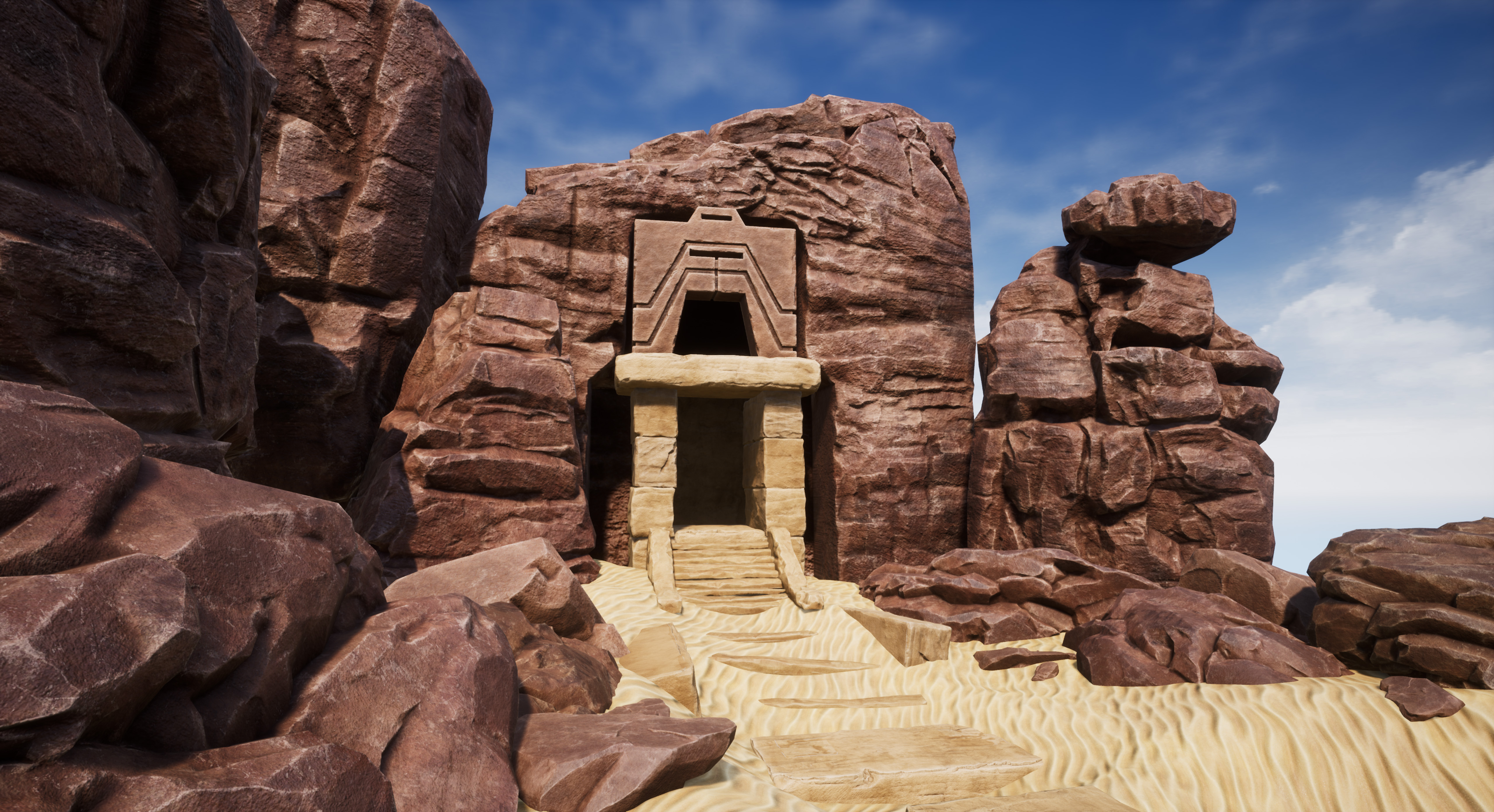
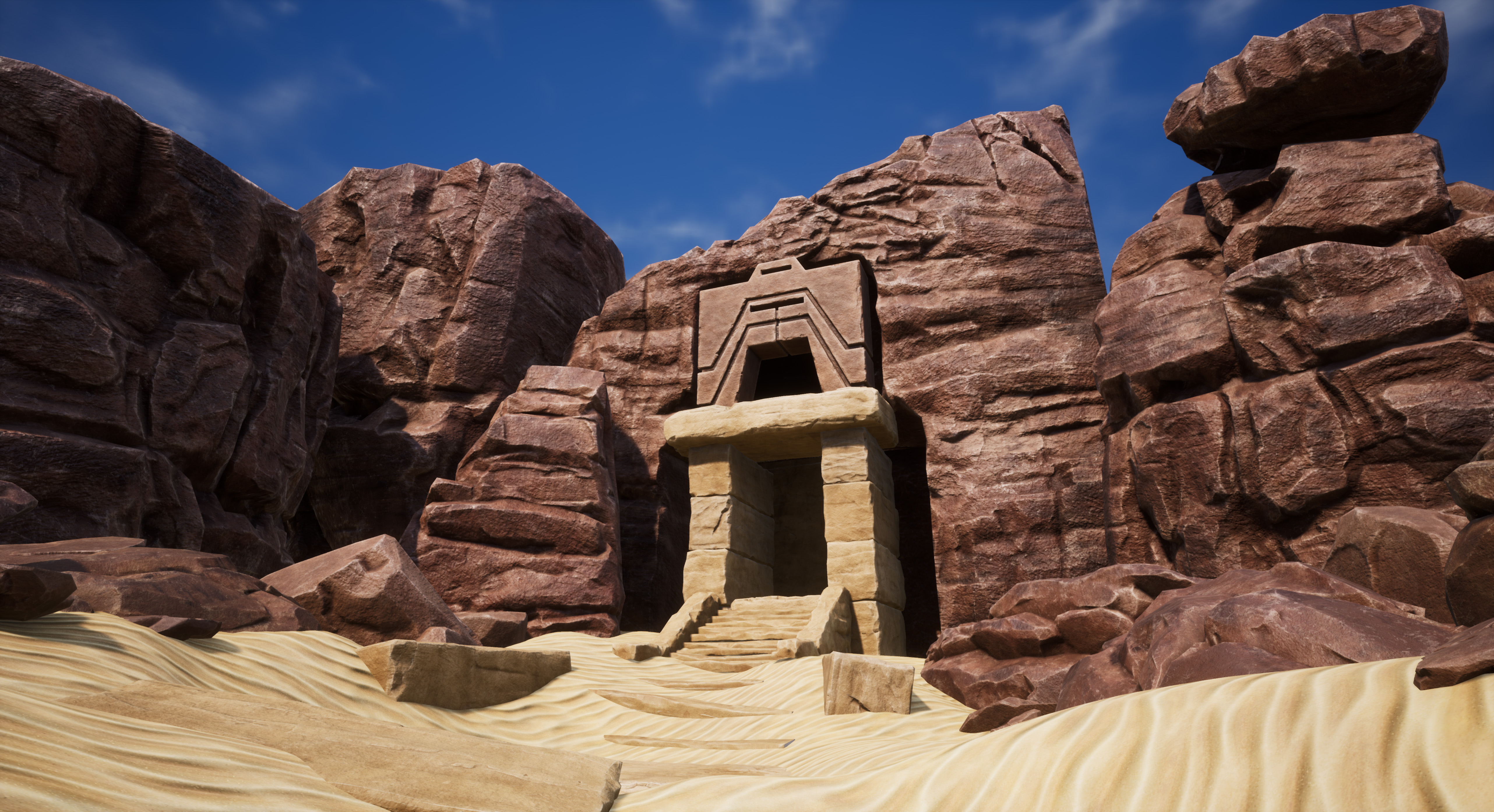
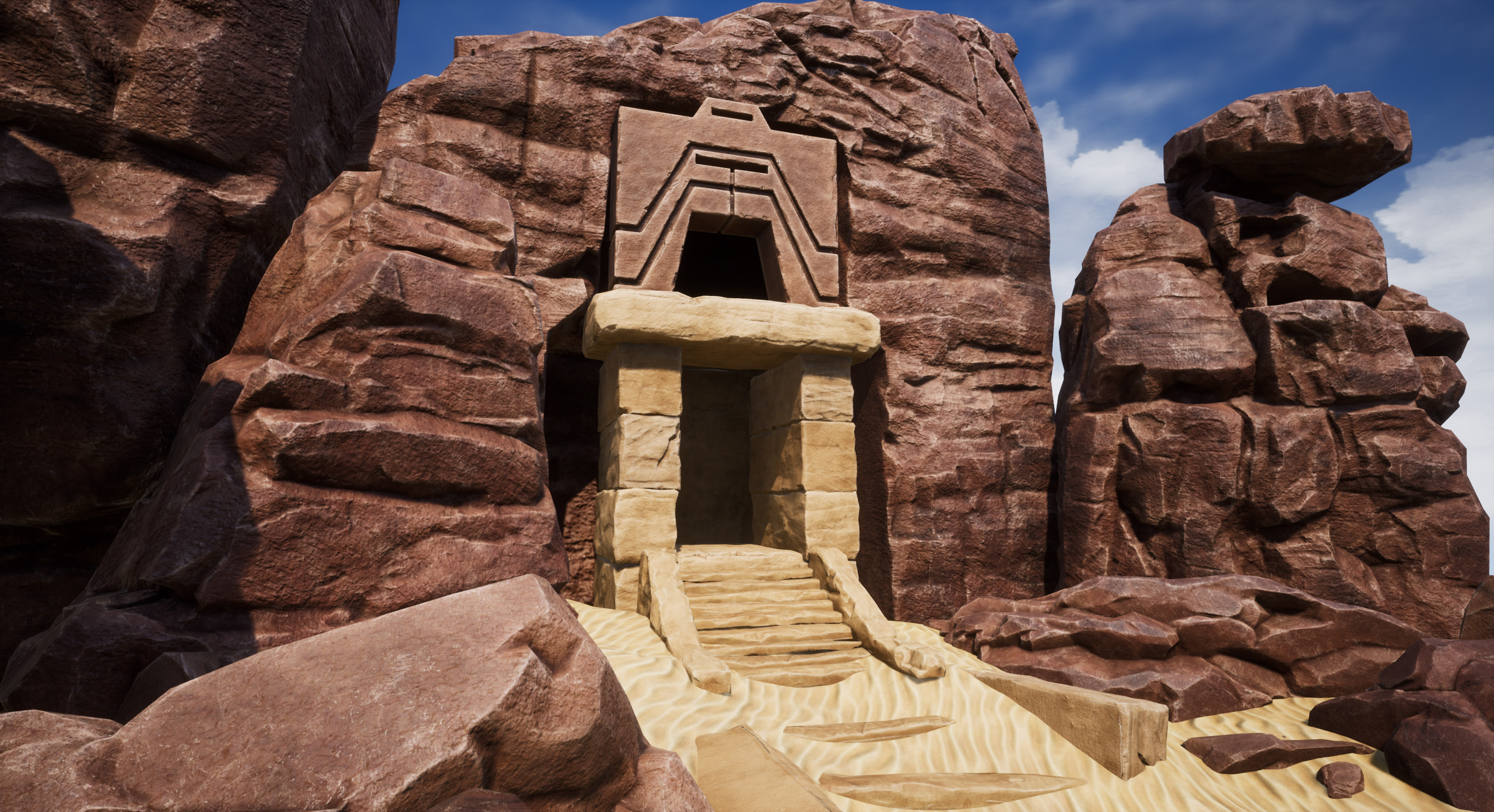
- The research into rock formations and methods for sculpting rocks really paid off, I think the rock sculpts are really strong. The texturing is decent although the rocks seem oddly shiny for a desert environment. The temple entrance and surrounding rocks feel a little disconnected when compared to the reference where it looks like the entrance is carved from the same rock-face. Given that the main features are the cliffs/rocks it would have been good to see more investigation into more complex materials for adding detail noise, vertex painting colour variation or blending sand into the crevasses. For example https://80.lv/articles/setting-up-rock-shaders-in-unreal-engine-4/ This would help greatly to improve the overall visual quality of the assets with fairly minimal effort. The designer sand texture looks promising although feels a little stylised when compared to the more realistic rock formations.
- It would have been good to see more reference and annotation saying what you liked and wanted to incorporate into the scene. It looks like you skipped the block out phase; be wary of doing this as it allows you to check scale, light and composition in the very early stages of development. Your rock sculpting looks good but it would have been better to create a kit of rocks and use them to populate the environment rather than several unique pieces. I can see you went down the kit route for the temple but be careful of making too many assets of the same thing: one stone block would have sufficed (you can also rotate and scale it in the engine to make it less obvious that it’s the same asset being used over and over). The way the temple sits in the rock face looks quite unnatural. The lighting is a little simple. You could have got more interesting shadows by making the cliff formation taller. A subtle amount of fog would have helped give more depth to the scene.
- Artist – Forin Iasinovschi Category: Search for A Star Assessor: Anthony O Donnell – Lead Artist at Firesprite Work name: Secret Desert Entrance Research and Development /Documentation The document is nicely presented. Decent reference images were gathered to inform the work. The document covers a few key elements of the asset creation process. It does not go into as much detail regarding the UE4 and scene setup. Technical Art Geometry Polycount is pretty decently spread out across the scene with the higher density on the hero props. Materials and Textures Overall the assets are well made. This kind of scene would benefit from the use of detail maps. Channel packing was used. Consideration was given in the roughness maps of which areas would be smoother / rougher based on angle and dirt build up in cavities. Edge wear was also considered. Creative Art The creation of the rocks follows a good process. The end result is very good showing evidence of strong observational skills by the artist. The temple entrance currently has an albedo that contrasts too much against the rock textures. In a lot of the reference images these are closer in hue / value. Lighting wise a lot of the reference has light coming in over the tops of the cliffs but never quite getting to the ground as it’s occluded by the cliffs given the angle it’s at this could be something to explore. The alien structure angle is interesting and should likely become the main narrative element in the scene as it develops. Details such as grunge streaks from rain vertically running down the cliff faces and sand blowing up against and covering the rocks lower down will make this scene feel a lot more natural. The addition of clusters of even smaller rocks / pebbles will add more visual interest. Final Presentation The final images are nice but as the scene is still WIP they do look unfinished with the close to default lighting setup. An improved lighting pass and additional time spent filling out the scene will show of the well-made assets in a better light. Adding a sand blend on the rocks touching the ground would sit everything better in the scene as per the reference images. It’ll be good to see this completed.
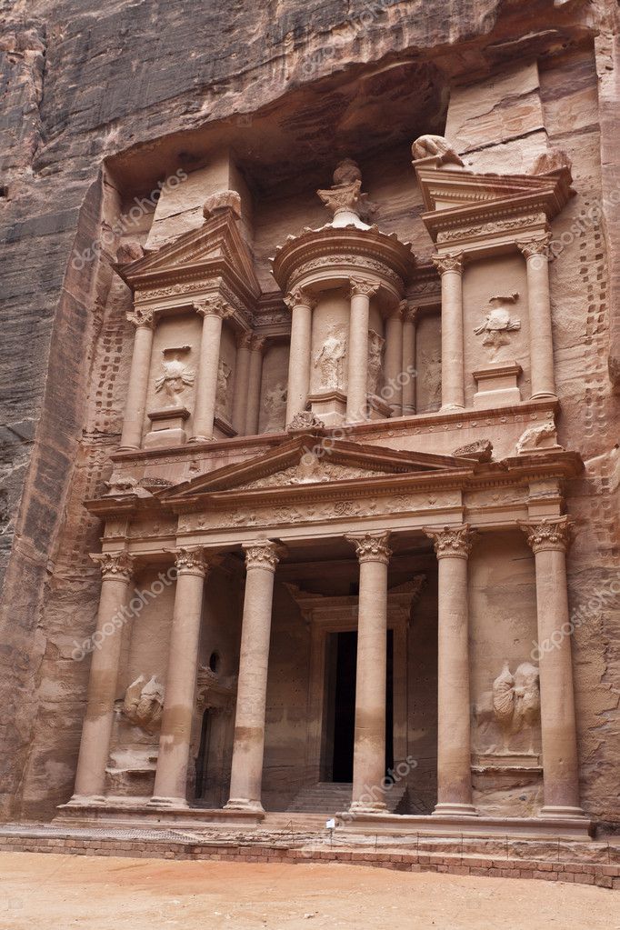
- Submission Title: Secret Desert Entrance Submission Tier: Search for a Star Assessor: Dominic Shaw Artist @ Firesprite Research & Development There was a nice breakdown of the process taken to make this environment but I think the project would have benefited from a bit more research, concepts and layouts to get a clear plan of what the project will look like before jumping in and making assets. Creative Art The rocks that you have sculpted are really nice and it’s good Zbrush work but I think the overall scene needs more work to get more story telling elements and more of an interesting focal point. I think the rocks alone will make a really good portfolio piece but the environment needs more work. There is too much contrast in value between the rocks and sand, it would be nice to get a dirtier sand to vertex paint around the rocks to help blend them into the environment more. You have a good focal point and your eyes are drawn there but I think the sculpts for these rocks could be a little more interesting and visually appealing. You can add more story telling elements in to help sell more information about the civilization that built this temple. Here is a good example of an entrance: https://static8.depositphotos.com/1248018/930/i/950/depositphotos_9307103-stock-photo-the-treasury-in-petra-the.jpg In this photo there are some good carvings and architectural detail which is visually appealing. I also think the focal point rocks could blend more into the surrounding rocks as at the moment there is a perfect slot for them which feels unnatural which is a shame because the rock sculpts that you have done for the surrounding rocks are really good and feel natural. Technical Art You have some good technical skills and I like that you used distance based tessellation and not just full on tessellation everywhere as this will help with the optimization of the environment. You did some good channel packing on the props but I would also channel pack the vertex paint material. I noticed that you applied the vertex paint material you made to the landscape material, when setting up vertex painting for landscapes, you should use landscape paint layers rather than the way you normally set up vertex painting on props. Here is a good tutorial on this workflow https://www.youtube.com/watch?v=2rOmej5tIkg. Documentation There was a nice breakdown of the props and materials that you made but I think that the environment could have benefited from more of a clear plan of what you are making. Final Presentation Overall, I think that you have the skills there and the assets that you have made are pretty good but moving forward I would focus more on the bigger picture of the environment before starting the individual props. Really plan out all the assets and the storytelling elements in the research and development stage.
- Hi, It’s an interesting challenge you are facing on this project. I can easily pin point the areas the viewer could have problems with on the final product. Things to look at: -The rock models on Zmaterials in terms of silhouette and sculpt mid distance detail are good but all this detail is not coming across on the final render. -The colour hue of the rocks seemed to be as if the reference of it was taken in the shade during a sunny day. I would advise you to think of this as if you have taken those references during an overcast day in England. The result would be less blue, less saturated. - Temple entrance should feel like it’s made of the same stone therefore and has aged with the background around it - Rocks need dust mask added on whatever is facing upwards so make it sit better -Add extra dust mask added on top of everything -Rocks need to have some erosion and extra colour information added on the grouts of it. -Add some foliage like shrubs, blades of grass, pebbles, tree branches or elements that might’ve ended up stuck in places because of the wind on key places such in between some rocks and around places where rocks meet the ground (scatter them carefully as too much will break the intend). Dirt should be added to the bottom of the rocks where they meet the ground - Forget the sky and put a more indicative background like in the photo references. If this is an entrance to a temple why am I going up first? To then come down? i.e if you put a big bad ass rock back ground behind it will: 1. help you achieve the scale of temple built inside a mountain. 2.give you more context to where this mysterious place is. -Lighting should be treated carefully as it’s there where the real deal happens. Don’t use just a directional light. If you need to fake bouncing light, then do it. Faking is good as long as no one notice! -Can we see I tiny bit more of what’s happening inside? Like a teaser? Maybe by adding a bouncing would reveal more instead of a black patch. -I would stick to the ground dirt material that is shown in the reference instead of the sandy beach type. Having orientation of the lines like that fights against the rocks and how they are placed. IF sandy beach type is what you really want. Then it needs more variation of scale, distribution etc. -Ground and Rock background should feel like they belong to the same place. -Choose your hero shot. You only need one. Work on the composition of it by adding camera tricks such DoF, field of view etc. -Add hero objects with high resolution very close to the camera so that you achieve layers of interest. Ie. Pebbles, grass, high res dirt etc -Experiment with a tiny bit of fog/haze - In the documentation it would be interesting to see how things are UVed and how many materials you end up using. It’s also great to see how people think in terms of colour pallets and point out problems they faced and how they went around them and/or prioritise them. -On your final chosen shot add grading to the picture so that everything sits together be subtle however. I hope this helps!
Challenge Tier
Search For A Star
Leave a comment
Log in with itch.io to leave a comment.
Comments
No one has posted a comment yet