


Play asset pack
Cave environment's itch.io pageResults
| Criteria | Rank | Score* | Raw Score |
| Documentation | #21 | 3.578 | 4.000 |
| Research & Development | #25 | 3.354 | 3.750 |
| Presentation | #30 | 3.130 | 3.500 |
| Overall | #30 | 3.086 | 3.450 |
| Technical | #34 | 2.907 | 3.250 |
| Creative | #51 | 2.460 | 2.750 |
Ranked from 4 ratings. Score is adjusted from raw score by the median number of ratings per game in the jam.
Judge feedback
Judge feedback is anonymous and shown in a random order.
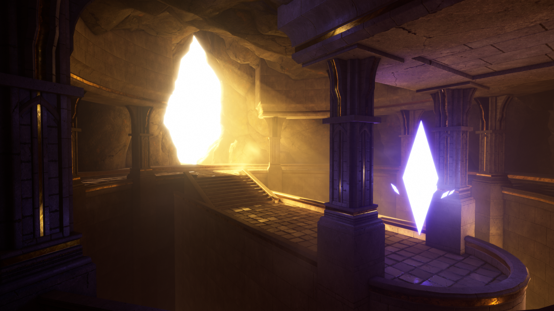
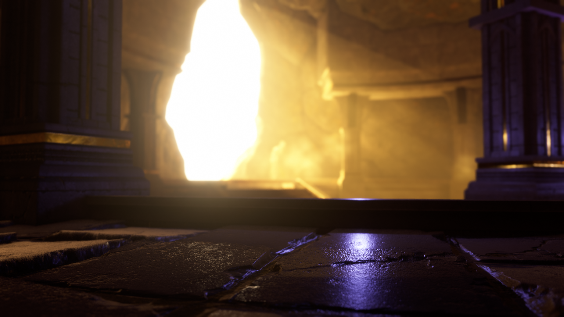
- I absolutely loved that you tracked your time and chose to prioritize certain aspects of the scene over others. The end result looks like a complete scene, which is fantastic, and hows good planning skills. However, in the future I'd consider evaluating more thoroughly what you choose to work on, versus what you choose to scrap as I feel that having some level of foliage in this scene would have paid off quite well. I'm a little perplexed as the reference images you've chosen and the final result - based on what you've presented, it feels like you had a singular vision from the start - which is fine. Consider using the images you've used for mood and lighting references as actual lighting keys. Adjust the colors of your main light and shadow colors, and play a bit closer attention to how the final look is. You've got a great lighting setup for this scene already, but I'd love to see some more love being spent into the post processing and fog settings, as those can really make this piece stellar. I'd have liked to see some sort of story to this scene, even if vague and general. Clearly this is a fantasy based piece, but outside of a bright crystal, and the concept of a hidden alcove with light pouring in there's not much else going on. Has this been guarded for many years? Has this been abandoned and left to rot? You've got some good modular pieces in here and I think moving forward, creating some variations that have things less angular and 'perfect' would go along way in adding a bit of character. You've got good material work, and you've encountered a dilemma a lot of working professionals run into - and that's learning new tools while working under a deadline. I'm glad you've come across to the other side, and the end result seems to have been worth it. I'd have appreciated seeing decals in this scene since those would have gone a long way in adding more detail and interest to your overall materials. You've got some good establishing shots, but your video fly-through was a little underwhelming and works against the rest of this work. I'd strongly consider trying to take another attempt in shooting a few more interesting angles - use the screenshots you've already taken as starting points and animate the camera DOF and transitions. Some thoughts to consider moving forward: Look at the assets you chose to cut due to time, and consider revisiting them for another pass - I think foliage or general variation to the materials in this scene will go a long way in making this absolutely top notch. Also consider re-working the blue crystal. It's the brightest element here, but also the most boring. Something this bright would be casing a brighter light in this cave, and as it is also fights with the main directional light in the scene. Consider revisiting your mood board and inspiration, and perhaps tone down the emissive intensity and some detail / motion to it.
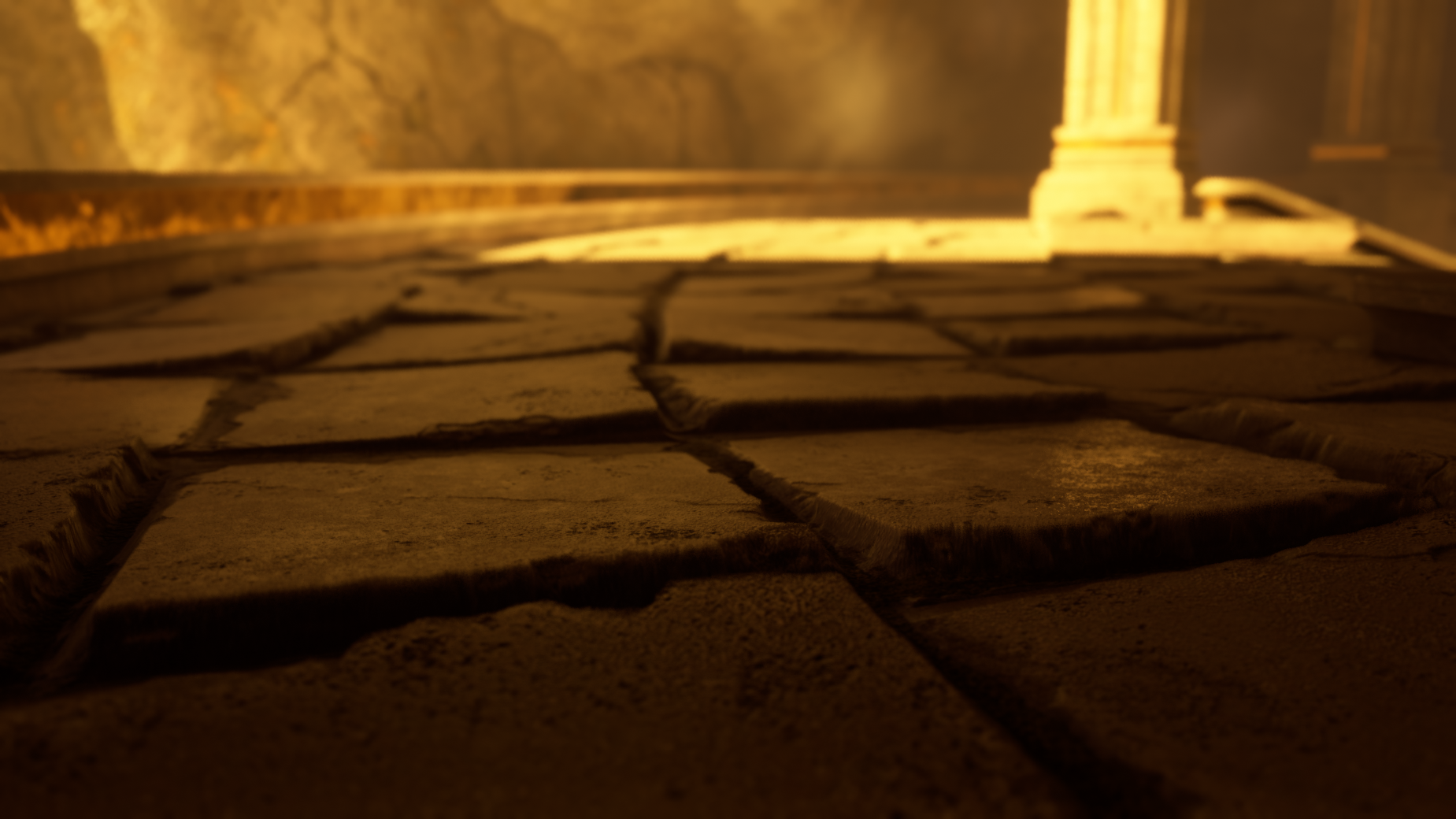
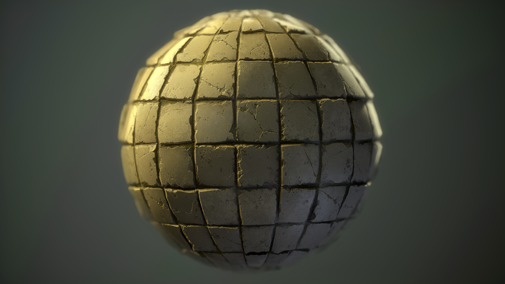
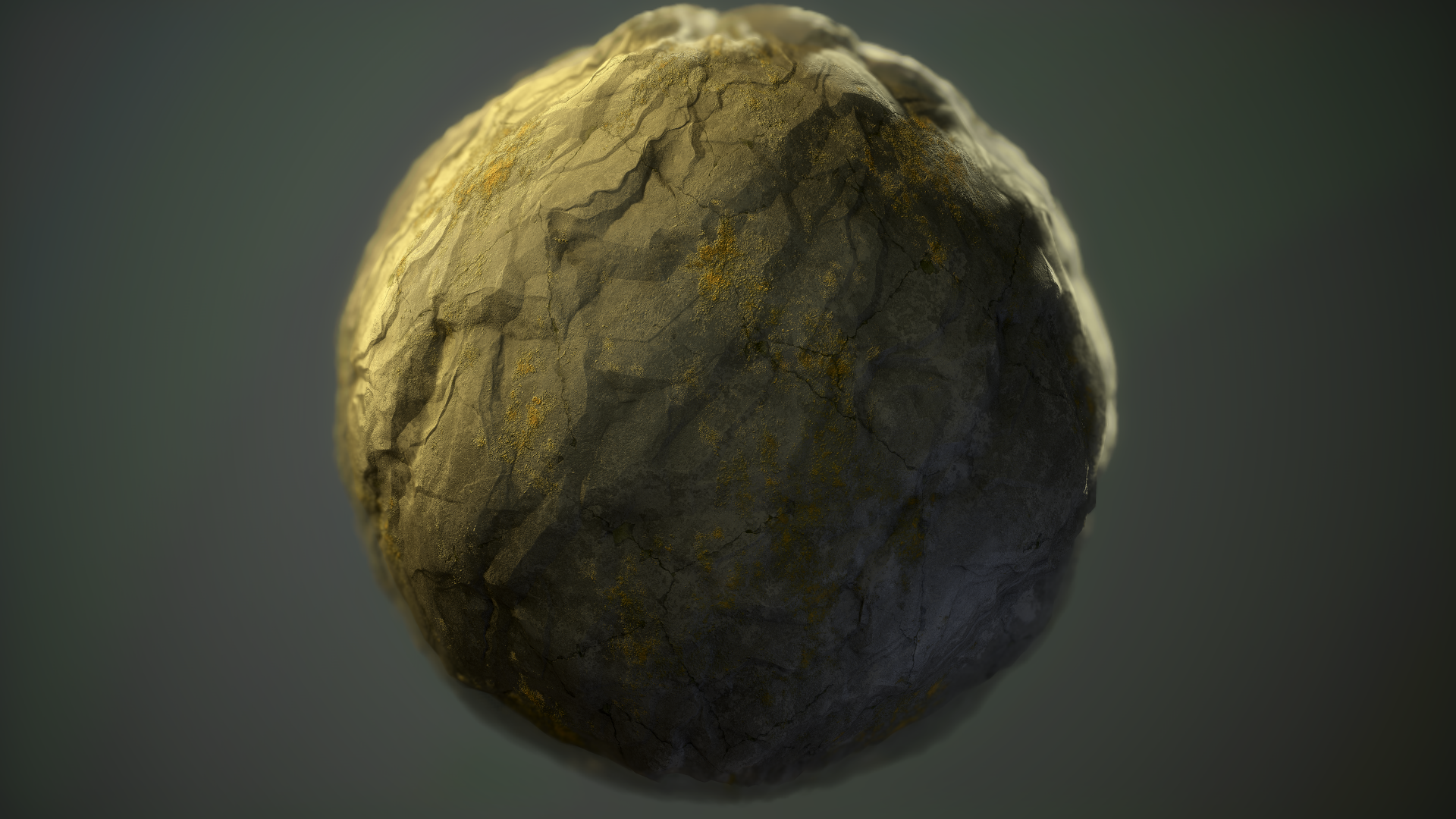
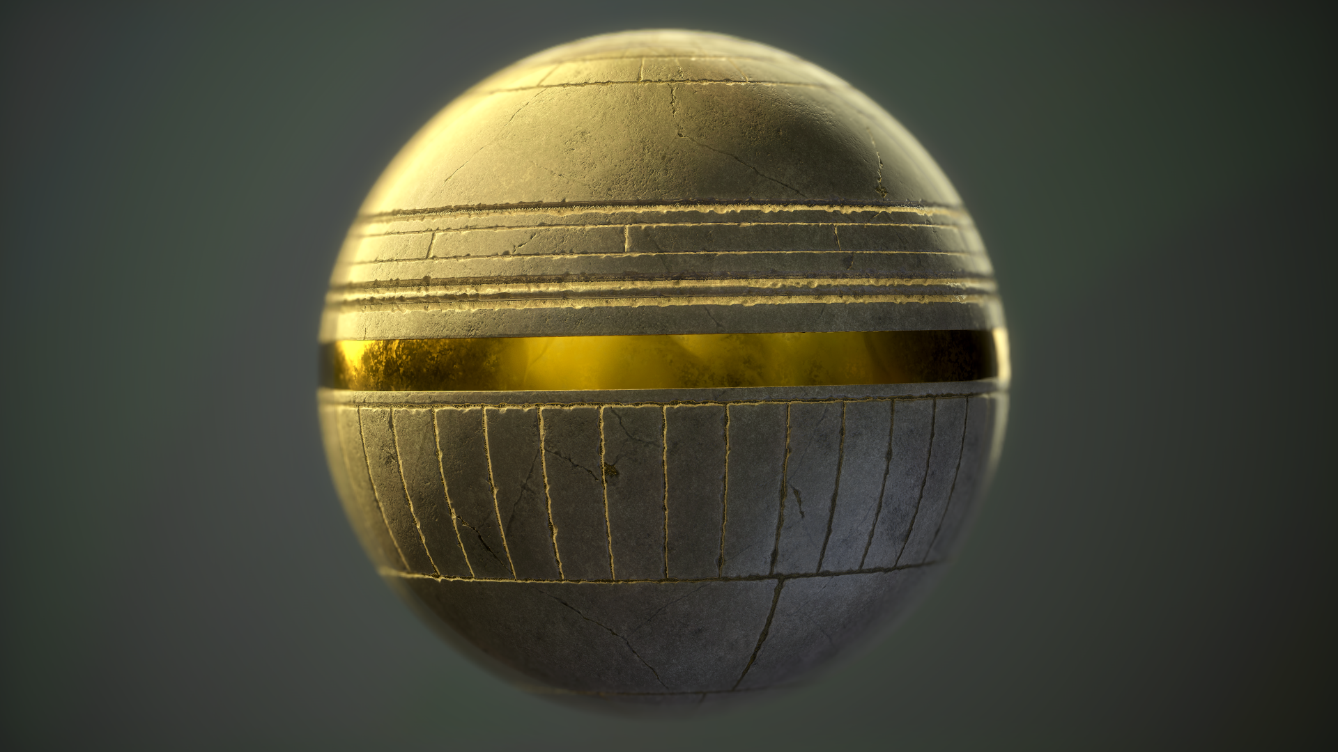
- Artist – Kristian Lid Category: Search for A Star Assessor: Anthony O Donnell – Lead Artist at Firesprite Work name: Cave Research and Development /Documentation The document is well presented and written giving good insight into the creative process. The work follows a good iterative path from concept drawings to the blockout with and initial lighting pass and beyond. It delves into some good details regarding the asset creation process. It's good to see the issues encountered along the way and solutions used to address them. Technical Art Parallax Occlusion Mapping was used to good effect showing of the textures well. Particles were used for dust effects. Volumetric effects were used via the directional light. Geometry Polycounts are generally ok here. The rock meshes could have been modelled a bit better to properly represent the type of rock desired. Somewhat sharper and chunkier. Materials and Textures These came out as the strongest piece of the work. Given the focus was on learning Substance Designer it's not a surprise. There's a nice bit of roughness and albedo variation which was handled carefully not to repeat noticeably too much. Adding in some more dirt / grunge / roughness variation via blending between textures would add a lot. Creative Art The main assets in there are well made and nicely detailed. Next steps aside from doing more with the crystal would be to incorporate some material blending around the broken section covering the surfaces some distance in with sand blown in from the outside. Final Presentation The final images look good and have all the main elements. It's a shame more couldn't have been done with the chains / crystal ideas as it would have made it all feel more complete. The lighting works well to draw the focus on to the crystal. The scene has a nice atmospheric hot and dusty feeling to it. It's worth considering the wider context of this scene as in are we viewing it in it's time is it centuries later ? What is the environment outside ? These answers would help inform how much ageing / weathering and dirt build up to apply to the textures.
- Research & Development Lighting and moodboard references look good. References images could showcase a bit more of materials, props and detail. Creative Art The scene reads as an Indiana Jones' like tomb, where things go down once you reach to the object of otherworldly attributes. The layout is clear, stuff looks polished and optimized, but is a bit lacking in storytelling and supporting narrative of the space. Who built this? It's rock, so human beings? How did they build it? How is the place so clean, and has direct lines without irregularities and wear and tear? Hard edges are also eating away a bit of grounding the place into world. Adding also material blending and decals to the scene would add to the feel. The rocks look like they are clipping through the platforms. The Crystal shader could maybe be pushed a bit further with effects and particles. Maybe playing it every once in a while could help with looking at how the space feels? Technical Art Parallax shader works wonder on the floor. Meshes seem well optimized. There's clear sense of modularity. Particle work adds to the scene. Good job tackling Substance Designer. Documentation Documentation is well written and easy to read through. Images present things well. Final Presentation Images are of high quality and showcase the work well.
Challenge Tier
Search For A Star
Leave a comment
Log in with itch.io to leave a comment.
Comments
No one has posted a comment yet