Research & Development
Research shows different world locations of similar places. I'd suggest picking a main reference and sticking a bit more to it for the time being. The structural correctness of modules shows, but might benefit from looking a bit closer at reference to get the things to read with better scales (how much things are sticking out)
Creative Art
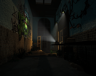
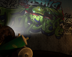
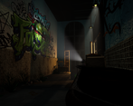
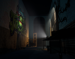
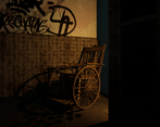
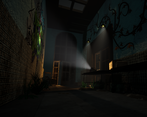
The corridor reads as a abandoned asylum where spray artists have been exploring their artistic capabilities, with the main focal point being the bigger tag on the wall.
Technical Art
I'd suggest to look into texel density (512 for 3rd person, 1024 for 1st person), and check dimensions of real world objects such as tiles and doorways. Use this to your advantage when planning your texture, and try to reuse same texture space as much as you can without sacrificing quality. 2k maps are somewhat the biggest texture size you could be covering for individual assets, but you can also divide bigger assets into several materials (eg. tileable 1k material set, decals 256 material set, uniques 512 set, .. )
Lighting works well to present the main attraction.
In terms of polycount, round connections of gurney might have too high roundedness, while the module with rounded top might have it too low. In general, it would be a good idea in today's games to model separate elements of windows as separate elements, instead of extrusions and insets of a plane. Wheel chair has polygons that don't seem to add a lot to the model itself (eg.the laurels of wheel).
Playing the build, the character is either half the size of common 2m, or the objects might be double in scale. Maybe there was a conversion issue?
There's probably something slightly funky with the packed file, too, as it seems to be almost 2Gb of size while the project unpacked out of it is something around 500 megs.
Documentation
The documentation presents images well. Text is by most parts easy to read. Progression and thoughts behind decision making could maybe be more present.
Final Presentation
Presentation, although being a bit dark, shows the scene and doesn't try to hide anything. Delivering build instead of uproject was a nice touch, even if it meant judging models I needed to import models to Marmoset Toolbag. All in all, nice delivery.


Leave a comment
Log in with itch.io to leave a comment.