


Play asset pack
Old House's itch.io pageResults
| Criteria | Rank | Score* | Raw Score |
| Documentation | #17 | 3.833 | 3.833 |
| Research & Development | #27 | 3.333 | 3.333 |
| Overall | #37 | 2.900 | 2.900 |
| Technical | #45 | 2.500 | 2.500 |
| Presentation | #50 | 2.500 | 2.500 |
| Creative | #59 | 2.333 | 2.333 |
Ranked from 6 ratings. Score is adjusted from raw score by the median number of ratings per game in the jam.
Judge feedback
Judge feedback is anonymous and shown in a random order.
- Hi Amy, I’ve been looking at your scene and despite being a small environment it has a lot of potential that you can still explore. I agree in many aspects with your self-evaluation and I give you thumbs up for submitting one. Here are a few pointers: -Choose one render angle and make it your hero moment! From there start shopping out there for ideas of cool assets to add. The rest of the renders can be just work in progress images. Just focus in one and make it look ace. -The best way to save time specially if you don’t have time to create an organised asset list. Once done and you are happy with it you can then estimate how long it will take you to do each asset realistically. By adding all that up you will have a clear picture if you project is doable or not. Or if it can be modified to fit the deadline without affecting quality. -Play by your strengths. Lighting is a vast area during production that cannot be left for the final stage. It needs to go in conjunction with everything else so that other considerations in regards to silhouettes can be considered. -Sun light behaves very different from moon light as well as incandescent lights. This sounds very logical but it’s really difficult to achieve due to technical restrictions or because we artist like to forget the rules. Your outside is very overexposed which suggest that the shot it taken during the day however the amount of energy coming through does not bounce enough. I would highly recommend to find a real place out there and get your camera out and play with exposure and aperture and see how light behaves. I also recommend you a book that has help me loads. Colour and Light by James Gurney. -Be aware of the straight lines. Nothing in real life is completely straight. This is far more difficult to achieve in games due to constrictions but by choosing a hero moment you can control this. You can decide where the hyper detail goes based on lighting and camera position. -Using the same wood texture to create a game friendly environment is good as it shows you are thinking about restrictions but there are several ways you can face this. First you need to state what the final piece is for. Is it a game? Is it a render of a game? Is it a beauty render that looks like in game? Etc. That way you can act on it. Meaning using the same wood texture you could have use different materials/shaders to perhaps tint the different scene components and achieve different wooden feeling. -Assets need some wearing and dust. The problem with using the same material with the same texture is that you are limiting yourself to one look. Maybe dedicating time and effort to those assets near the camera can me win. -Normal maps are quite strong. I’d recommend running some wearing on them as well as on the albedo/diffuse so that whatever is “out” feels more scratch. -Story telling is vital so everything can tell a story. From a single plank to a hero asset. Who use to live there? How often is this place visited? How old is this house? -Document any decision made regarding how the place will look like and create a brief for yourself to follow. I hope this helps here and/or in the future. All the best L
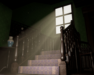
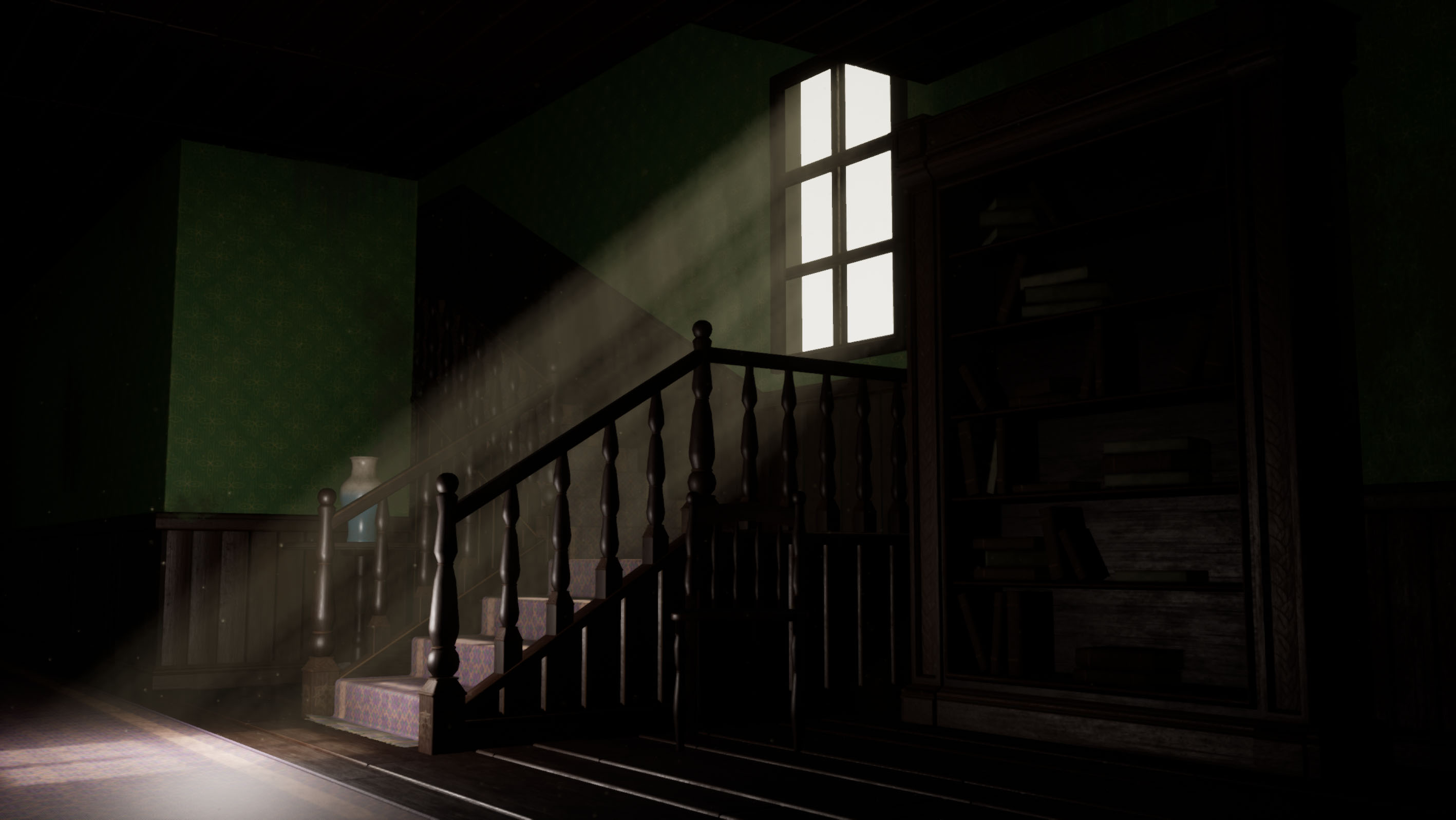
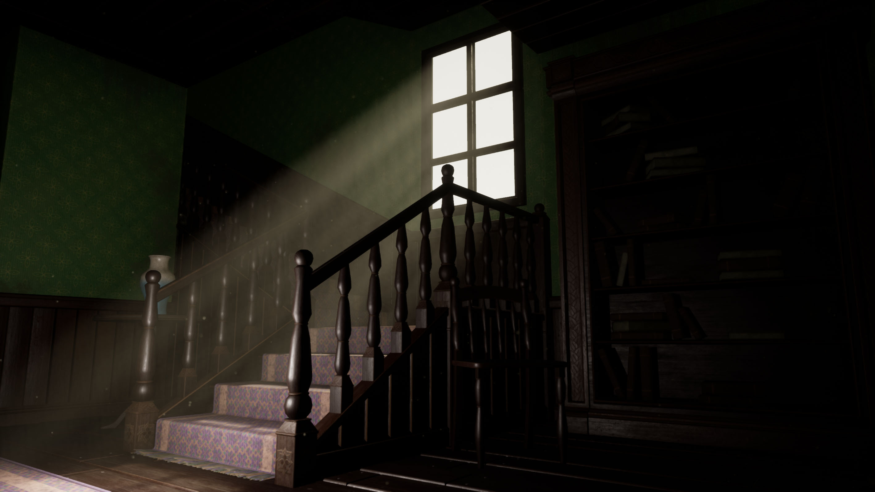
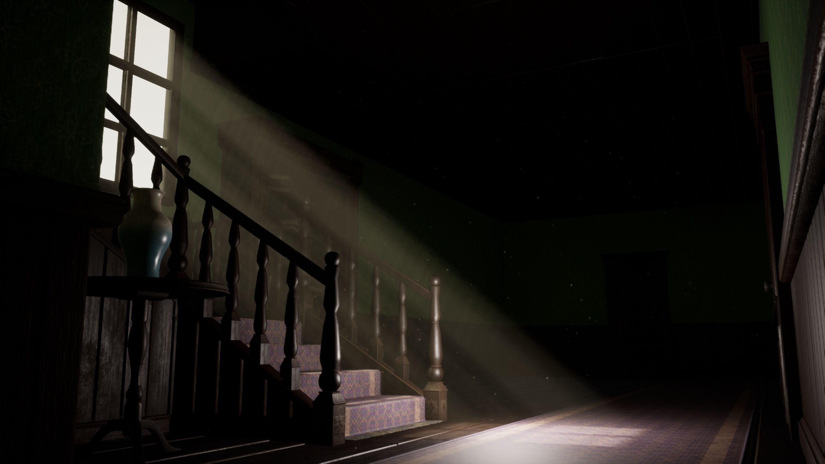
- It's always interesting to see an artist tackle the concept of an abandoned living space - and this is no exception. I think you've done really well with your research and collection of reference images, however it would have been good to seen less of a reliance on an existing game - and more in the original inspiration images you collated. There is some dazzling architecture in your references, and a whole slew of color and decor - but this seem to have translated to the final piece. You have some great establishing shots and camera angles for your presentation, however the lighting could have used some more love. A good focal point has been created, but the lack of any bounced lighting to illuminate the darker areas makes it difficult to see details, and we mostly see just the staircase. The materials you have created are a good start - and I am glad you were able to use your trim sheet for smaller props, I feel like that is often ignored by newer artists - but kudos on your ability to structure your UVs smartly and utilize the wooden trim sheet so well. It would be good to see more variation to your materials - not just in types, but in finish and wear. Looking at your materials and textures, they mostly seem to be uniform in their roughness, which creates a very boring and even read throughout. You have decals in the scene, but they don't seem to play a huge role visually - consider making them more obvious, or use them a bit more : where the wall turns could have a decal showing edge wear, or damage to the wallpaper itself exposing the underlying wood. Some things to consider as you work to improve this scene, or as you start new scenes in the future: Think about the 'story' or backdrop of the environment. You mention this was inspired by fantasy / horror, but there isn't much to sell that here. Was this house abandoned? Was there an element of the super natural? Has somebody been living here and keeping the place somewhat clean? Use this backdrop to find some more reference to help add more character to the scene - perhaps there is more structural damage to the wall, with more apparent water damage and warped wood. Maybe the window has been boarded up and creates a more interesting lighting pattern on the floor.
- Artist – Amy Chesworth Category: Search for A Star Assessor: Anthony O Donnell – Lead Artist at Firesprite Work name: Old House Research and Development /Documentation The production document is well written and presented. It shows clear evidence of research of games industry workflows which informed the production of the scene. The scene itself began with a blockout to assess scale / composition which is good. An appropriate body of reference was curated to direct the visual design of the scene. Technical Art Creative use of tileable textures and trim sheets was used. The techniques were executed well showing a clear understanding of industry workflows. This was time well spent learning how to properly work with and create tileable textures / trim sheets. Geometry Polycounts were good and the assets were well modelled and UV'd. Materials and Textures Textures have a decent amount of roughness variation to imply dirt build up complimented with decals to offer further variation. Roughness variation across surface types had appropriate definition. Roughness maps were correctly set to linear ( not sRGB) A slight criticism would be the normal map of the wood grain being a bit intense. Creative Art It's a well made scene with a decent idea but would benefit from fleshing it out more. There are some scale issues the most noticeable being the plank sizes relative to the stair steps. Lighting wise the over exposed pure white window is too intense in value compared to the darkness of the room. It would look more natural if the room was lighter from the indirect light or the window darker. Final Presentation The final scene has a clear intent and mood which works for the most part. The scene does have that rigid "CG" look. Modelling some folds / wrinkles into the rugs or adjusting it to sit less rigidly on the stairs would make it more natural. As highlighted by the artist the addition of some more appropriate assets to flesh out the scene adding more visual interest would improve it. Some curtains around the window would work as having none seems odd in this kind of scene.
- Submission Title: Old House Submission Tier: Search for a Star Assessor: Dominic Shaw Artist @ Firesprite Research & Development There were some good breakdowns for this project and the way that you went about making the scene was great with the use of trim sheets, tile-able textures and decals which shows a good understanding of optimization techniques. It would have been nice to see some more real world reference of mansions and this sort of architecture and reference for the props so that you can get a real understanding of what you are making. Time management is a really important thing with environment projects because there is so much work so it would have also been nice to see some time plans and asset lists. Creative Art I think the technical side of this project and how you went about it is great but visually, I think it still needs a bit of work mainly on the lighting side of things as a lot of the environments are completely in darkness. There was a good focal point in the environment with the window but It would have been nice to some lights in the interior and a second focal point so that half of the final renders wasn’t in darkness. This would have also helped to show off the wallpaper and decal textures as well as the bookcase. Once there are more lights in the scene it could be good to do some more variation of the wallpaper texture such as torn areas that you can then vertex paint in to break up the repetition. I think the environment is a really good base and now at all it needs is another lighting pass and potentially a few more props and storytelling elements in the corridor parts. With the window, I would add a bit more dirt to the glass rather than it being fully see through. Technical Art I think this is the best part of the project, you really showed a good understanding of how to optimize the level with the use of trim sheets and tile-able textures. I think to further push this now I would start to channel pack your roughness, metallic and ambient occlusion maps into one texture. I noticed that you weren’t using ambient occlusion maps which I think is a real shame and I think by having these maps it would really help. I like what you did with the carpet going down the stairs and if you can get your hands on the program, I think it be worth giving this a try in Marvellous Designer as you will be able to simulate better folds and more realistic fabrics. This isn’t a must though and what you have already done is good. When it comes to the modelling of props like the chairs and the stair banister, I think you have gone a bit too low poly with this stuff and they have ended up looking a bit jagged. They way that you have textured them though with the use of trim sheets is a really good workflow! Documentation The documentation was a good insight into your workflow and the only other thing that I would have loved to see is some of the breakdowns of your textures. Final Presentation The final presentation showed off the focal point well, but the lighting is way too dark and I think by improving this, it will improve the renders too. Overall, I think you have a good understanding of game art workflows and now it’s just all about getting the visual quality of the piece up a bit more by simply doing another lighting pass to make sure half of the renders are not in darkness and then adding more props to the environment to fill up the empty space of the corridors.
- Great to see a lot of reference, annotations and some planning into what will be on your trim sheets. In the past I’ve used painted trim sheets in my block out to help me work out how they will be used in the scene. Good to see a block out but you might want to add in a bit more model detail opposed to simple shapes. Try and check that the scale looks good at this stage and add in assets that help cement the scale. The door vs the chair vs the bookcase vs the stairs don’t feel like they all stick to the same scale. Good to see heavy use of tiling textures and trim sheets and that you’ve used them on the kit pieces and props. Don’t be afraid to add more geometry to assets especially if it will better the shape or silhouette. Lack of geometry is most noticeable of cylindrical assets as you can see the facetting more easily. It would have been good to see some break up in your wood textures eg. subtle differences in diffuse and roughness values. This would help give it that “hand made” feel. The final lighting looks a little flat. It would have been good to see some colour contrast to help lead the eye into the scene. The volumetric light is a bit too strong but I like the dust particles. The scene could have also done with a set dress pass: add in more props in the background (even if it’s the same ones). This would make the scene feel more lived in.
- Research & Development Lots of pictures. Lots of real life ref and looking into usage as a benchmark. Good to see the blockout. Creative Art Rays of light give a nice feeling to otherwise a bit dark scene. Materials look nice. Cool pattern on the wall. Adding irregularities could push the feeling of reality. Dark wood might be too dark. Planks feel a bit short. Wood feels very shiny and smooth as plastic with wooden overlay. Window looks a bit 3D and like it can't open. Scene could use some softening up with additional bounce lights or light sources and curtains, and organics, splodges of color would add to the scene (with smaller props or similar). The carpet seems old, but the rest looks new. Technical Art Great you explored trims. Okay mesh plane decals (There's also a decal actor in UE4, you might want to research that) Meshes seem pretty nice with round and non-round surfaces. Hard edges kill the realistic feel. Naming is a bit unorganized. Documentation Good. Fast to browse through. Easy to read. Final Presentation Good quality images show the scene.
Challenge Tier
Search For A Star
Leave a comment
Log in with itch.io to leave a comment.
Comments
No one has posted a comment yet