


Play asset pack
Dwarven Throne Room's itch.io pageResults
| Criteria | Rank | Score* | Raw Score |
| Research & Development | #28 | 3.200 | 3.200 |
| Overall | #41 | 2.720 | 2.720 |
| Technical | #43 | 2.600 | 2.600 |
| Documentation | #45 | 2.800 | 2.800 |
| Presentation | #46 | 2.600 | 2.600 |
| Creative | #55 | 2.400 | 2.400 |
Ranked from 5 ratings. Score is adjusted from raw score by the median number of ratings per game in the jam.
Judge feedback
Judge feedback is anonymous and shown in a random order.
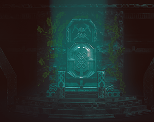
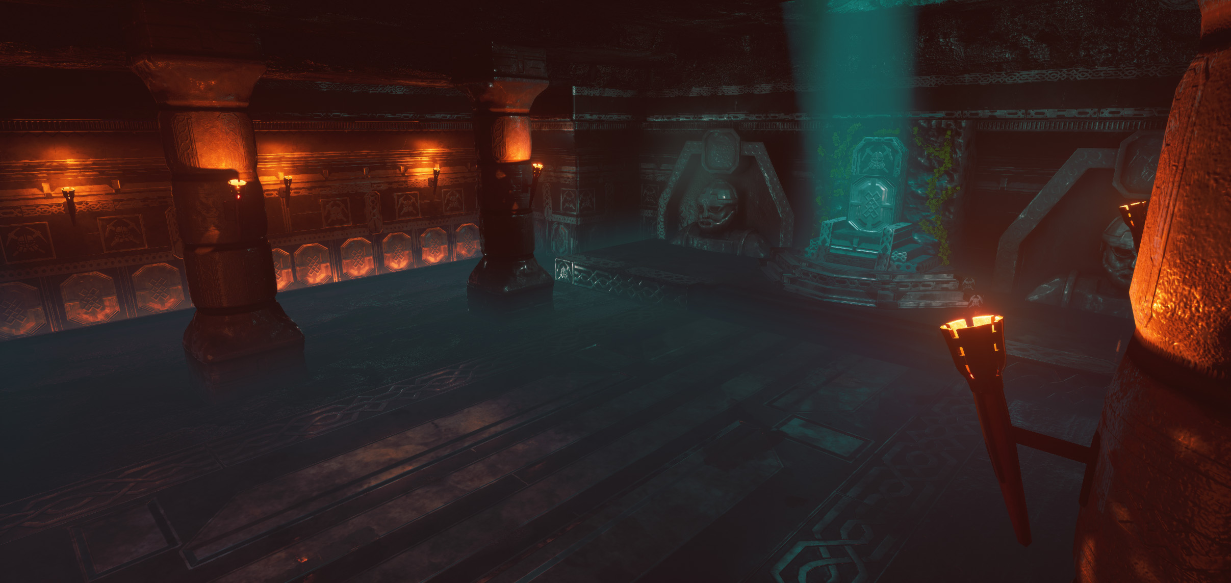
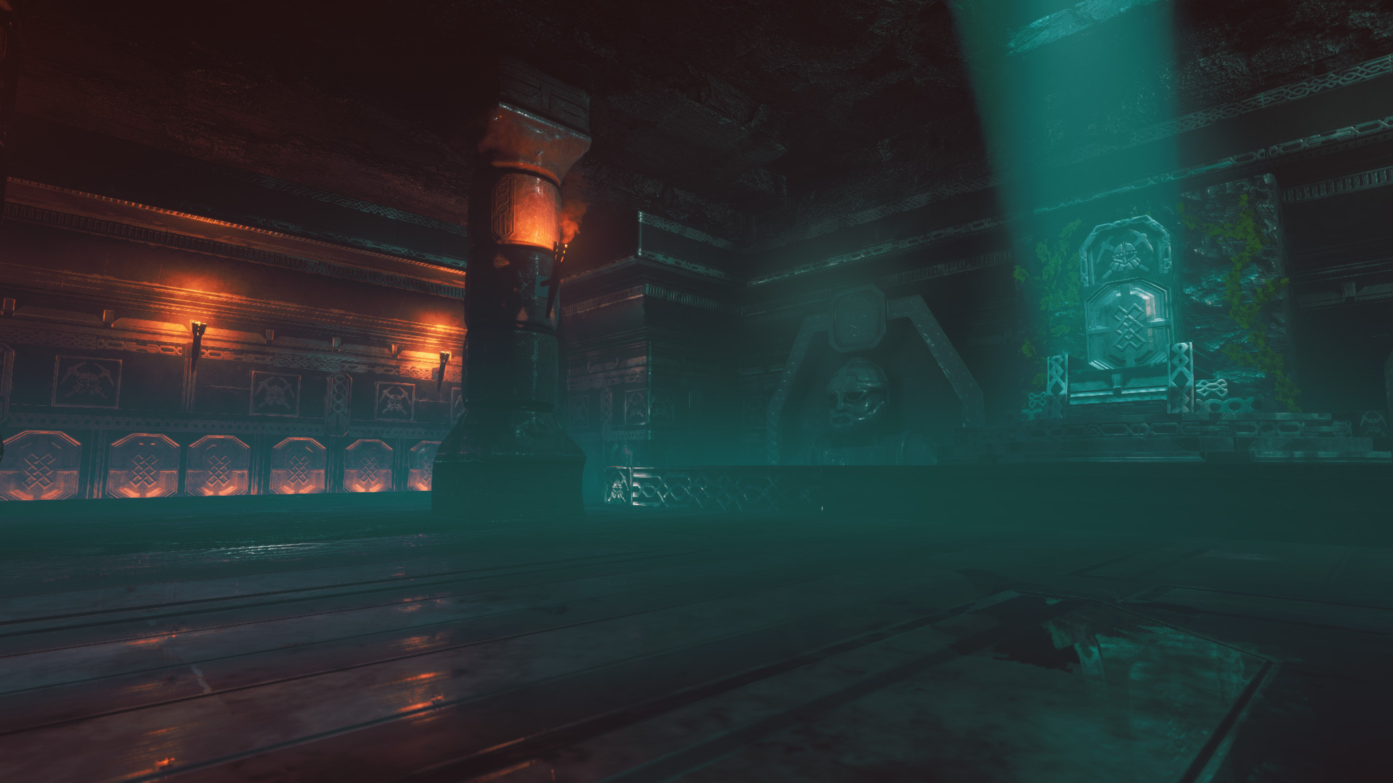
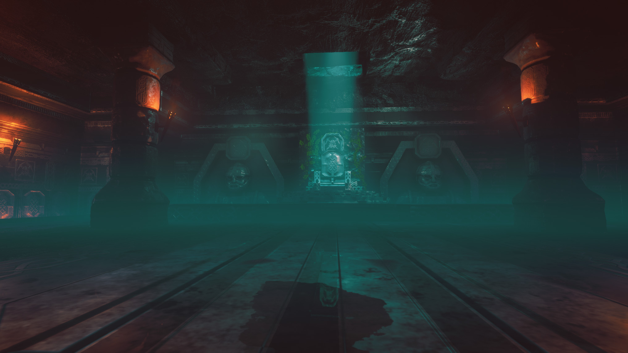
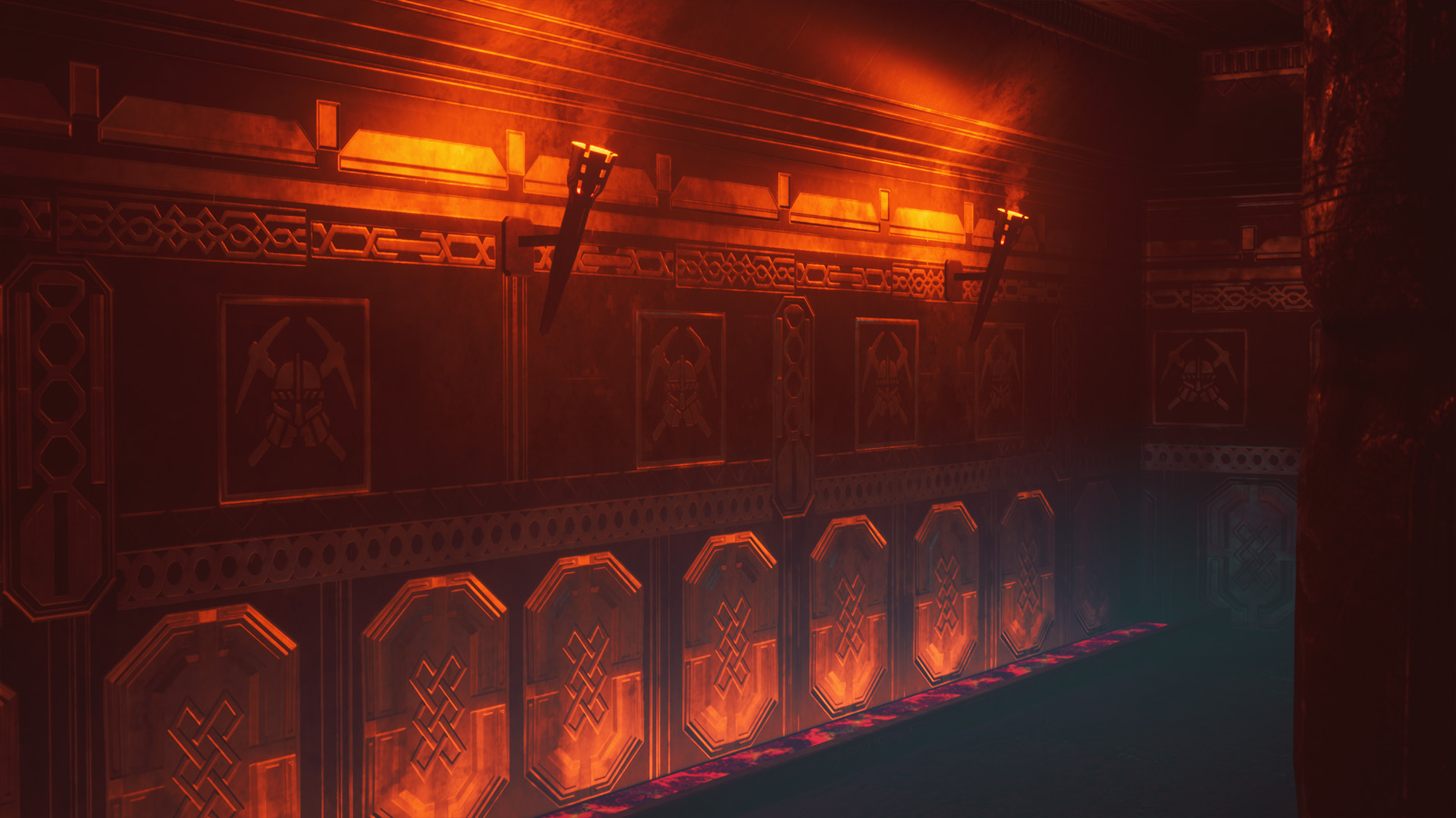
- Good to see a mind map of reference and notes. I also like that you drew out a direction that you wanted to take the piece in. I can’t see a block out in the documentation. Be wary of skipping this step as it’s useful to see the size of the environment and it will help you see how much you need to create for the scene to be complete. You could have broken your assets down into a smaller kit of parts and utilised tiling textures a lot more. Your model sculpts look very smooth and soft (especially your pillar and dwarf torso). Your walls and kit parts have too much geometry; if the surface doesn’t change significantly then model flat planes and have information to the normal map of the tiling texture. You can add more detail and break up with trim sheets and decals. I like that you have colour contrast in your lighting but it’s a bit too foggy in the scene. I think the volumetric (fog) highlight is a bit too intense. Nice to see use of PBR and differences in roughness throughout the scene.
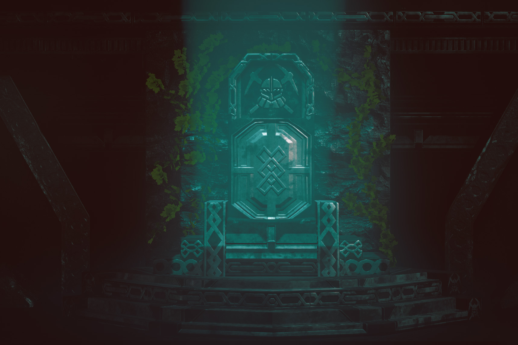
- Research & Development Creative Art The main attraction is obvious, with the pathway leading to the throne. Ornamental statues look interesting. Colors of torches and cold atmospheric light give a nice separation to the scene. Fog looks nice and fitting. Objects could use irregularities to modules. Steps and hard edges could benefit from face weighted normal workflow. Scales of trims and objects feel a bit chunky, using a bit more scale variation could help with making the space feel a bit more pompuous and interesting. The throne could read as a more impactful objects if it was one of the few parts with detail to it. (I made a quick editor test to see how changing some of these changed the reading https://imgur.com/a/jjbO4pH ) Technical Art Idea behind using tileables and trims for the scene is great. Basically the idea is that if you extended the side with UVs scaling at the same rate, the result should be seamless, one-way tiling material. Researching a bit more into Texel density might help with scene quality. Scene uses quite many polygons that don't adhere well to roundedness of, say, arches or silhouettes of objects. Scales could maybe use research into how big their real-life counterparts are (for example in case of the torch on the wall) Materials could benefit from material instances and material attributes. Lighting looks fairly optimized. Documentation Documentation is done well. Mindmap styled project organizing looks interesting. Final Presentation Images are nice and crisp.
- All your models need a lot of optimisation. If the subdivision doesn't affect the silhouette or UVs, delete it. There are just too many triangles in the scene for it to be functional as a game environment. Worst cases of this are the pillar, statue, the floors, walls and the roof. You could shave off thousands of triangles and the visual end result would be the same. I would also suggest using trim sheets for the pillars, to get more UV space. The pillars are very soft-looking. In all your reference dwarven architecture tends to be very angular with sharp edges. The pillars are the exact opposite of that, and I'm not sure if there is a reason for this. The square hole in the ceiling feels strange. It might have been better to make it either obviously natural and irregular, or build an ornamental frame for it to emphasize the squareness. The ivy feels out of place, because it's only growing on a small surface of the back wall. If it was hanging from the ceiling hole, or covered more of the wall and floor, it would add a nice contrast or organic vs artificial silhouettes. I like your colour scheme, but I think it would work even better if the orange wasn't quite so saturated. There isn't much material response: All surfaces have a plastic shine to them. The green of the ivy is very cartoony, and doesn't fit in with the rest of the scene. The walls have a lot of repetitive ornaments, which could be broken up with some 3D wall panels and supports. This would make the repeat less obvious. The trim sheet is a great start, but I think you need a couple more of them to avoid repetition. In places it feels that the trims are just too large and lack detail. If you have long strips that need decorating, rather make the texture tile from one side of the Uv space to the next, so you don't need to chop off the geometry. I think the scene has interesting lighting and nice small details. However the technical problems are getting in the way, and I think you could have done more with the composition. A perfectly symmetrical space isn't very challenging to you as an artist or interesting to look at.
Challenge Tier
Sumo Digital Rising Star
Leave a comment
Log in with itch.io to leave a comment.