


Play asset pack
Alien Clone 9's itch.io pageResults
| Criteria | Rank | Score* | Raw Score |
| Creative | #48 | 2.582 | 3.333 |
| Documentation | #53 | 2.582 | 3.333 |
| Research & Development | #56 | 2.324 | 3.000 |
| Overall | #56 | 2.375 | 3.067 |
| Presentation | #58 | 2.324 | 3.000 |
| Technical | #62 | 2.066 | 2.667 |
Ranked from 3 ratings. Score is adjusted from raw score by the median number of ratings per game in the jam.
Judge feedback
Judge feedback is anonymous and shown in a random order.
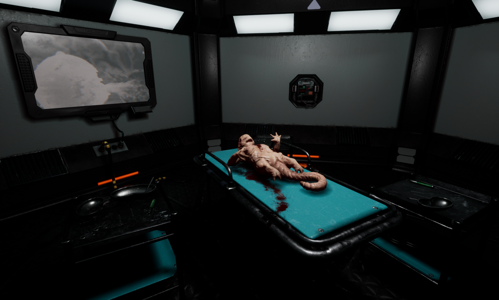
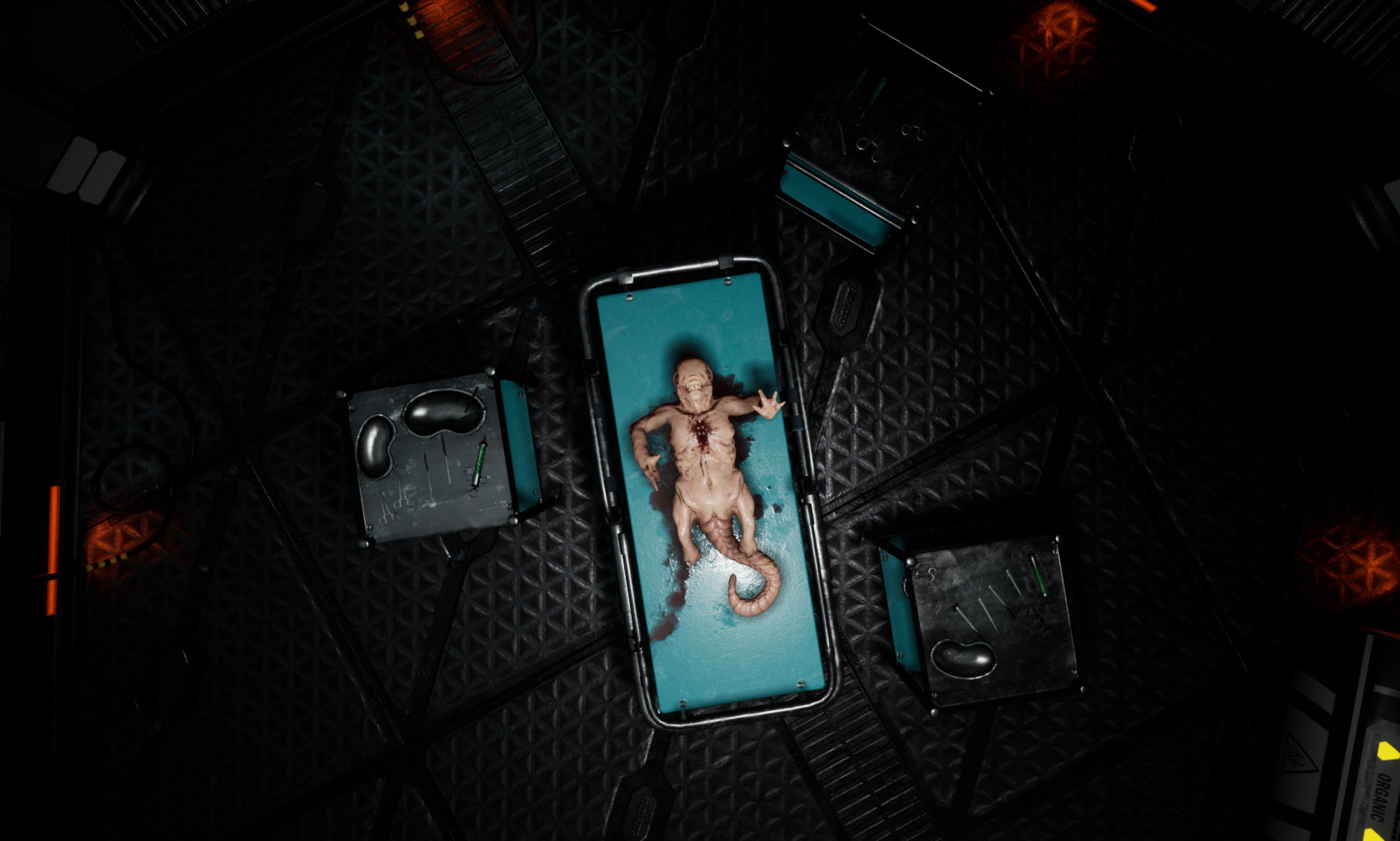
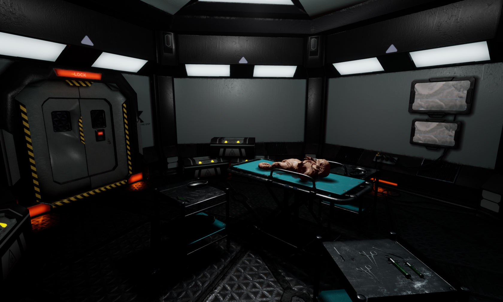
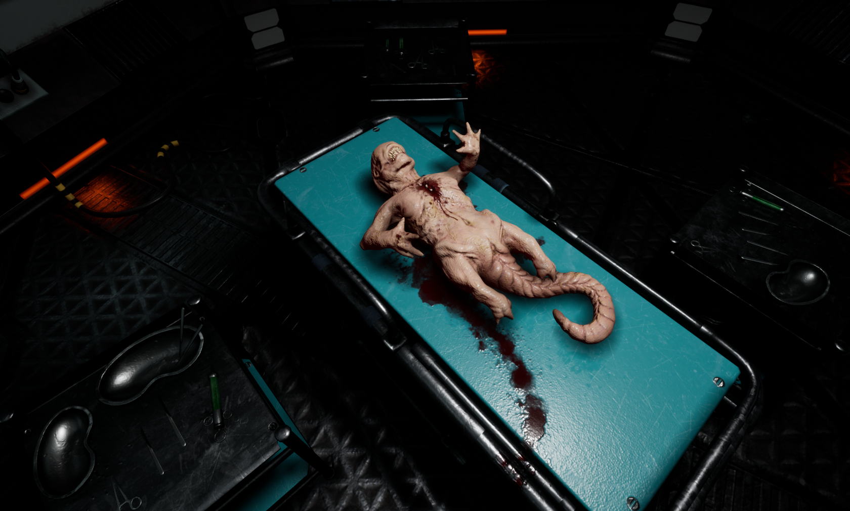
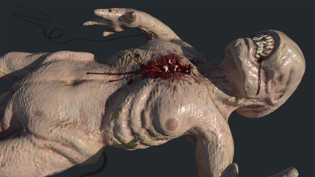
- Research & Development Research shows nice planning. Object, material, lighting and mood references could be added; they could help you cater more to a specific feeling you want to achieve. Creative Art Lighting shows a gross alien-like organism in a gritty an dark environment. Utensils look nice. I'd suggest getting some solid real world references. The layout feels a bit narrow also for player to move around it, and the material choices feel a bit funny for a scene like this. Interesting concepts and design, from what I know, are trying to mix and match real world references with functionality, while thinking about patterns, scales, how it feels, real-world detail, getting interest to silhouettes and materials, color, getting big, medium, small and detail level to work for the occasion of the purpose of that specific scene and area it's suppose to fit in. It can become very painful to adjust and feel those, especially if you want to use unique bakes for bigger components such as the door. Technical Art Assets look interesting in Maya, but present some extra polygons that don't adhere to roundness or silhouettes of objects. Alien could maybe do with fewer polygons. Modelling or using trims and decals to show ways how objects and especially wall modules have been put together could enhance the scene by a lot. Objects could do with some chamfered edges, as hard edges break the immersion of reality basically immediately. This can be achieved with baking mid/high poly models to the low polies in case of smaller objects, or using face-weighted normals with trims and tileables for bigger modules to hit the texel density of 512 or 1024. Materials could take advantage of Master Material - Material Instances workflow. You could look into maybe dropping some deferred decal actors also to the scene. Good use of post process. Documentation Documentation is well written. Images add to the document. Final Presentation Images look nice and of high quality.
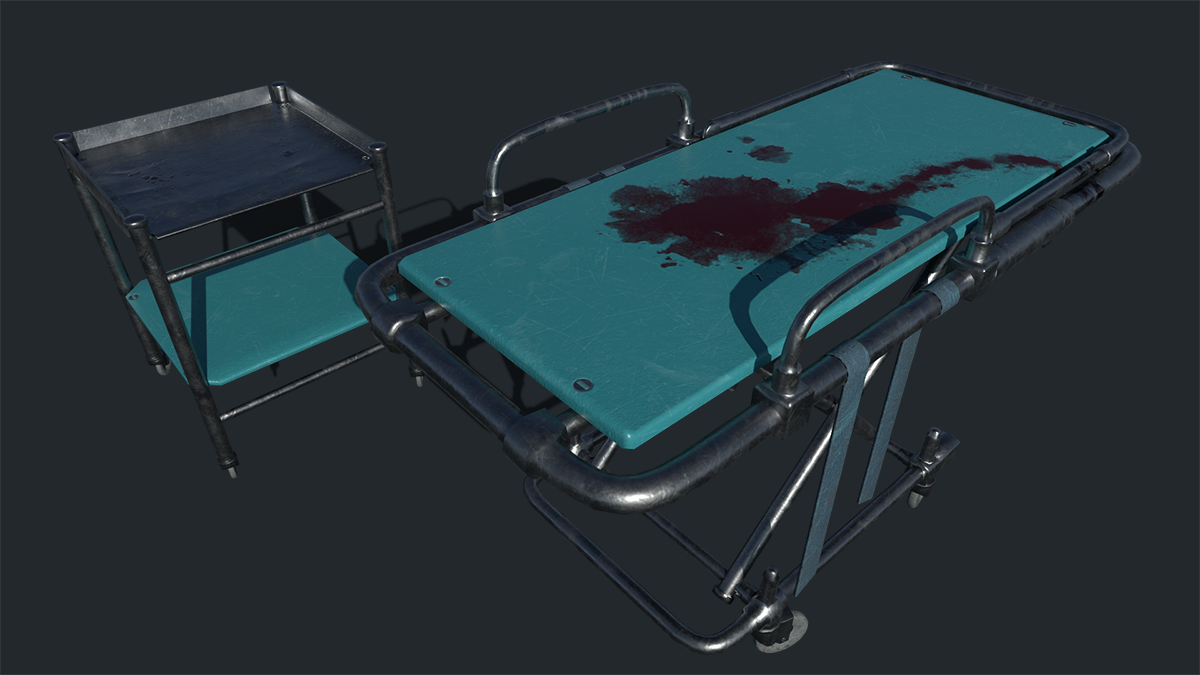
- - The scene content looks good. - Modelling looks neat and tidy, there do look like opportunities have been missed to further optimise on flat surfaces (based on images shown in the documentation). - The animated texture was a good addition, would recommend using the video screens to inject some colour into the scene. - The red light fall off from the emissive strips near the floor was a nice lighting detail. - The blood on the gurney was a nice extra detail colour and material looks good here. - To add further variety, interest and realism suggest working on materials and textures further especially adding some more colour variation to the scene, there was a lot of black and grey where as some shiny metal / chrome on the gurney would have been nice for example. - Recommend increasing the glow level and adding a small amount of fog to help with atmosphere in the scene. - There are opportunities to really add some style and interest through the lighting in the scene, add some accent lighting to the sides with some stronger lighting on the gurney to guide the player to that focal point. - The cables on the floor are a nice detail but as the floor is dark and cables are dark they are easy to miss, suggest tweaking the colours and lighting to help make the most of features like these. - Overall a good effort to create an alien inspired scene.
- I think the modelling of the low and high poly meshes is strong although some are let down by the issues you had with normal map baking. I'd strongly recommend you improve your understanding of how to bake normal maps correctly. There are plenty of tutorials which cover this subject. The alien is a really nice sculpt although the in game mesh is way too high poly and could have been optimized further. It would also have been good to see some investigation into how the skin material could have been made to look more realistic. For example https://docs.unrealengine.com/en-US/Resources/Showcases/PhotorealisticCharacter/index.html I think what lets the scene down is the materials which in many cases just seem way too dark. For example it is very difficult to pick out the props from the floor as the base colour of the metal floor is much too dark, metal colours tend to be much lighter. You should improve your understanding of authoring textures for a pbr engine such as unreal as it will make you're assets and scenes look much better. Allegorithmic has some good resources for this https://academy.substance3d.com/courses/the-pbr-guide-part-2
- Good to see a break down of assets you’ll be creating for the scene. It would have been good to see more reference and a small art test of some assets to cement the art direction you wanted to take the piece in. It would have also been good to see a block out of the scene and assets in UE4. The block out stage is important as you can check assets fit together, work out which assets are more important, set up some early lighting and add in some shot angles (adjusting the scene to get stronger compositions). Your prop modelling looks good. I’m glad you stated that you had problems and you attempted to fix them. From the image you included it looks like you’re having a problem with the normals and lack of hard edges. Also you might be getting errors through the mirror tool or flipped polygons or polygons sitting on top of each other. Try using Mesh Cleanup to rectify any problems. Copy and pasting the model into a new scene can help. Sometimes it’s easier to recreate the asset (and faster as you’ve already made it once!) but this is a last resort. If your baking in Painter make sure to include everything on one UV sheet (make sure your UV islands are separated along any hard edges). I can see that you’ve used PBR and that the assets all work together. Your floor texture is nice but it’s a shame you didn’t use this on the walls as the flat grey texture looks unfinished. The lighting could be more moody and the light colour tinted. At the moment it looks flat. Decreasing the amount of possible light sources would have helped here eg. instead of having lights along the walls you could have it emitting from one of those dentist lights. Very subtle fog would have also given more depth to the scene.
Challenge Tier
Search For A Star
Leave a comment
Log in with itch.io to leave a comment.
Comments
No one has posted a comment yet