


Play asset pack
Cullen's Brewery's itch.io pageResults
| Criteria | Rank | Score* | Raw Score |
| Presentation | #16 | 3.667 | 3.667 |
| Creative | #19 | 3.500 | 3.500 |
| Overall | #26 | 3.200 | 3.200 |
| Technical | #30 | 3.000 | 3.000 |
| Documentation | #36 | 3.000 | 3.000 |
| Research & Development | #36 | 2.833 | 2.833 |
Ranked from 6 ratings. Score is adjusted from raw score by the median number of ratings per game in the jam.
Judge feedback
Judge feedback is anonymous and shown in a random order.
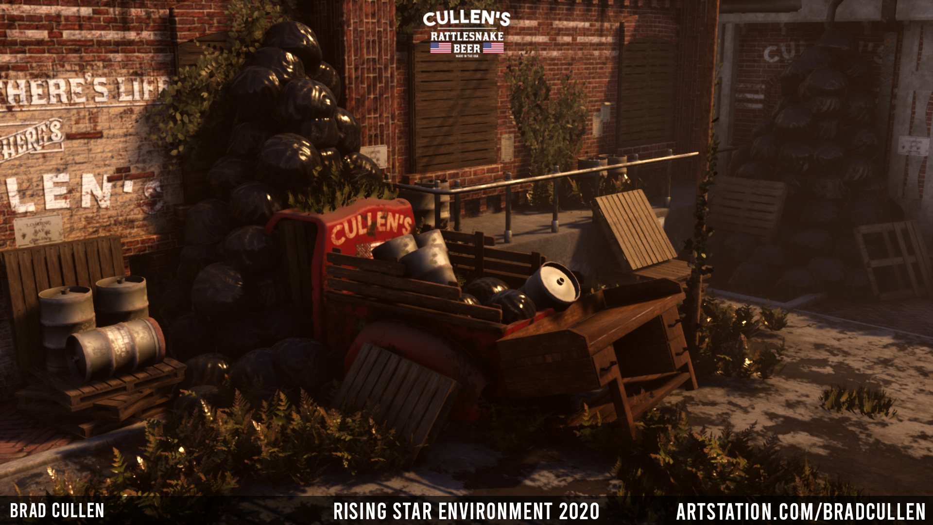
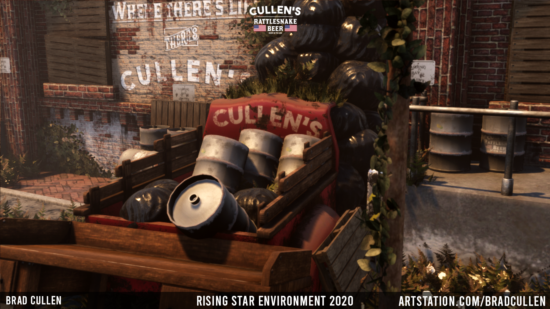
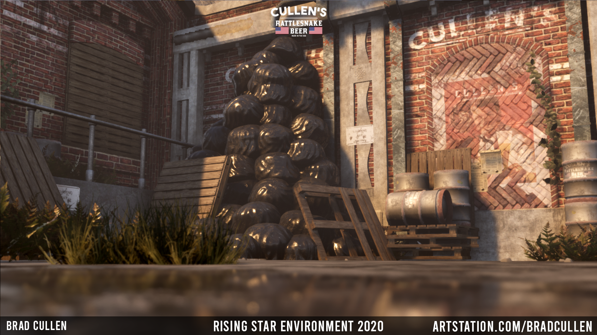
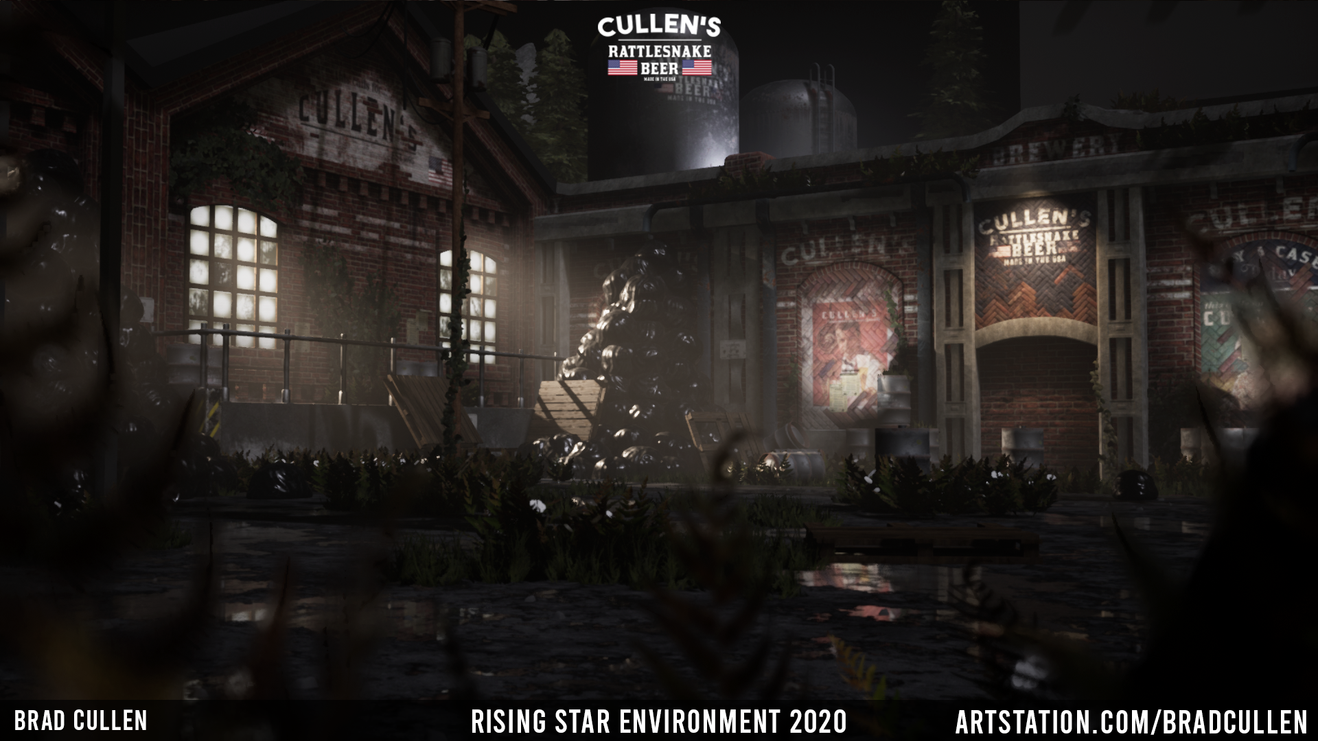
- Artist – Bradley Cullen Category: Sumo Digital Rising Star Assessor: Anthony O Donnell – Lead Artist at Firesprite Work name: Cullen's Brewery Research and Development /Documentation The production document is very well presented and gives some insight into creative decisions taken to produce the environment. Appropriate reference was chosen for the scene and it's clear to see its impact on the final piece. A glimpse is seen of the production process. Technical Art It was not possible to do a technical review as the UE4 assets kept crashing the editor when trying to open the assets to view or the map. The asset folders were not fully consistent with work viewed in the final images. Creative Art The scene visually is well lit and composed nicely to tell the intended narrative of a long abandoned brewery. The branding of the company and other such touches are really nice. The general weathering and considered detailing throughout the scene to support the narrative is strong. Final Presentation The final images are visually interesting and show an awareness of creating a scene with a narrative and not just a bundle of props. The interior shots have a well chosen lighting setup to support the abandoned feeling. Some elements such as the cleanliness and repeating wood textures on the wooden pallets don't sit well against the deteriorating visuals of the rest of the scene. Overall it's a strong piece of work.
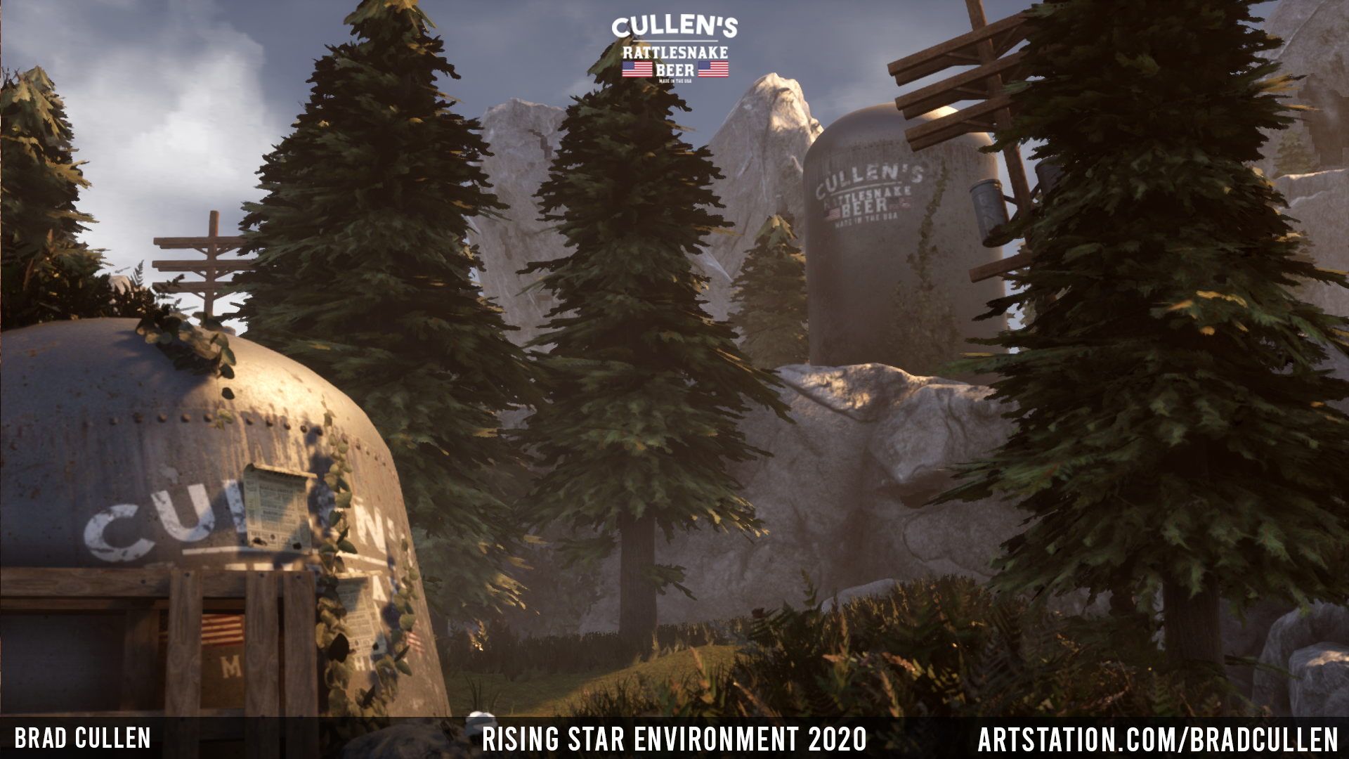
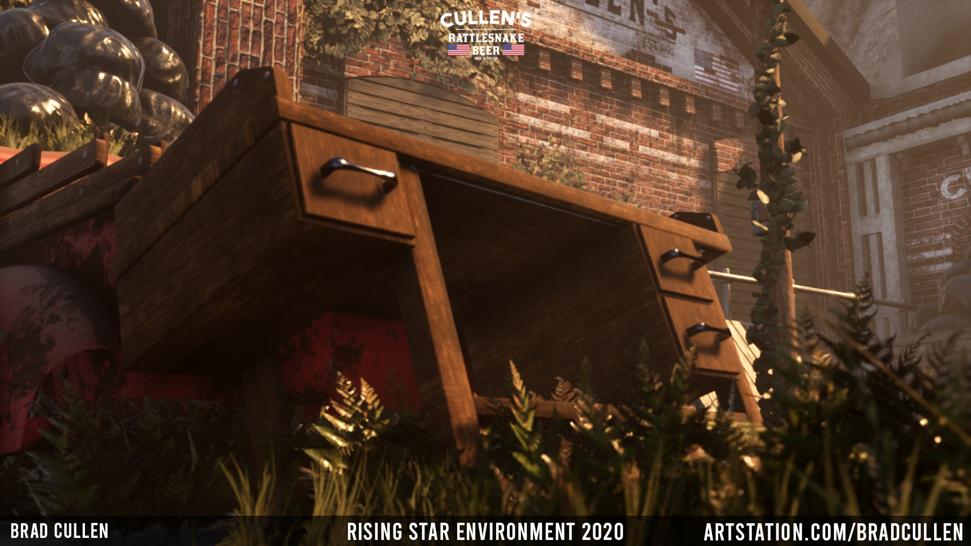
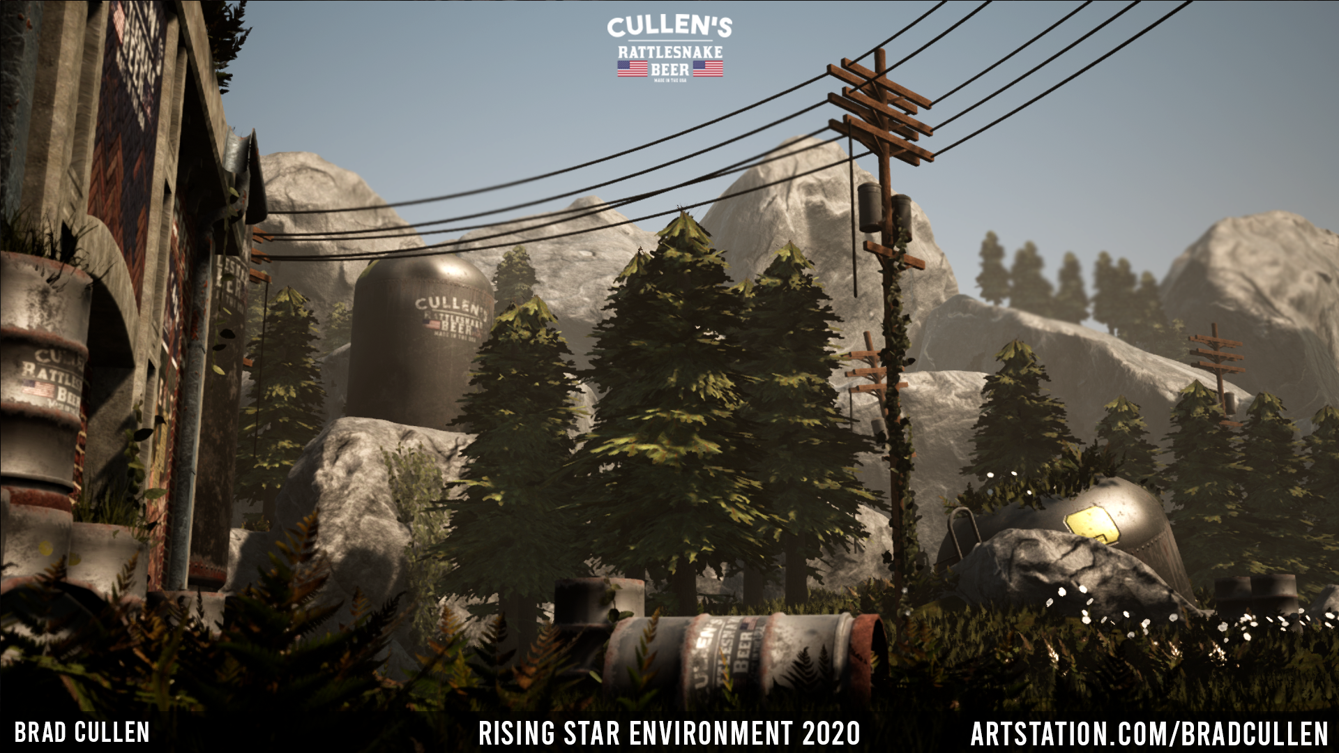
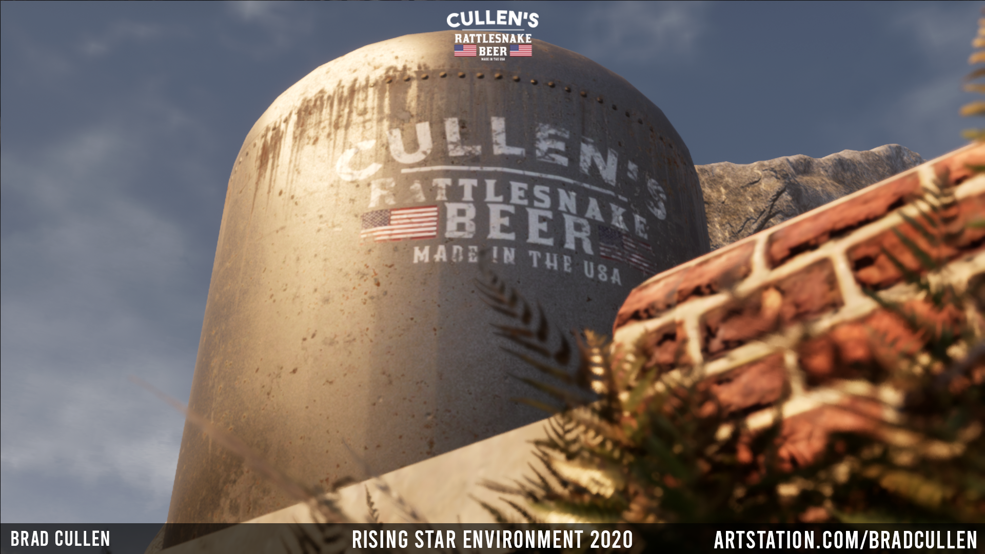
- Research & Development References include interesting images of forests and decaying buildings. However, the references are a bit lacking in terms of main references and what the buildings and objects are based on. I'm not exactly seeing good lighting references either, even if the end results look astonishing. Narrative reasoning and explanation of brands is nice and adds to the scene, but in the end could also benefit from adding another interesting factor to the mix; such as who is living there now, why would they pile the garbage and kegs like that etc. What would have been the purpose to build the factory there, to a desolate place with mountains surrounding it could also be reasoned there, or given some more thought to explore the nature around the factory. Research isn't cohesive and doesn't lead to the final depicted scene. Creative Art The overall feeling with color and contrast in the scene is very nice. When getting up close, there are things you might want to consider polishing further. I might reconsider the use of puddles on the ground as well, as there isn't support to show signs of rain in other places. General advice to consider in future projects would be to use tileable materials with vertex blends and decals for buildings. Object silhouettes could be further pushed with carefully added polygons to create irregularities and interest. In case you want to make more variation for pallet's wooden planks, I'd suggest using one-way tiling texture, where you have a few different looking planks, reuse the space and offset the UVs of the mesh to make them look apart from each other. Expression of creativity in theme and style is a bit lacking. It's not exactly creative to use your own brand name, or to fill the place with garbage and old car. You could take the huge tankers around the yard as an idea, and build systems around that for example. Maybe have ads about providing tours and souvenirs etc. You could also showcase different uses for the same building/area during different centuries and how things developed as times changed. Push it further, see how far you can get with logic. "Creativity Creativity is a phenomenon whereby something new and somehow valuable is formed. The created item may be intangible or a physical object. Scholarly interest in creativity is found in a number of disciplines, primarily psychology, business studies, and cognitive science, but also education, technology, engineering, philosophy, theology, sociology, linguistics, and economics, covering the relations between creativity and general intelligence, personality type, mental and neural processes, mental health, or artificial intelligence; the potential for fostering creativity through education and training; the fostering of creativity for national economic benefit, and the application of creative resources to improve the effectiveness of teaching and learning." -Wikipedia Textures look quite nice, but could benefit from proper texel densities. Quality of modelling looks sufficient. Layout works well as a small pocket to get around to (Coming from camera, heading inside the brewery), the reference is adapted mostly in choosing materials. Technical Art Atmospheric fog and lighting work very well. Objects could use a bit more carefulness; I pressed the pine tree, and it has over a thousand separate slots for pine needle material, which isn't exactly optimal. Other vegetation is also comprised of singular planes of flower etc. It's pretty common to make clustered meshes out of foliage, like grass patches etc. Reusing the texture space and using tileable and trim textures might also help with hitting correct texel densities. Pole for example also has quite a lot of free space that could be utilized for other things. Using unique textures for different buildings seems like something you would do if you were to do your own lods in old game art pipelines. The techniques for houses you're showing here seem appropriate for roughly PS3/Xbox 360 era games, or for open world games, with custom lods and needing to push the draw calls to the lowest possible number for hierarchy LODs. Or backdrops. Also, Material instancing can reduce shader building times. Here, you are using separate material for each object. It's the little things to consider, as the art fundamentals you certainly do have on par for the industry. Documentation Text is easy to read and placed in a readable manner. Pictures show well what the text is about. Prepro evidence; There's evidence of looking at images that look cool and could make up a nice scene. There's intro, shown influences from Division 2, mood with annotated texts about what was the general idea, not a lot of research and references into breweries, no concept, basic layout blockouts are present. Production evidence; Workflow is called in text but not shown (did you generate the material in PS or how did you 'add the breakage' etc. in PS?), no proper showing of tackled vegetation problems but only how you made it (solution, I guess?), concept amendment is shown as adding a building to otherwise nonexistent concept, changing labels is product altering of nonexistent concept Post-production evidence; Presented non-final renders, tools are named but not in a list, no mention of 3rd party assets or not using such thereof, no additional referencing for post-processes lighting etc., leaving the references giving a very far and wide idea as of what would come of it if given to any two artists in the world, reflective commentary is present but isn't showing any constructive ideas on how to improve themselves in the future and what they could improve on. Final Presentation Final presentations show nice screenshots with atmospherics, but also showcase problematic points you would notice up close, such as wood grain direction, smoothing problems of the tank, clipping of keg, grass growing on top of the rusting car and bigger than what I'm used to nails on pallets. Quality is good, structure looks nice, framing works well, colour usage seems nice, tone is nice and relaxing, lighting looks okay, render quality is good enough, render selection shows interesting tidbits with flaws (mentioned in paragraph above), asset files are provided, project documentation is easy and fast to read, no additional provided screenshots or visualization apart from the ones delivered in the documents
- Research & Development: The research includes some nice key real life references combined with the influence of The Division, which clearly leads to your final idea. You’ve kept in mind throughout the consistent idea of decay, abandonment & ruins to really solidify the narrative and situation of the environment which is great, and the key assets that you’ve chosen to work on for it project are all great picks and important in establishing the final scene. Even though I’m sure you did plenty of iteration to end up with your final comp and lighting, the main thing I have to see the progress is the WIP progression slide which shows how it progressed as a whole, but not so much with the different idea exploration for layout, composition, and lighting. The addition of the second building part way through is great however, and definitely adds a lot of substance to the project. Creative: The scene as a whole has a lot of personality/narrative and I get a good sense of the atmosphere which is perfect as you mentioned that this was one of your main goals, to focus on telling a story. The layout of the scene is really nicely done and as a whole I feel it is a good diorama for portraying the kind of world this would be set in. The addition of the company name & logo is also great to see, as you mentioned in the documentation it is important to make it feel like it lives in a real world of it’s own and branding really helps with that. One thing that would help a lot is to adjust the proportions of the assets closer to realistic sizes, the railings along the concrete floor stand out a lot in particular in this regard. A couple of other things to help improve would be to develop your understanding of PBR materials and how to best create them (PBR guide by allegorithmic free online pdf is great!), and to put a focus on your next materials to really define the surfaces a lot more clearly some of them are a bit noisy, or muddy/blurry. Technical: The tri counts on most assets aren’t too bad, however the pine tree named “TreeFinal” if it was the final is extremely high at 67k tris. I understand you would lod this out very aggressively, but it is still too much and you can achieve more with a lot less than this. The scaling of the assets appear to vary a lot and I assume in your final scene that you scaled them in engine by quite a fair amount to get them to work better with one another. The scaling of an asset should be as close as can be from the base import to save you doing this in engine all the time, keeping things consistent, and non uniform scaling is bad in general as it currently doesn’t scale the collision properly. It would be beneficial to clean up the file structure a bit, remove the placeholder items, and have a base naming convention, as this is extremely important in the studio and sharing work so everything is as clear as possible to anyone who needs to view and use it. Lasty, texel density is quite often overlooked but is an important thing to understand and know how to adhere to a texel density target. This will resolve any issues of 1 asset looking ‘higher res’ than another when paired next to it since everything is using a similar amount of pixels per meter to show the material definition. There’s a few instances I can see from the screenshots where this is apparent. Presentation: The overall presentation of the work is great! I love the additional fly-through video as I really get a better sense of the environment & atmosphere. The dressing for the scene is very good with the foliage encroaching on all the manmade bits and it feels quite natural which helps ground everything to feel more realistic. I also really like that you’ve taken the time to light the scene in both day and night time lighting. Unfortunately, the map was crashing upon loading so could not view the actual level in UE4 and have had to base markings off of the supplied content. It’s great that you’ve included the source files separately so you can view them in max, however there does appear to be quite a lot of them missing. Documentation: The documentation is nicely laid out & easy to read, and showcases the base research + references, with a nice WIP slide to show how it progressed from early on to the end. The references you’ve put in the documentation are all important and it’s good that you chose some nice real life references as well as inspiration from the division to influence you. It’s good that you’ve included the reflective summary and mentioned what you found went well with it. However, it’d be nice to expand a bit here for example, what are the things that didn’t work so well or go to plan? What issues did you face and how did you resolve them? What would you do differently if you started it again and would you take different approaches to certain things? Etc. As a whole is short and sweet, however, it never really goes into any kind of depth into your workflow in how you created the majority of the assets. I know you mentioned for texturing you used photoshop rather than painter (which though interesting and has a few situations you might need to, I wouldn’t recommend for a realistic style in the industry today), but what was your approach to the bin bags for example as there’s so many ways to producing that, or your approach to how you used your own photogrammetry, it’d be nice to see more of a breakdown on these kinds of things in the documentation. I see in your assets folder that you used Alchemist in the process too, that would have also been great to include in the documentation and see more of how you used that as a tool to create the textures. Lastly, I can see that you’ve used some third-party assets such as the Quixel Megascans ferns and rock, but have not mentioned this at all in the documentation. It’s really important to include the use of third-party assets/tools for obvious reasons.
- There is a lot of potential here. I'll start with my biggest issue: The bin bag doesn't have a proper 3D shape, and the texture makes it look like a solid lump, instead of flimsy, wrinkled plastic with a surface texture I would expect. I think the bag pile is the weakest part of the entire scene. If you compare the reference image you found with piled up garbage bags, you can see how much effort went into it. There's multiple colours, and the bags are in different angles to make the composition more interesting. Yours seems to be defying gravity, and it wasn't clear to me what they were until I read the explanation. The close-ups of your pine tree look good, but for some reason that doesn't come through in the final renders. Perhaps this is just a setting that needs changing? The alpha's are very blobby and there's no light passing though the needles. Your composition and lighting are brilliant. There's also a good, clear material response on most surfaces. I'm a huge fan of the overgrown foliage and the storytelling happening here. Technical skills can be taught in a job, but a good eye (like yours) is critical for any junior artist. In a game environment it would be better to create a tiling brick wall and add the signage as decals, so you don't need a separate material for everything. The final result you have looks very good, but it might be too expensive to use in a real project. There are quite a few spelling mistakes in your sketchbook. While that's not what I should be judging, it affects the overall impression anyway. There's also no need to mock taverns and sci-fi corridors. Instead, you could just say that you wanted to create something unique and eye-catching (which I believe you did, because I clicked on it), to show you have a positive attitude without putting others down. In this small industry is really important to take care of your reputation and be a pleasant person to work with. Your work is really good, let that speak for itself.
Challenge Tier
Sumo Digital Rising Star
Leave a comment
Log in with itch.io to leave a comment.