Play Environment
Lost shrine UE4's itch.io pageResults
| Criteria | Rank | Score* | Raw Score |
| Documentation | #21 | 3.578 | 4.000 |
| Presentation | #23 | 3.354 | 3.750 |
| Creative | #24 | 3.354 | 3.750 |
| Overall | #25 | 3.220 | 3.600 |
| Technical | #34 | 2.907 | 3.250 |
| Research & Development | #35 | 2.907 | 3.250 |
Ranked from 4 ratings. Score is adjusted from raw score by the median number of ratings per game in the jam.
Judge feedback
Judge feedback is anonymous and shown in a random order.
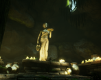
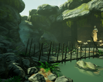
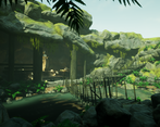
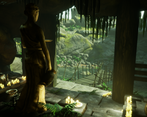
- Reference is a bit on the slim side. It would have been good to see more especially as the concept art has a lot of different materials in it. The block out looks like a good start. It’s good at this stage to add in base materials (even just colours) and rough lighting to get a better feel for the place from earlier on. Placing cameras early on helps refine the compositions too. The original concept piece is of a wider area yet all your props are much smaller. Knowing what you will and will not see early on (through the block out) will guide you in which assets need more or less attention. It’s good to see you using a kit of parts to assemble the rocky cliffs and wooden bridge. The lighting is good in that you have created contrast through the use of a directional light (the shadows help push the eye to the better lit area). The candles also help in guiding the eye to the statue. The foliage adds a good amount of breakup to the rock but check your PBR values between them; the ferns look unnaturally green. Good use of fog to layer the scene. Would have been good to emphasise the colours in the scene with adjustments to a post processing volume. Good to see a complete environment!
- - Nice explanation behind the choice of theme, always good to see an artist improving on new areas. - Shows good block out process and thoughts around composition and planning of assets. - Good work with the sculpting, showing promising technical knowledge of common art workflows - Great documentation showing all the process for the models, UVS and texturing - Project overall shows a lot of techniques and well thought out ideas, nice job!
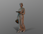
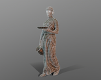
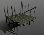
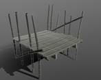
- Research & Development Research shows interesting fantasy concepts and a couple of real world sculptures. I'd suggest getting more specific reference for material, detail and assets. Block out shapes you can find reusable for different parts of the scene, eg. the cliffs, to test out if the kit can do what you want it to achieve or if you need more or less shapes etc. Creative Art The shrine looks like a very nice little scene. Lighting's nice, the color palette works. There are cool elements to the scene, especially the water shader, and smaller props next to the statue. Solid work, all in all! Using good real world reference to define a bit more of the scene, its structure and where things grow and how they look before diving into the asset creation might help mitigate some things that, I feel, are slightly off here. The hanging moss feel a bit odd. The bridge has nice curves, but I'd like to see a bit more of irregularities and maybe expanding the set with a broken variant. It's a bit odd there's man made wooden pillar to support singular rock formations. Rocks could look a bit more interesting with sharp edges, flat surfaces and directionality (God of War 2018 does a fantastic job at this I think). Outside composition feels a bit like I go in over the bridge and immediately turn to the right instead of wanting to take a closer look at the amazing statue; maybe turning the rock on the upper left side of the entrance to the shrine might help to create a circular focal point (here's a quick go in the engine (I hope the post stays up) ; https://imgur.com/a/KLrFsyT Technical Art Water and waterfall look very cool. It's nice you tackled materials in Designer. Channel packing textures is a good call. There is a whole bunch of so diverse and different elements from foliage to water and hard surface and other organic stuff to tackle in a scene like this, that it might have been a good idea to cut down on the size of the scene and concentrate on something smaller and tell, for example, about water/humidity being present with some decals and atmospherics instead or something alike to cut down on the process time. Spline mesh is a nice tool. I'd suggest also having look at Master Material (I use several, one for landscapes, one for props, one for architecture with material blending and decal master, possible other variants might include parallax master or similar), instancing materials out of those, and possibly some material attributes for landscape purposes. Documentation Documentation is written well. Images showcase the process well. Blockout work looks nice. Final Presentation Final presentation shows the scene well. Props are showcased nicely. Images are nice and crisp.
Challenge Tier
Search For A Star
Leave a comment
Log in with itch.io to leave a comment.


Comments
No one has posted a comment yet