


Play asset pack
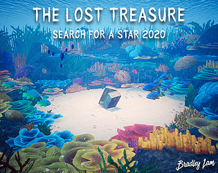
The Lost Treasure's itch.io pageResults
| Criteria | Rank | Score* | Raw Score |
| Technical | #3 | 4.000 | 4.000 |
| Overall | #11 | 3.720 | 3.720 |
| Documentation | #12 | 4.000 | 4.000 |
| Presentation | #14 | 3.800 | 3.800 |
| Creative | #20 | 3.400 | 3.400 |
| Research & Development | #21 | 3.400 | 3.400 |
Ranked from 5 ratings. Score is adjusted from raw score by the median number of ratings per game in the jam.
Judge feedback
Judge feedback is anonymous and shown in a random order.
- I thought this piece had a really great mood. Loved floating around under water. I can almost hear the sea. But, advice for you, I want to talk about the transition from air to underwater. If something in your video sucks, don't show it. Like, I understand what happened there and I'm a judge and am totally on your side, but your future employer straight up isn't, if you show something sub par and they have someone who simply just cut that bit out so it doesn't show, they will get the interview, not you. So either fix it or leave it out. This comment is meant with love, I've seen so many fall into the trap because they've worked so hard and want to show it all, but if it's not good, leave it out. The issue you faced can be fixed in 2 ways, the easy way is to set the blend distance of the post process to 0 so it just snaps to the volume and just ensure the volume is the same height as the water. Second is more complex, Have 2 volumes, and blend between them OR - make it unbound and animate the values based on whether you are above or below water. Other notes: Your fish can have 1 shared grayscale texture - which you colorize in the shader for variation. Reducing normal strength and adding some metalness to the metal of the chest makes it look a lot more convincing. Overall, great project. Well done :) Chris Harper Snr Tech Artist @ Splash Damage
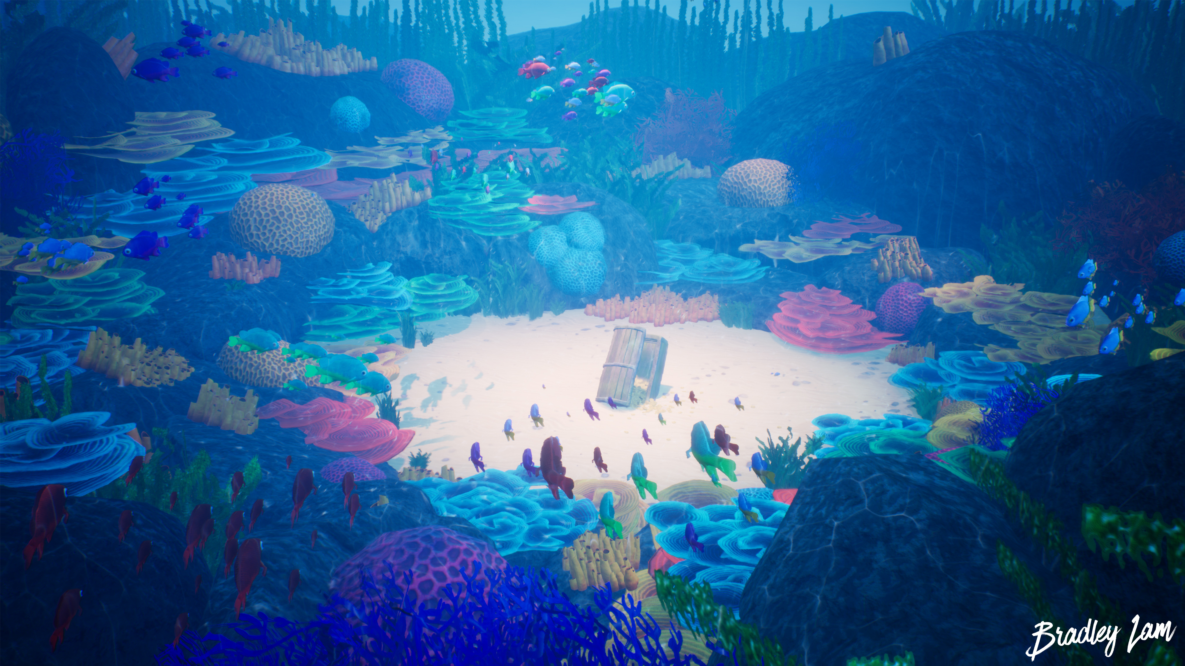
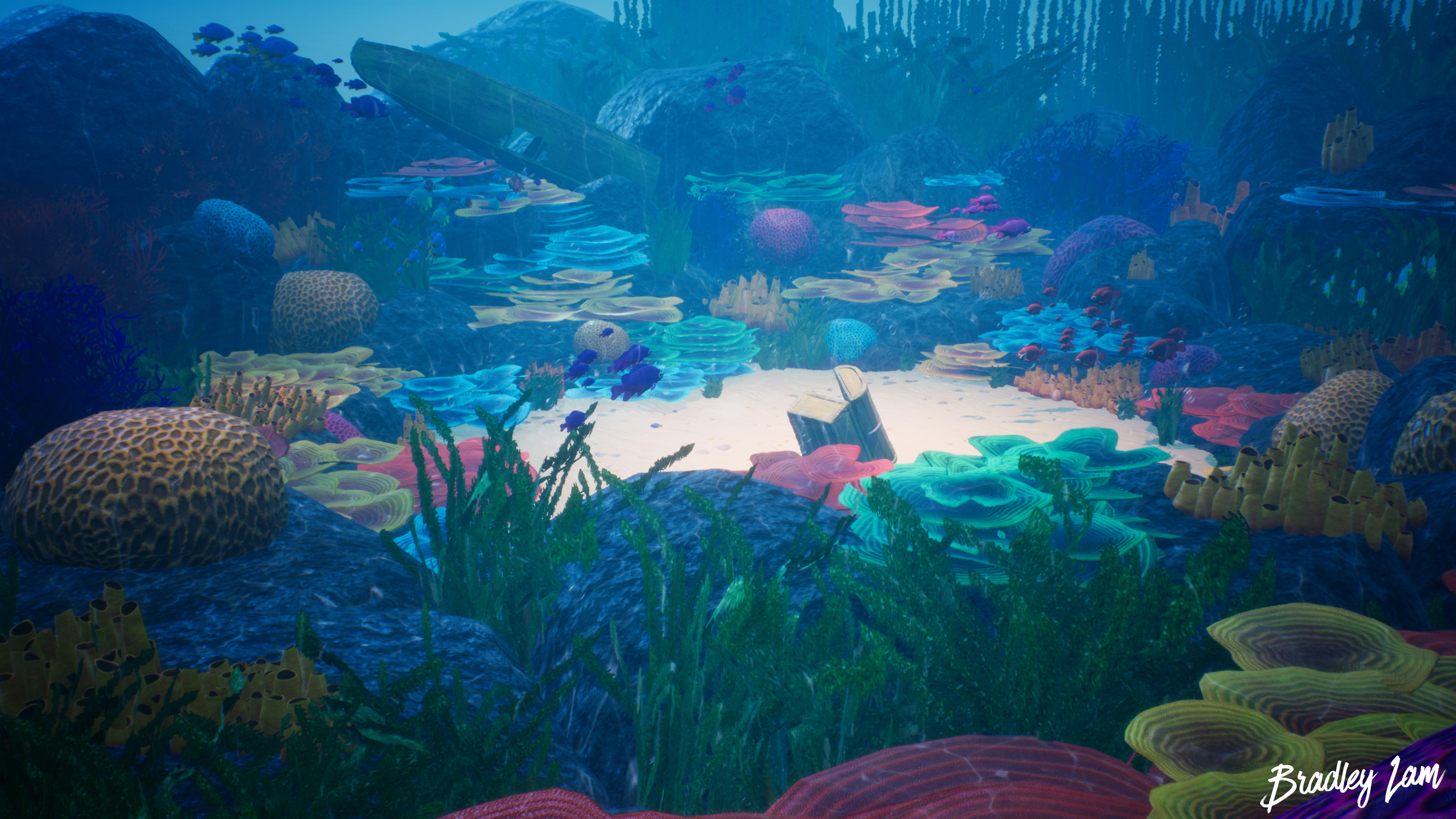
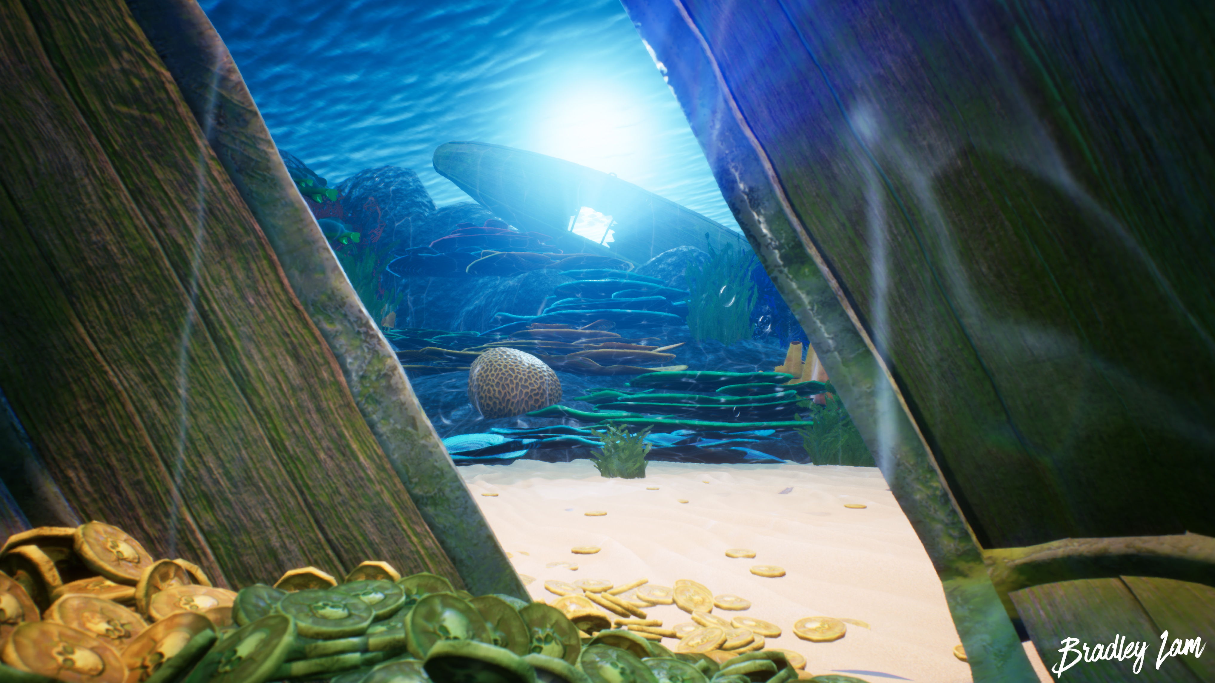
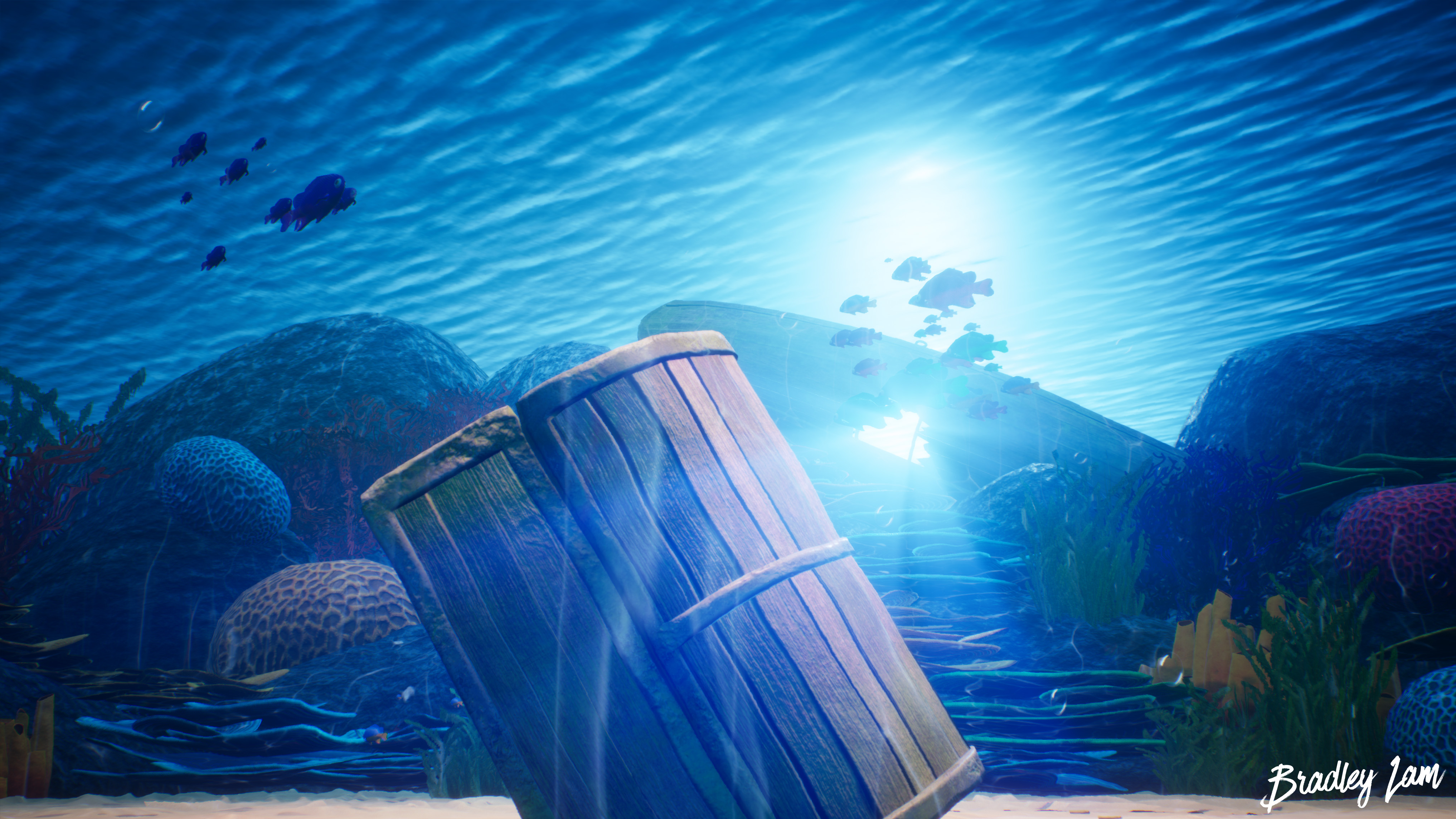
- Submission Title: The Lost Treasure Submission Tier: Search for a Star Assessor: Dominic Shaw Artist @ Firesprite Research & Development There was some good use of asset plans in the project and some good reference of the props needed to create this environment. I would have liked to see some more reference of real-life corals as well as some time management plans has this would have really helped with the production of this environment. Creative Art Overall, I think this is a nice and appealing scene, there is a lot of colour in the environment which is eye catching. You have done a good job making the props and you have gone about making the environment quite well. However, there are some areas that I think need improving, mainly being the values of the environment. You have done a good job making the sand the brightest part of the image as you are drawn to the focal point but then the water in the background is a way too light which makes you feel like you’re not that deep down in the water. This takes away from the story of ‘lost treasure’. I noticed that in your concept you had the background water quite dark but then lost this in the final image, I would recommend darkening the water down a bit to get a good in-between the concept and what you currently have in game. After you have darkened the water, I would also darken a bit the sand so that the caustics you have can be seen more as currently, they are kind of lost in the image. Technical Art There are some good workflows used with the vertex painting for the sand and a good master material with the use of channel packing which will help optimize the level. You have a good understanding of the pipeline needed to create environments and the fish movement was pretty cool too. Other parts that you could improve on is by destroying the props a bit more, especially on the boat, you could have added more broken planks to really make this feel like it got destroyed when sinking. Documentation There were some good breakdowns of each prop and it was clear to see how you went about making the environment. Final Presentation The final renders all have good composition and shows off the focal point quite well. I think the overall piece was pretty nice and there was a good focal point to the treasure chest, however I did struggle with the depth of the water as it feels like you are quite close to the surface, I would expect lost treasure to be more down in the depths as this will really help to sell the ‘lost’ feeling. I would recommend darkening the water to help sell this idea. Moving forward, I would focus on destroying the props a bit more and having another pass at the values in the image.
- Would have been good to see some annotated reference and more of it. I like that you’ve photobashed your environment together but there isn’t much reference that supports the area you wanted to create. It would also have been good to create a small art test to show the direction you wanted to take the piece in. It looks like you’ve skipped the block out phase and dived straight into production. Be wary of doing this as the block out is crucial to the look of the scene and will save you time in the future. Sand tiling textures look good and the model of the boat looks good. The texture of the boat looks more realistic than stylised though. Coral textures look nice but your seaweed textures are quite samey. Adding a bit of colour variation in them would help add detail to the scene. Check the texel density across all models before texturing (the treasure chest and coins are big offenders to this!) It would have been good to have more height variation across the scene and to have gaps in the coral across the rocks and into where the chest is located. The chest itself looks a little odd in the way it’s sat. The lighting is a bit flat. Angling the directional light to add more interesting shadows would have helped a lot and also helped guide the viewer’s eye about the scene. It would have been good to see water caustics on the seafloor too.
- Research & Development Research shows different reefs and corals; could do with a few more closer references about each specific subject as well? Mood and lighting could use a bit more exploration, and maybe whose ship was the one that sunk, on which occasion and such. Creative Art The scene is a colorful and polished representation of an underwater treasure. The contrast looks nice, colors read well, focal point is obvious. The scene has a nice narrative to it. Mesh interest could maybe be pushed a bit further with more time. Reefs could possibly break a bit more towards the surface of the water to deliver a bit more variety to the otherwise slightly evenly placed scenic outline. The rocks could be maybe pushed a bit forward with good references and different sort of detail normal usage. The boat looks interesting, but could maybe just be on the ground layer with the treasure, or with some repeated wooden plank pieces to make the connection to that part of the scene, as it's a bit hidden right now. Technical Art Meshes look fairly optimized. The rocks might do with a slightly smaller polycount. Switches work wonders for materials. Postprocess screen distortion works wonders with caustics to deliver a very nice and convincing feeling of being underwater. Custom LUTs and using post process to look at values sound like solid policies for polishing the scene. Blueprints to get moving fishes add to the feel. What was the idea behind turning light function idea of caustics to decal? Was it performance related, or did you feel like you wanted the sort of stretching of the light to the surfaces? Documentation Documentation present the ideas and tehcniques well. Text is easy to read. The fishes look stunning Final Presentation Images look nice and crisp and showcase the scene well.
Challenge Tier
Search For A Star
Leave a comment
Log in with itch.io to leave a comment.